Understanding Type
Understanding type as form rather than language was the main goal for this poster.
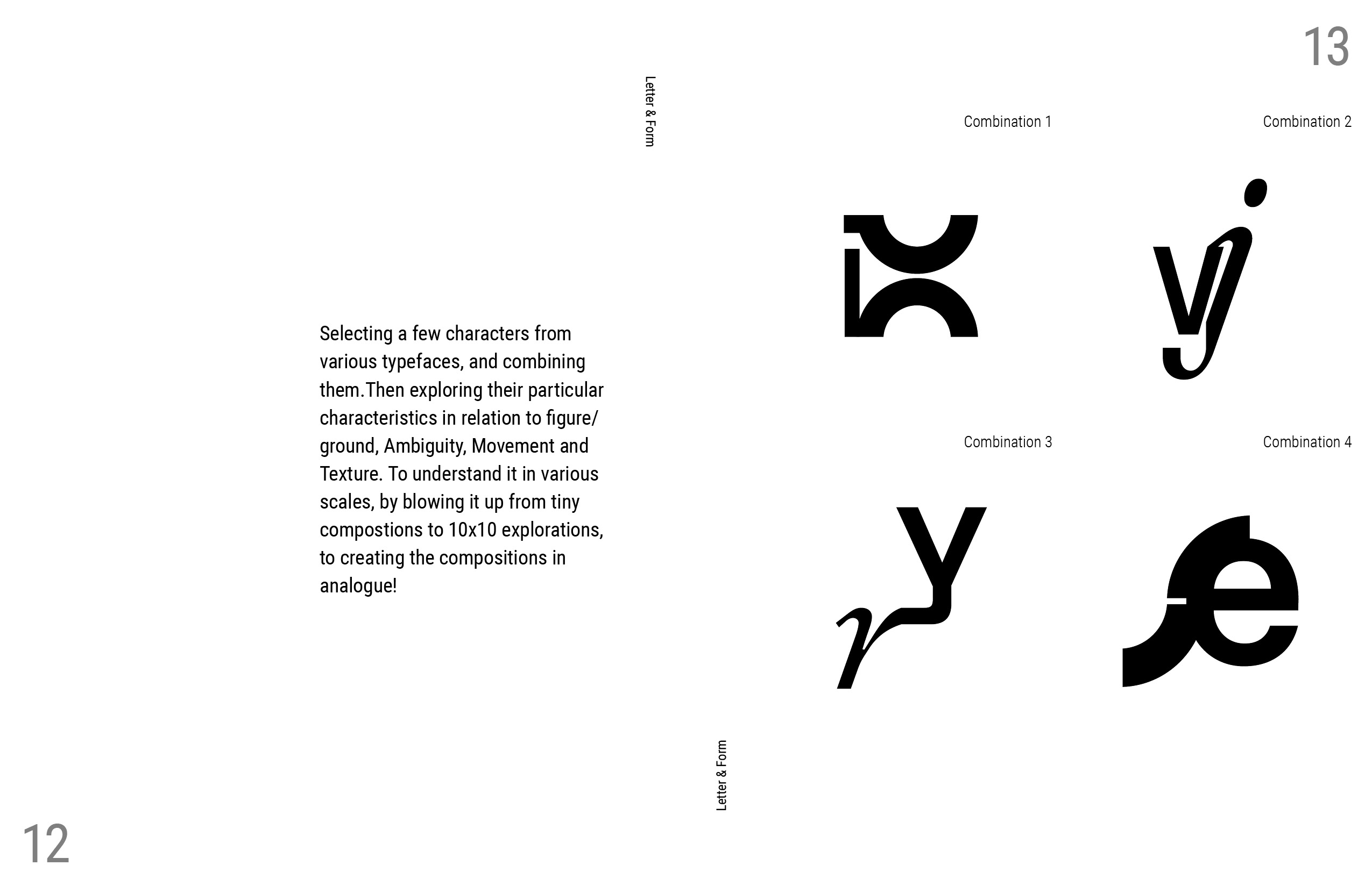
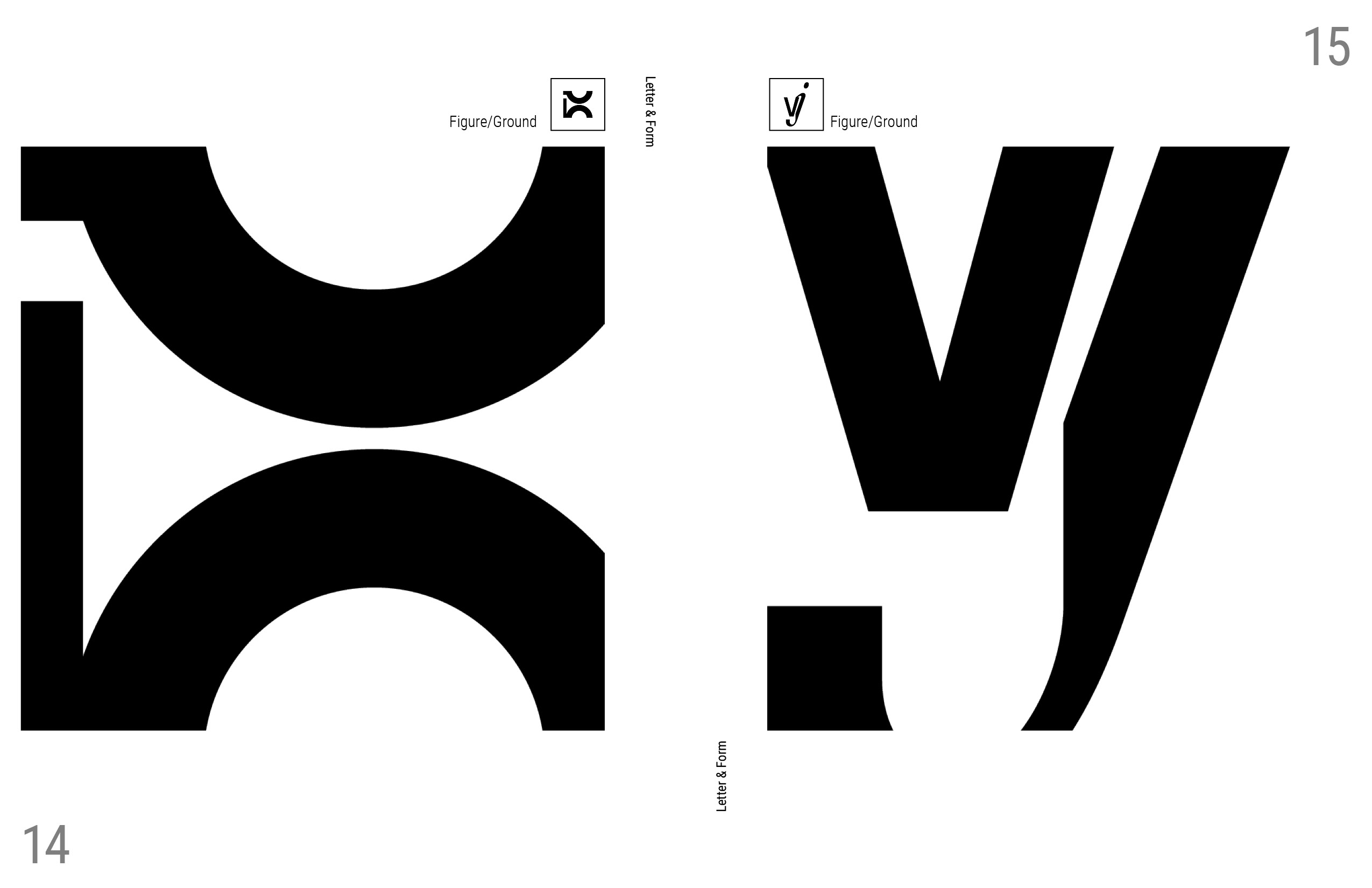
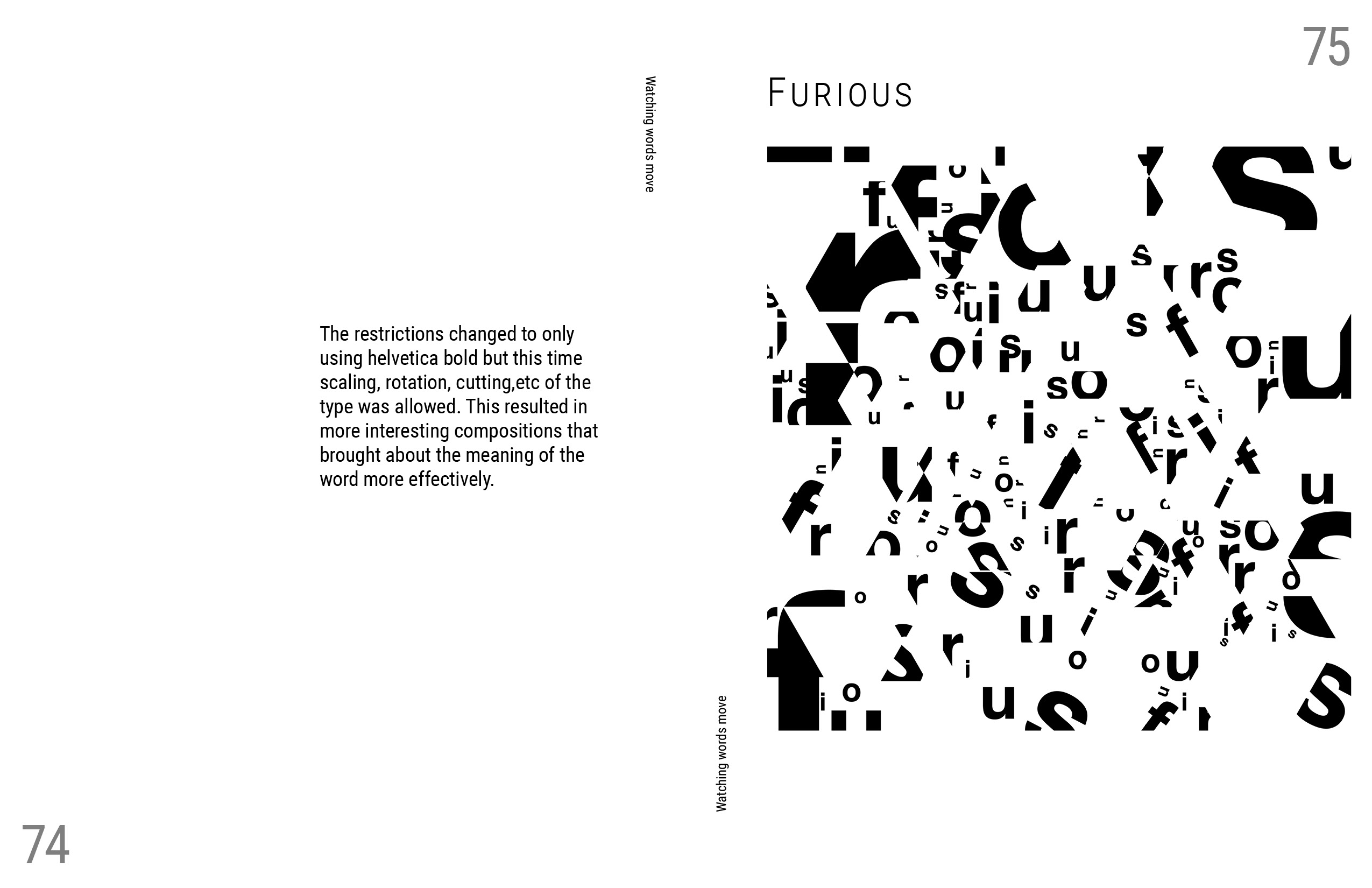
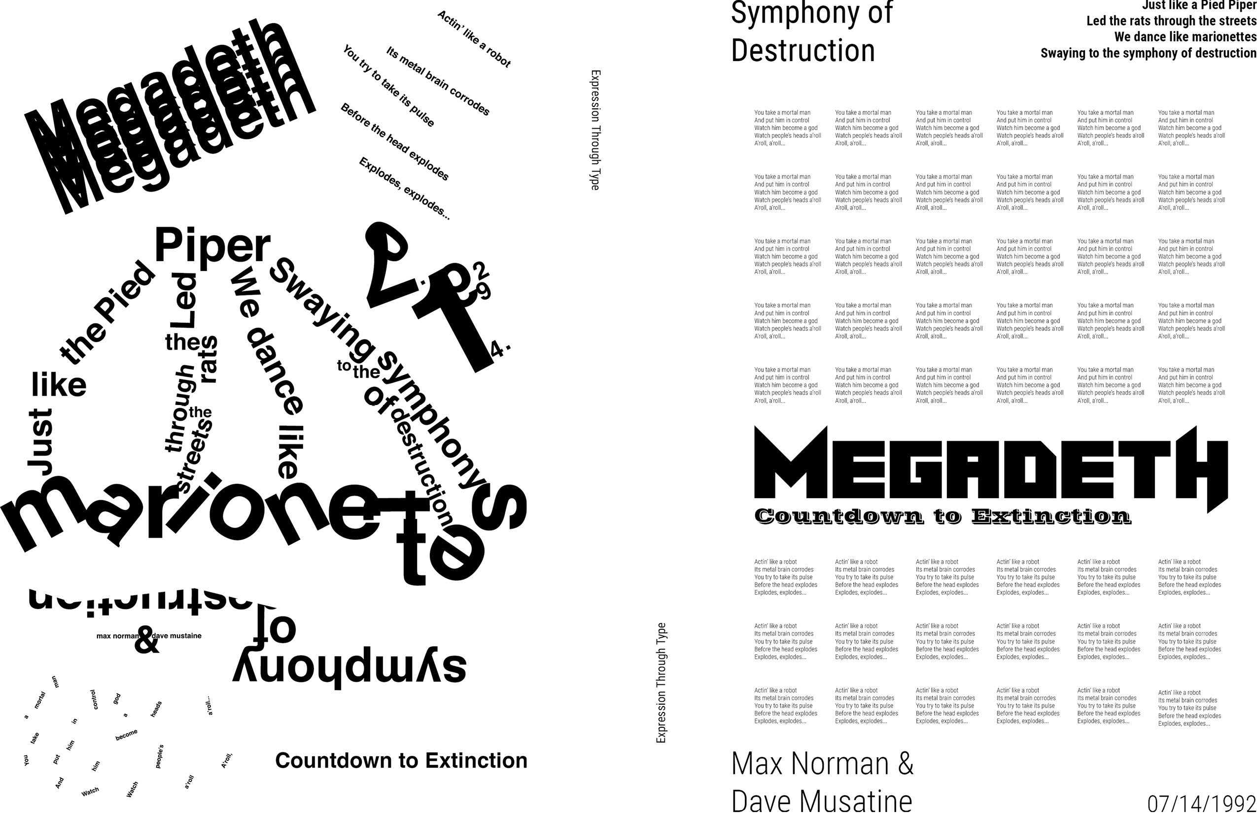
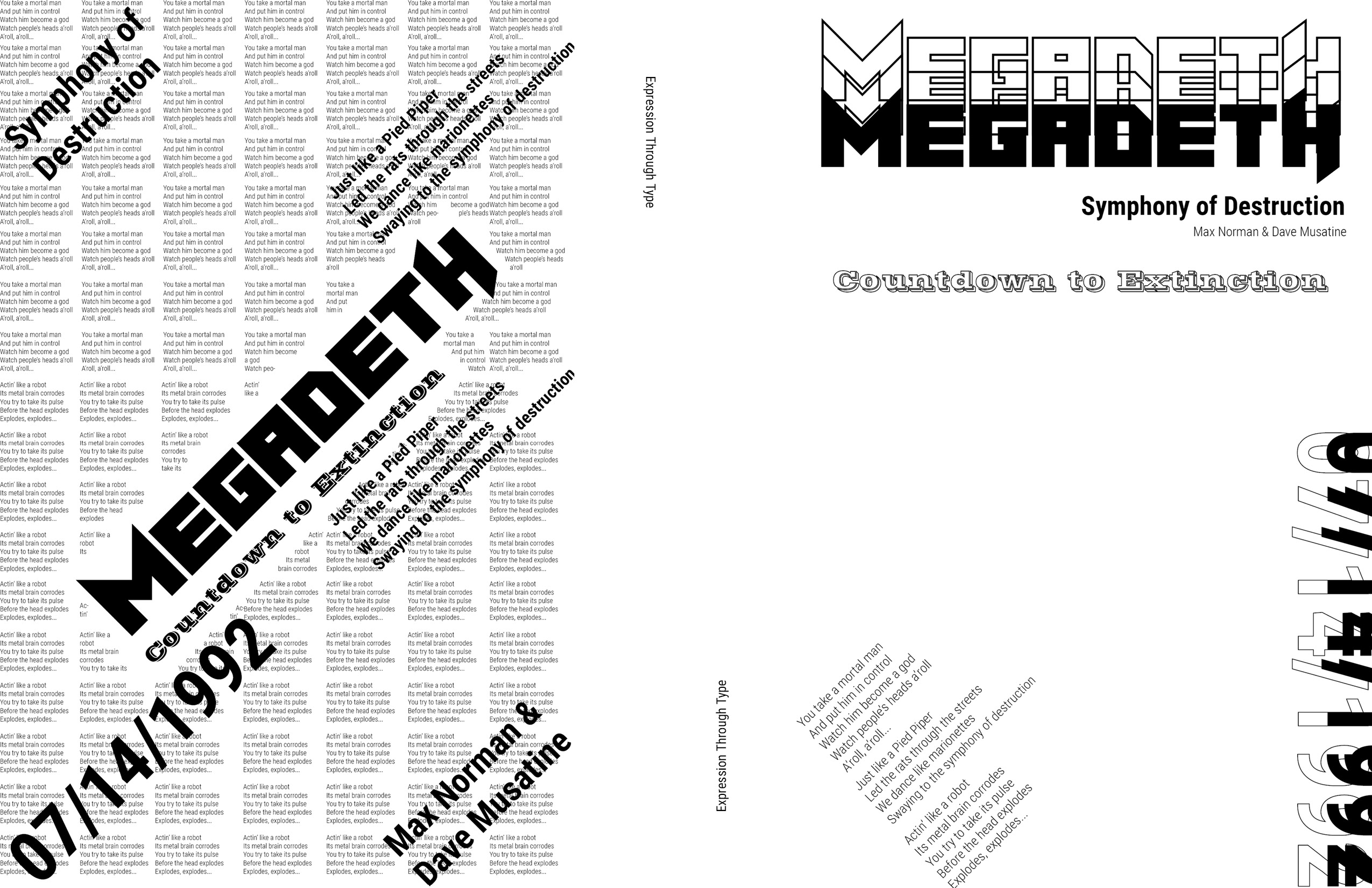
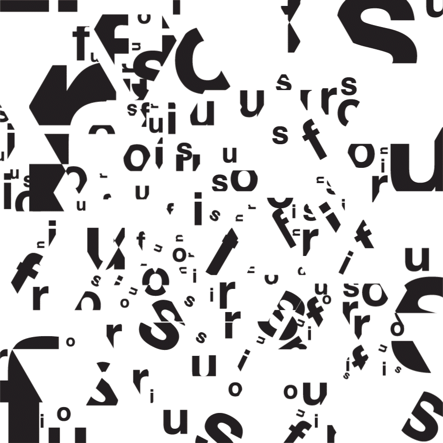
Looking at type from a different perspective, seeing it as a shape, I explored various layouts letting the meanings of the words define the path. I finally used them as a form to decipher the meaning of the sentences that were used in the design of the final poster.
Software Used—Adobe Illustrator, Adobe InDesign, and Adobe After Effects Categories—Poster Design, Typeface Study, Typeface Design, Type-Only Poster Design, Process Book Design, Experimental TypeProject Completion—December 2021

Introduction:
In order to improve my skills, the type-1 course let me dive deeper into typography, where the design of a few typefaces based on the things I liked, took place. Understanding type as form rather than language was the main goal to incorporate the practice of creating posters using only type.
Starting with it as forms, and opening myself to using it in creative ways, I was then encouraged to think of the meaning of the words and use them as a form to decipher the meaning of the sentences that were used in the design of the final poster as can be seen above.
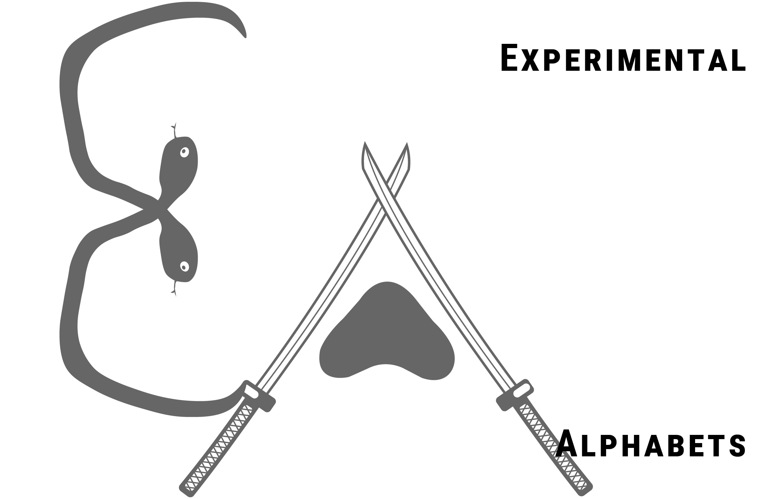
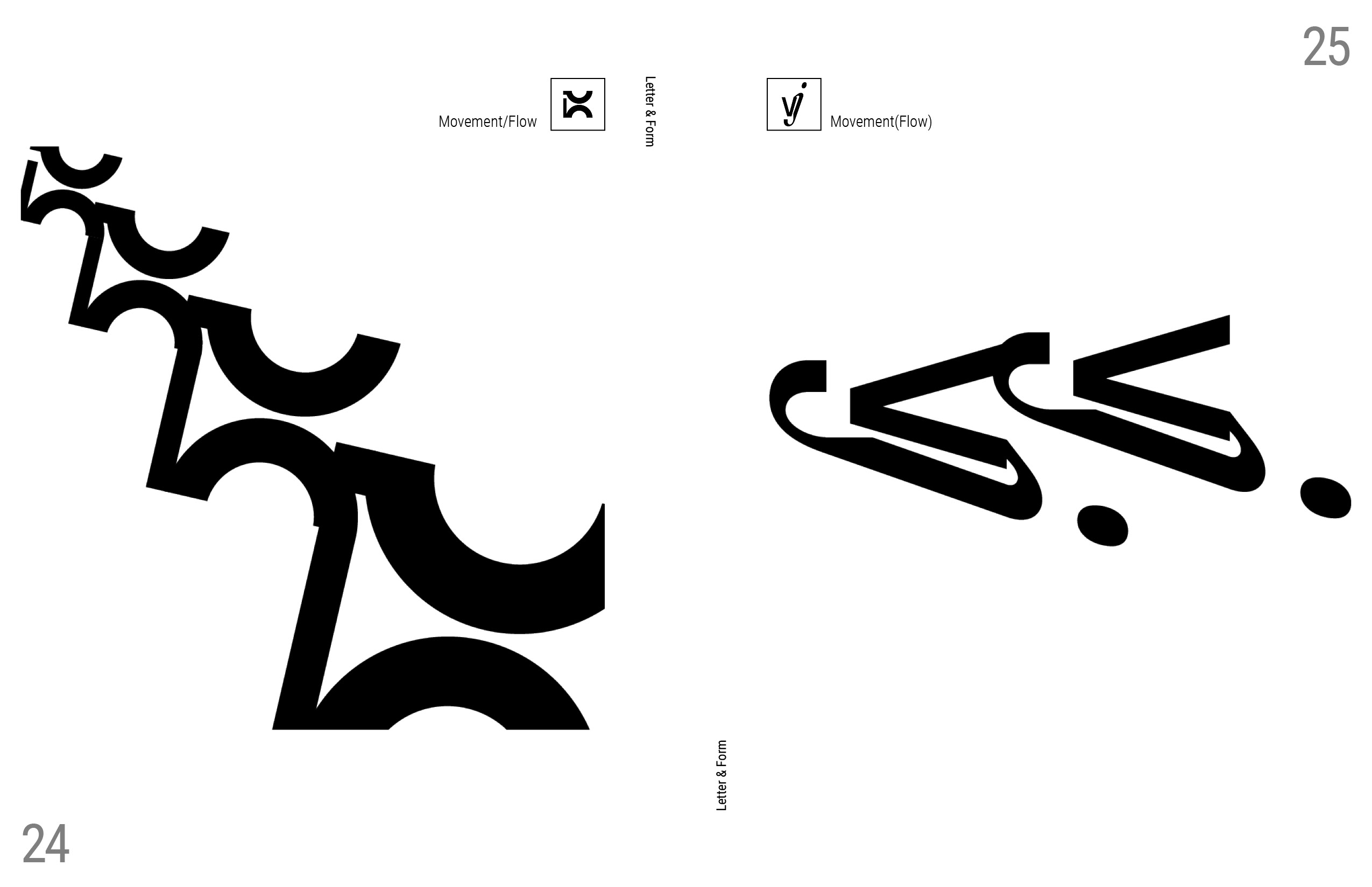
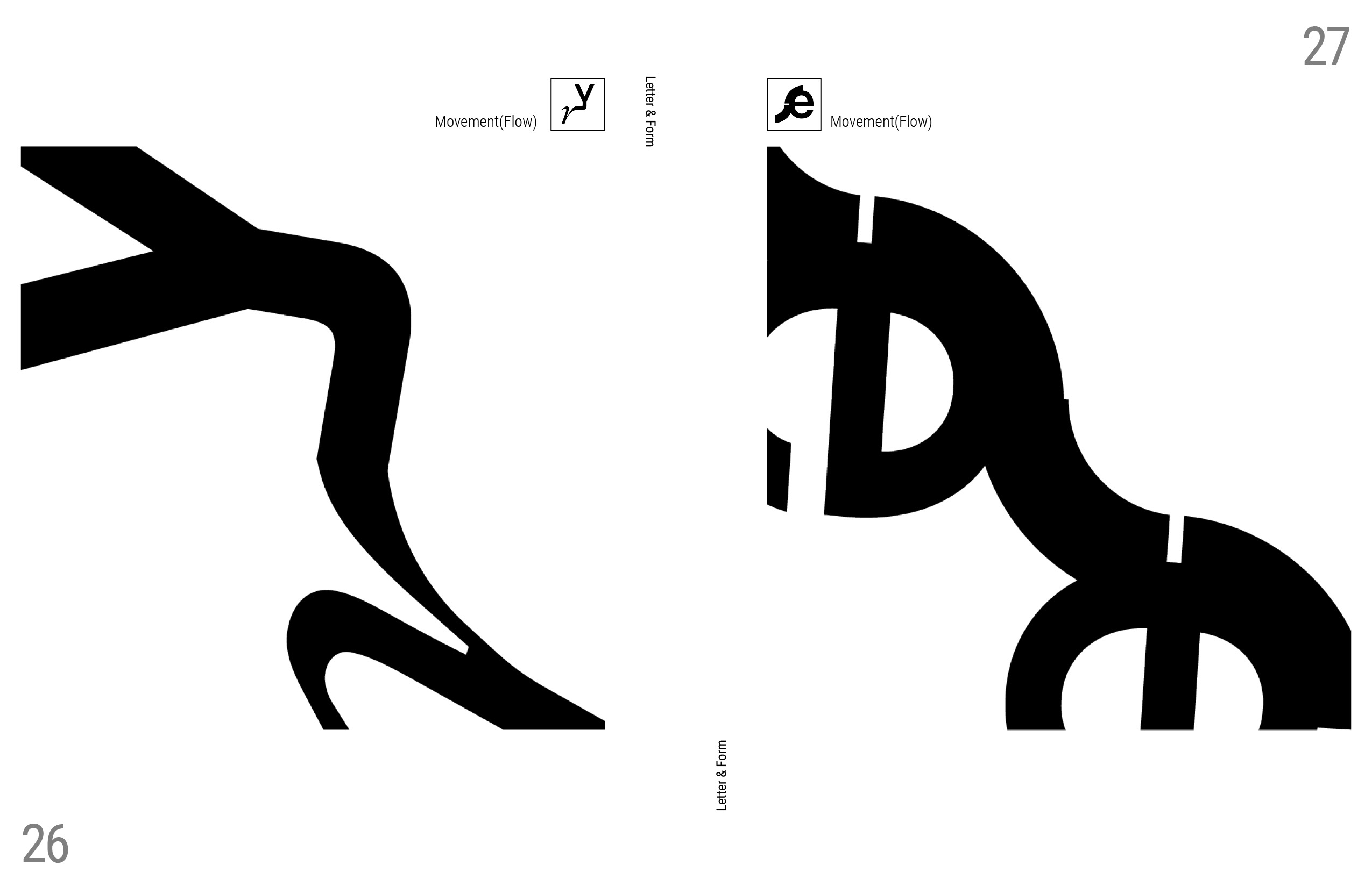
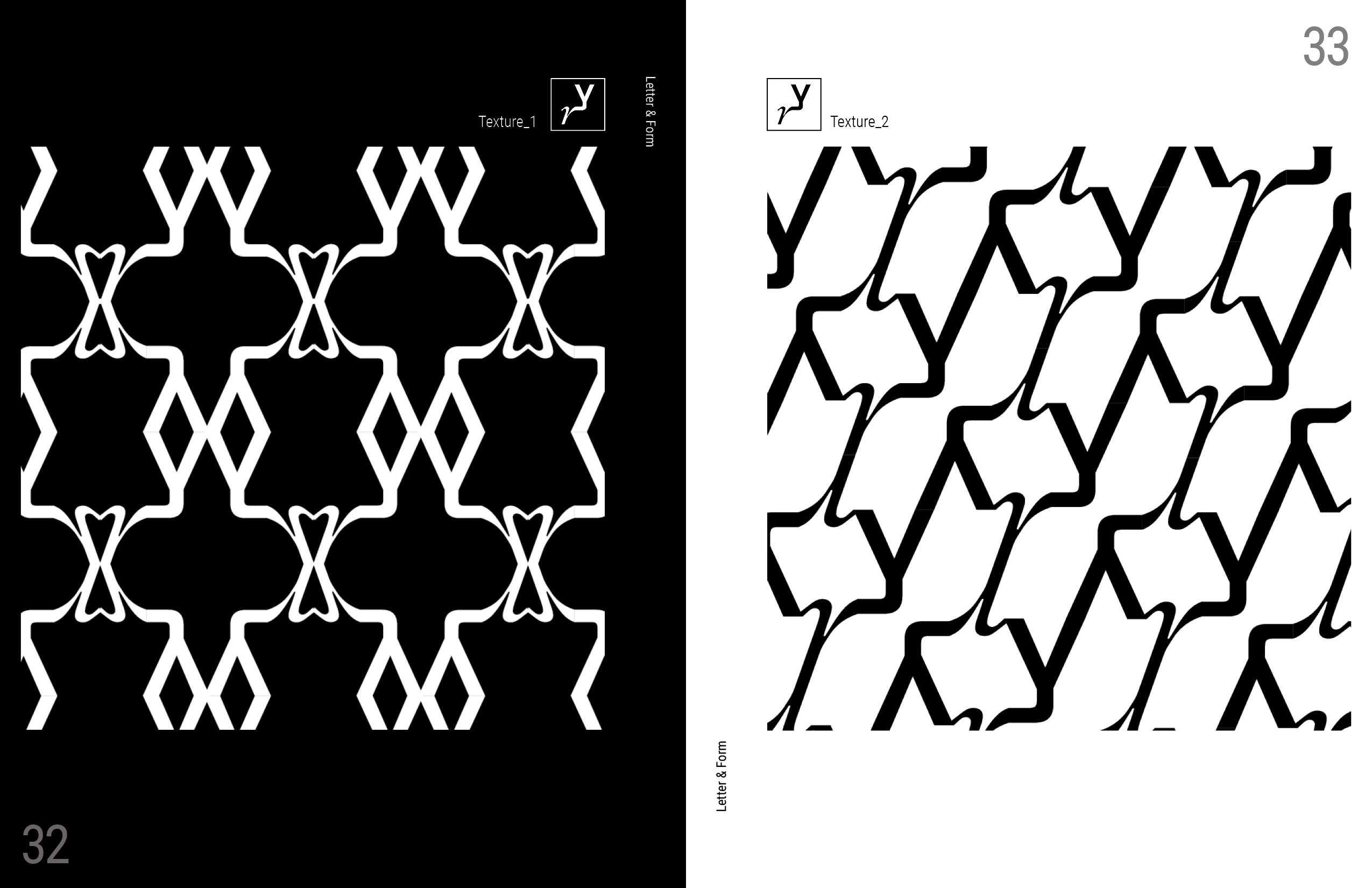
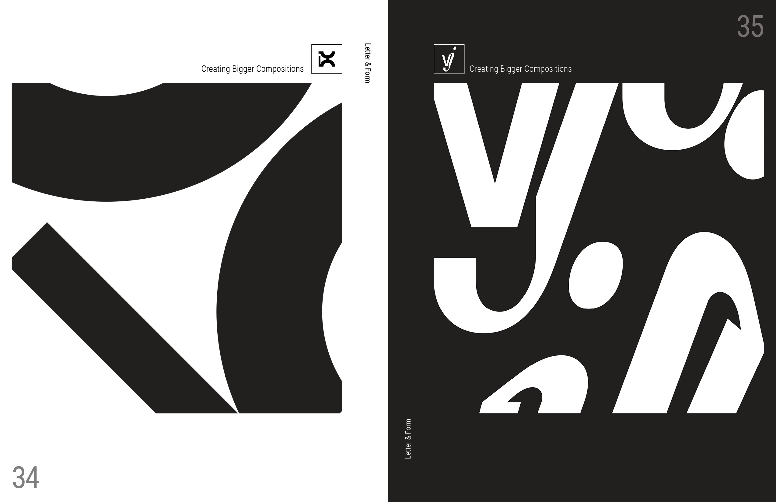
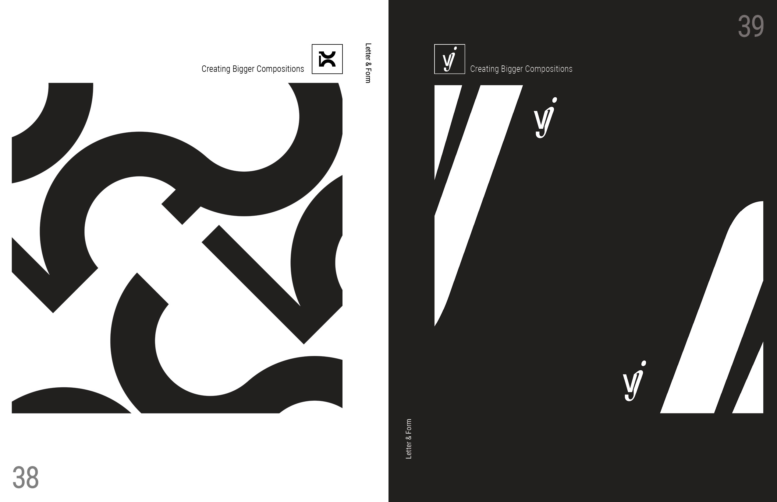
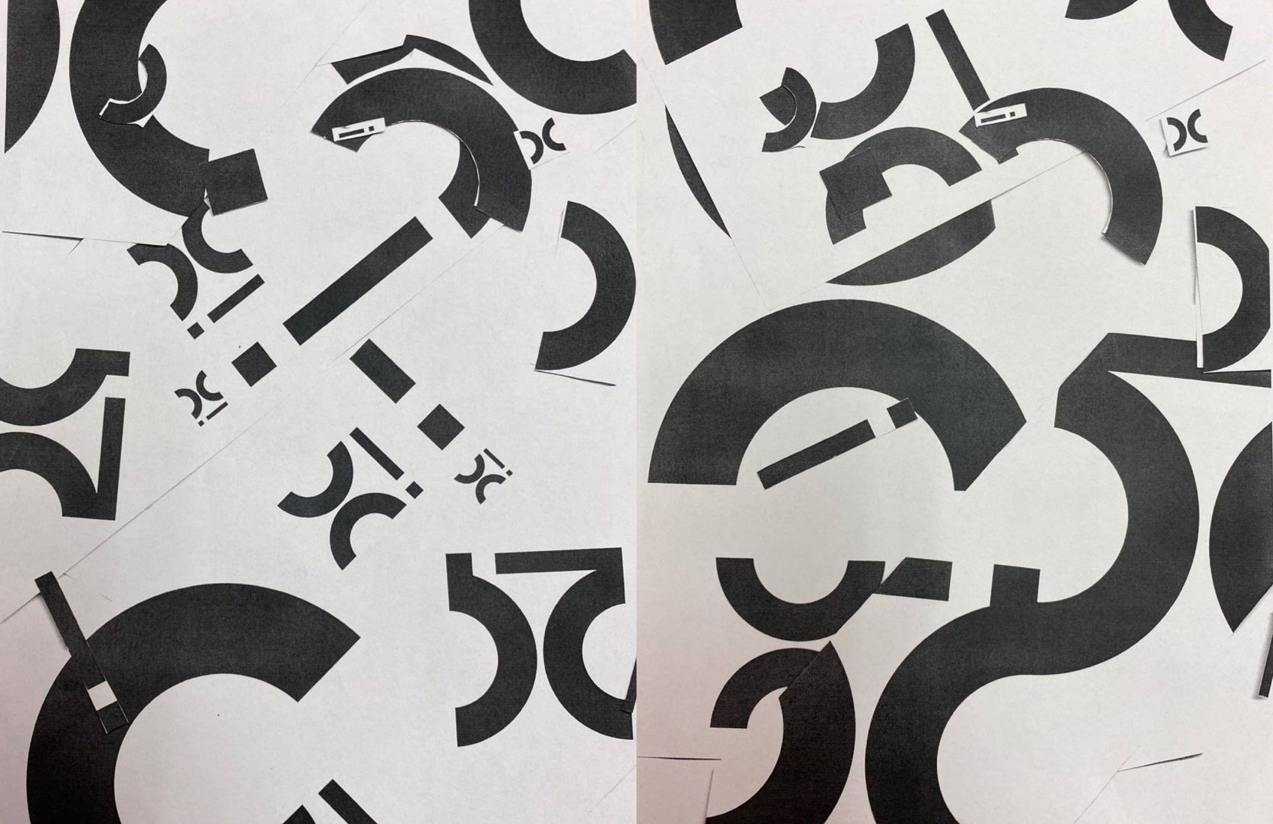
Experimental Typeface Design
:
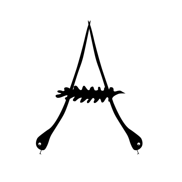
The following typefaces were designed based on simple shapes, leaves and snakes, and paws and swords—things I explored for experimenting with type design.

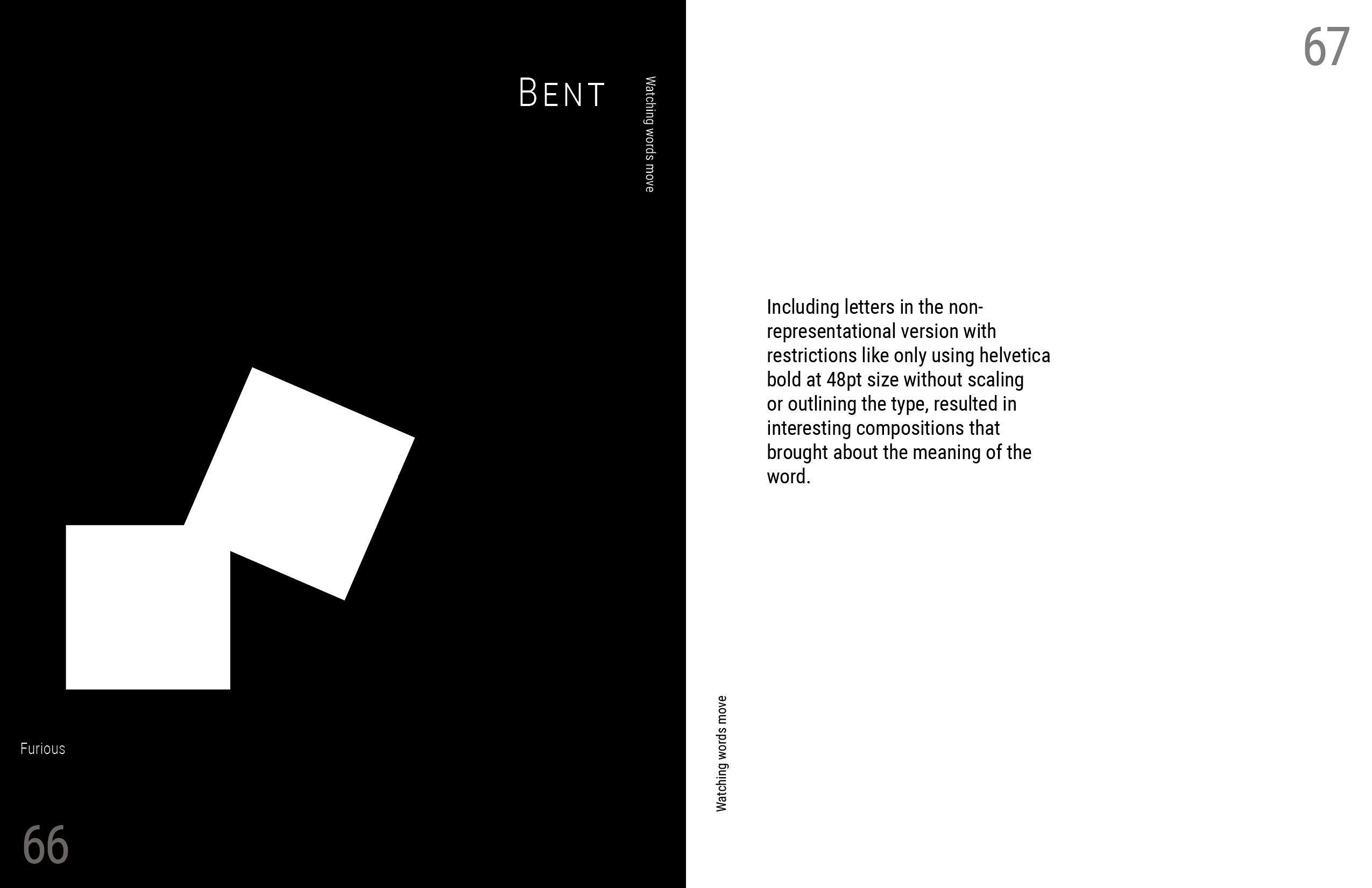
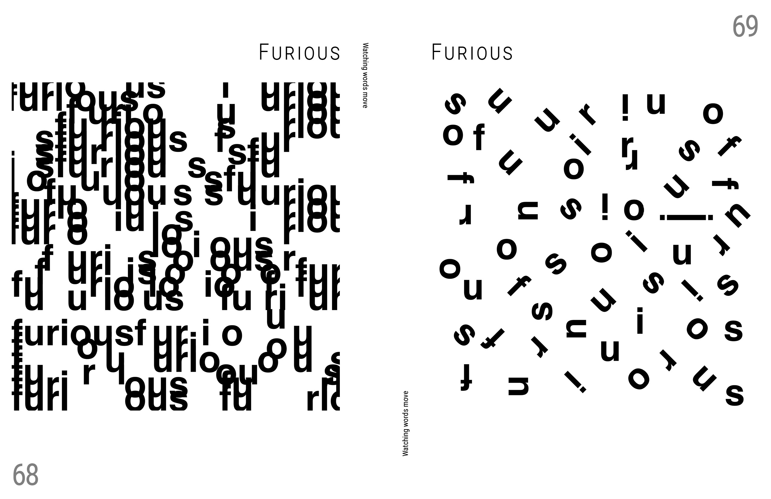
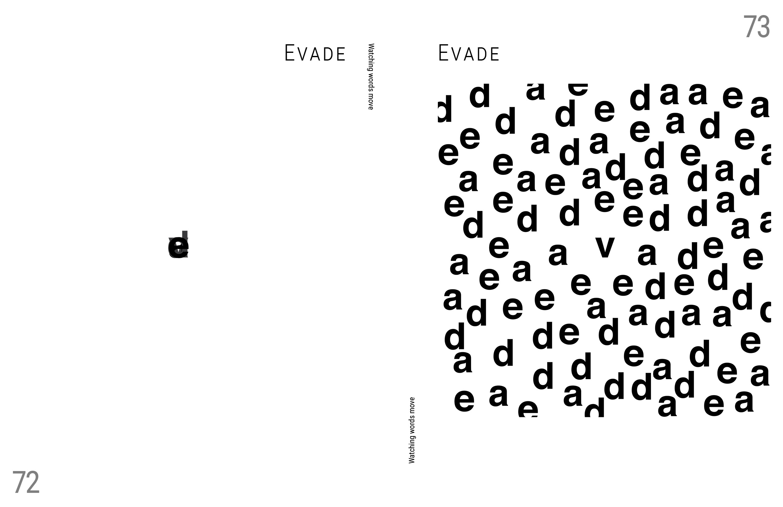
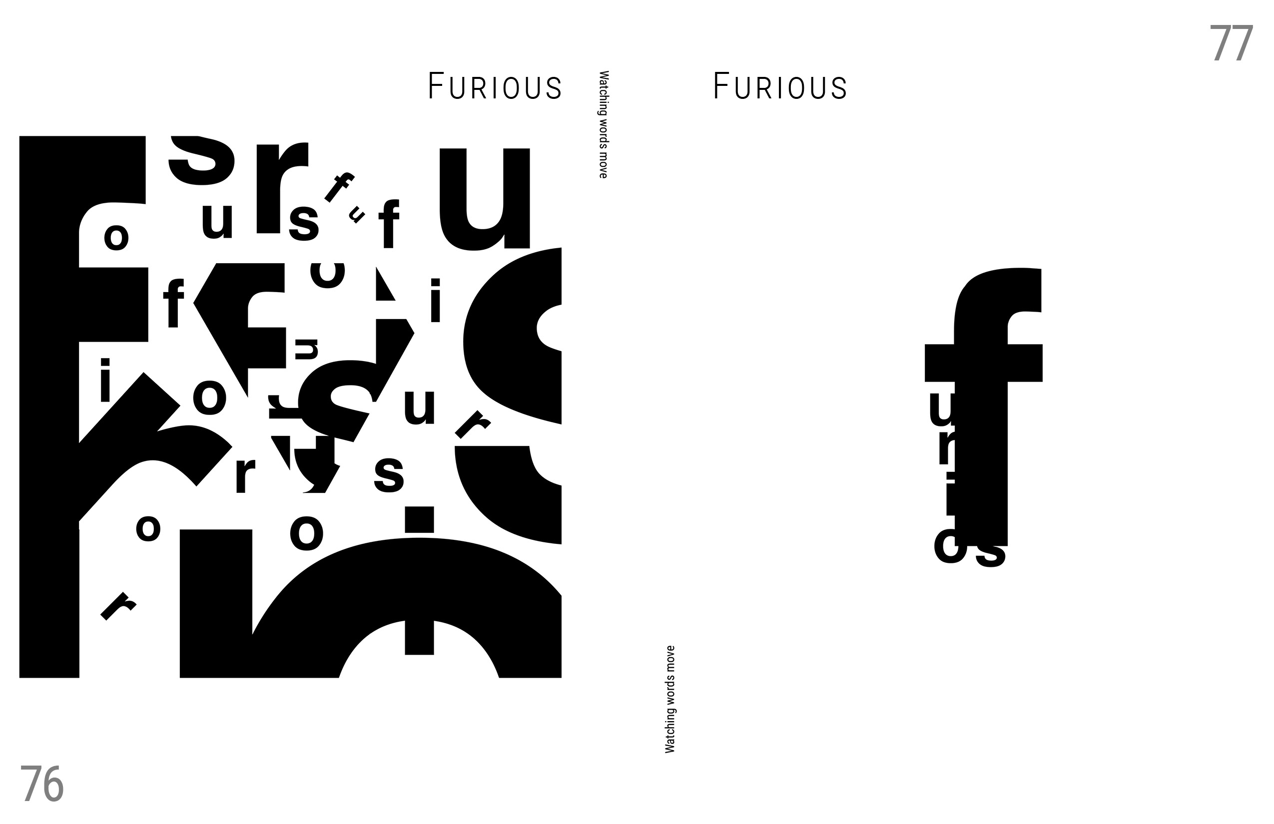
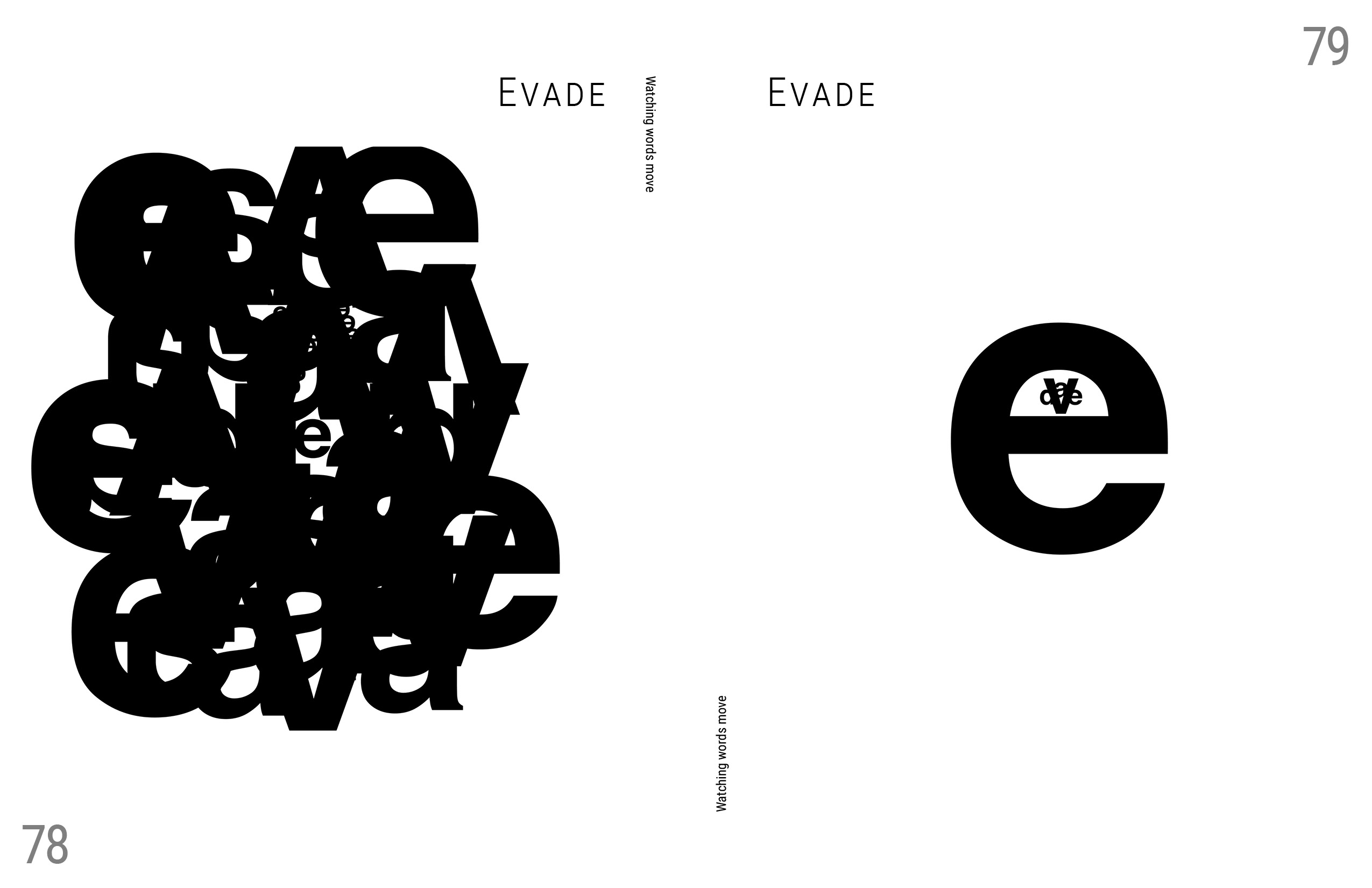
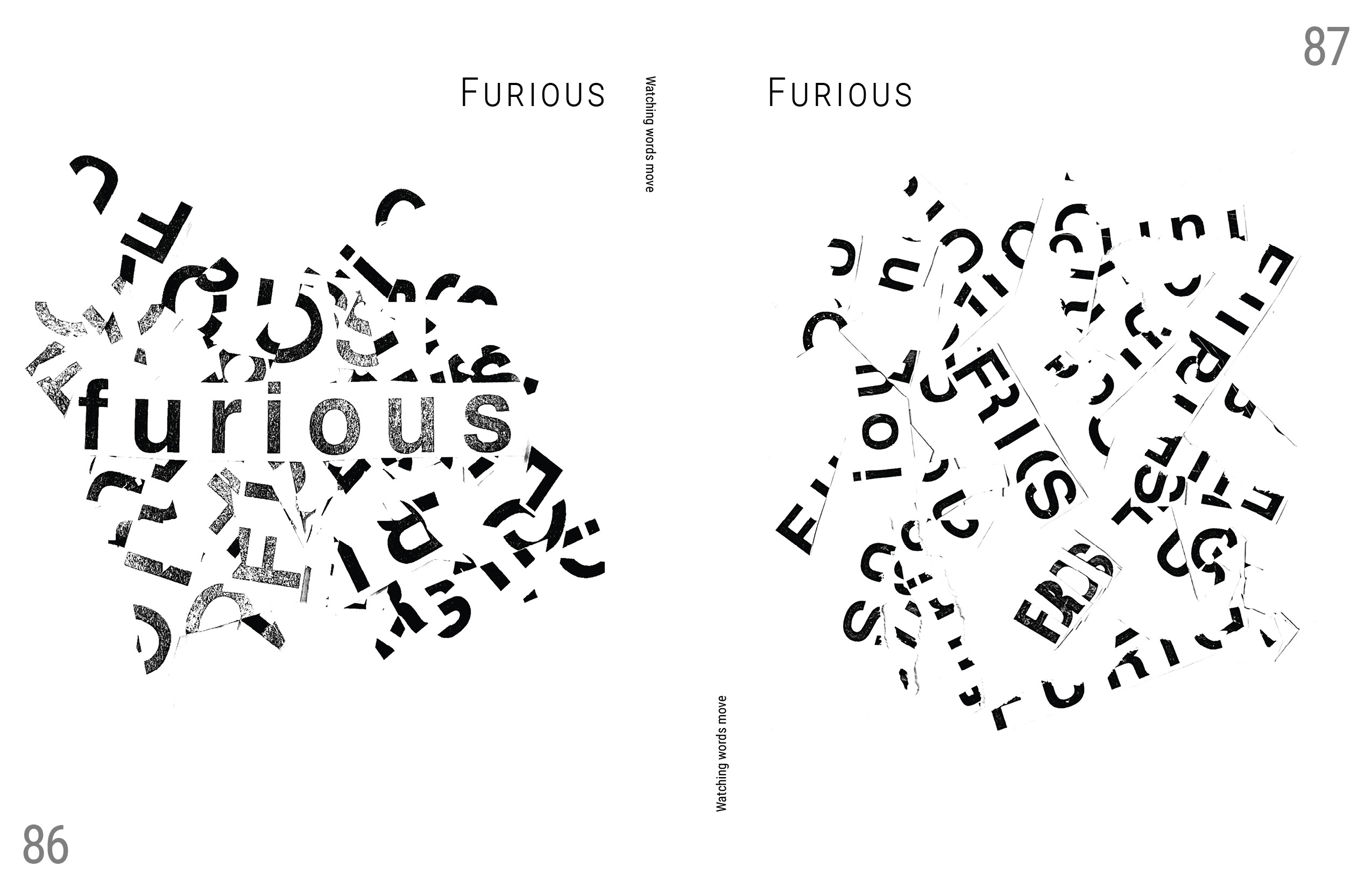
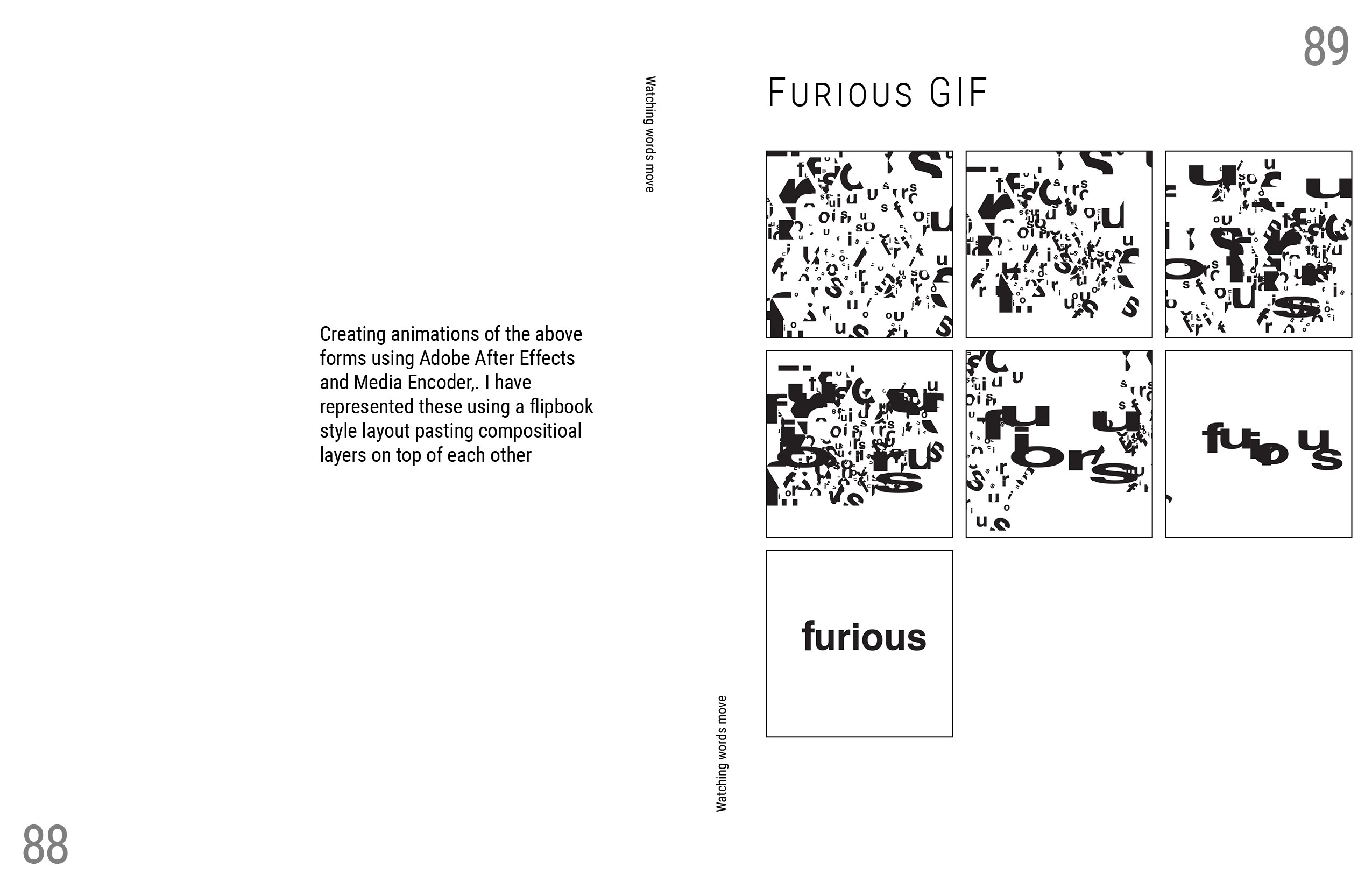
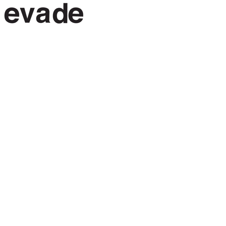
Moving Words:
Animation to represent the meaning of the word using only the word itself.
Process:
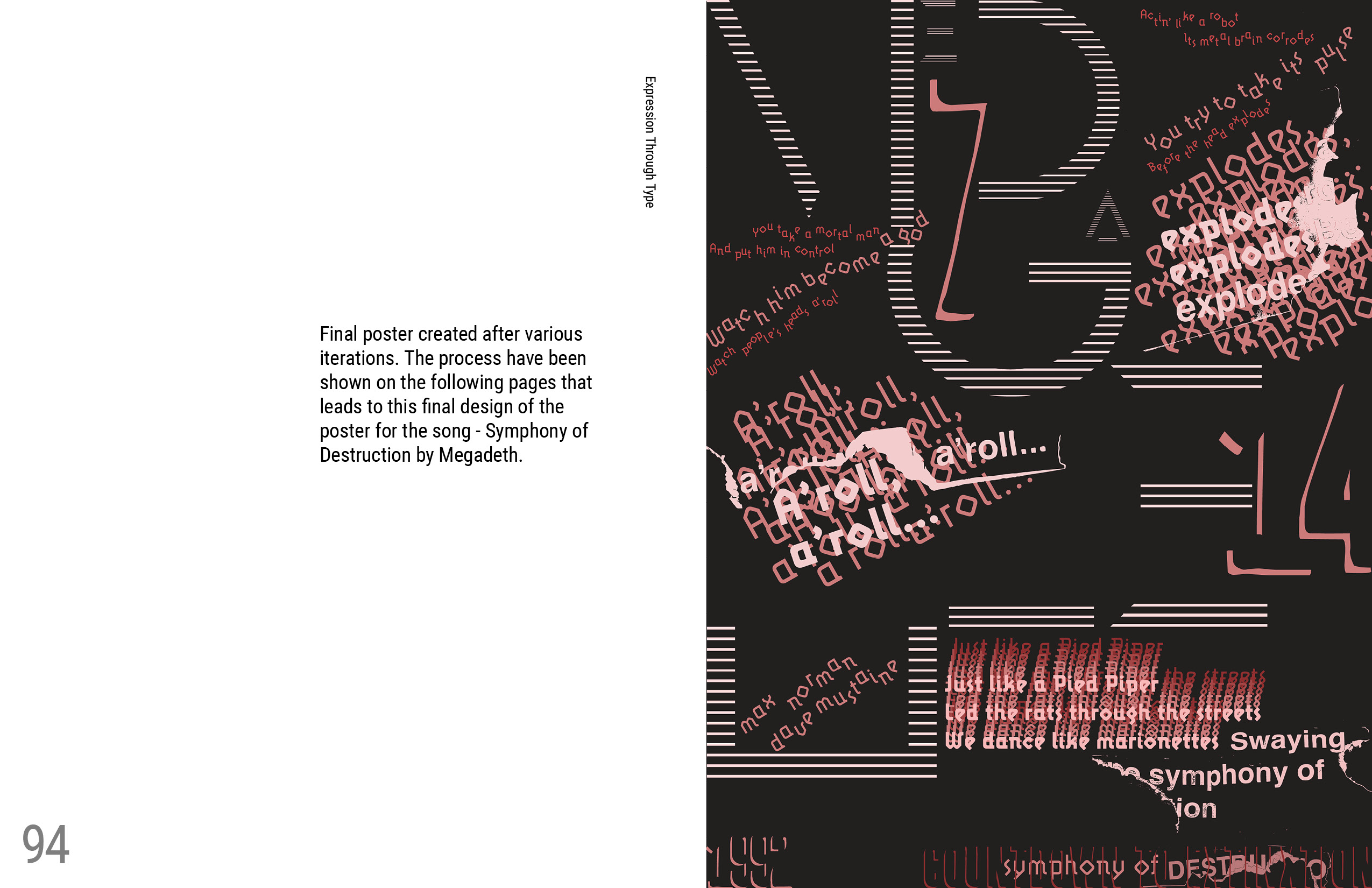
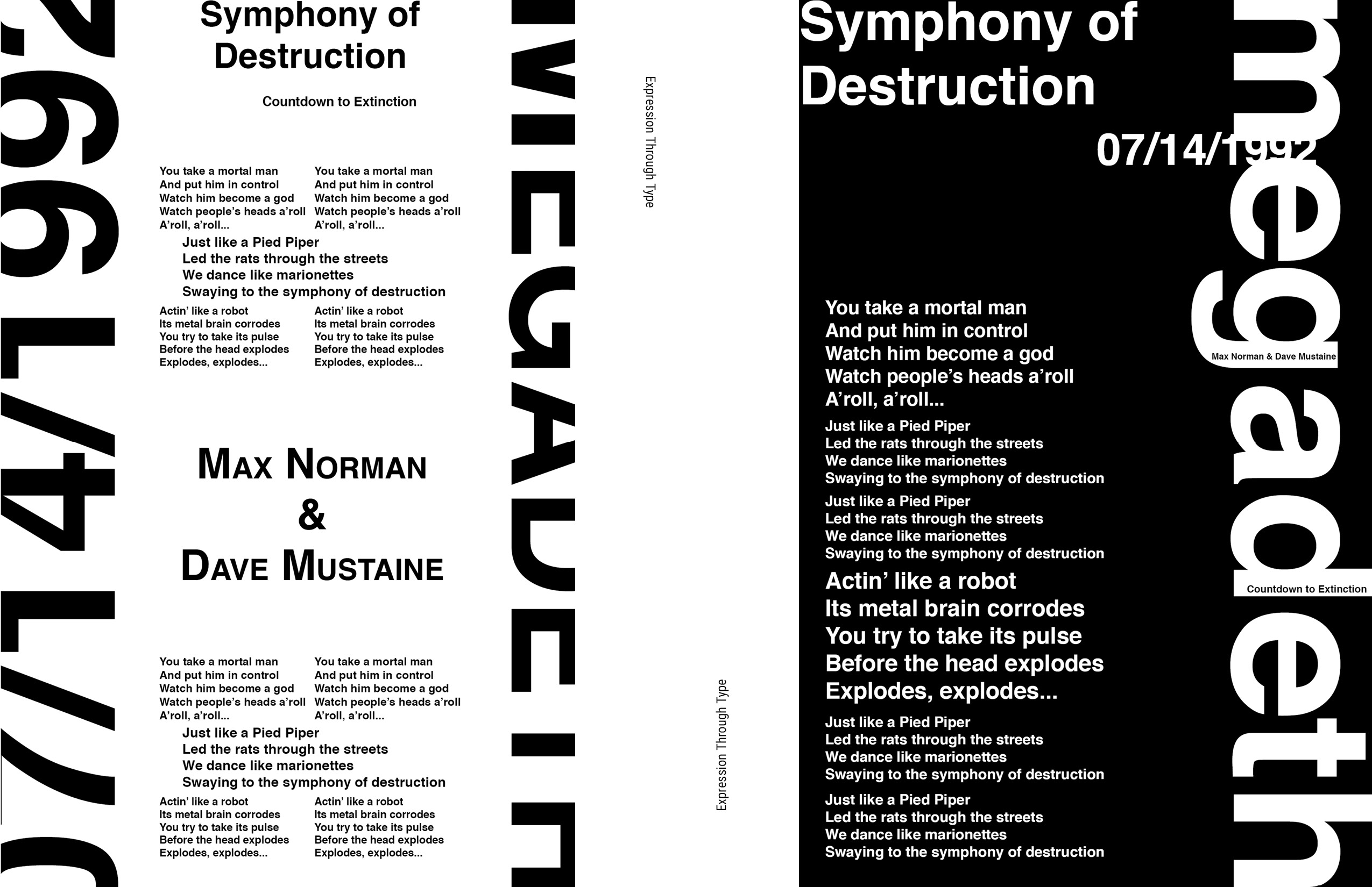
This led to designing a poster based on a song or a poem, in my case, a song by Megadeth—Symphony of Destruction. The poster was designed based on the lyrics of this song to represent the feeling of the song and its meaning. The whole process of reaching the poster and understanding type was placed in a book format as a process book that is shown below.