Mrs Eaves—Zuzana Licko
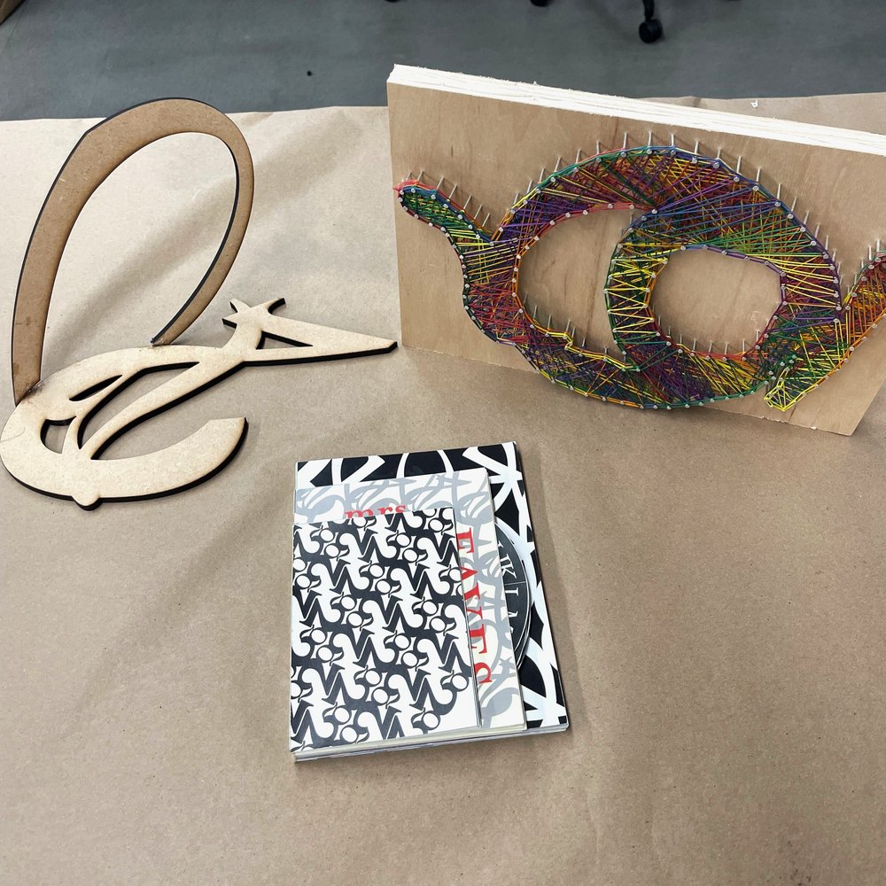
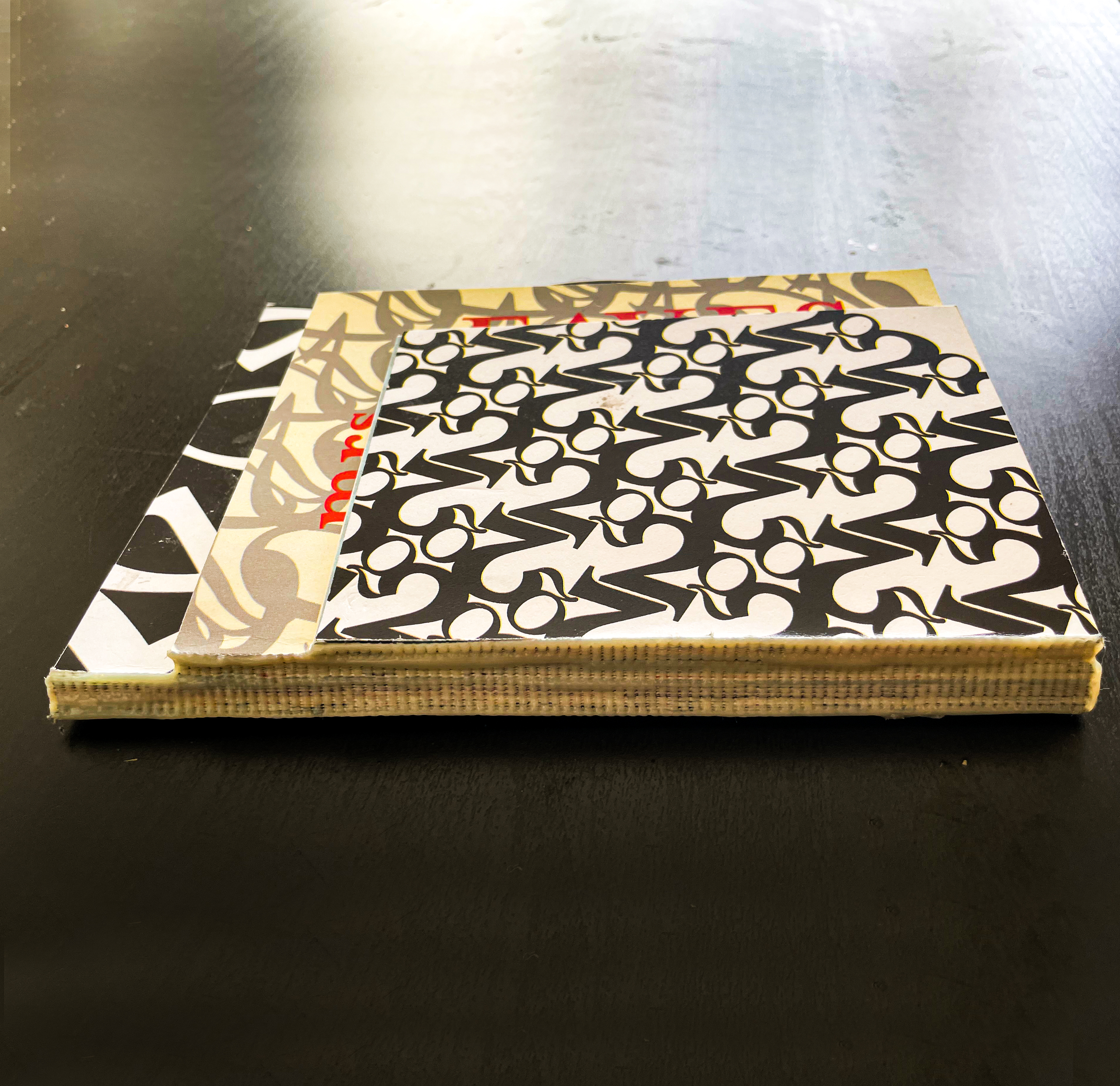
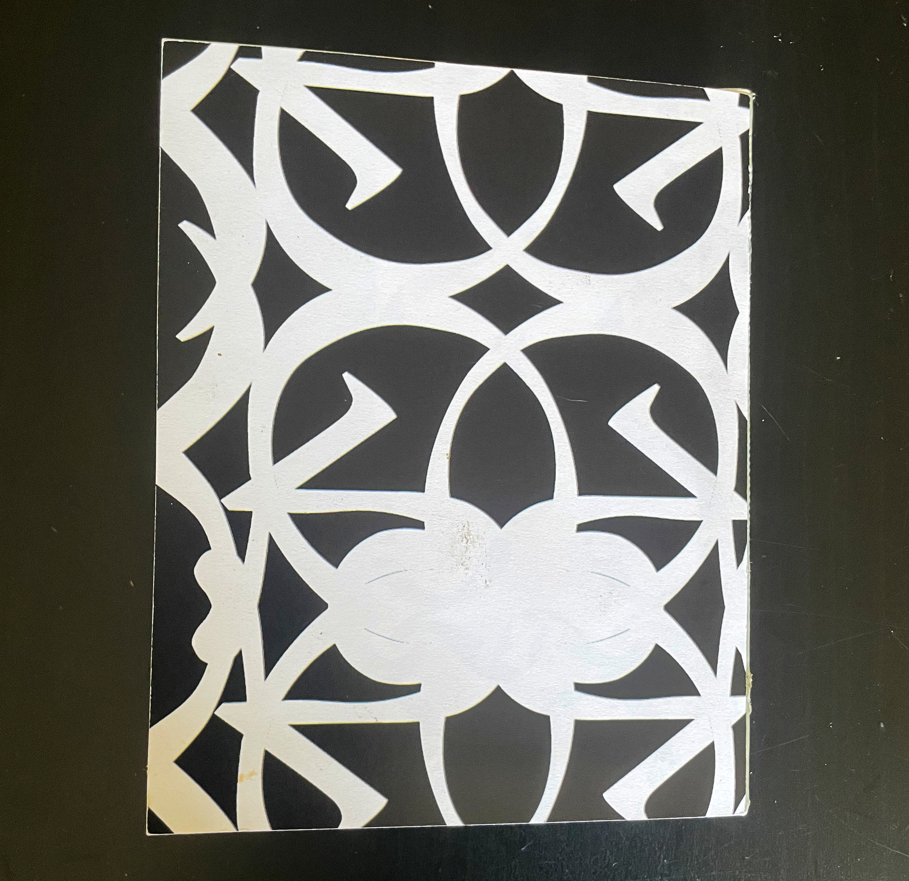
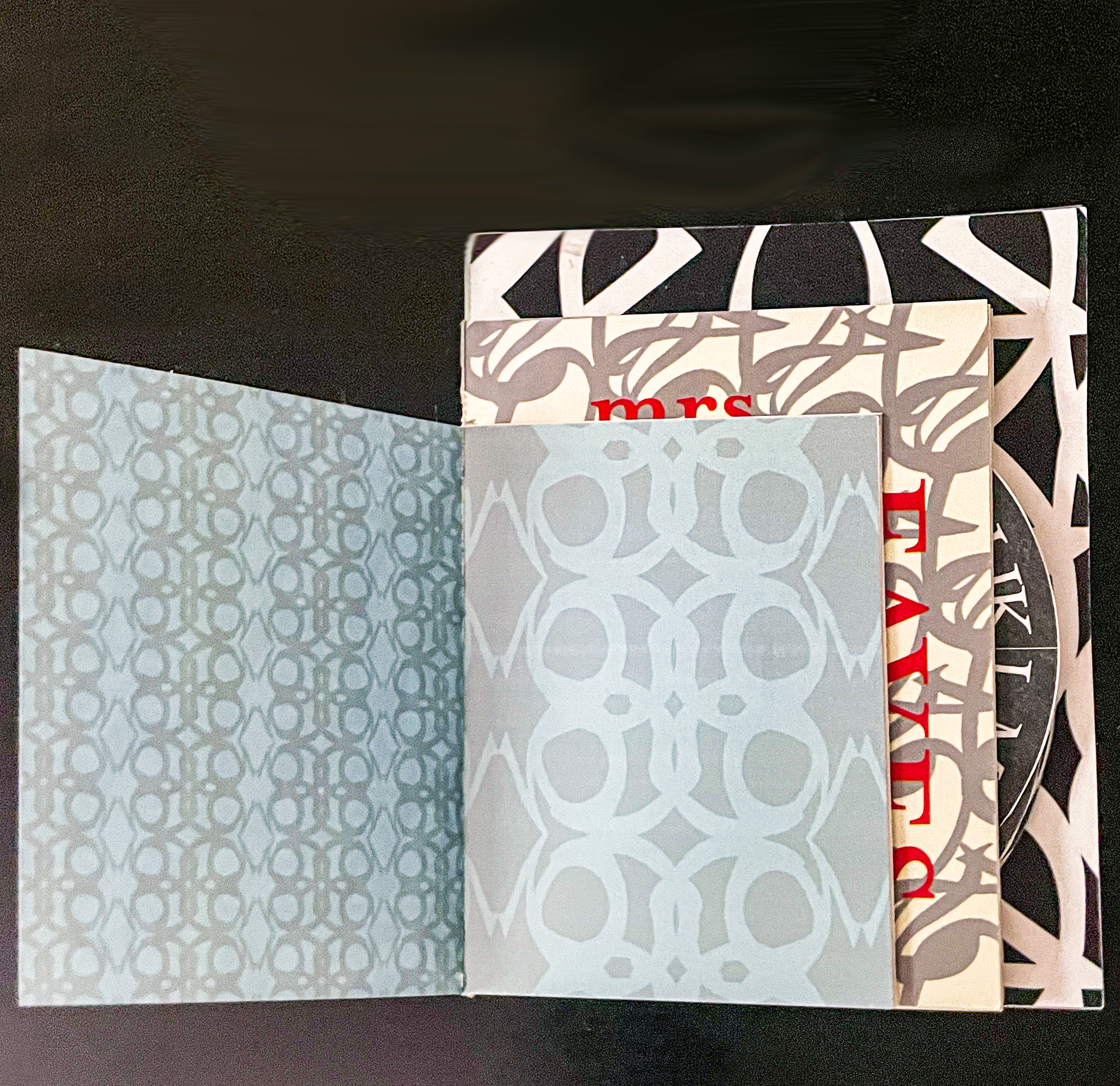
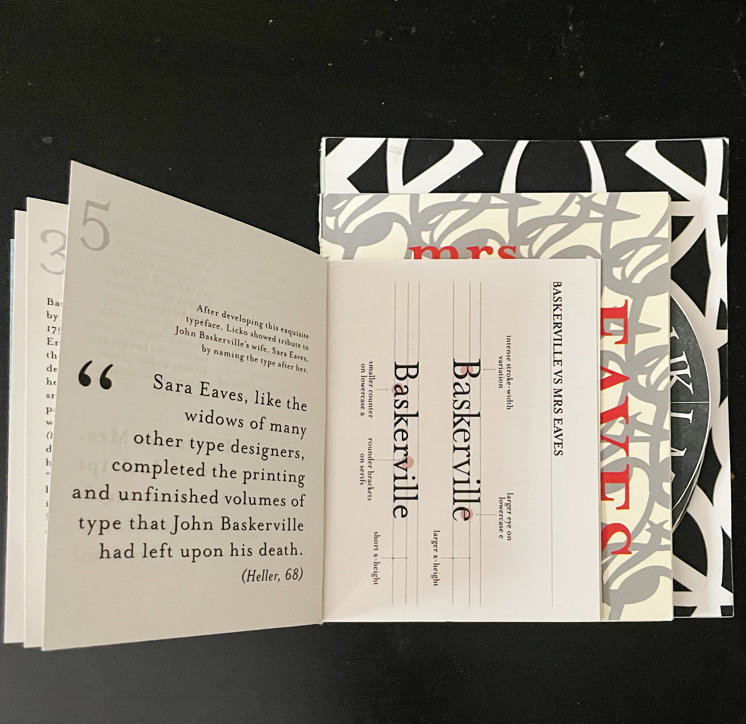
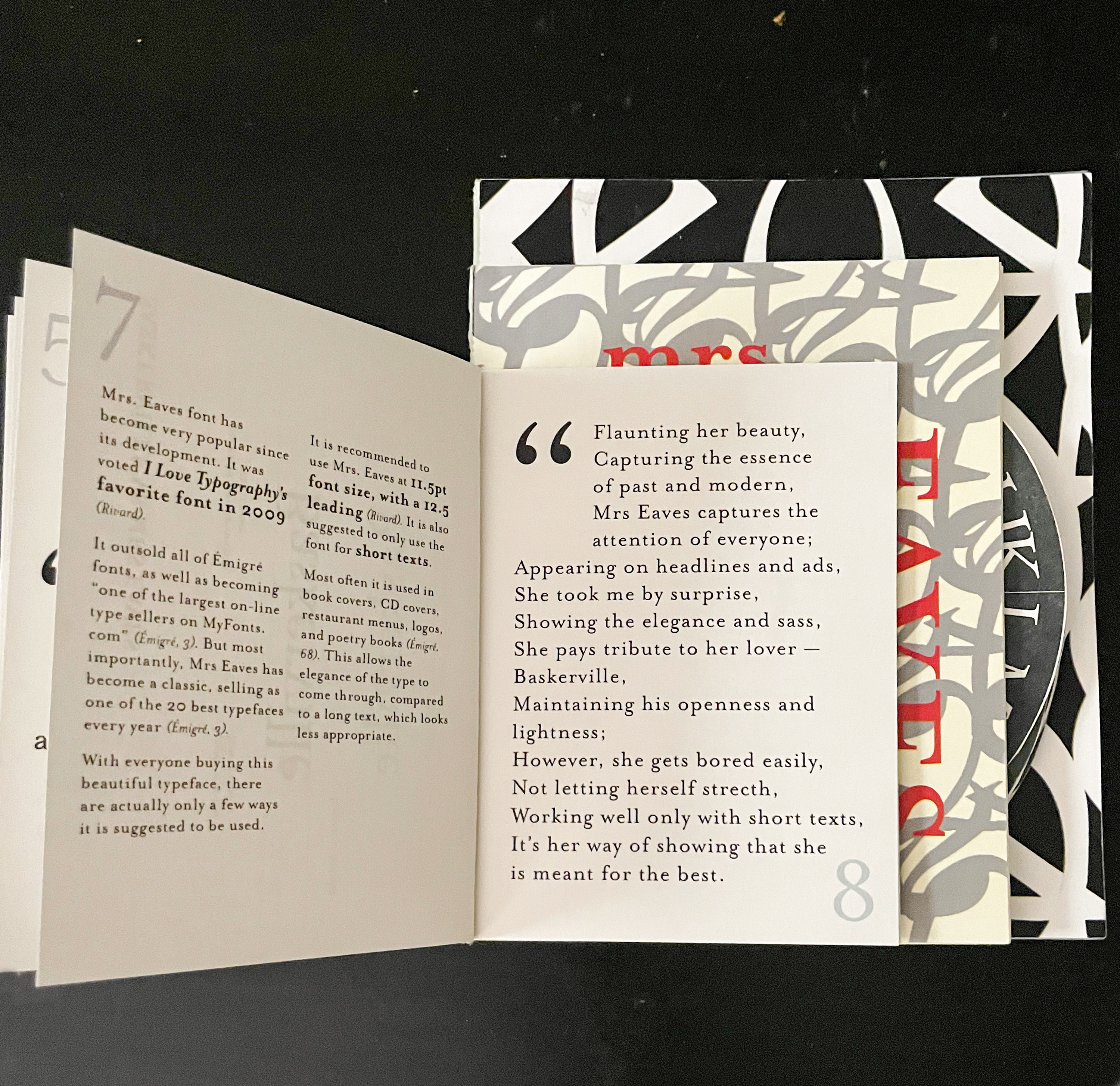
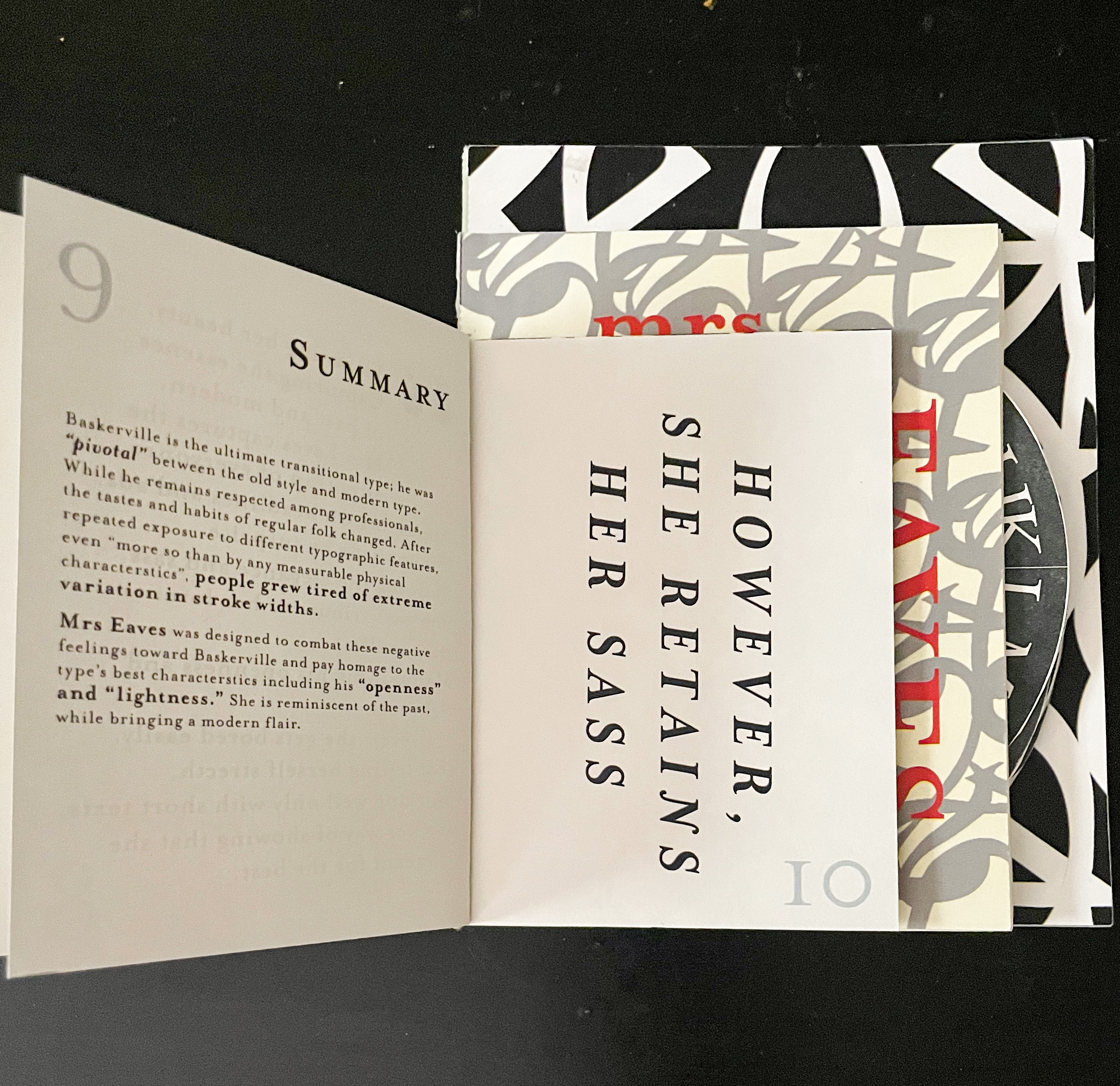
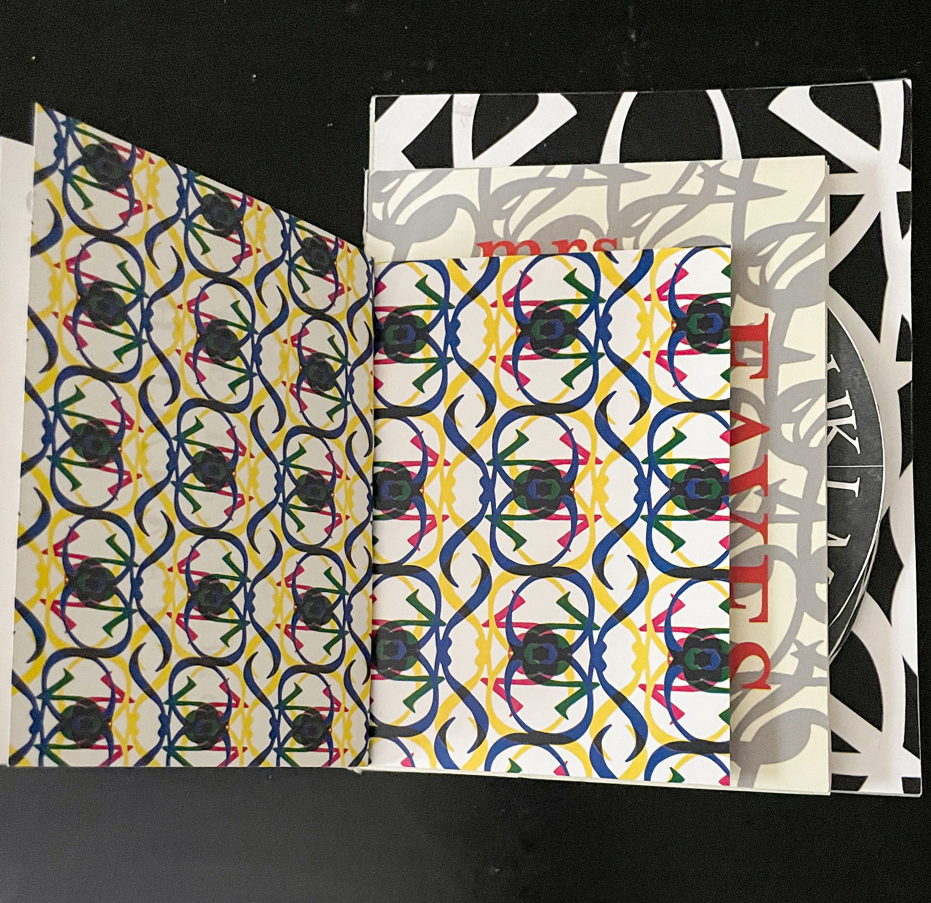
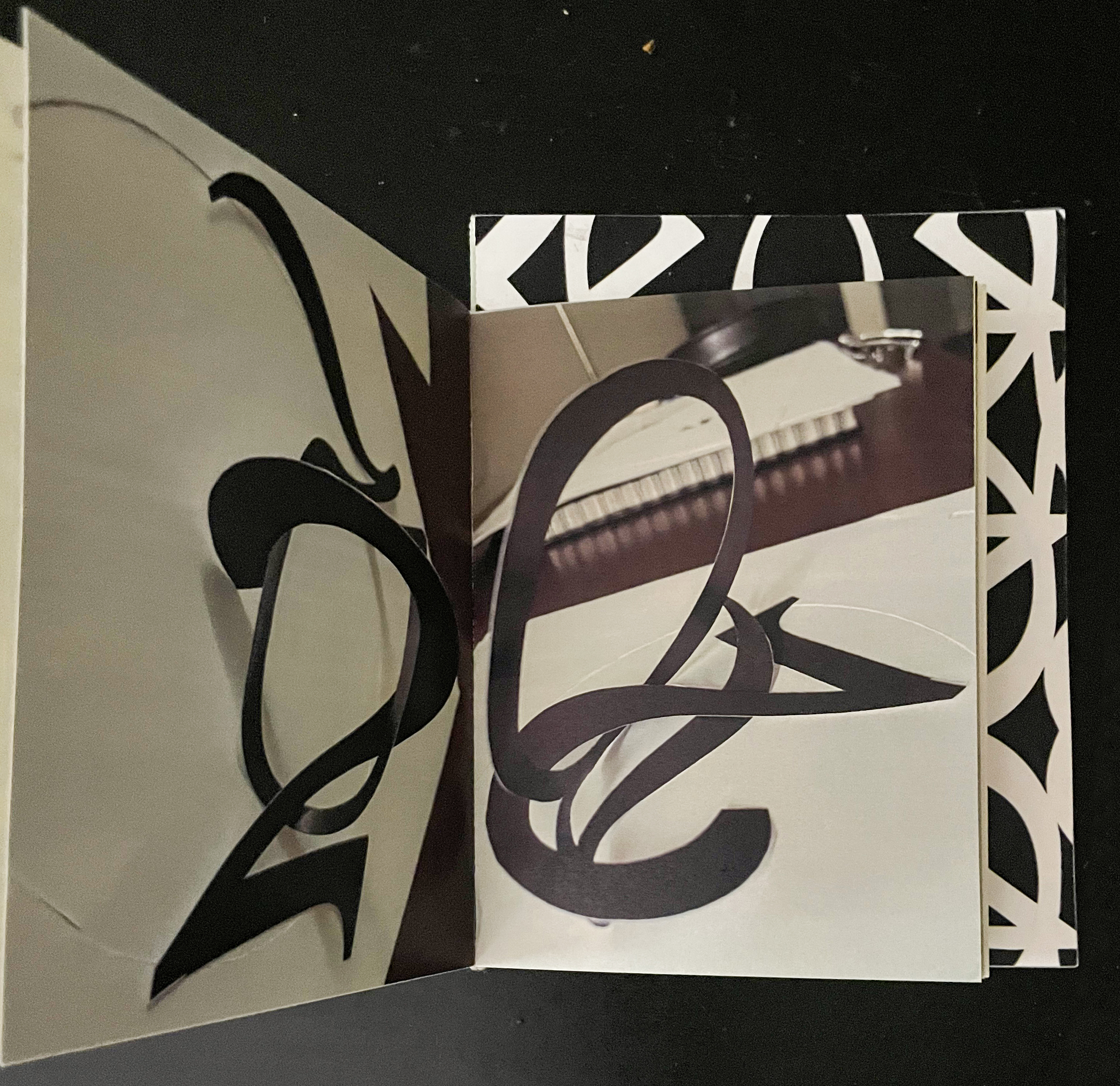
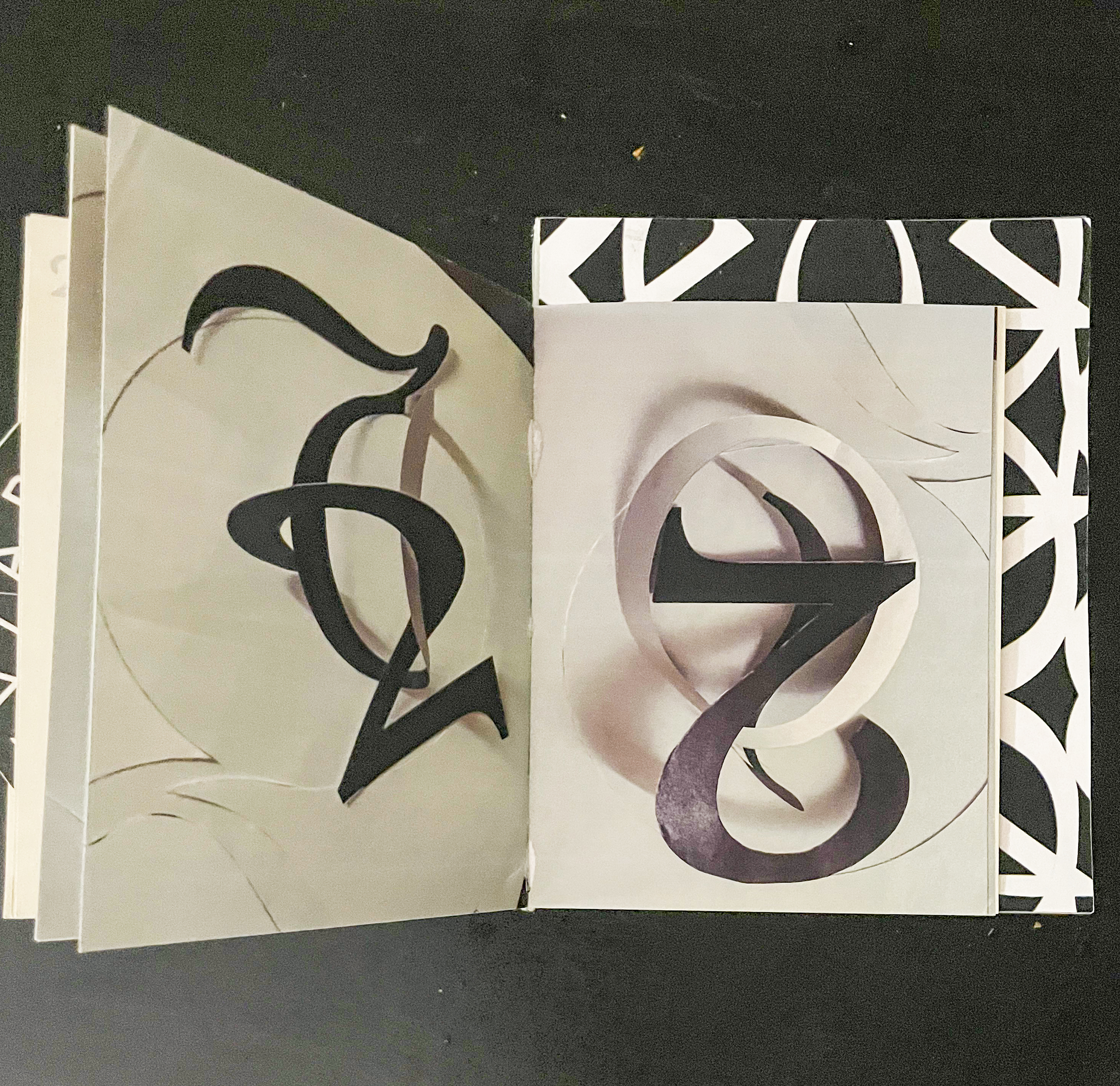
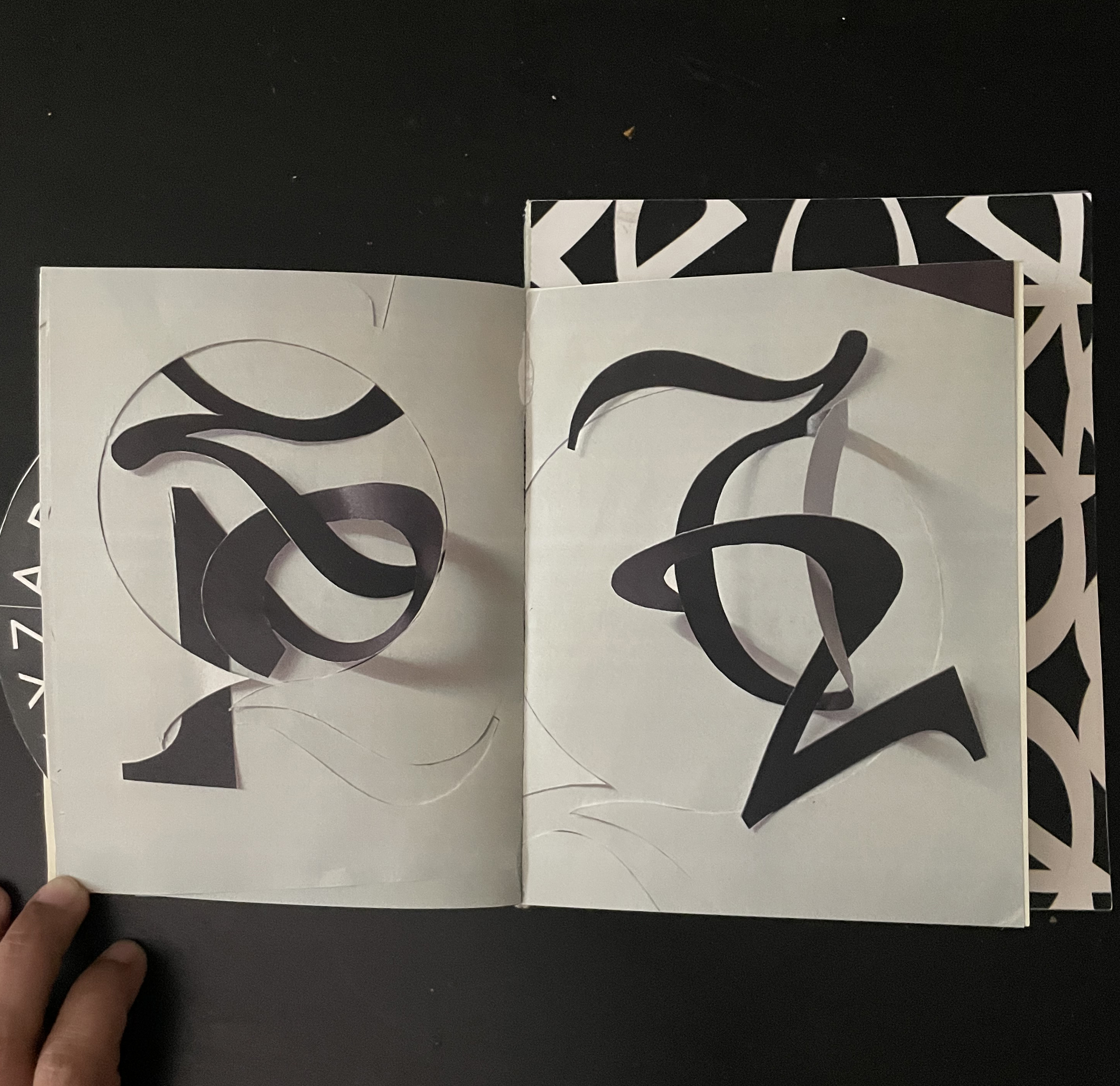
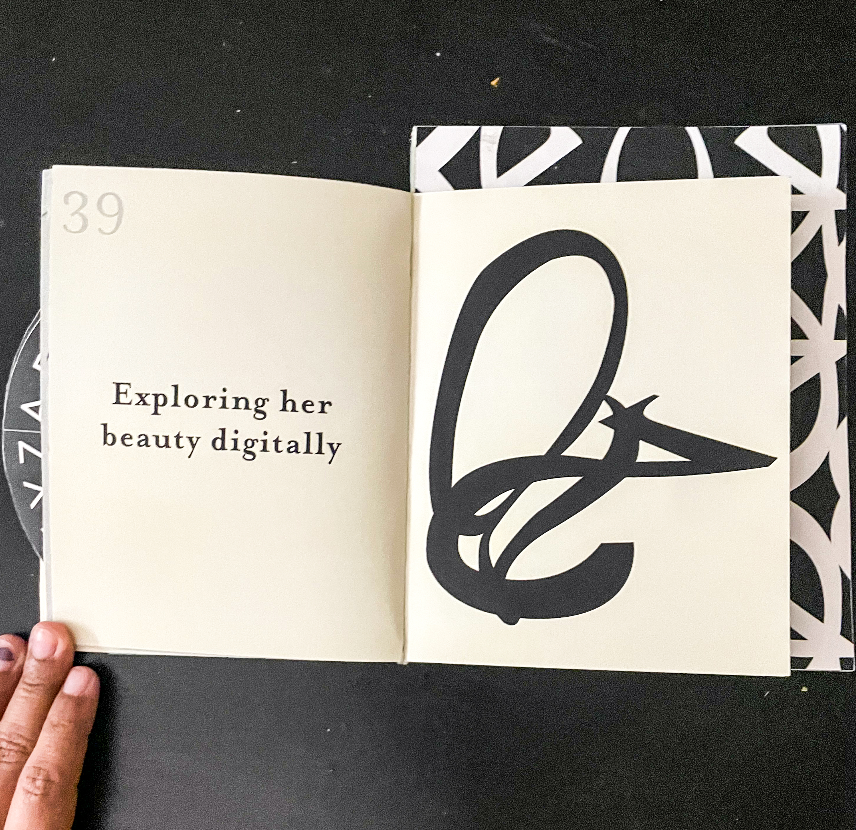
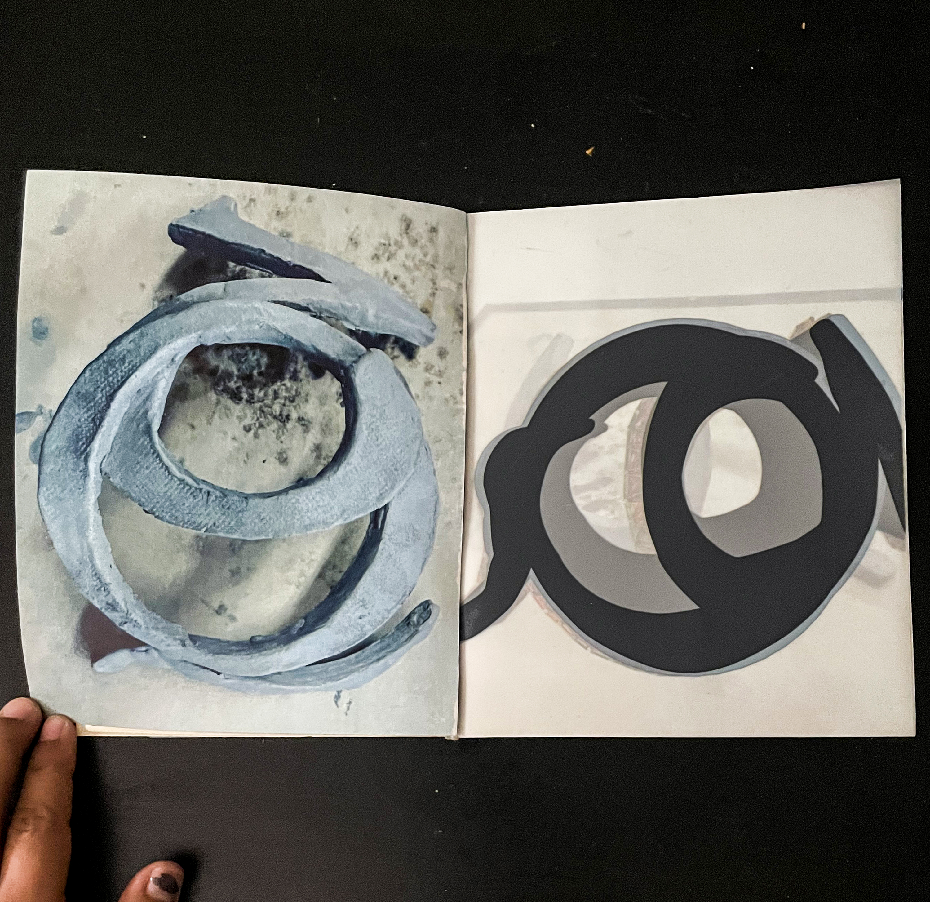
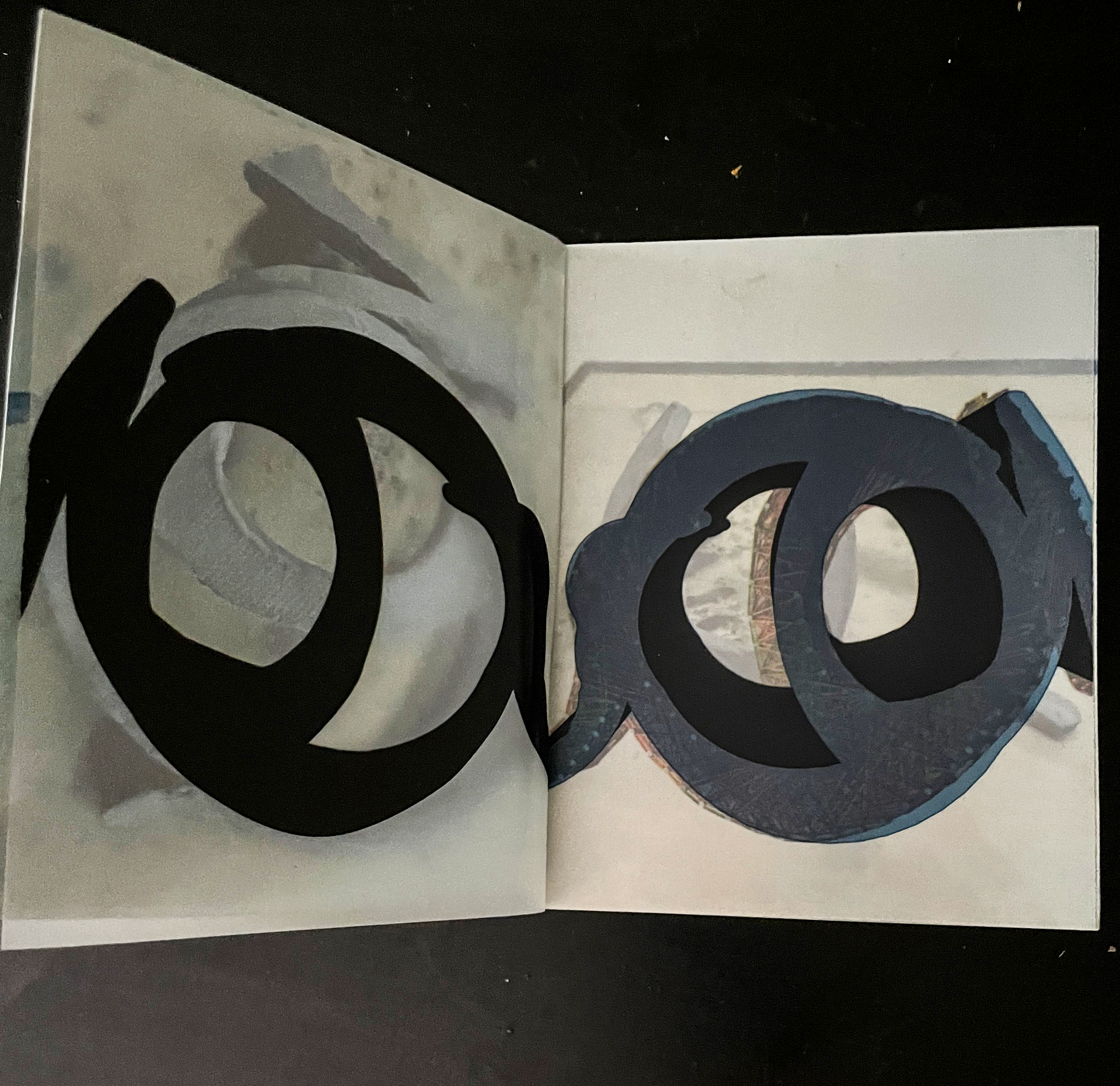
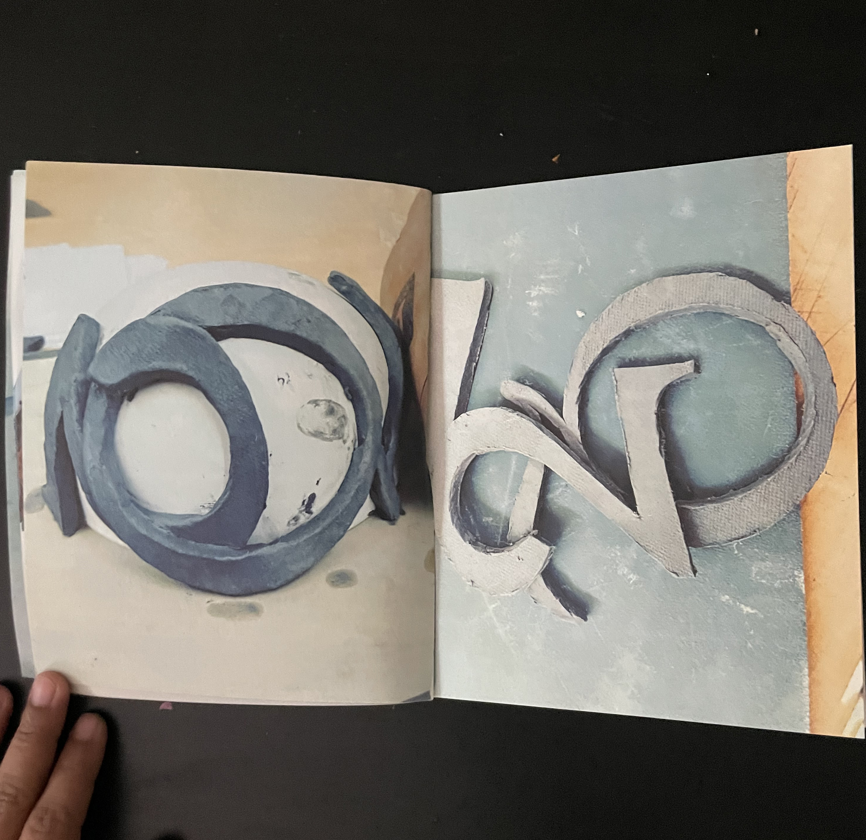
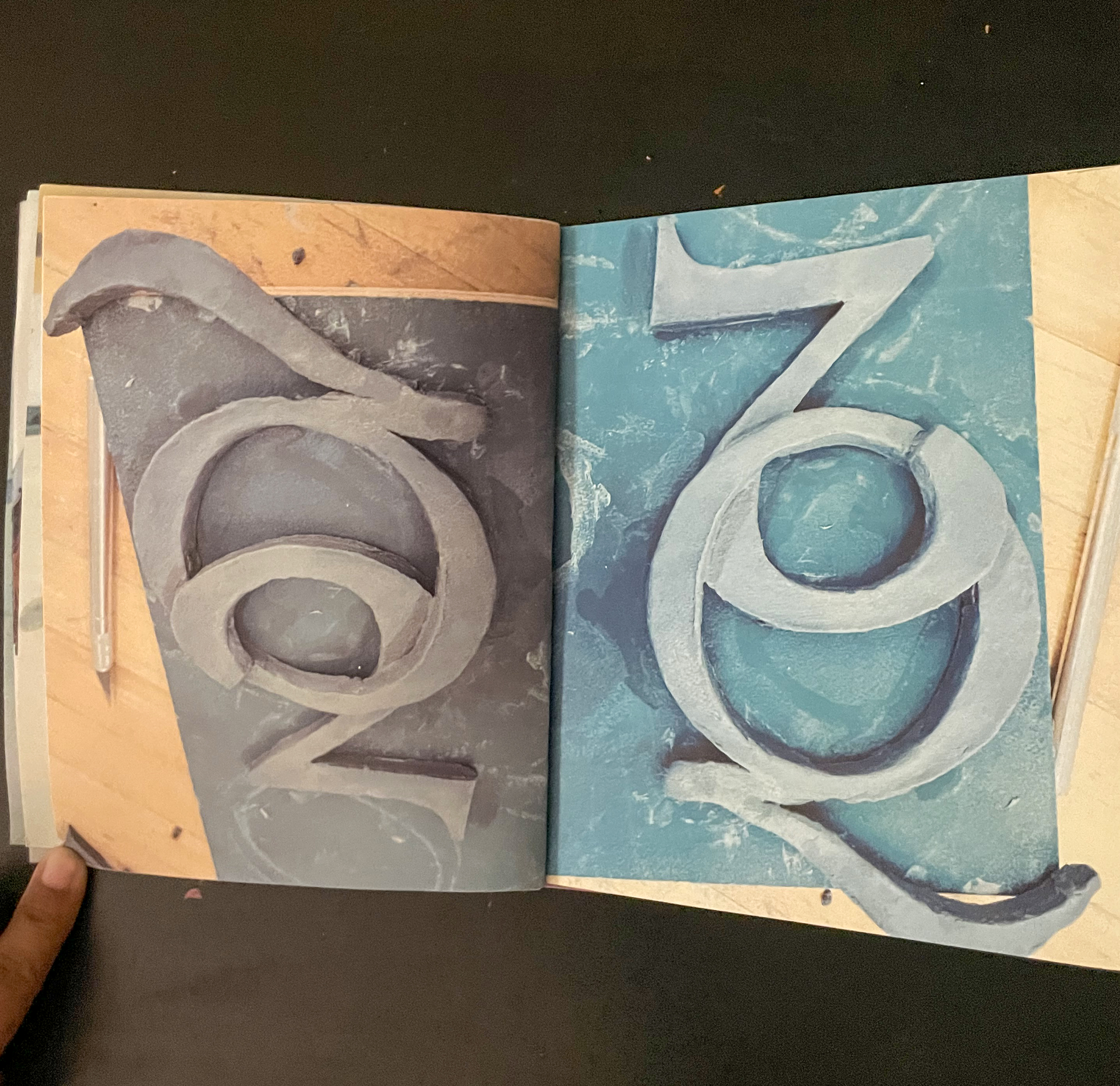
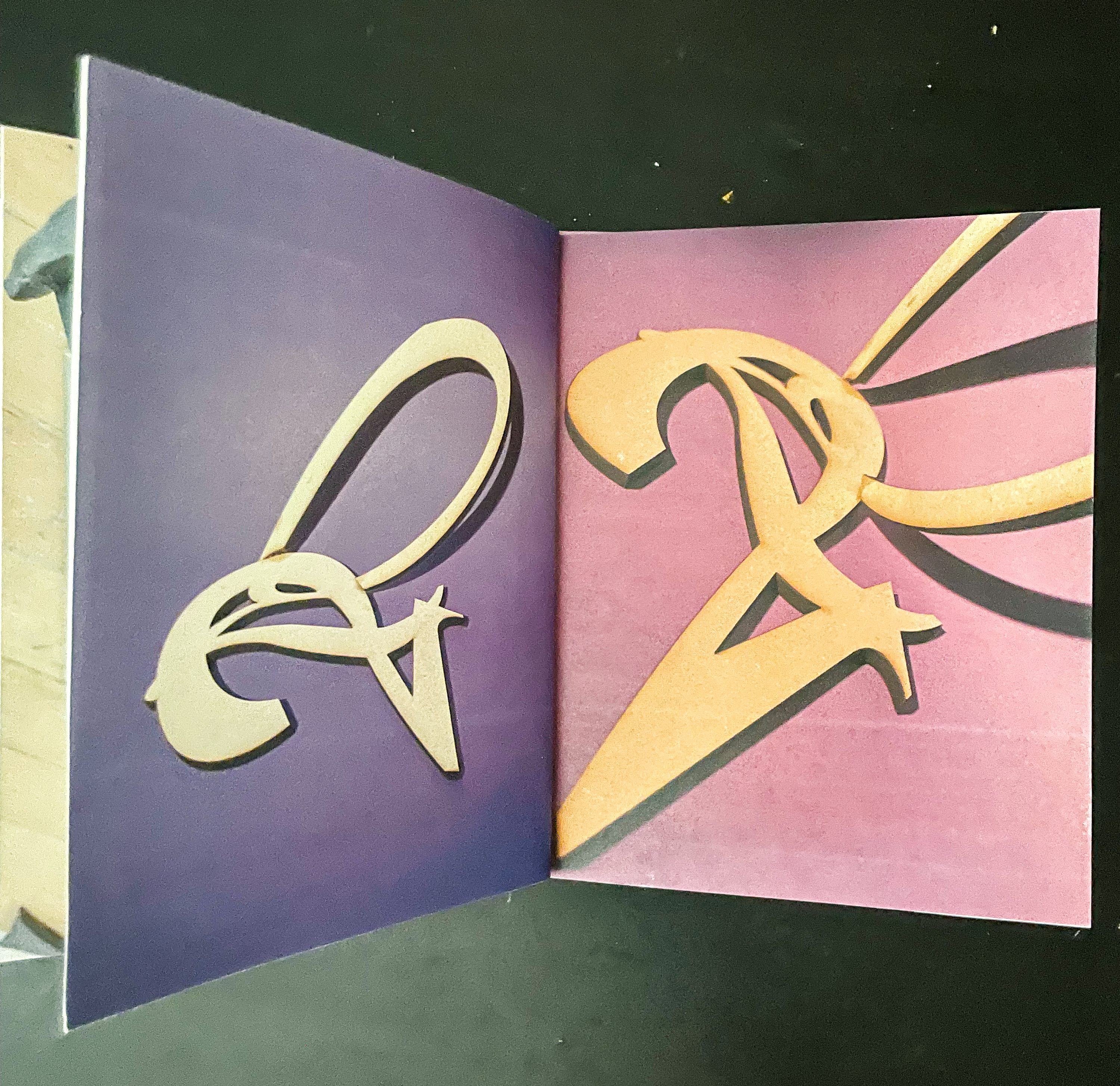
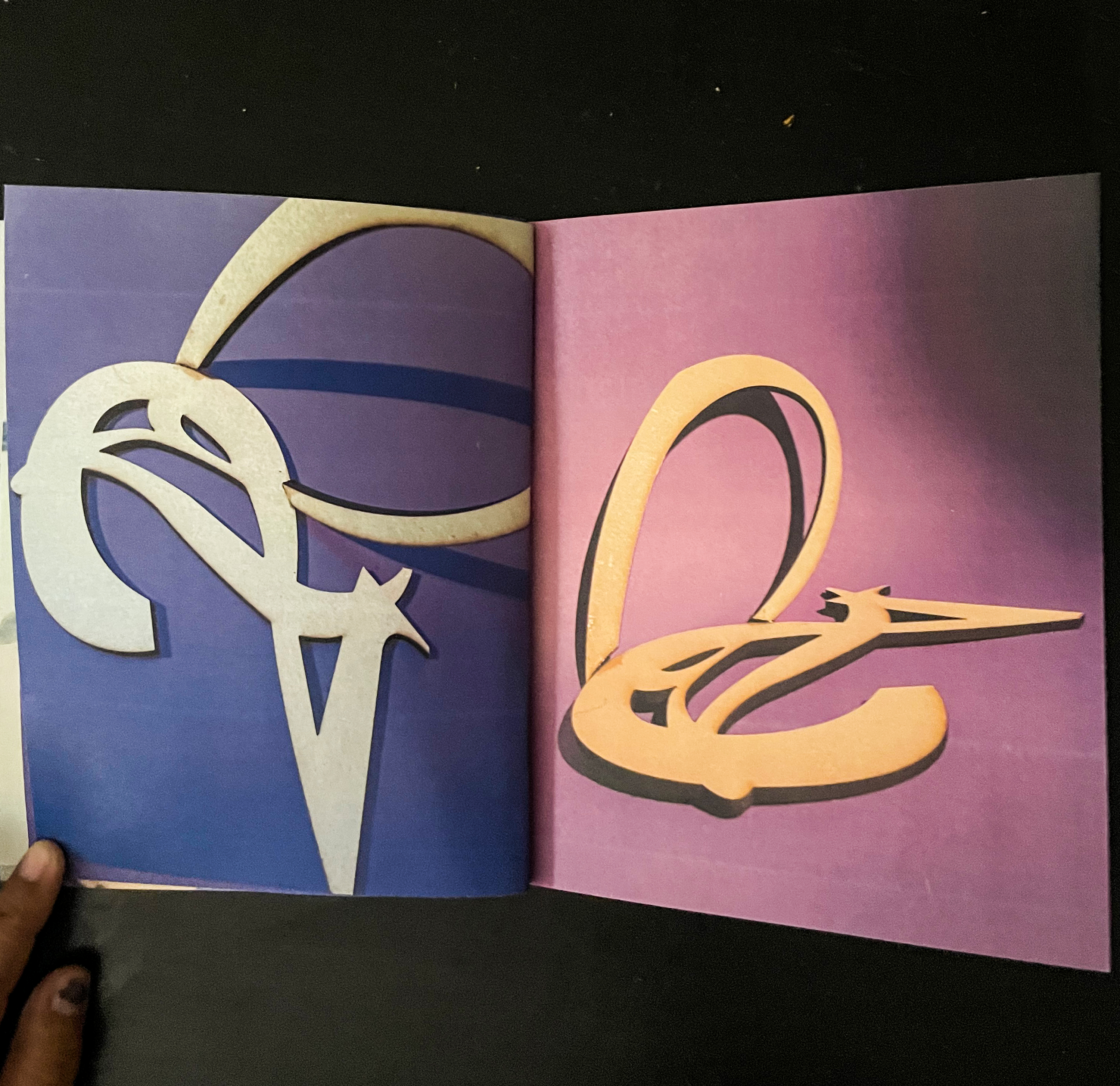
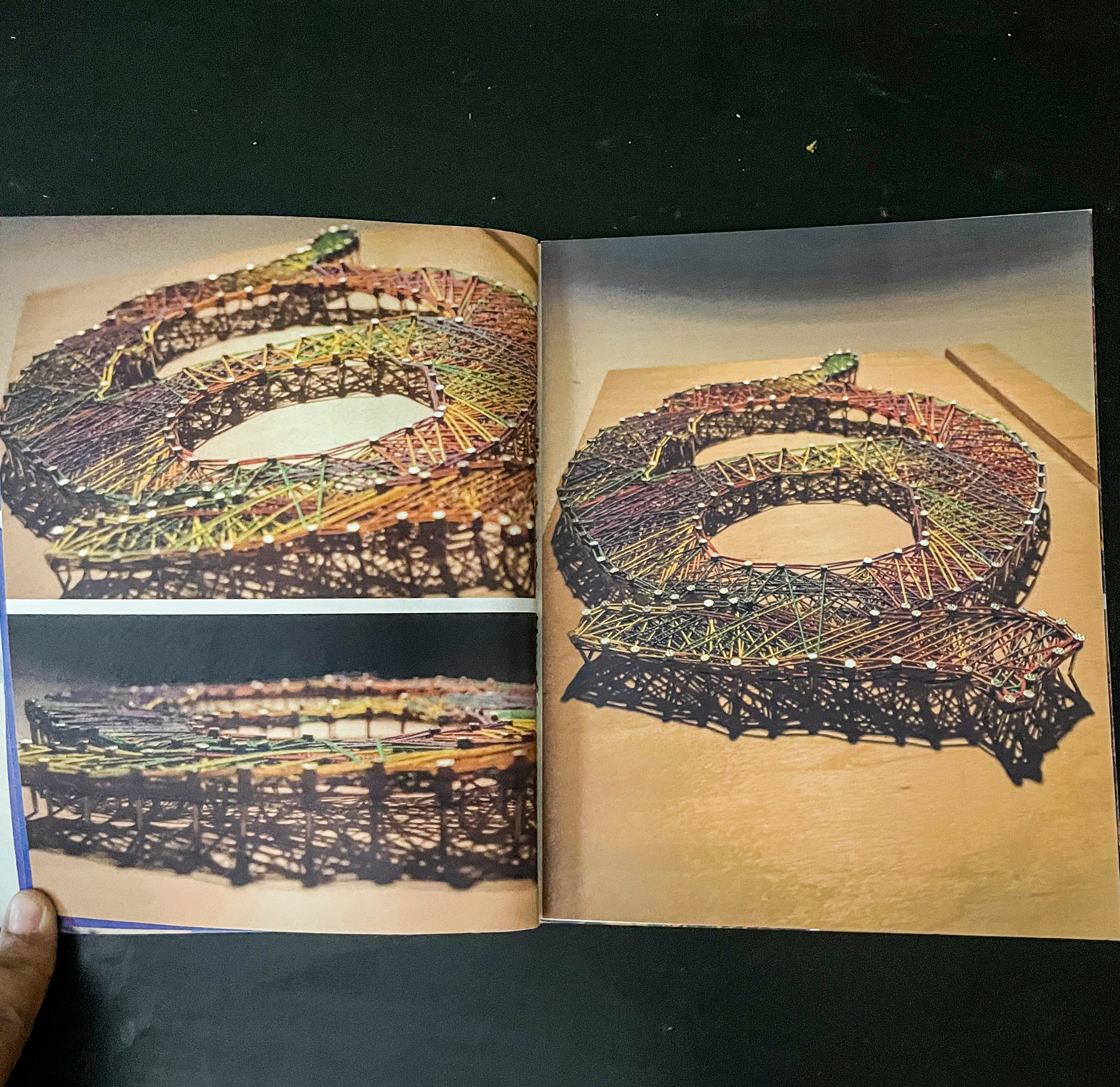
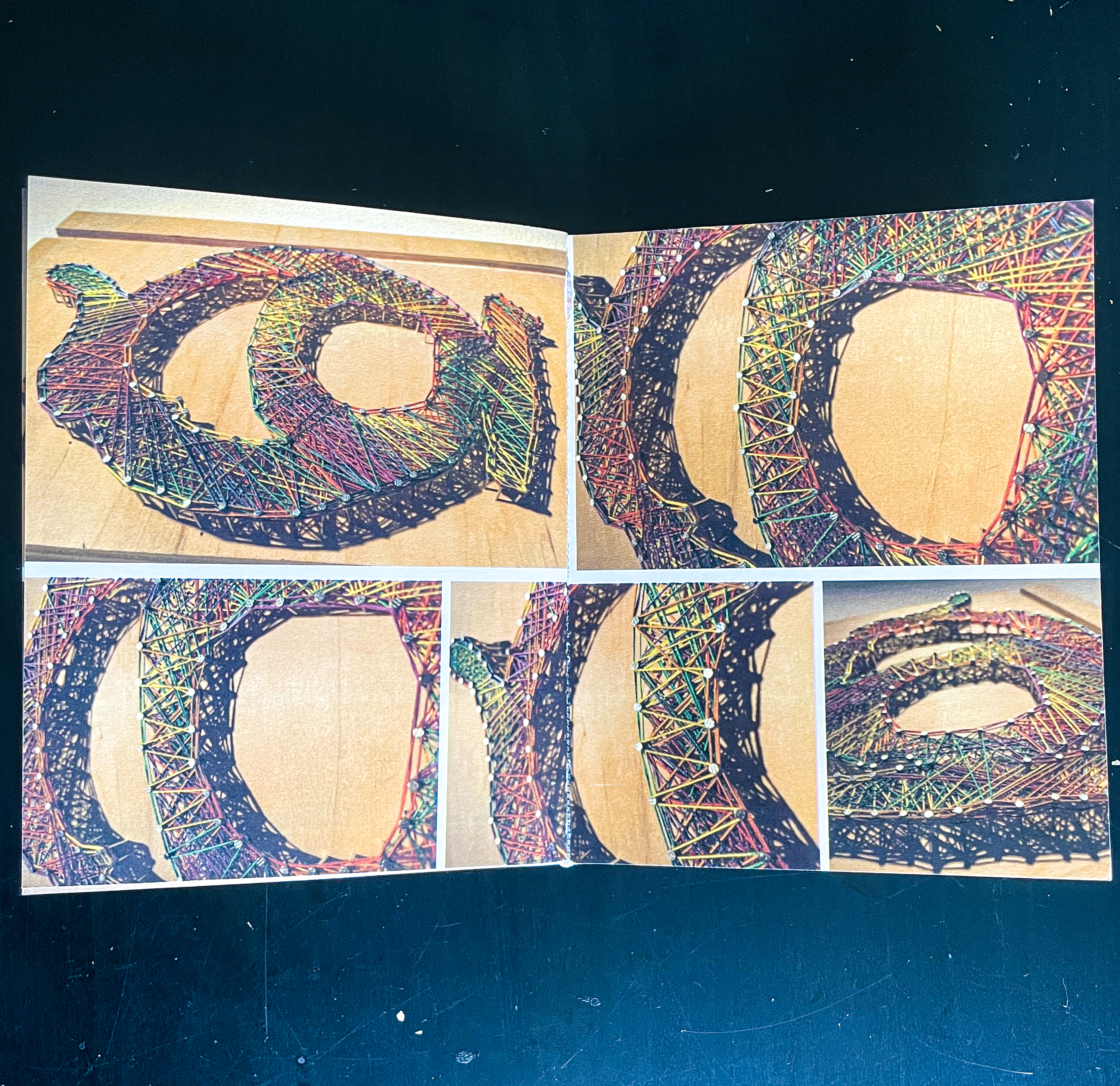
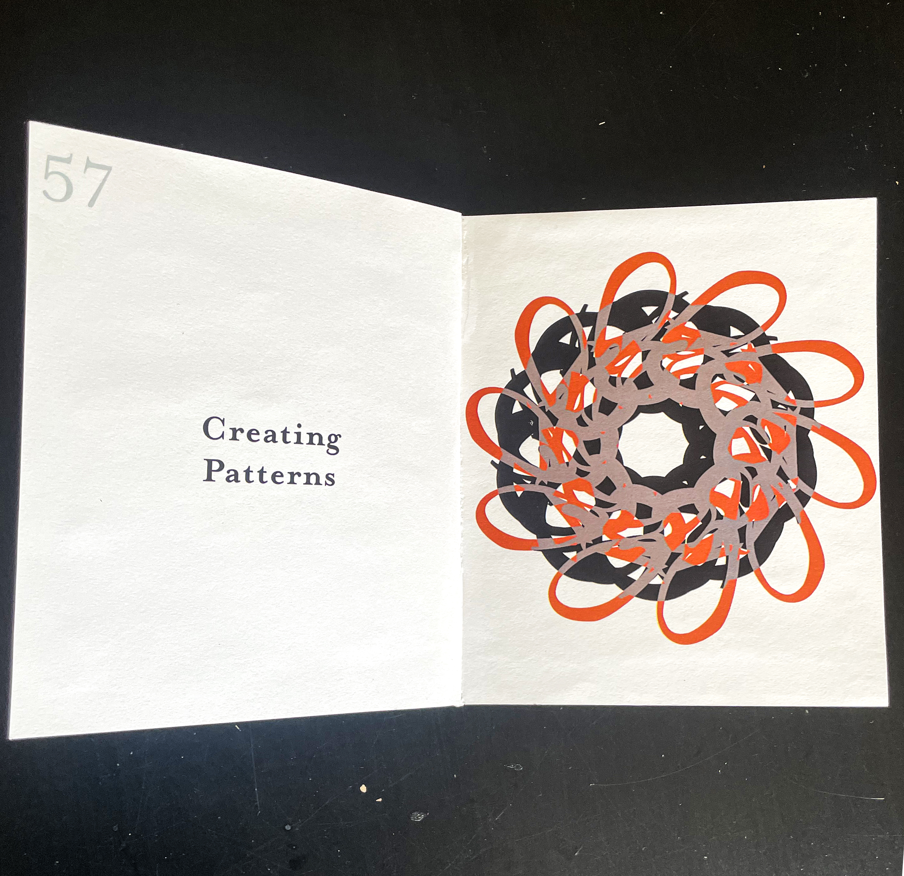
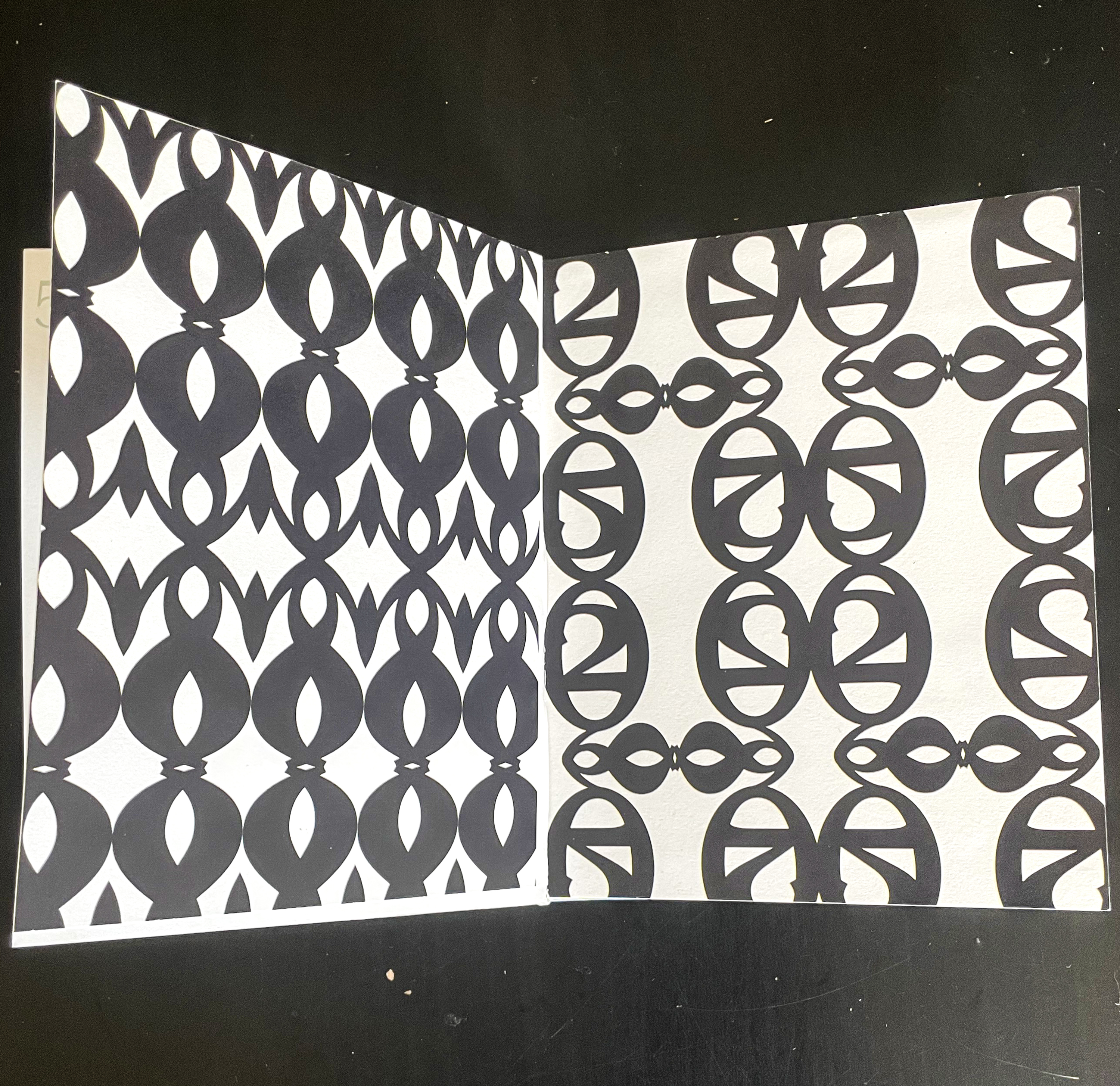
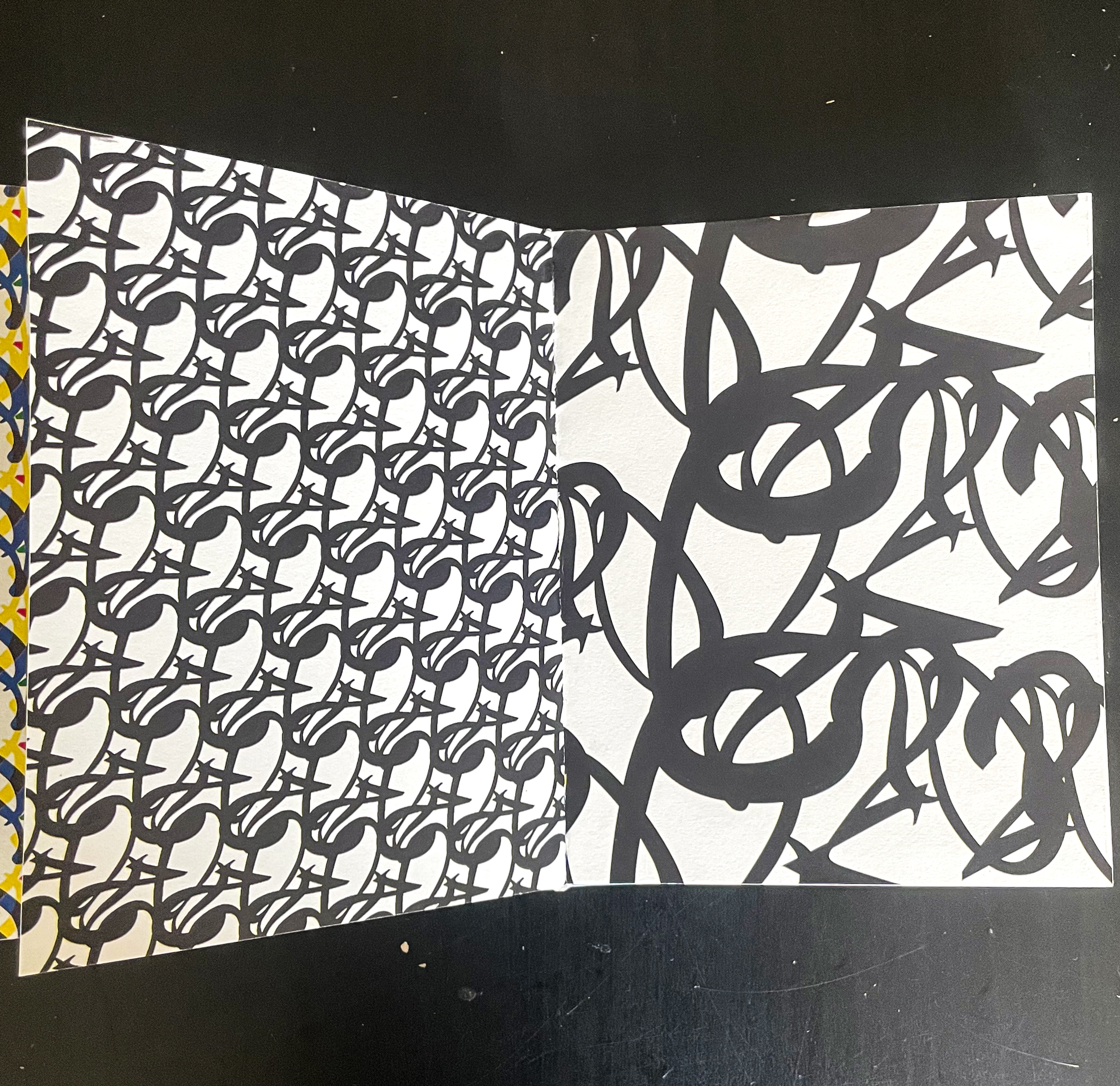
This project was based on research about one particular typeface, mine being Mrs. Eaves by Zuzana Licko. This research along with the process is compiled in a book that is shown below. The process included selecting 2 letterforms from the typeface and conducting studies by creating 3d sculptures and patterns that finally became a wallpaper.
Software Used—Adobe Illustrator, Adobe InDesign, and Sketchup 3D Categories—Book Design, Typeface Study, Typeface Research, 3D Letterforms Design, Pattern Design, Wallpaper Design, Model Making Typeface—Mrs Eaves by Zuzana Licko from Adobe FontsProject Completion—December 2021



Introduction:
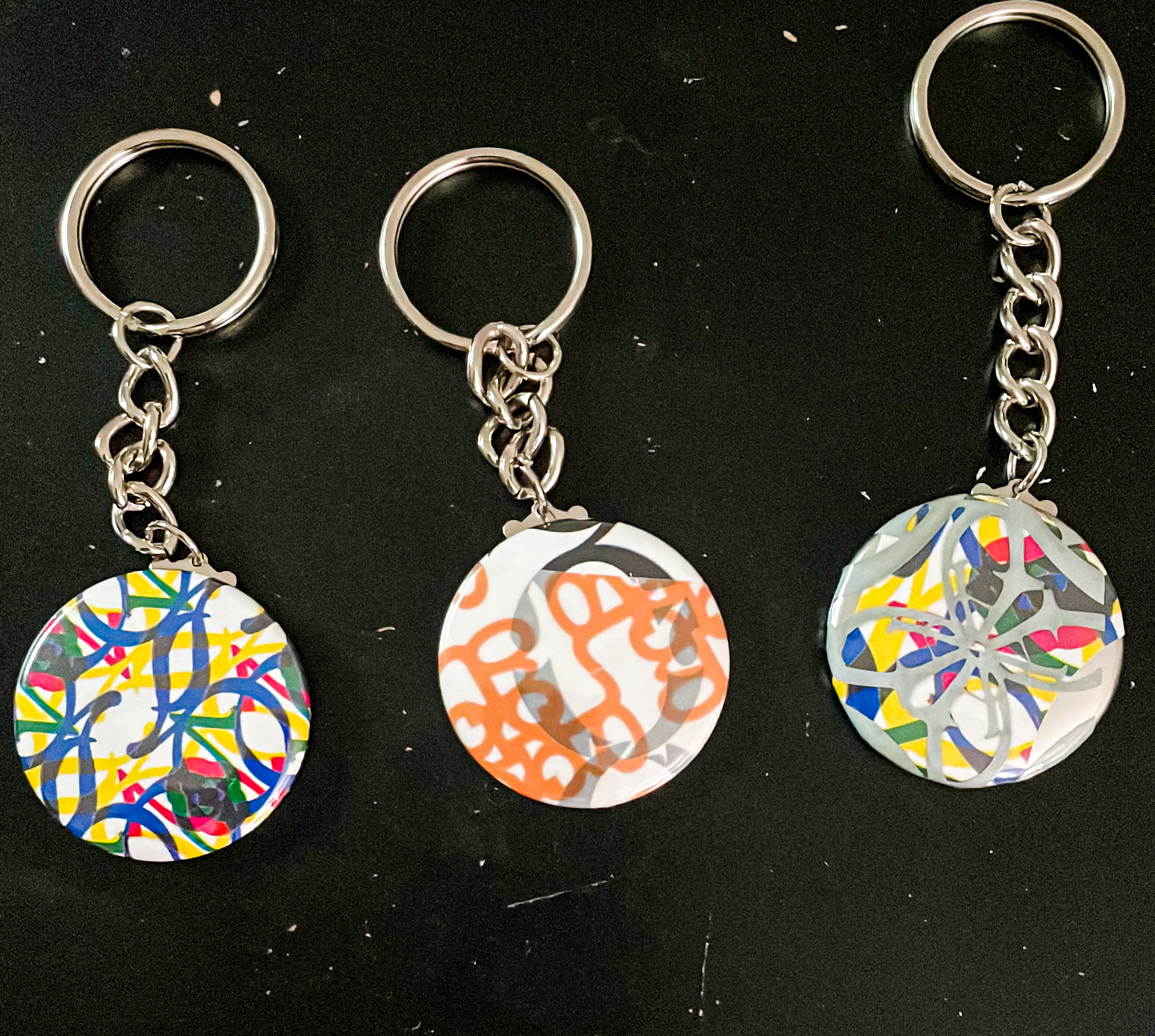
It all began with a typeface provided by the instructor, to study and research about. Selecting two letterforms and creating their multiforms that got converted to vector and later became a 3D model. These letterforms were also used to create patterns one of which turned into a wallpaper. Later, the research of the typeface was compiled into a book that was exhibited at the end of the semester.
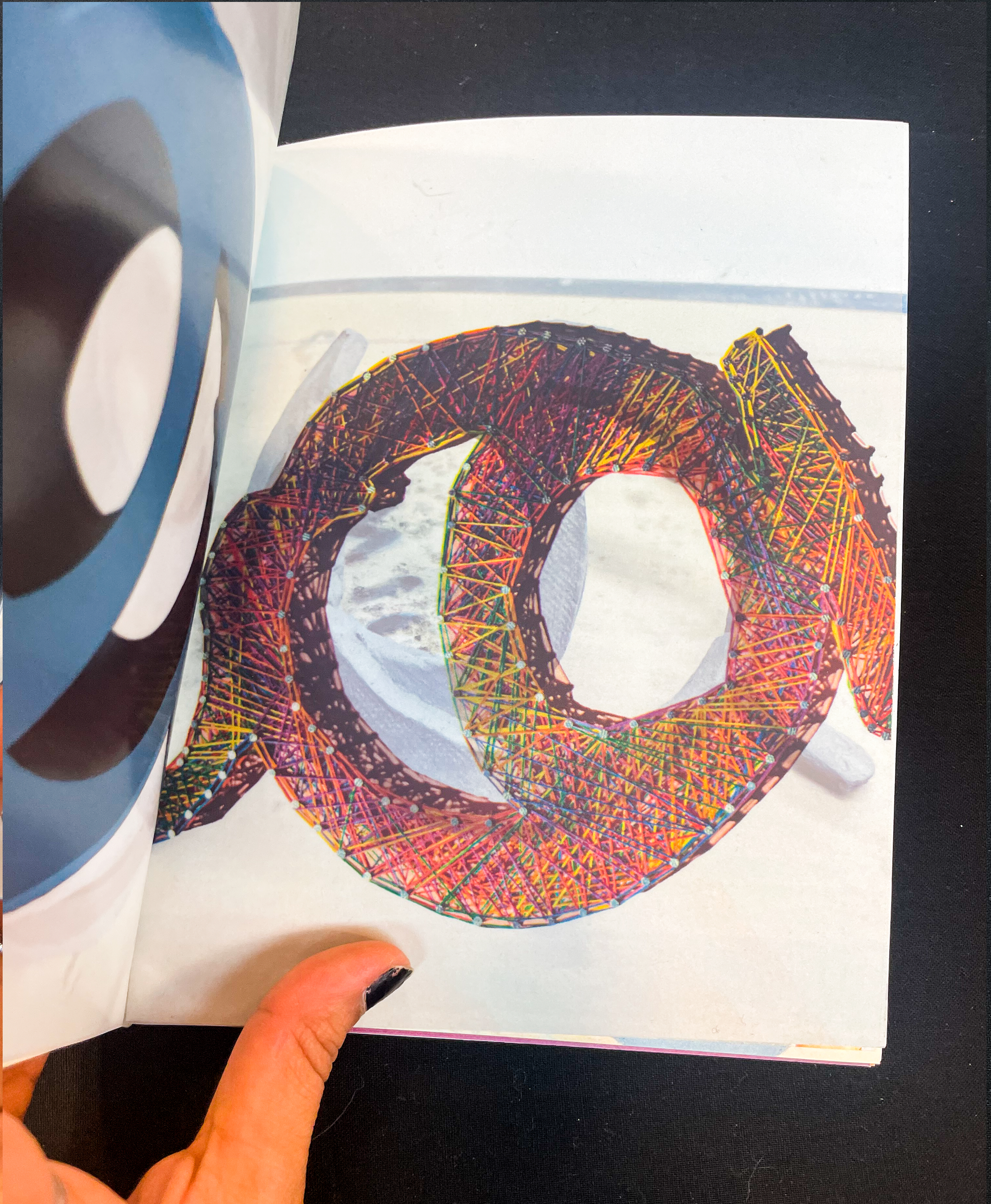
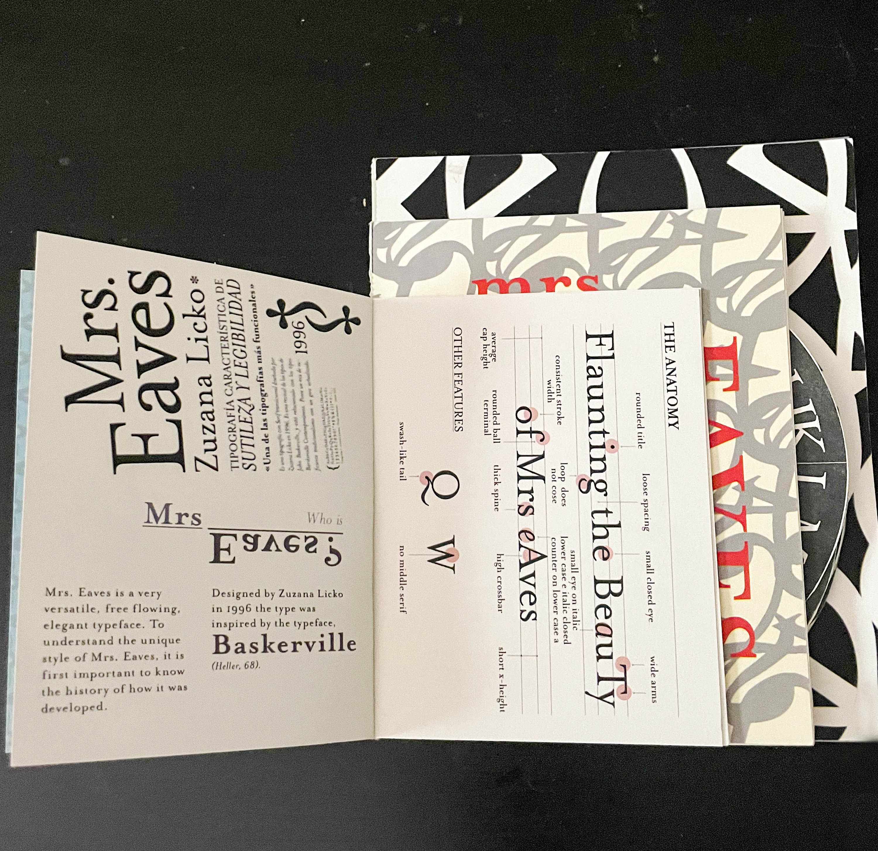
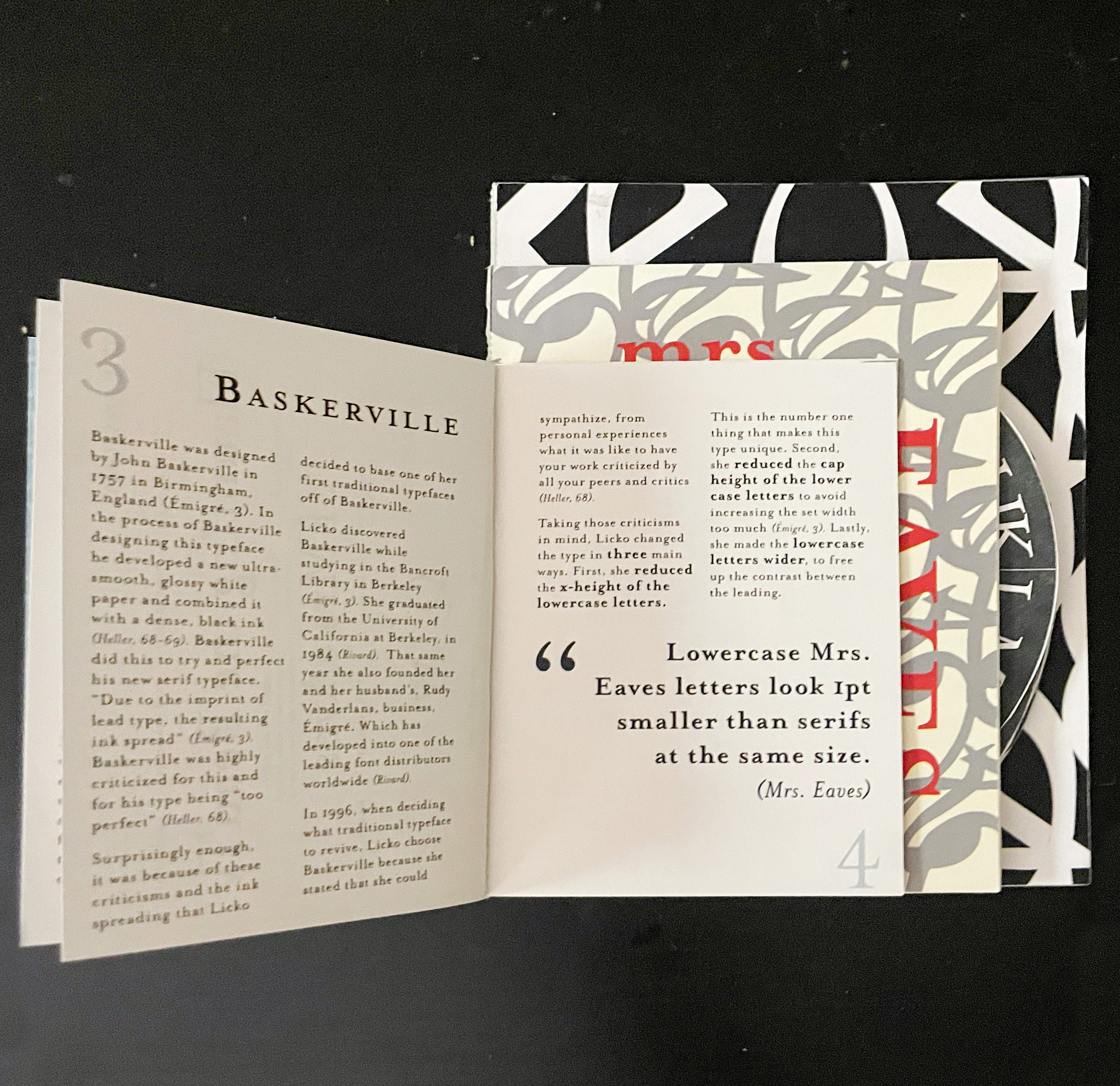
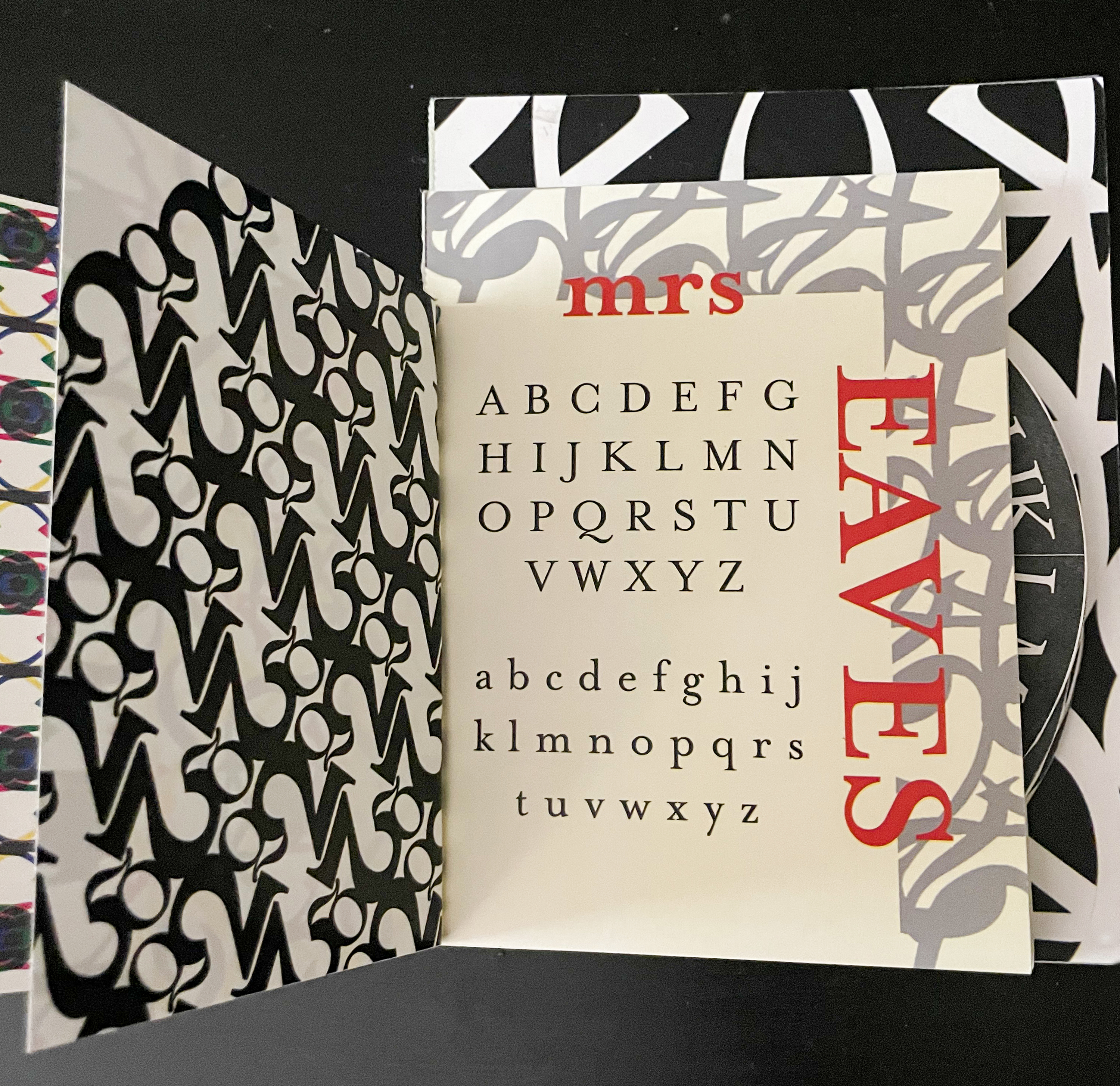
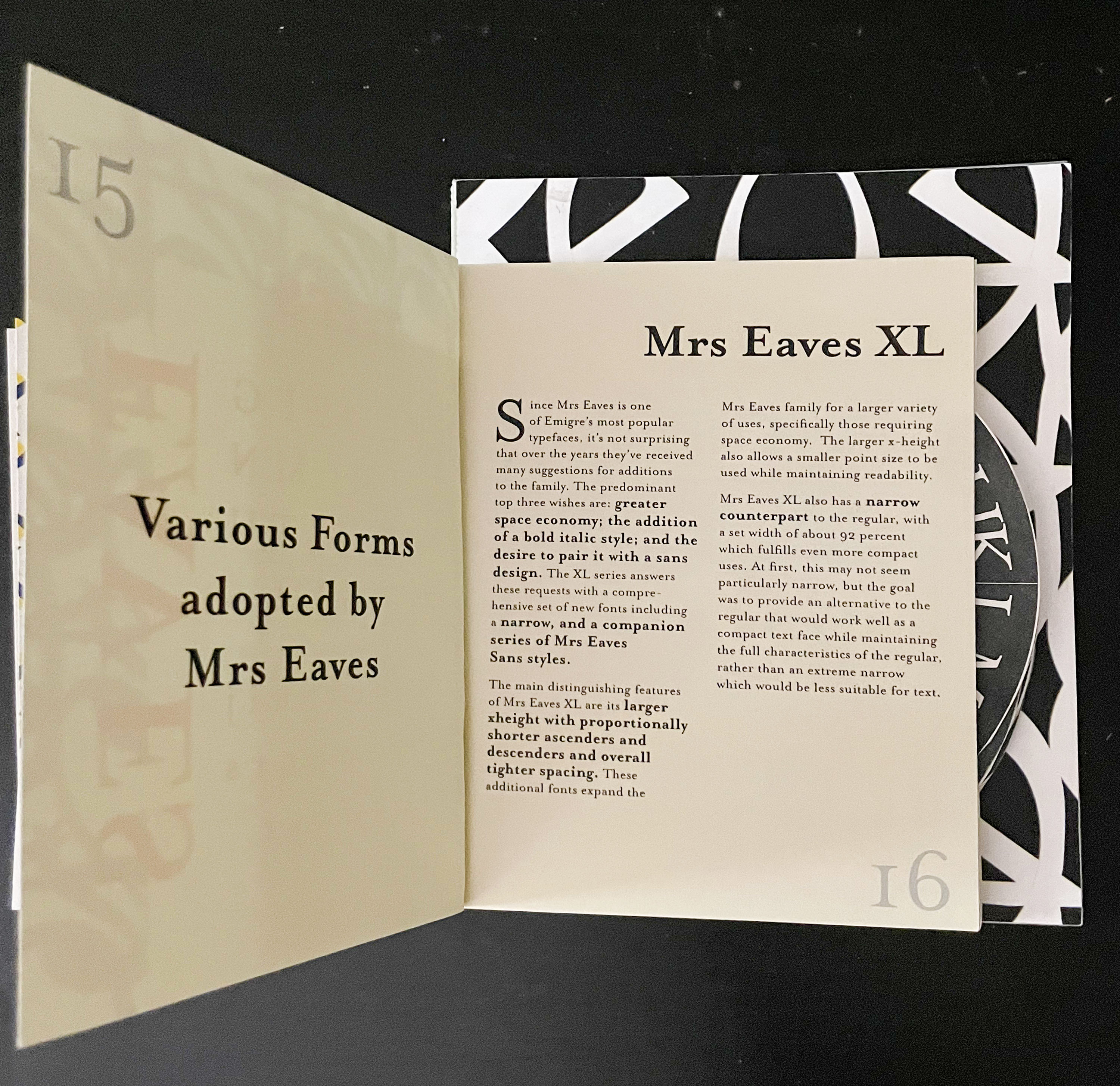
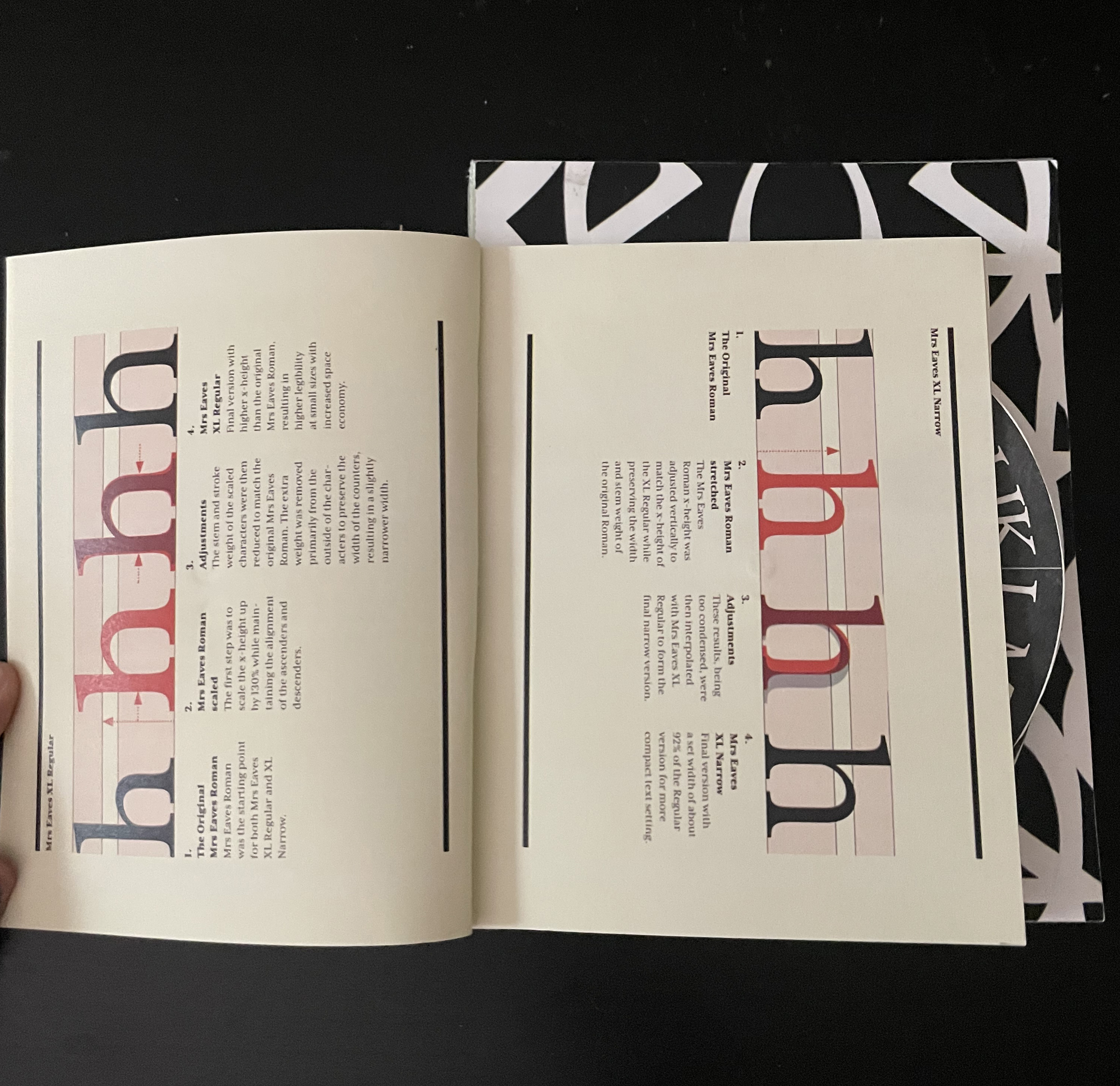
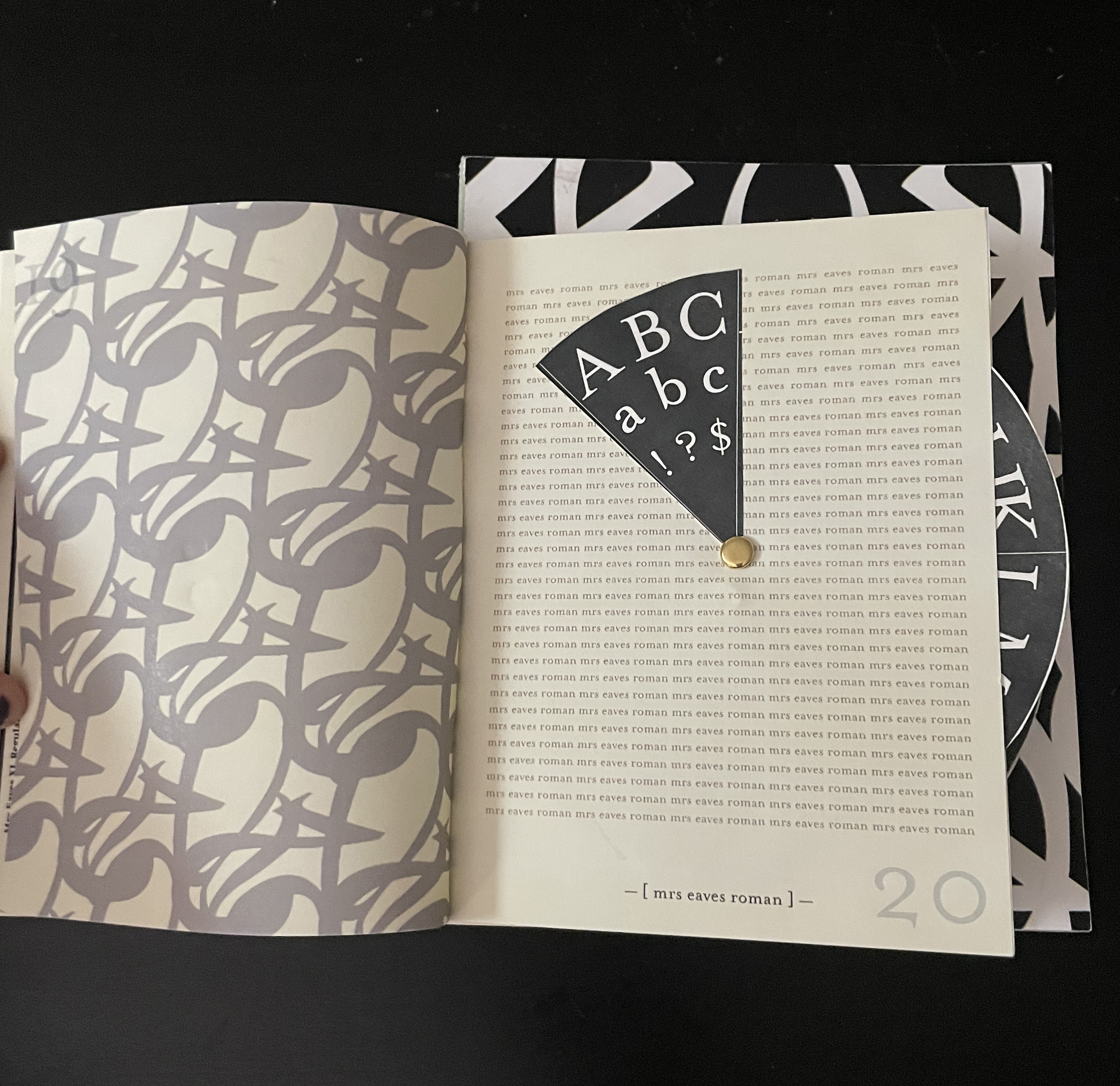
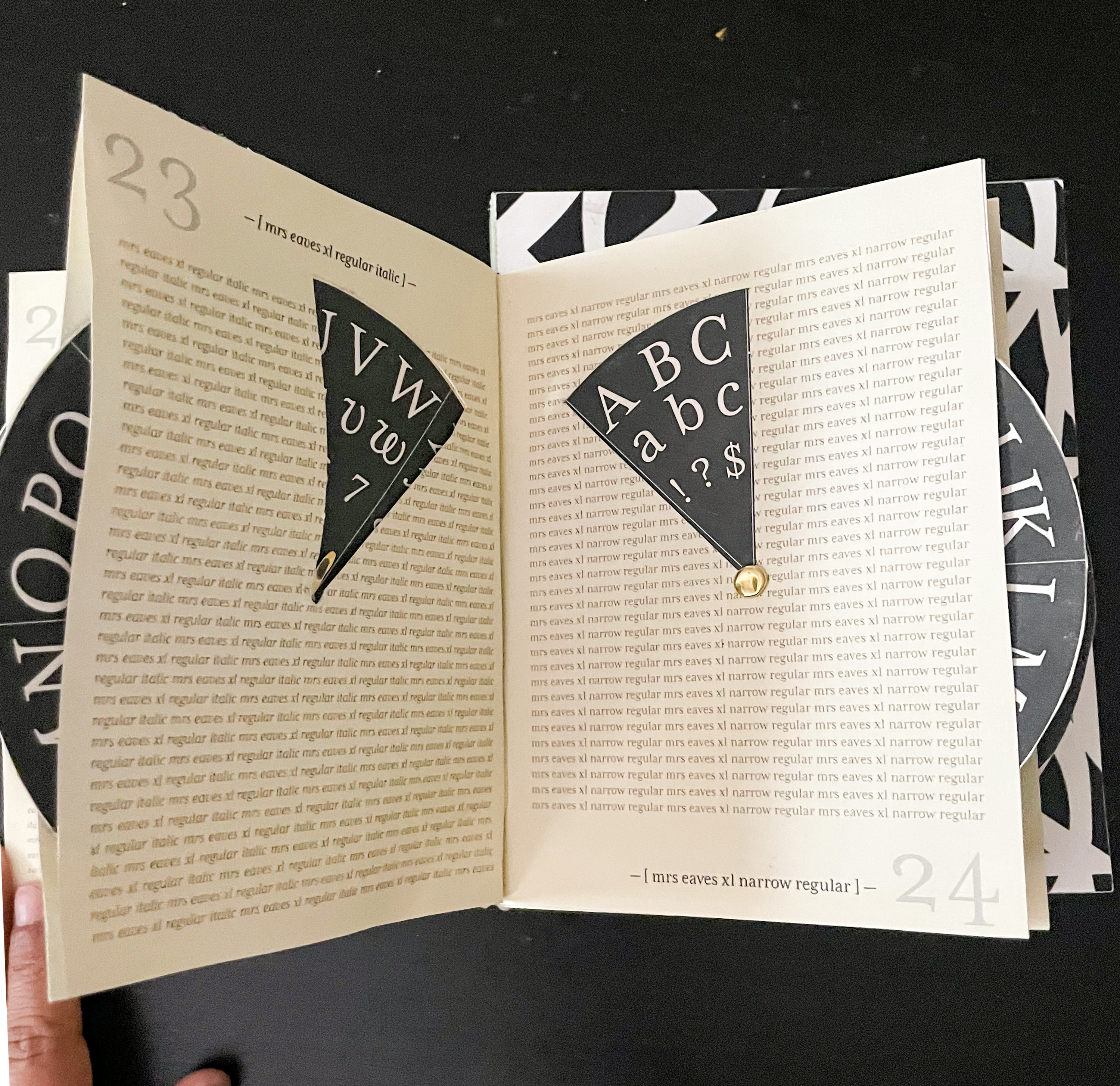
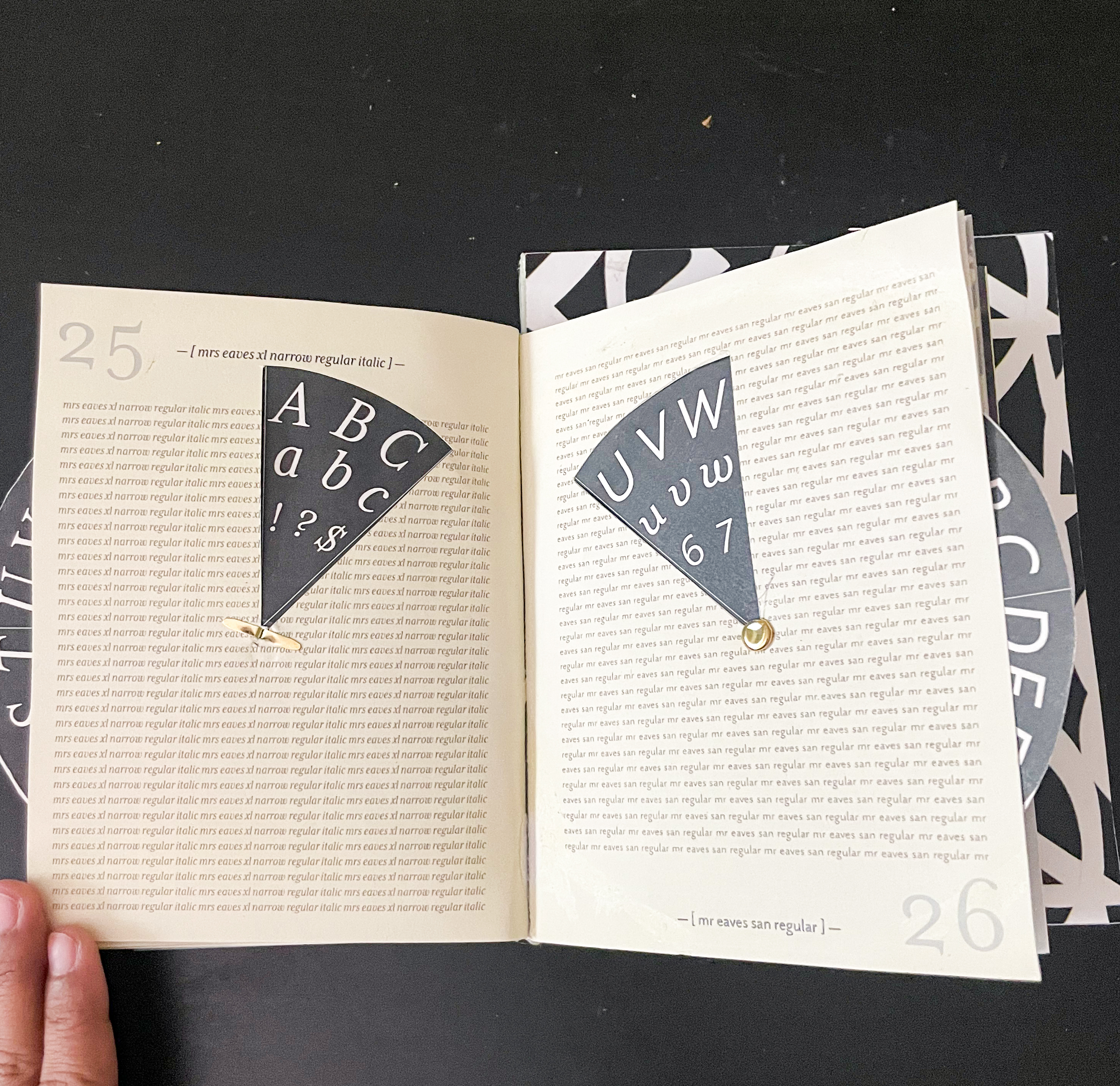
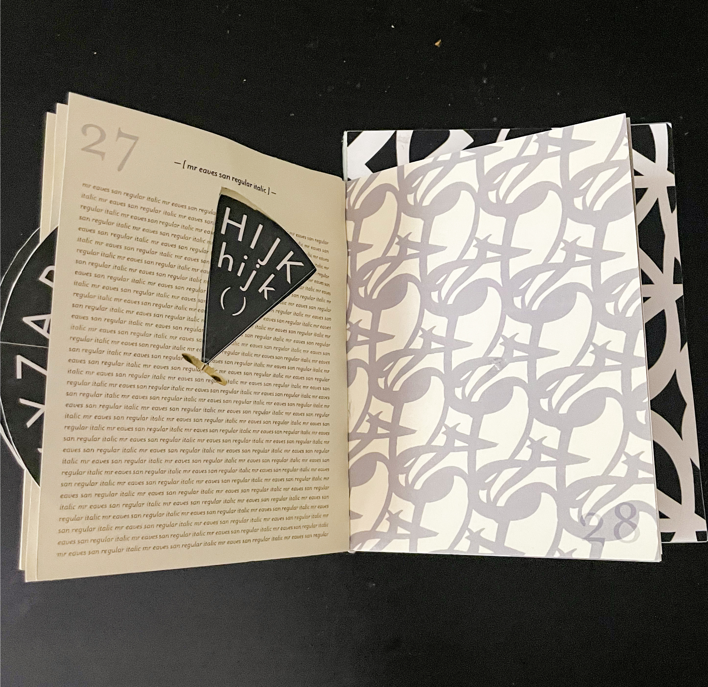
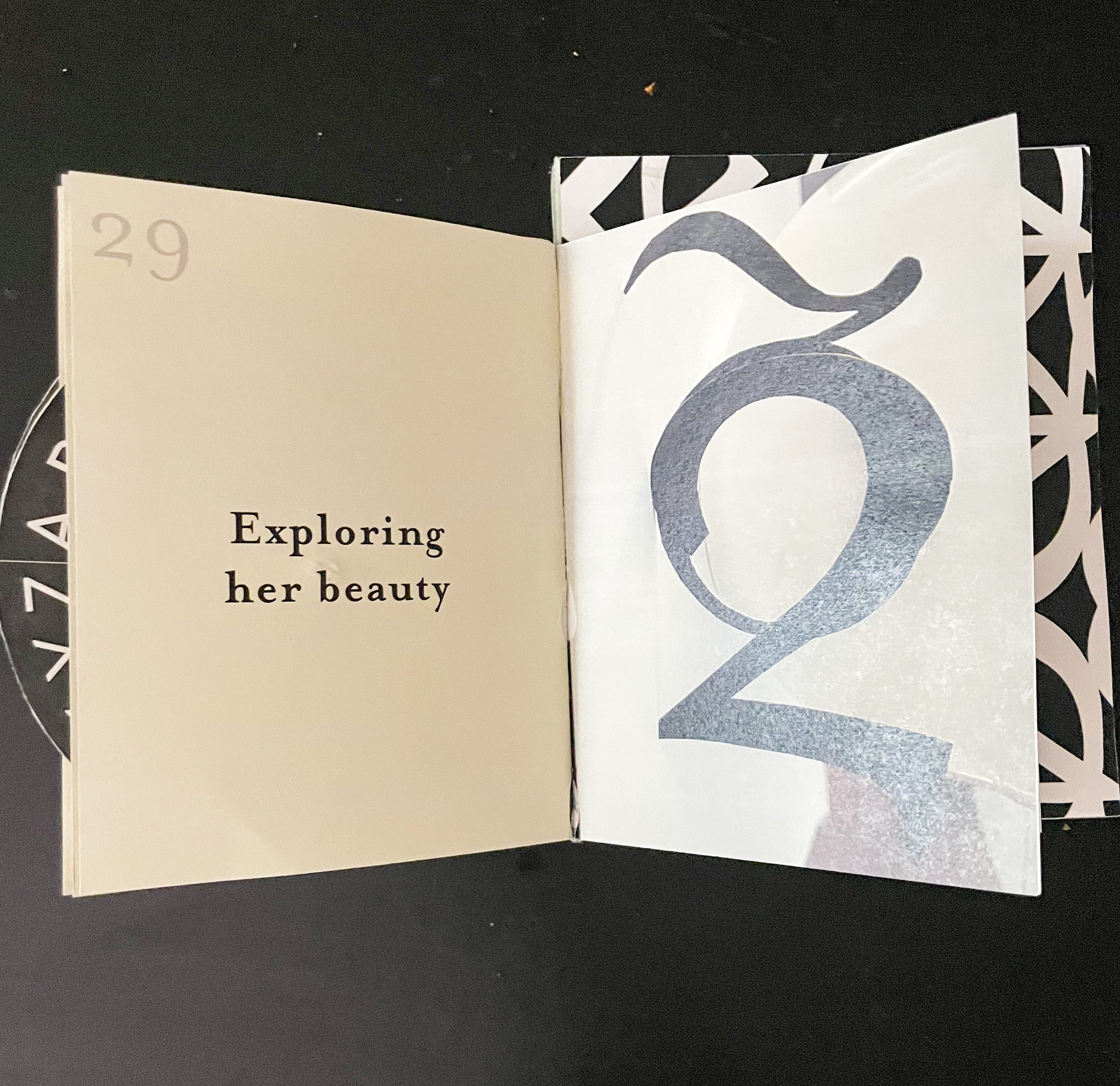
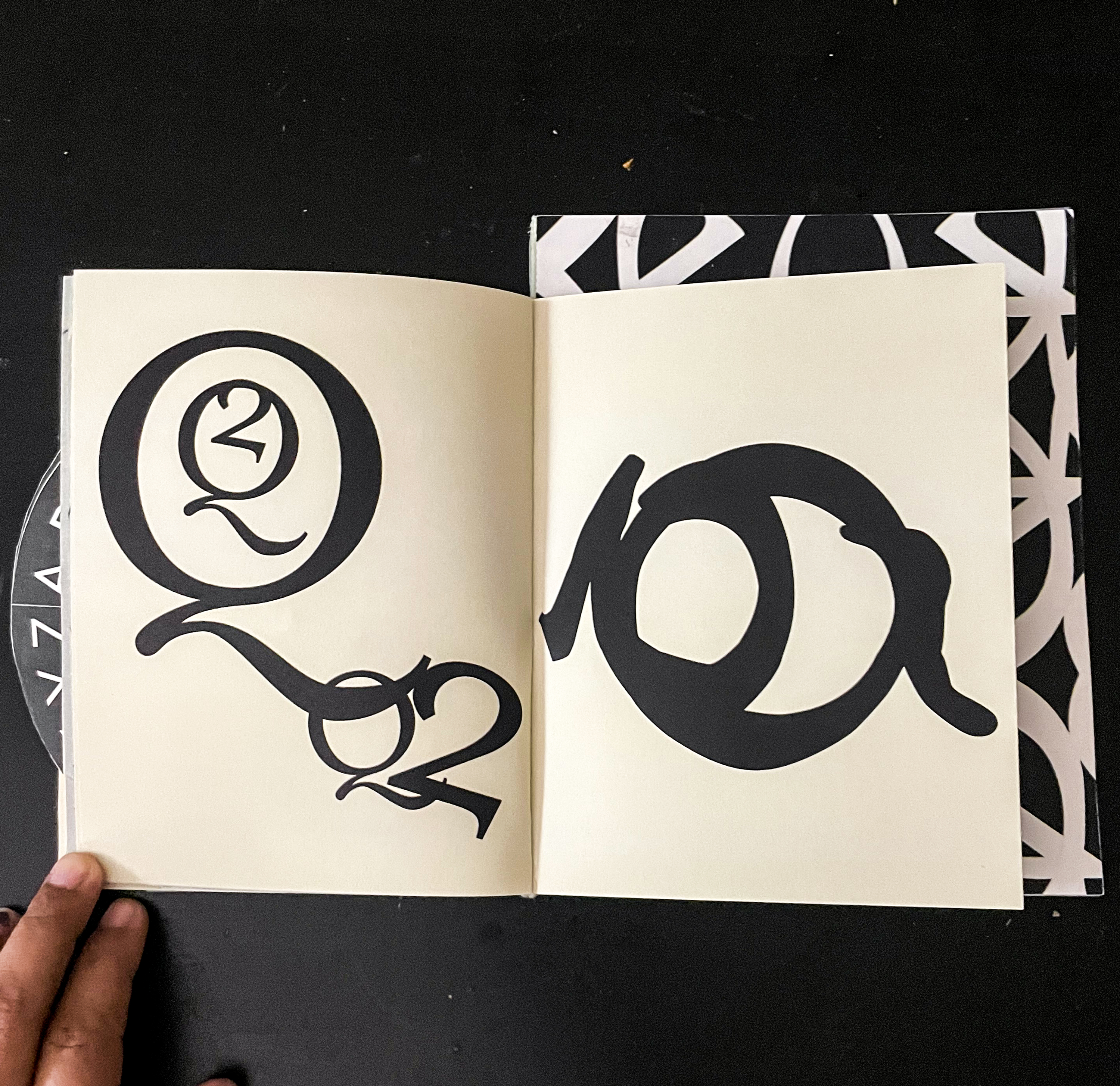
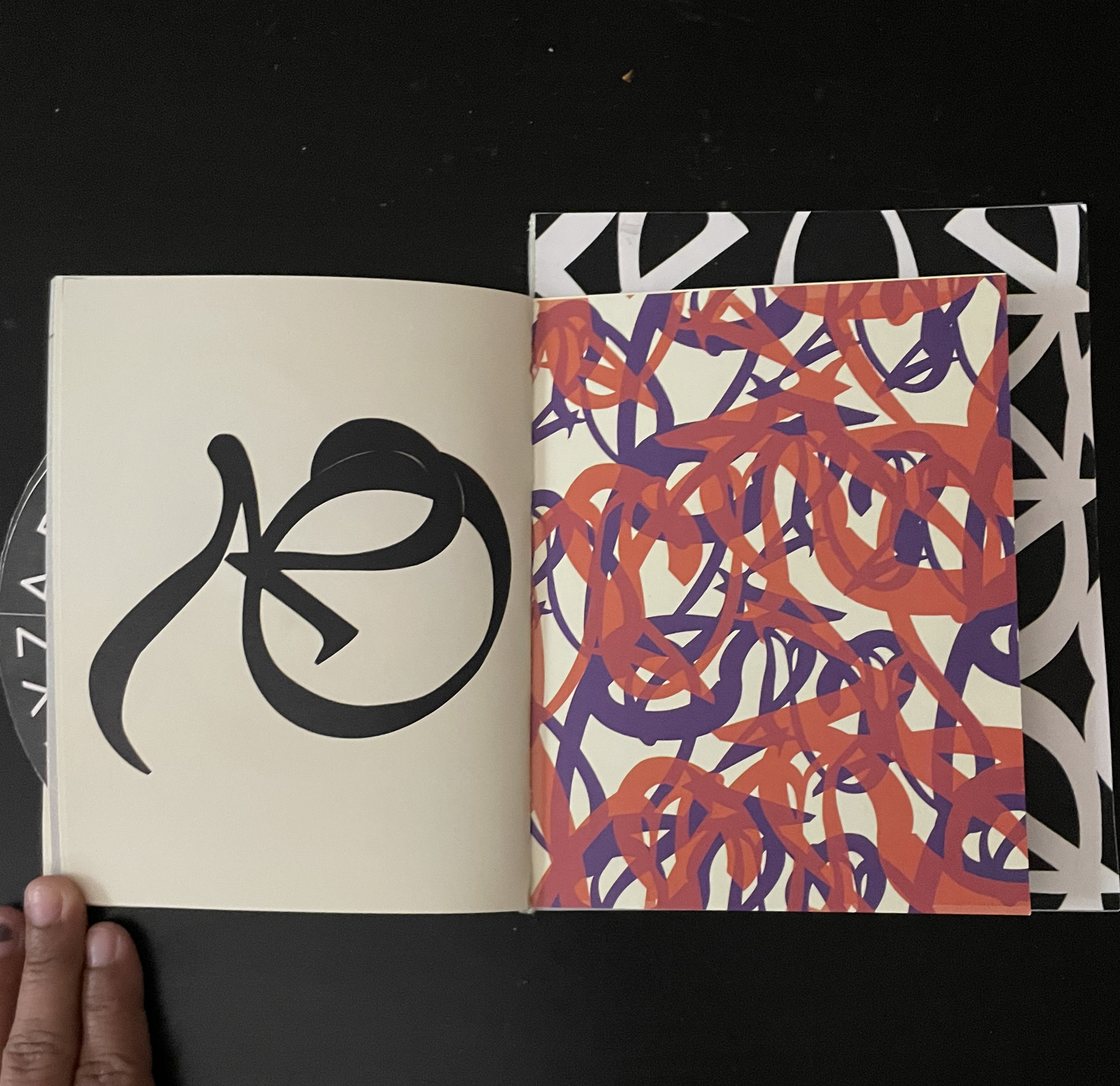
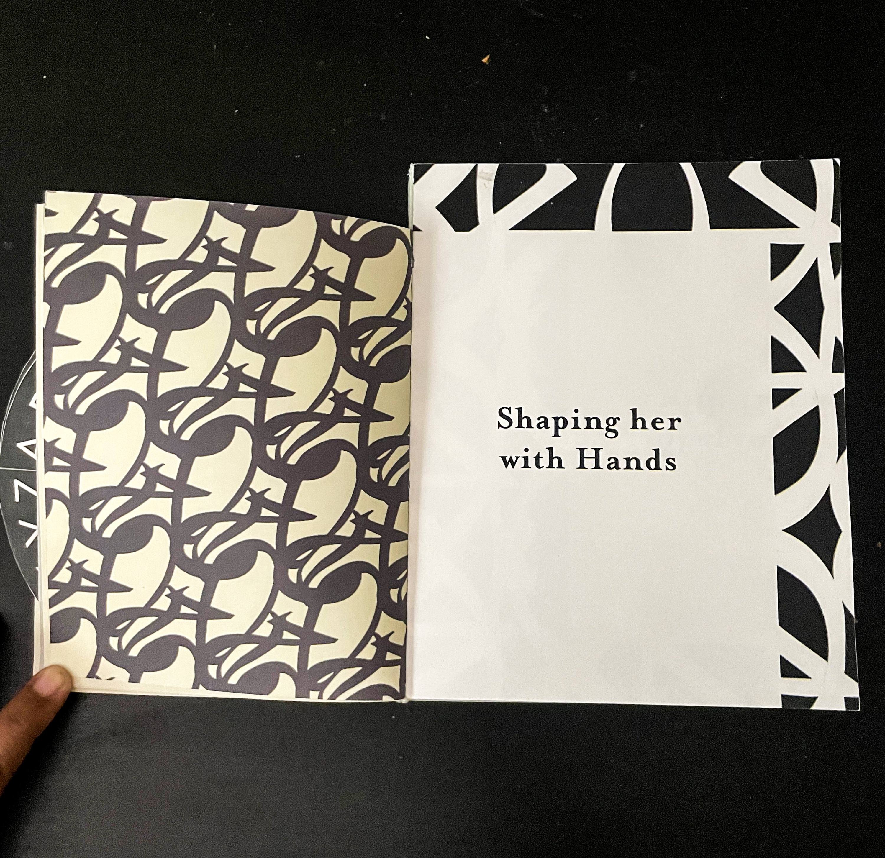
My typeface being Mrs Eaves, which was designed by Zuzana Licko, I selected 2 letterforms—“Q” and “2” because of their interesting tails. Studying them, creating 2 types of models, I understood the difficulty of using this typeface in a big block of text. Therefore, choosing only small body text, made my book unique and more interesting. My final book consists of 3 smaller booklets combined together. The first booklet, consists of all the texts about the typeface and the history, the second booklet, shows the various styles of the typeface in an interactive way, using circles that rotate to reveal each letter separately. And the last booklet, consists of all the patterns and pictures of 3D models that were created during the process. All the pages from the book are shown below.



Wallpapers:


Pictures from the Exhibition:

