Wagging the Tail of Change: Rebranding spcaLA
A heritage of compassion, a future of hope. As one of the oldest animal welfare organizations in SoCal, spcaLA needed a visual identity that would capture its timeless mission. This project sought to explore the intersection of design and social impact creating a visual language that not only reflected their dedication to animal welfare but also evoked a sense of compassion, education, and unwavering commitment to preventing cruelty.
Software Used—Adobe InDesign, Adobe Illustrator, Adobe Photoshop, Procreate, Glyphs3 Categories—Identity and Systems Design, Branding, Brand Guidelines, Typeface Design, Logo Design, Logotype Design Typefaces Used—GT Flexa from Grilli Type and a custom typeface that I call Animal TailsProject Completion—December 2022


A Design Process Driven by Purpose:
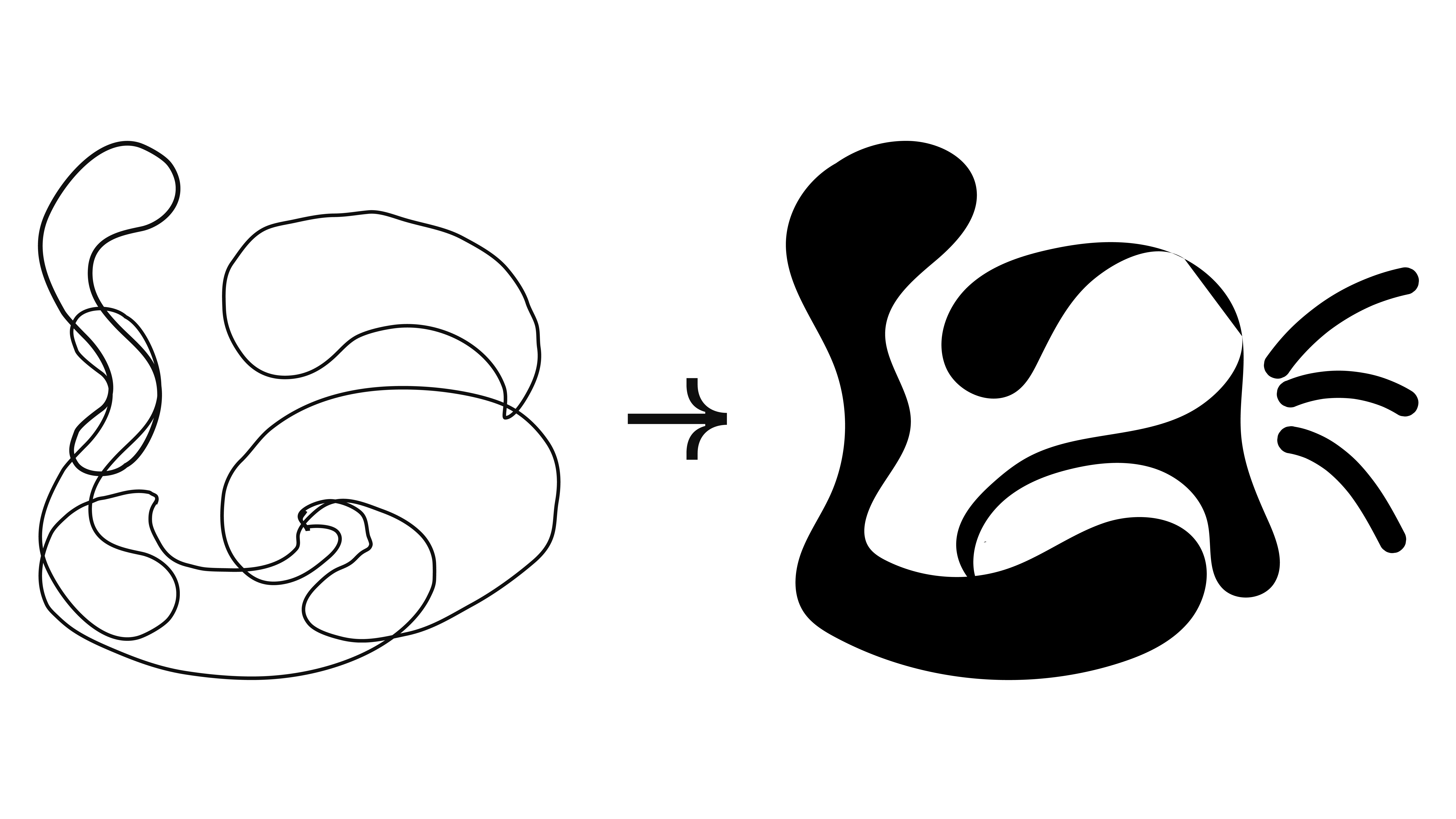
From initial sketches to final deliverables, the design process was a journey of exploration and refinement. I immersed myself in the world of typography, delving into the intricacies of glyph design and font production. Through countless iterations, I honed the visual language of spcaLA, ensuring that every element, from the logo to the typography, reflected the organization's unique character.
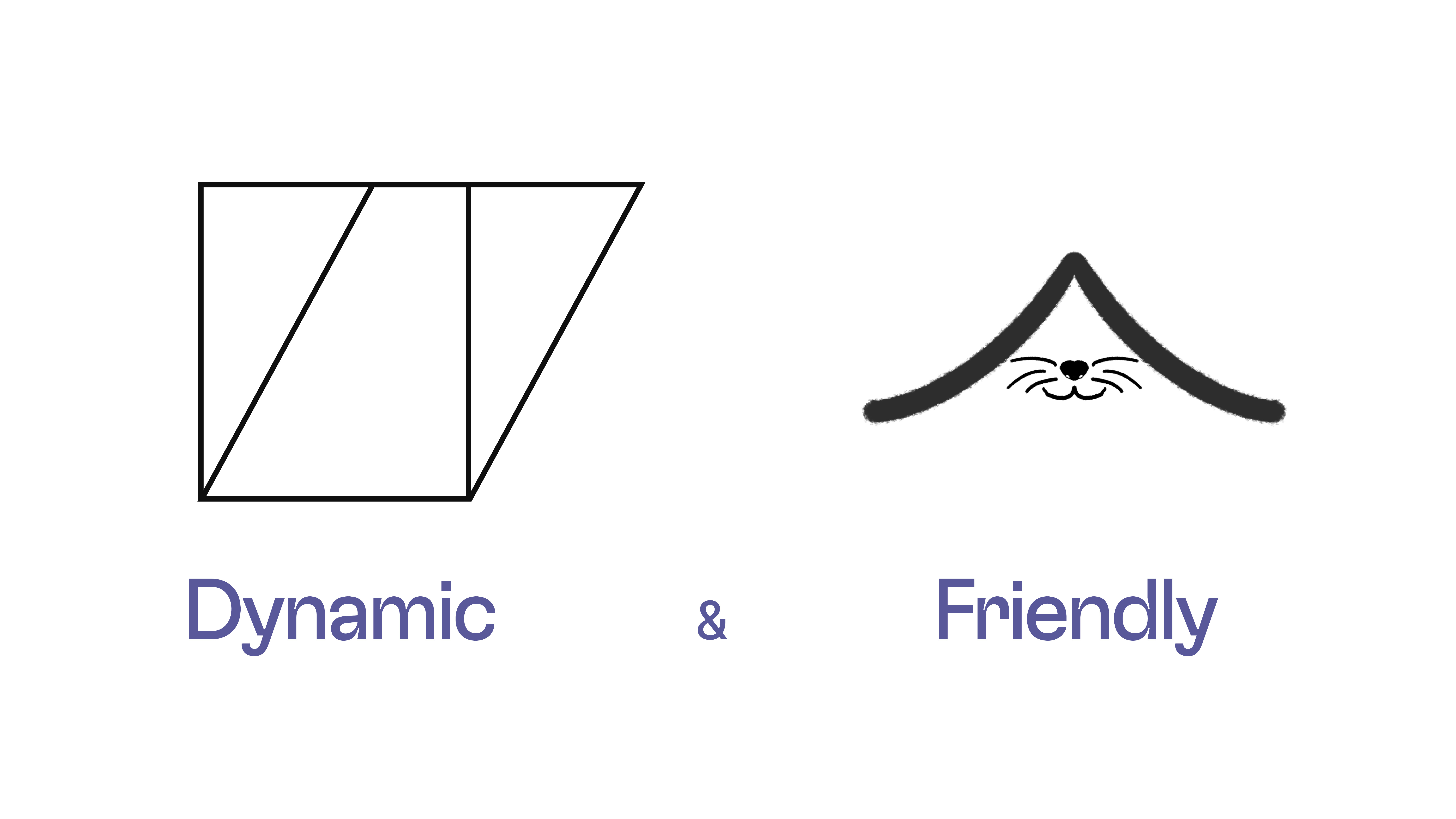
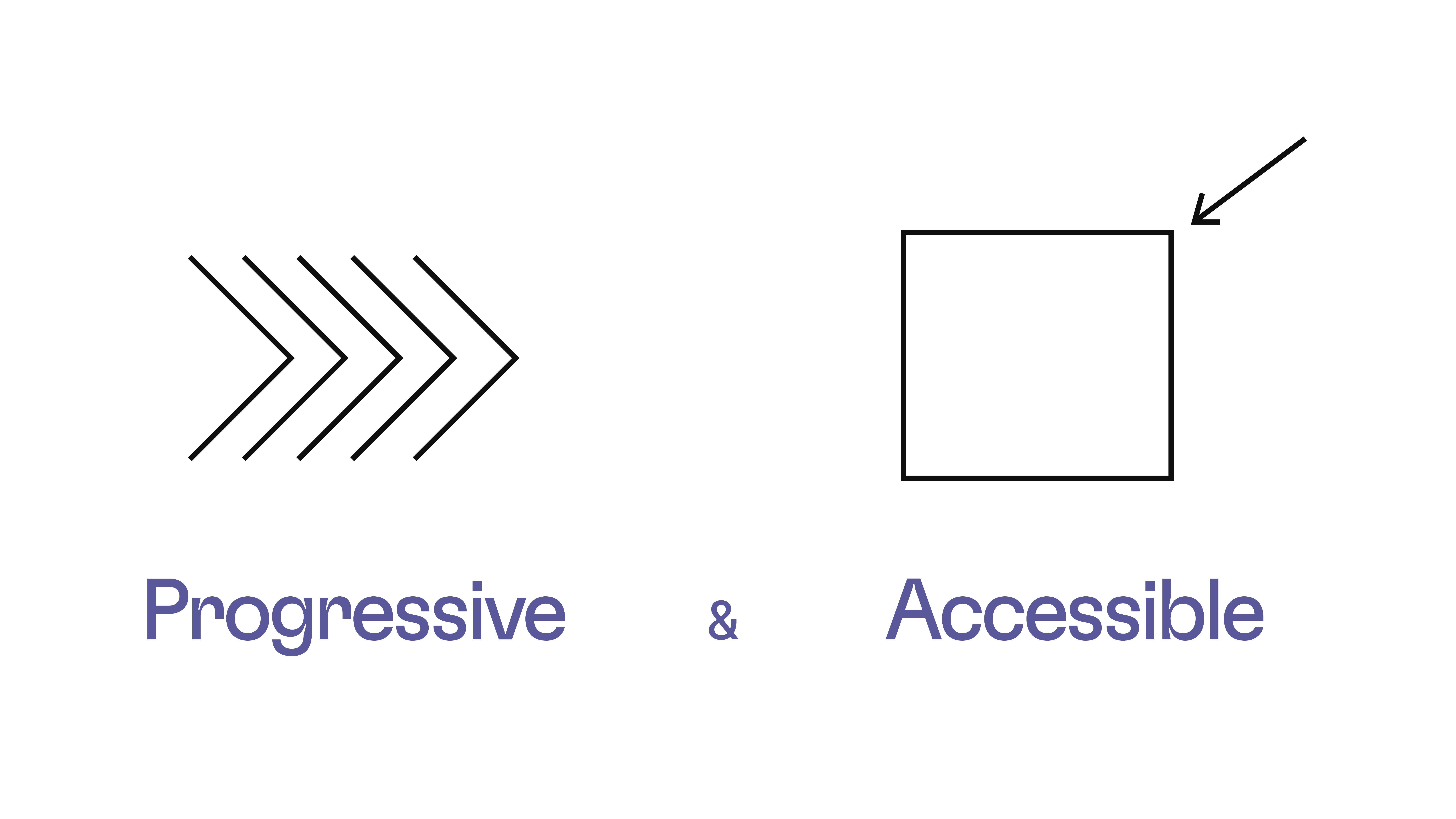
The process began with in-depth research into spcaLA’s mission, values, and history. This exploration highlighted the organization’s unique position as an independent entity, dedicated to adapting to the ever-evolving landscape of animal welfare. Inspired by their mission, I started sketching initial concepts that embodied compassion, dynamism, and a touch of playfulness.
spcaLA is ...


A Tailored Approach:
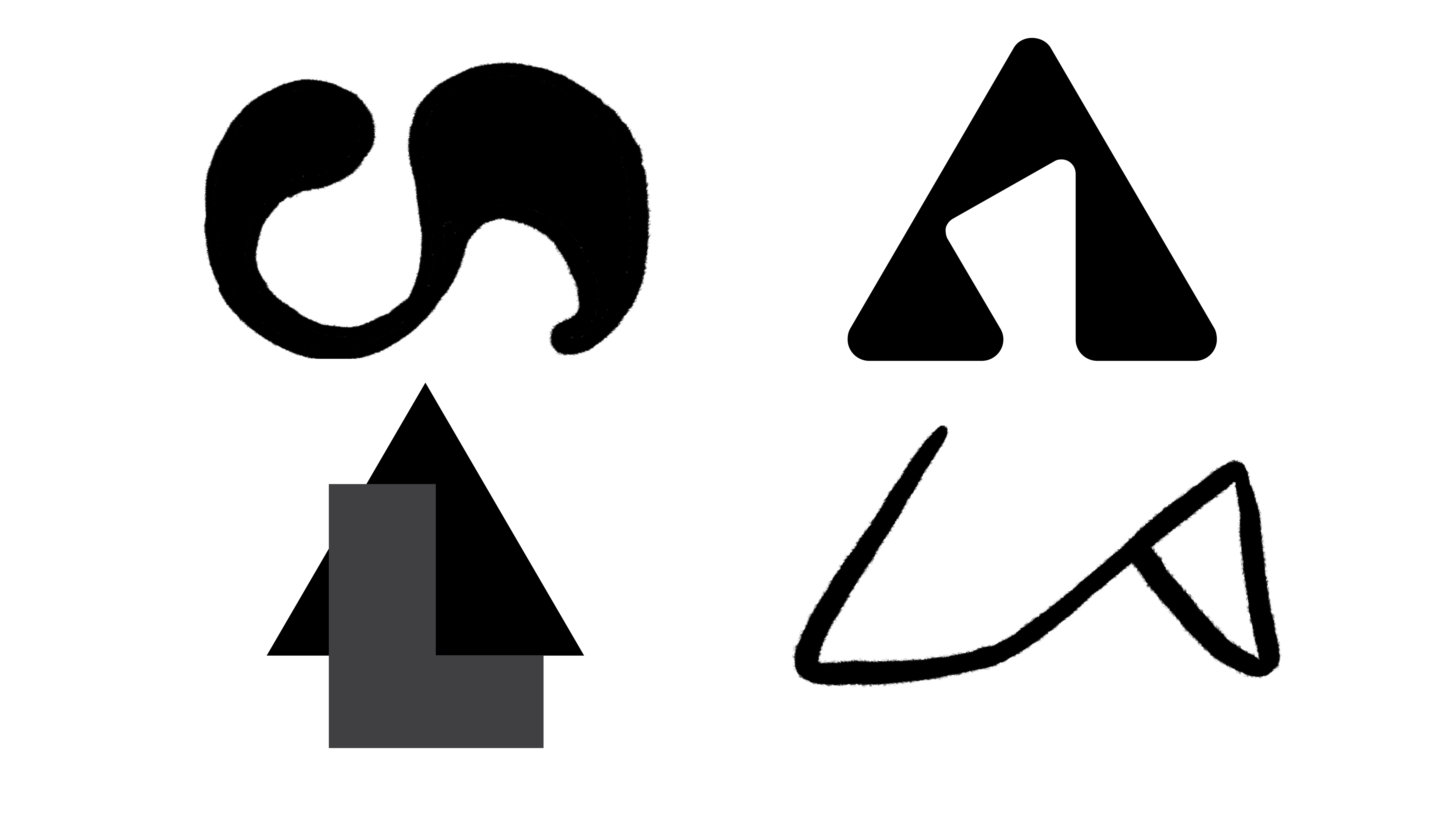
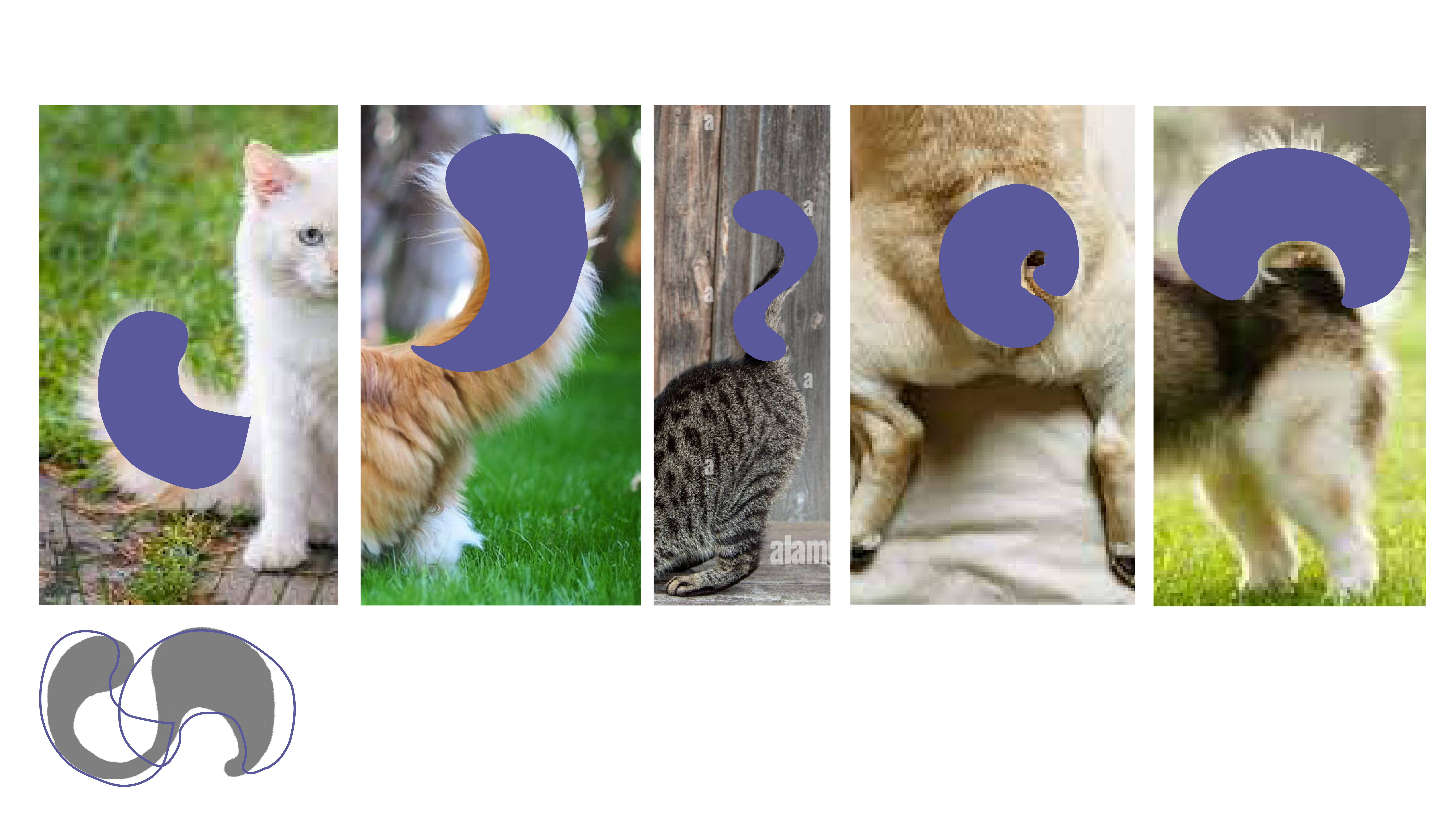
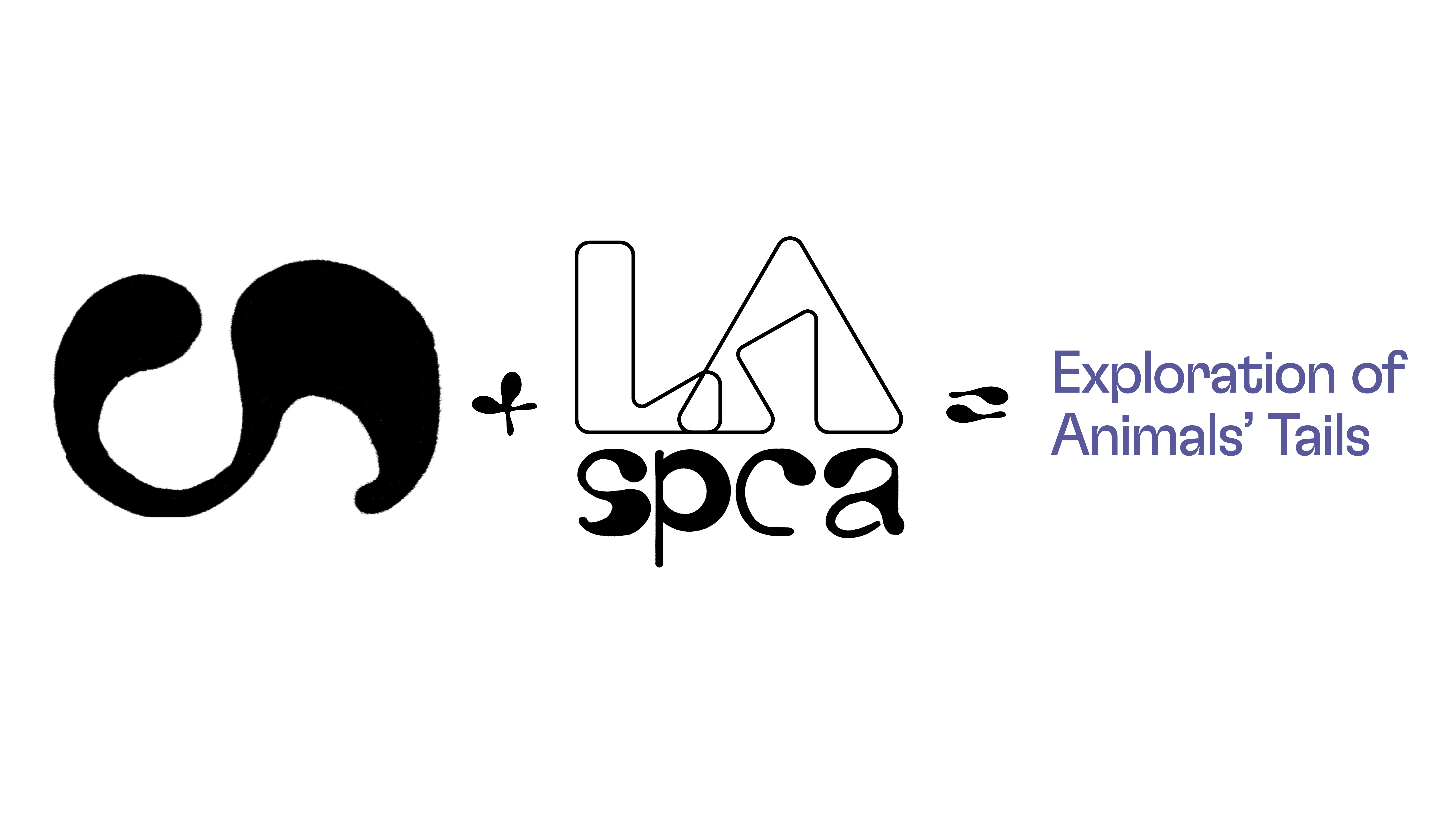
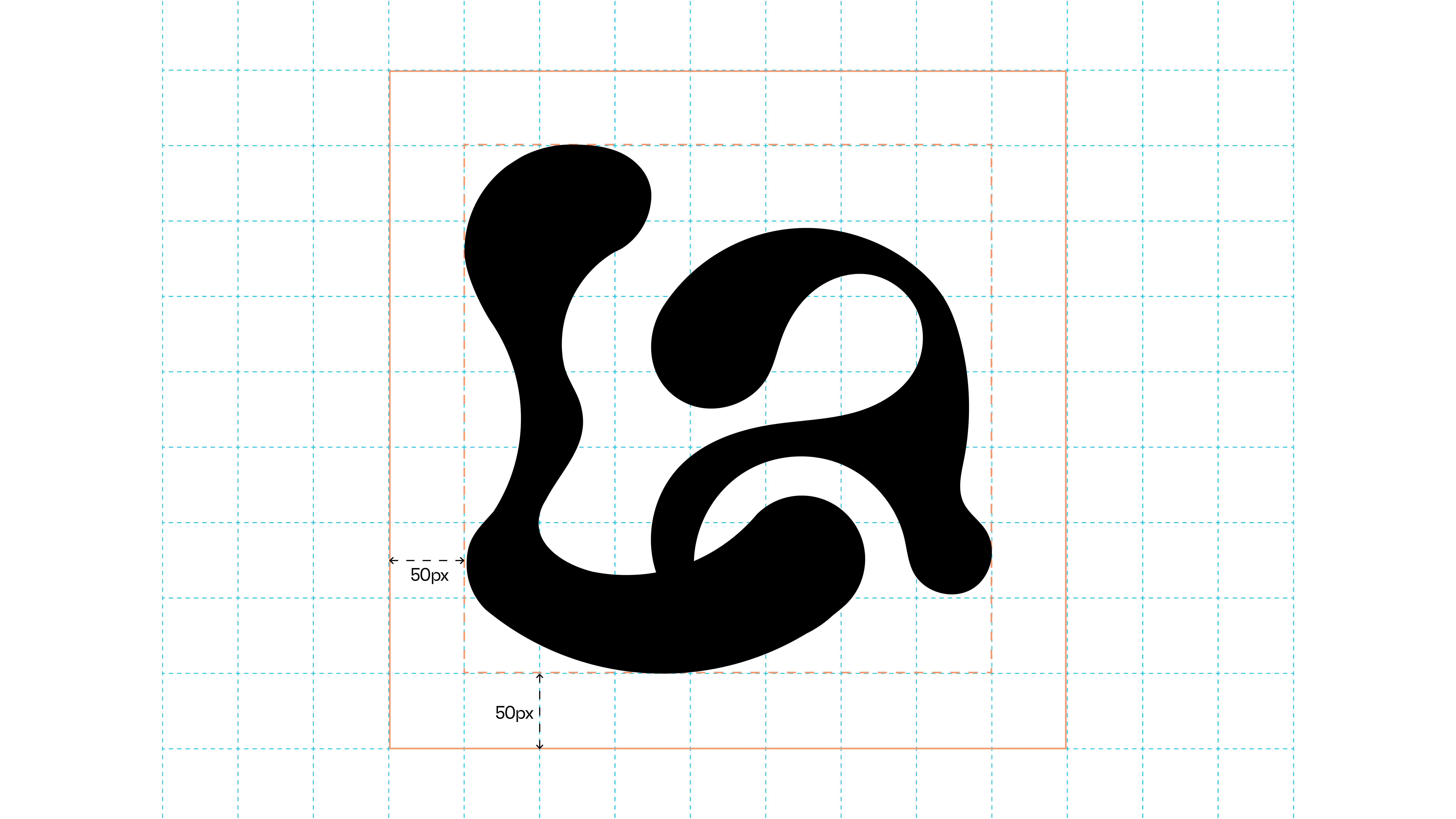
Concept: To embody these qualities, the identity centered around the concept of “Animal Tails”. This central motif symbolizes movement, adaptability, and playful spirit.
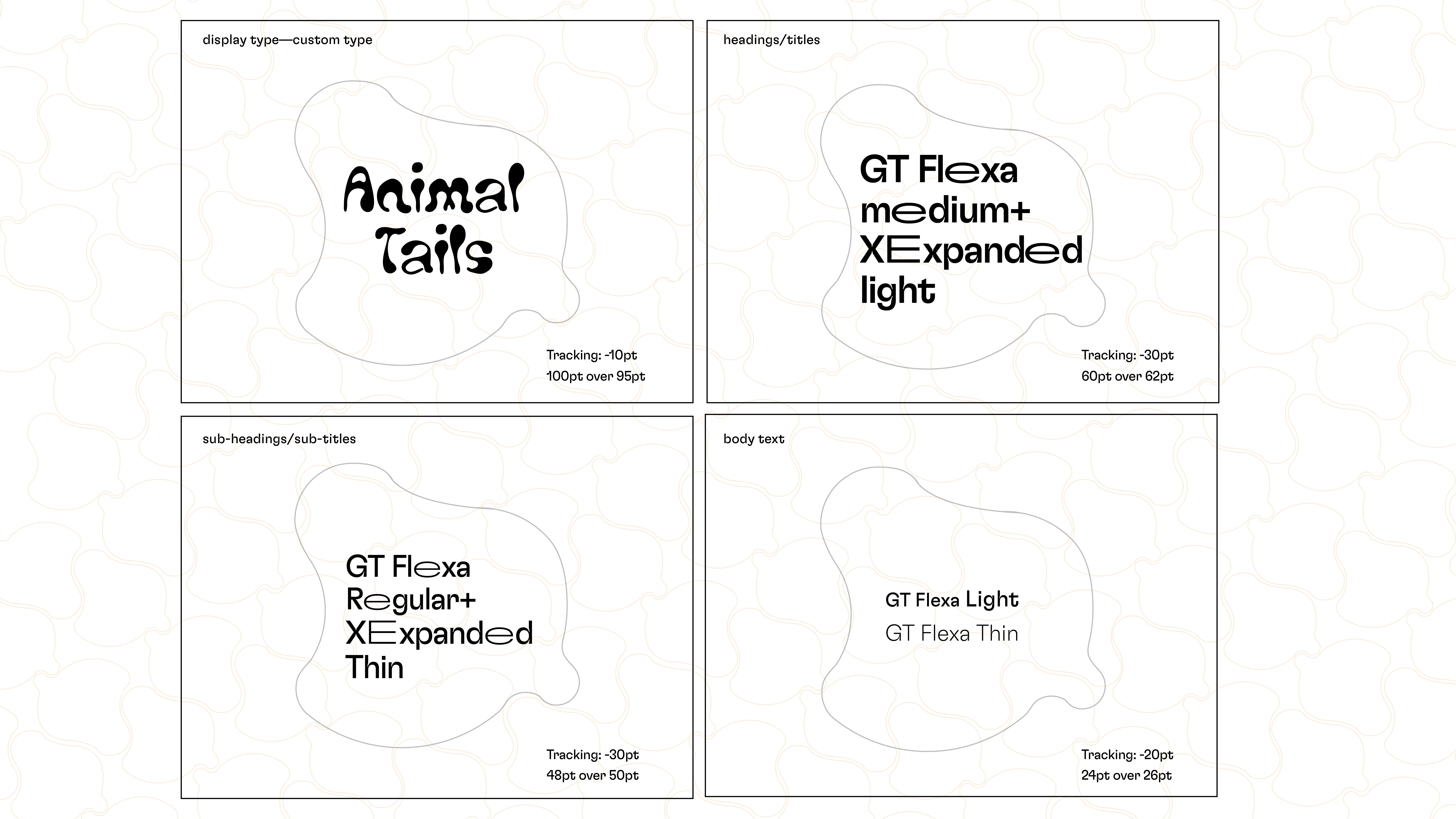
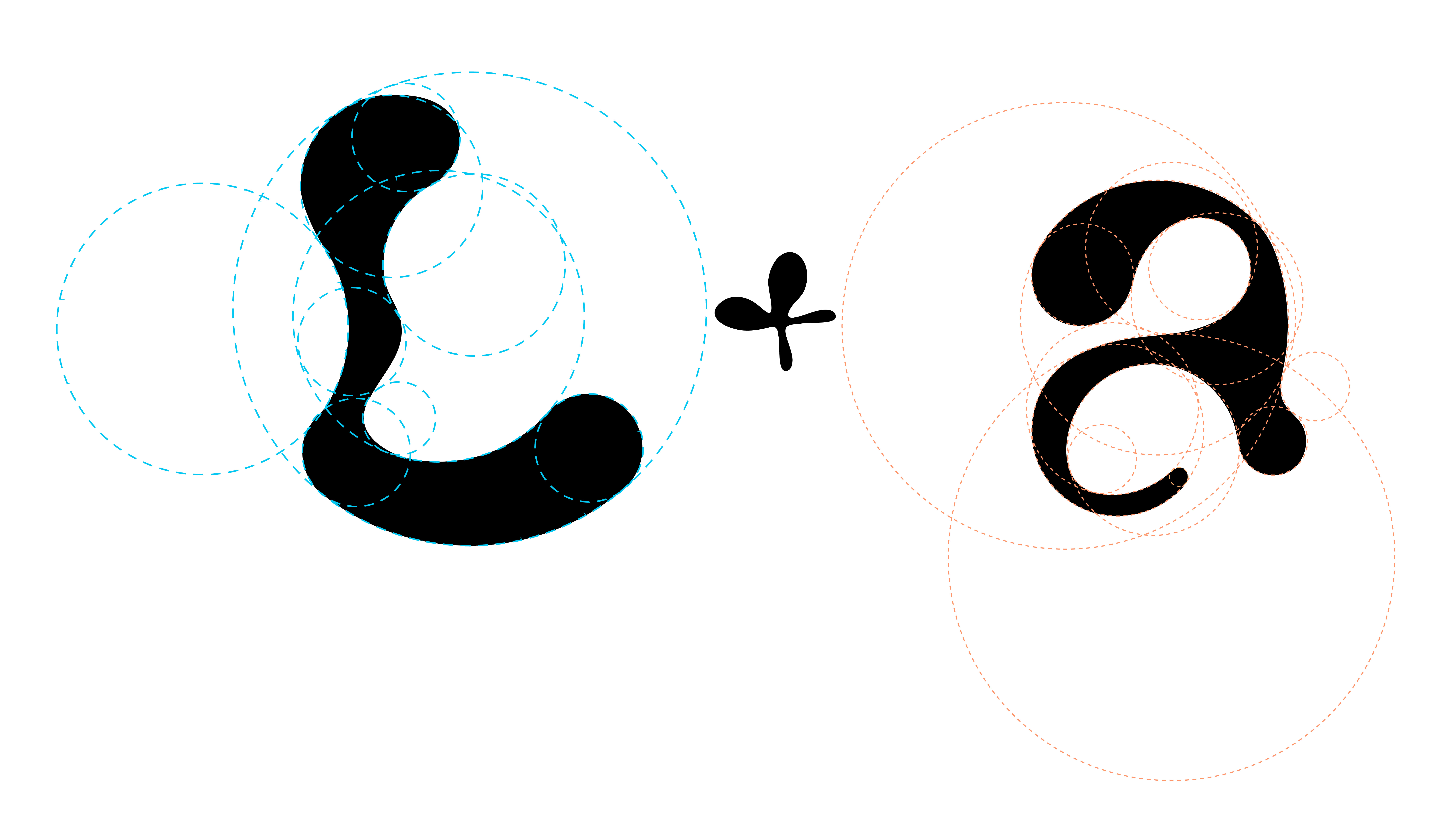
Typeface Design: To further embody the concept, a custom typeface, “Animal Tails” was created. This unique typeface features organic shapes and fluid forms, reflecting the dynamic nature of the organization.


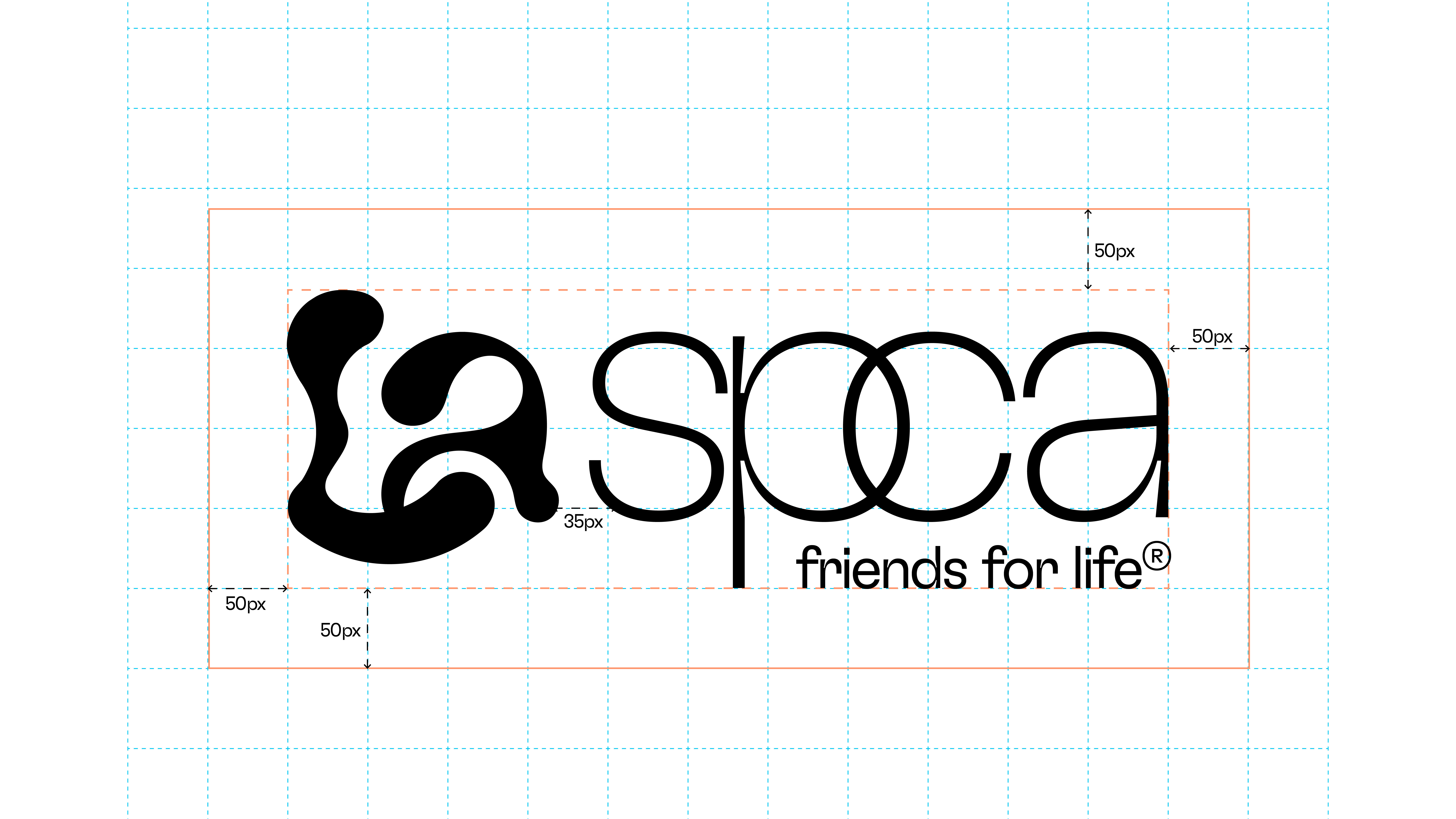
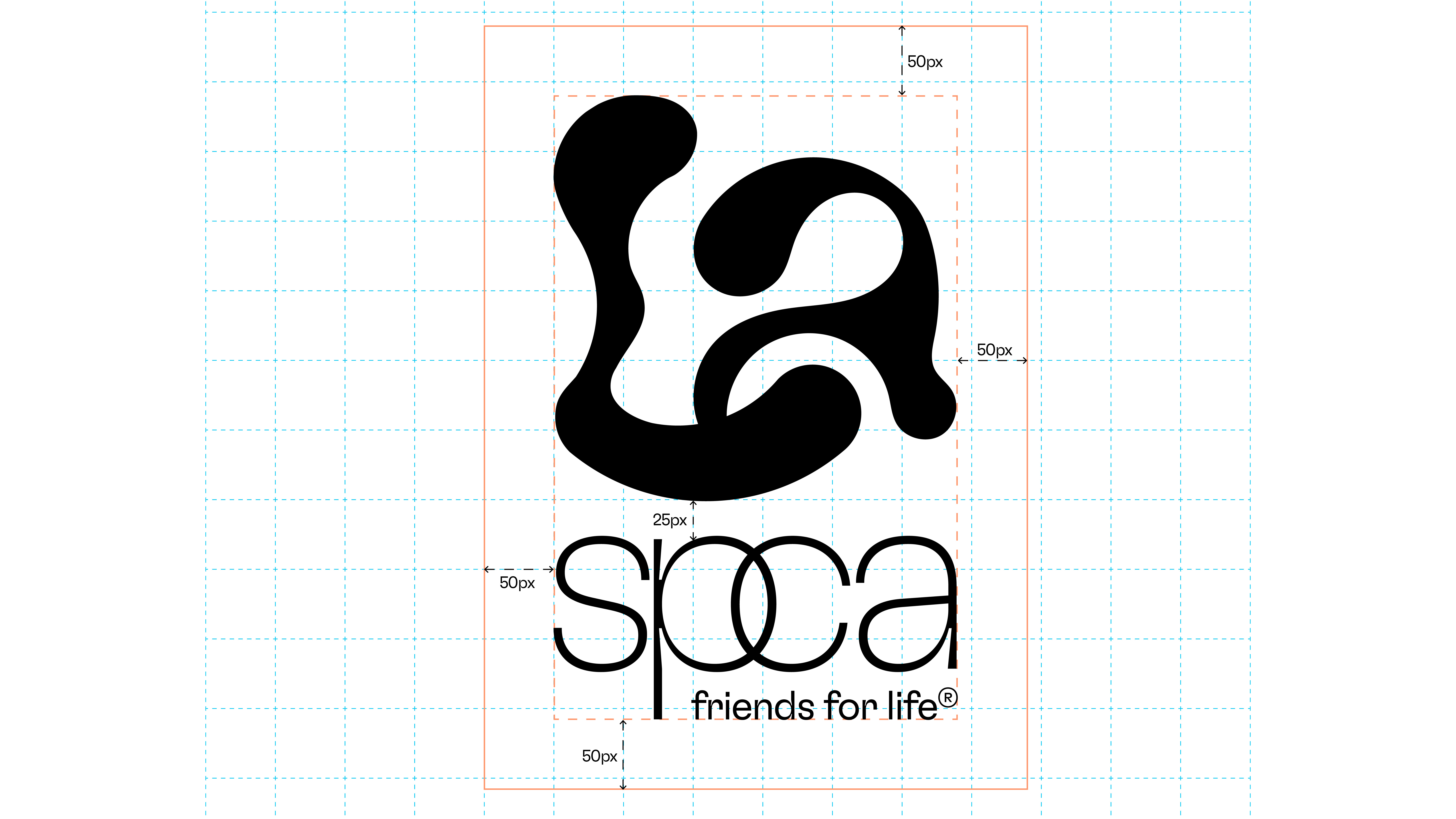
To complement this custom typeface, I selected GT Flexa, a versatile font that balances playfulness with professionalism. This font pairing created a dynamic and engaging typographic system that aligned with spcaLA's mission.
A Visual Language of Compassion:
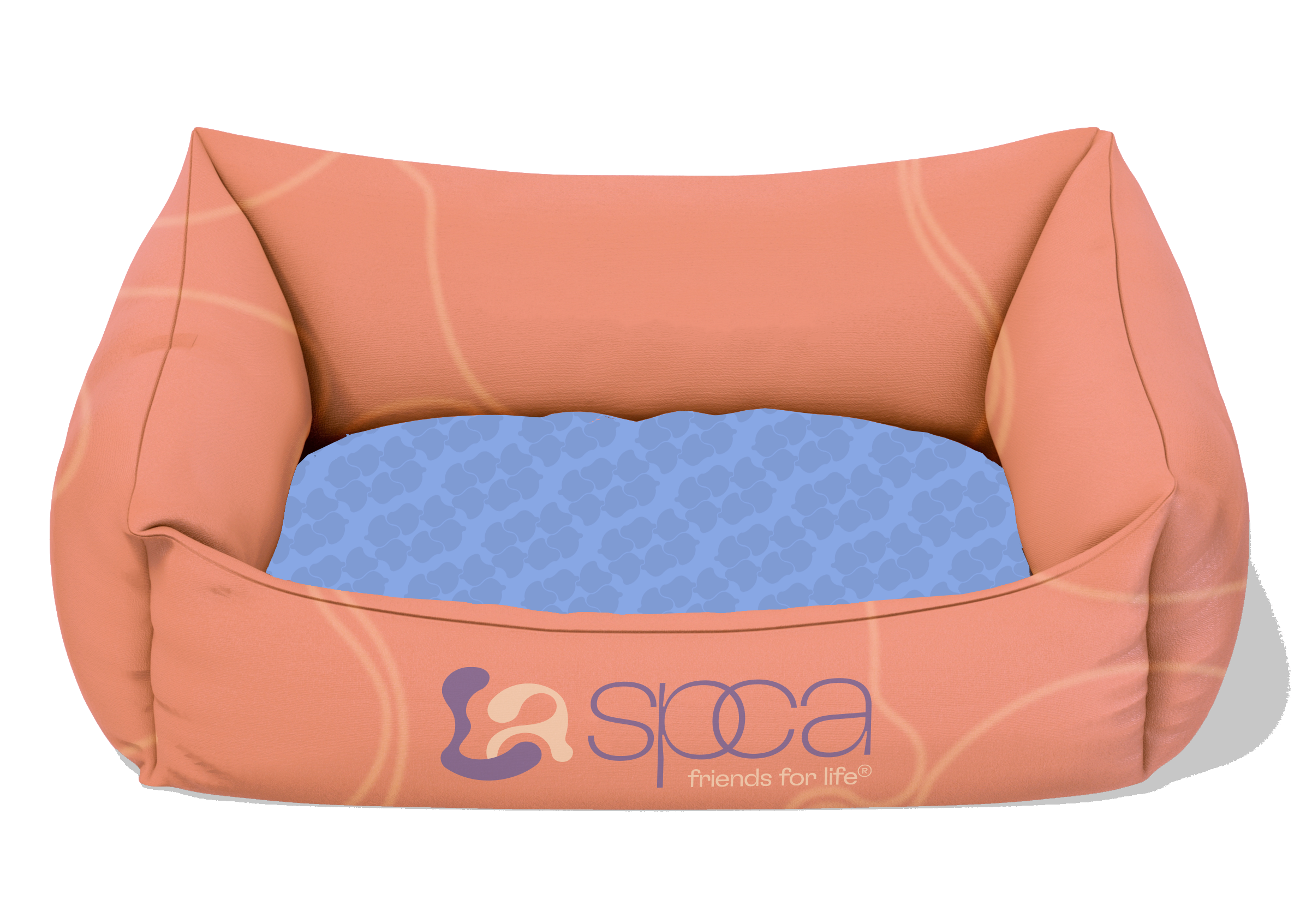
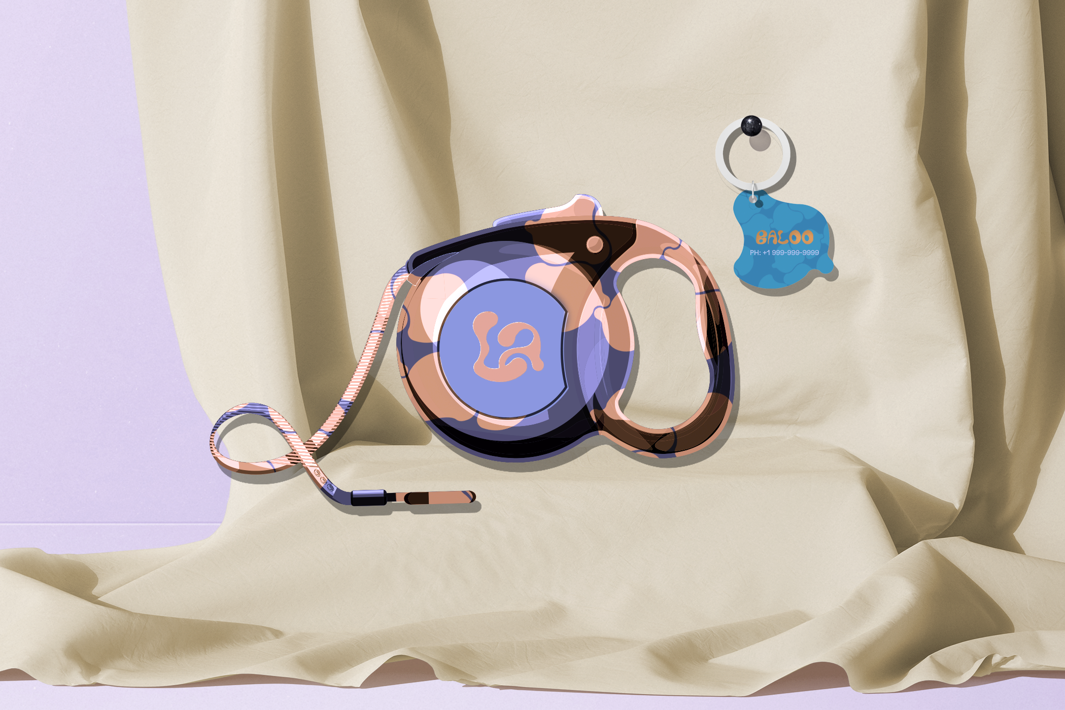
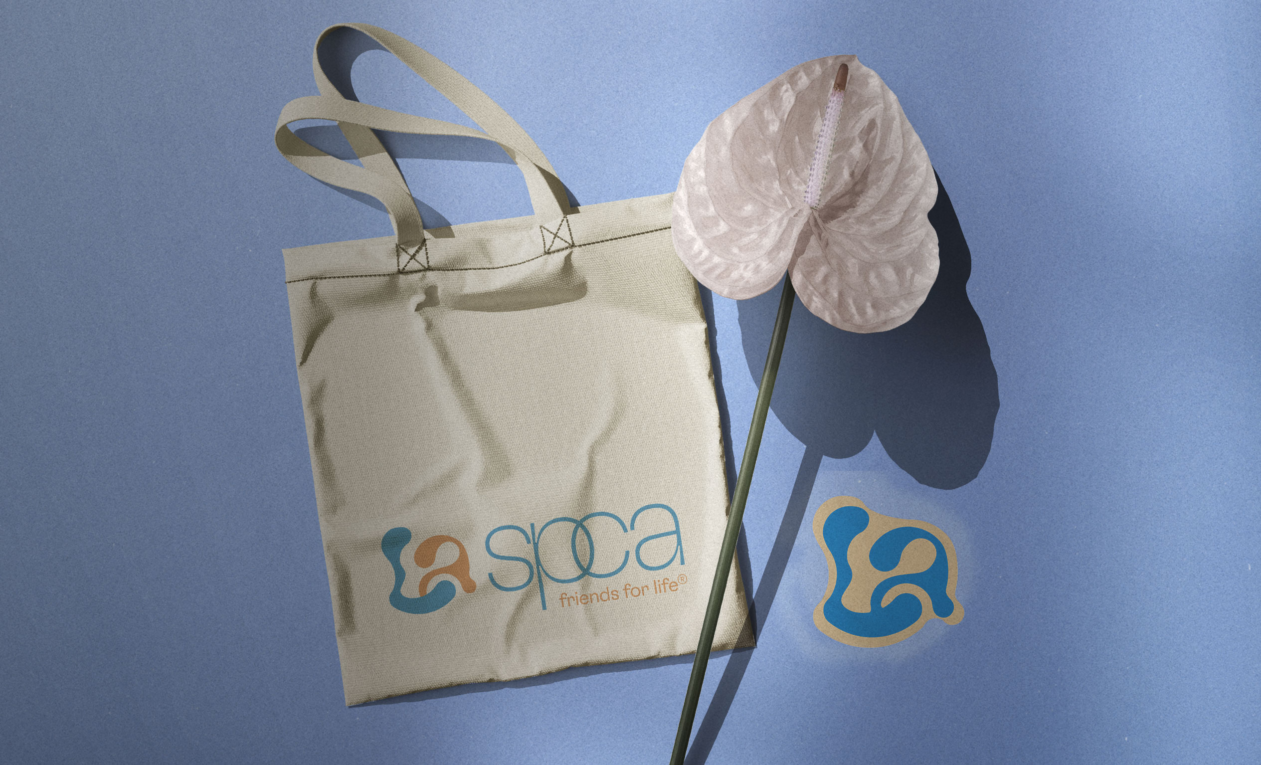
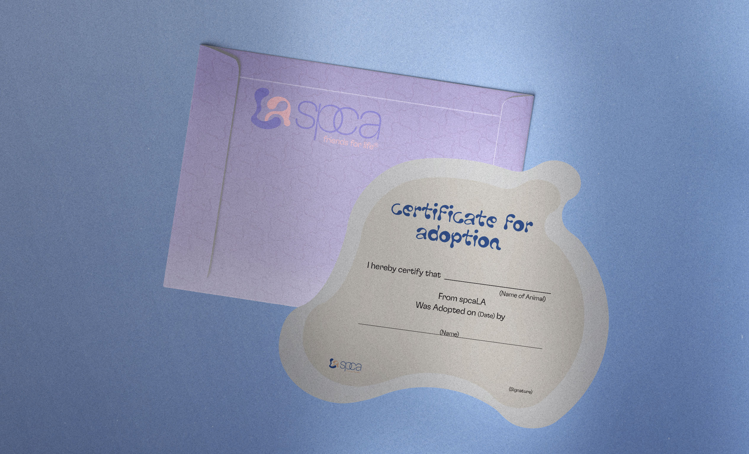
The logo, a stylized "LA" inspired by animal tails, served as the foundation of the identity. It conveyed a sense of movement and fluidity, while also representing the organization's independent spirit.

Logotype Lockups:

Color Palette:
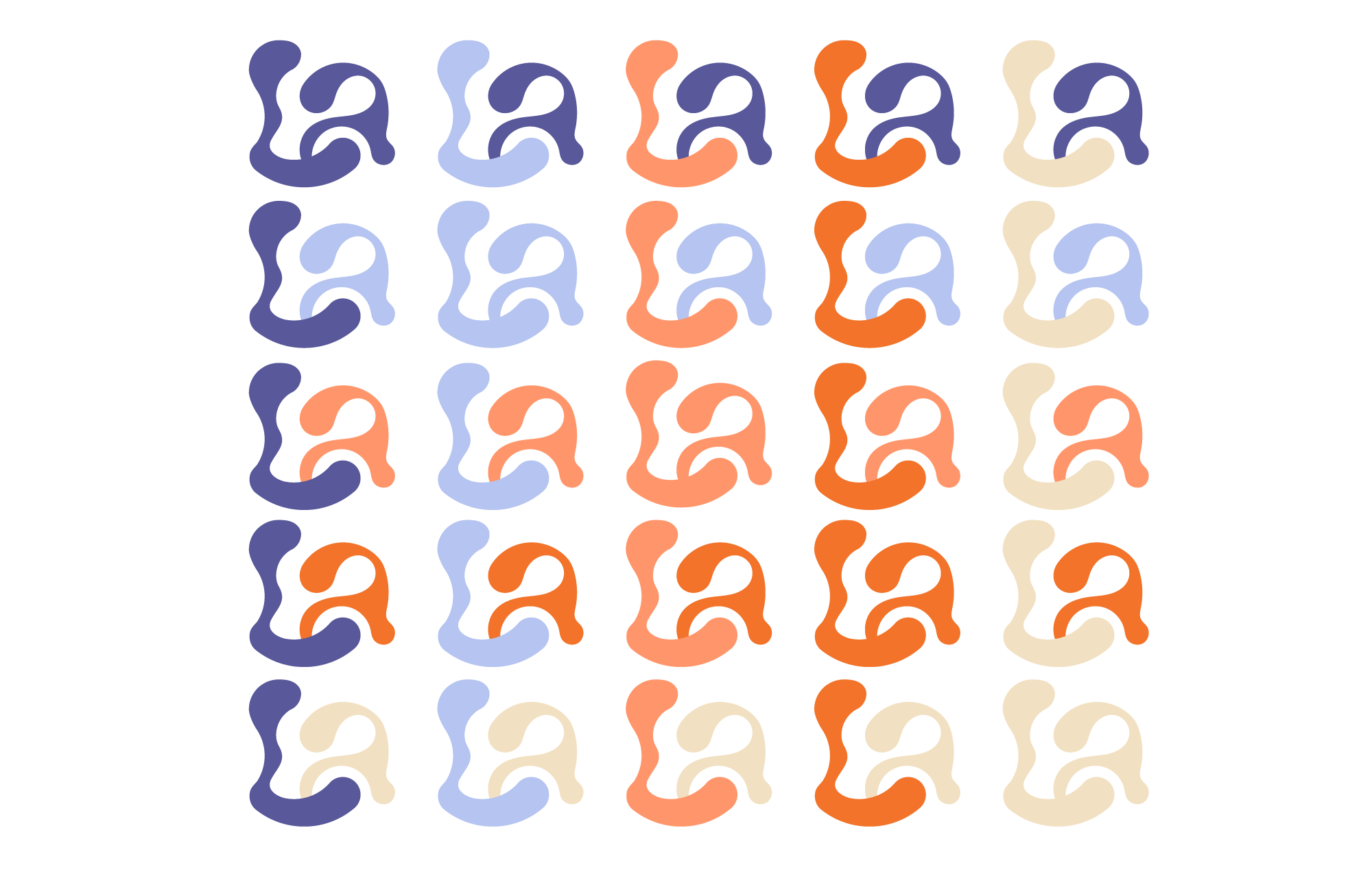
A carefully curated color palette, incorporating earthy tones and calming hues, reinforced the brand's connection to nature and its commitment to animal welfare.


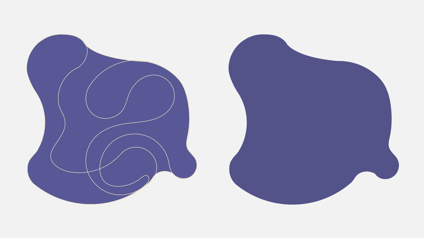
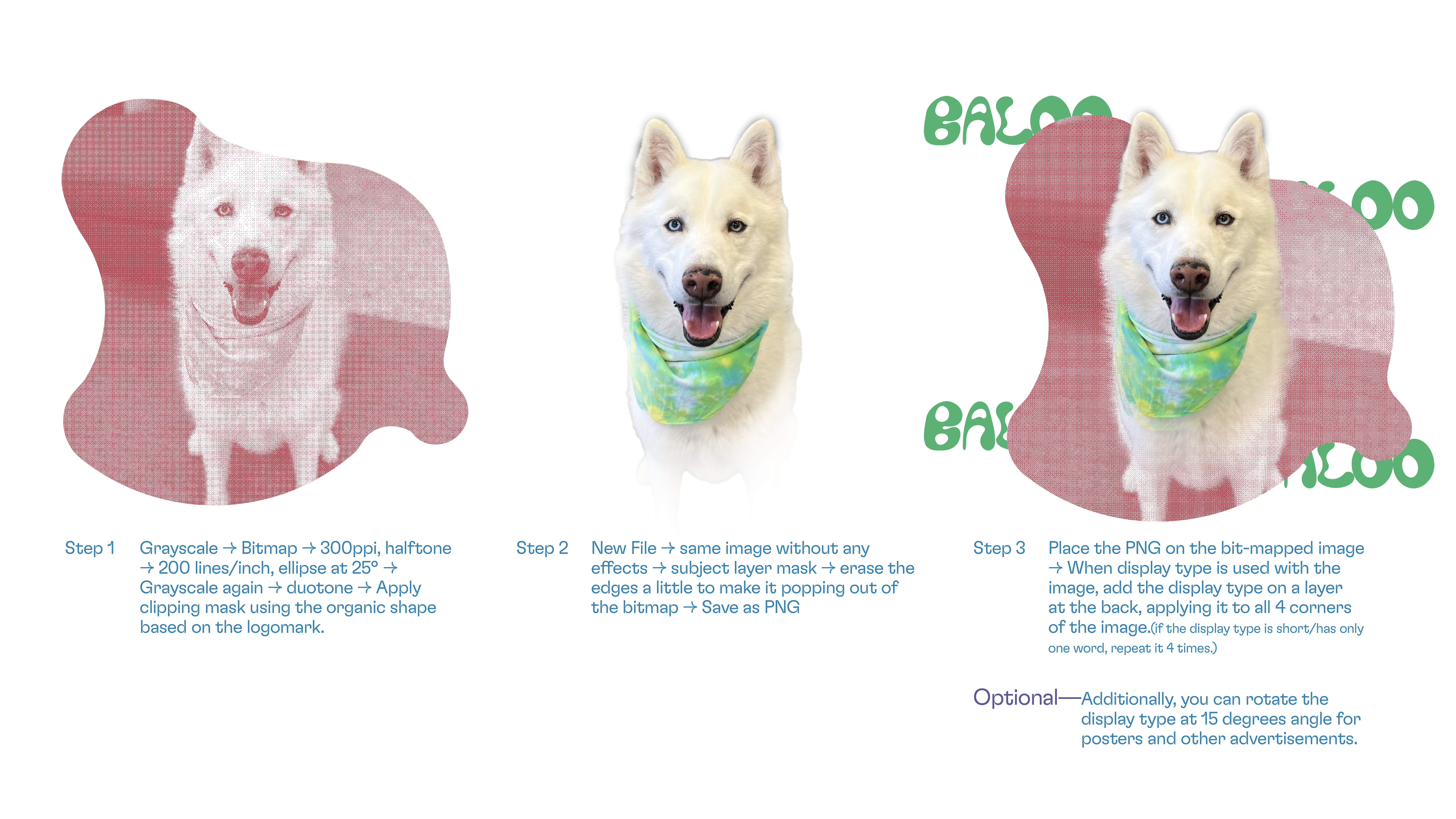
Pattern Design & Image Treatment:

A Legacy of Compassion:
This reimagined identity is more than just a visual makeover; it's a testament to the power of design to inspire and connect. By aligning form with function, I hope to contribute to spcaLA's mission and inspire future generations of animal lovers.
This project was developed as part of an academic exploration into social impact branding, with a focus on creating a meaningful identity for a real-world nonprofit organization.