Otis MFAGD Art Book Fair—2022
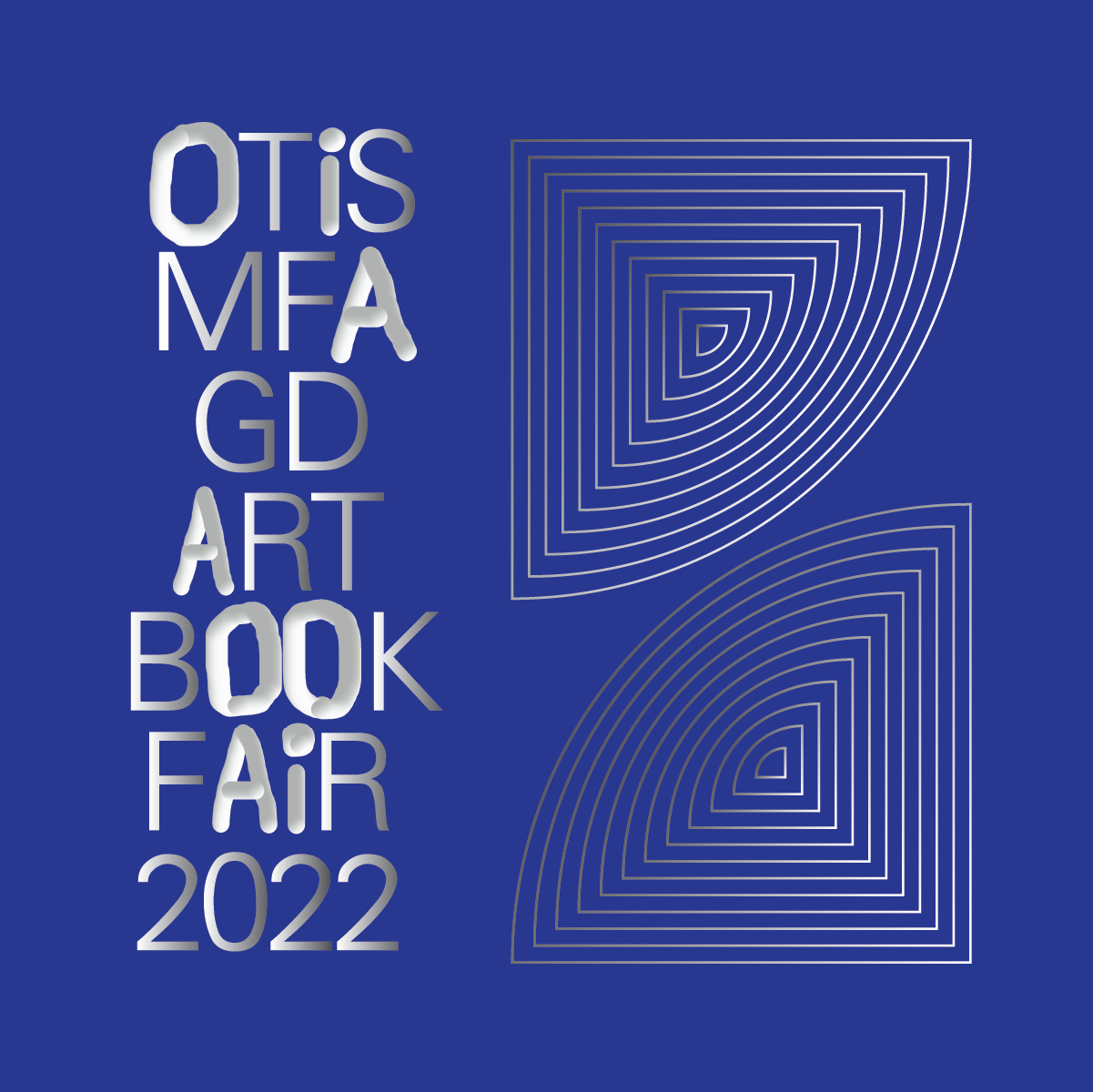
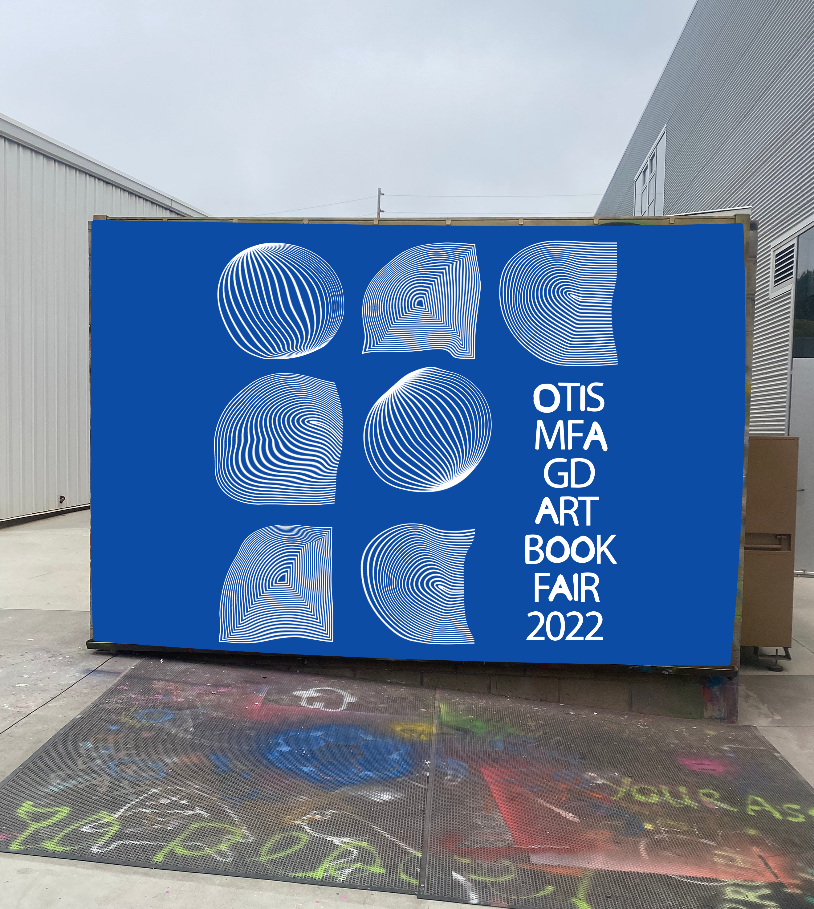
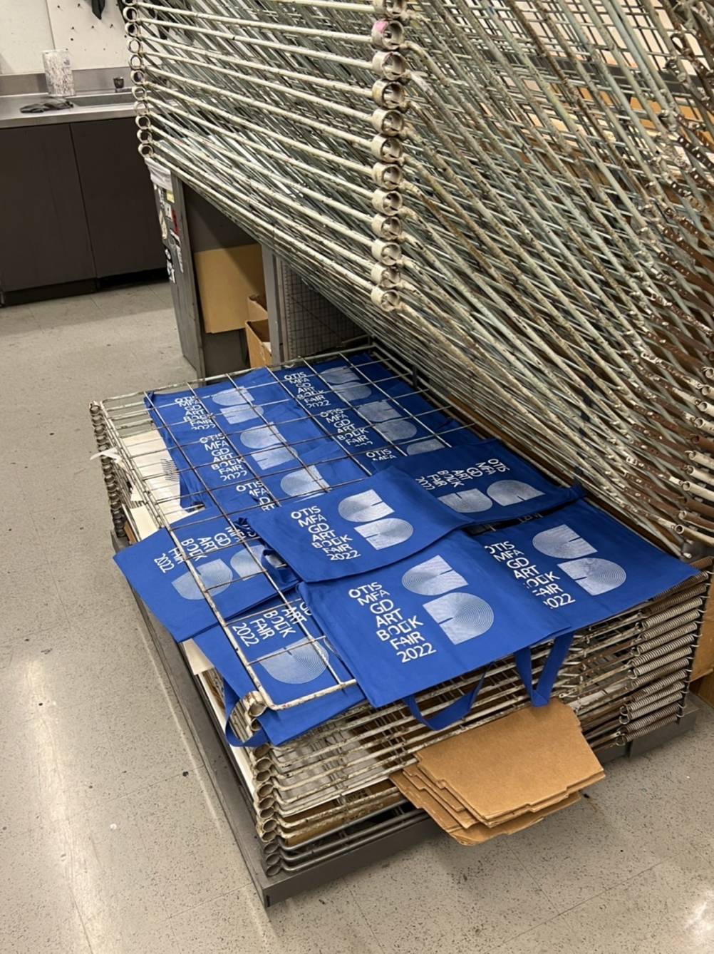
For the Otis MFAGD Art Book Fair 2022, me, along with a few of my colleagues collaborated with Draw Down Books to design the Identity for the Art Book Fair. Based on this identity, I designed the website for the Art Book Fair which was held on June 25th, 2022. You can visit the website by clicking here: Otis MFA GD Art Book Fair Website.
Software Used—Adobe Illustrator, Adobe InDesign, Cargo, HTML, CSS Categories—UX/UI Design, Website Design, Identity Design, Responsive Web Design, Landing Page DesignProject Completion—June 2022
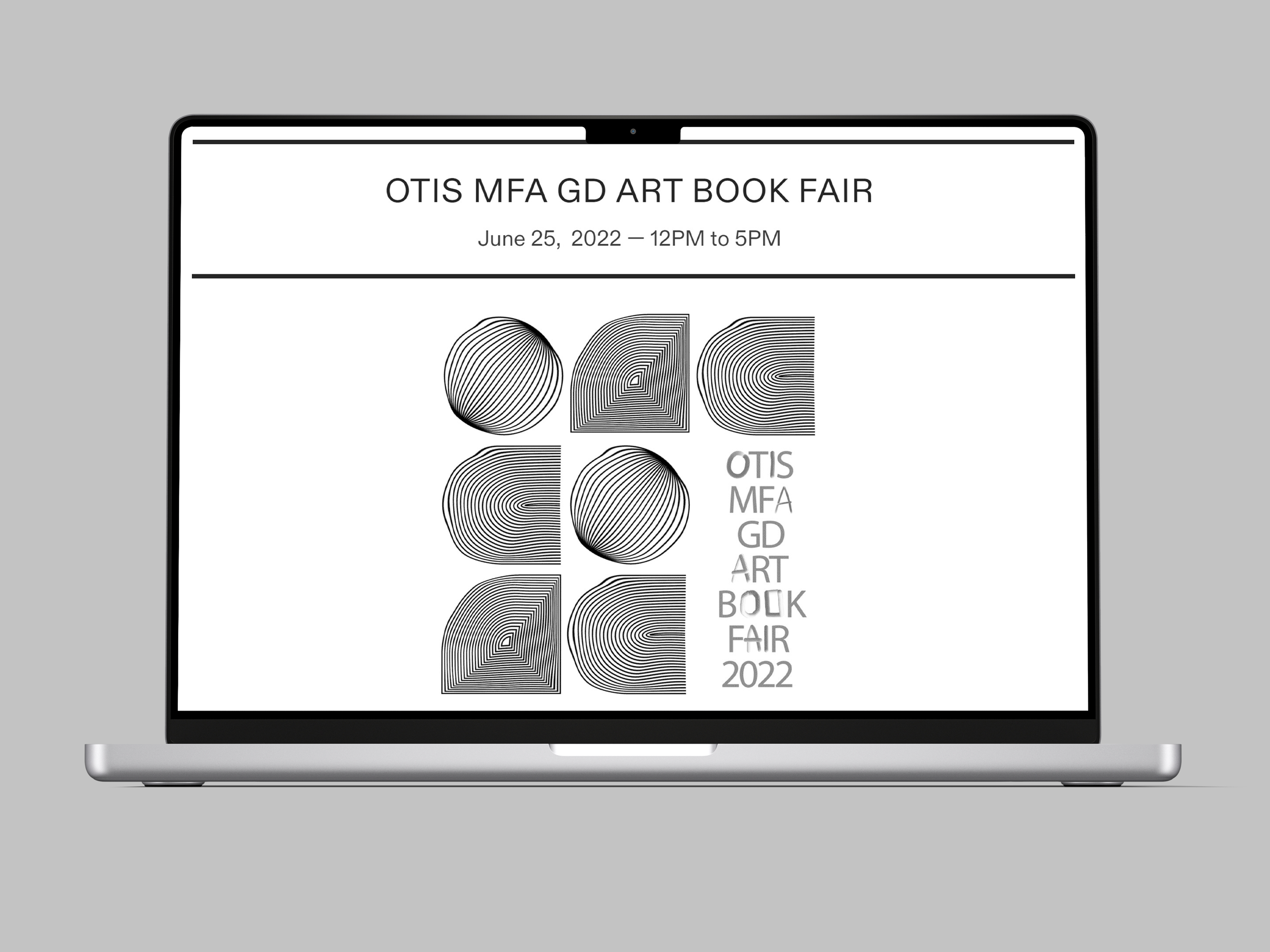

Website:
Introduction:
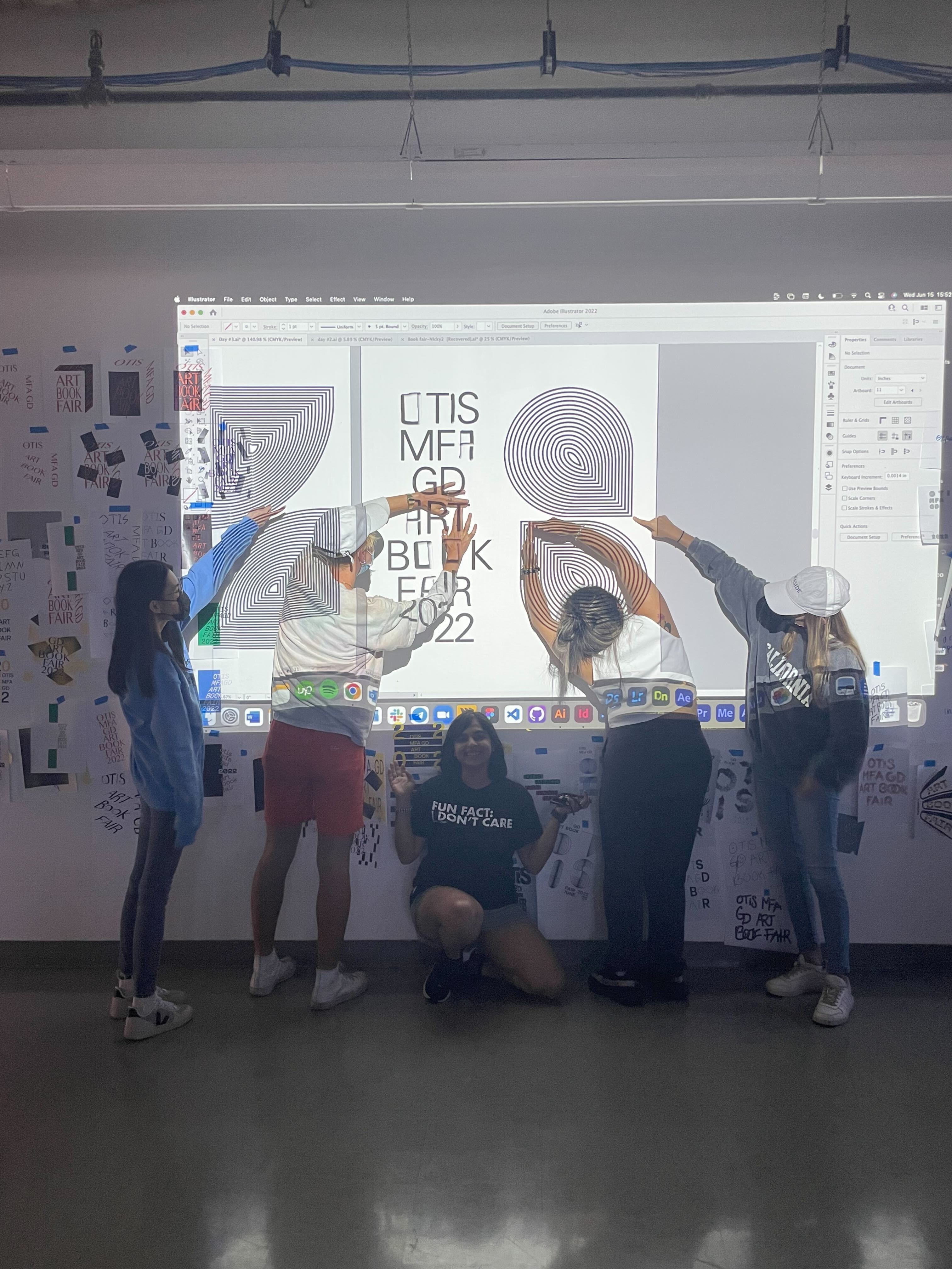
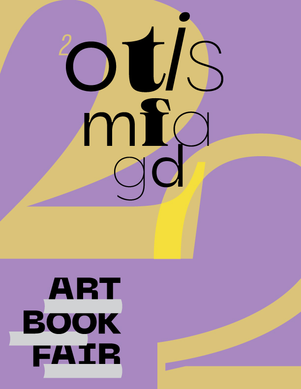
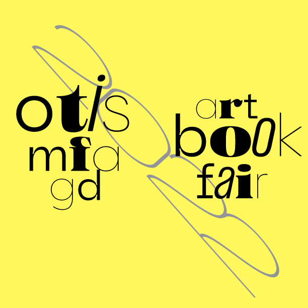
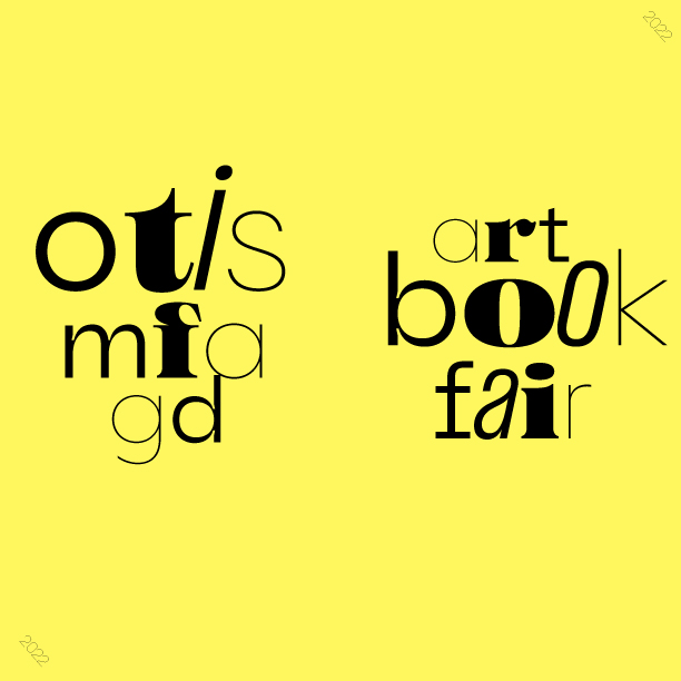
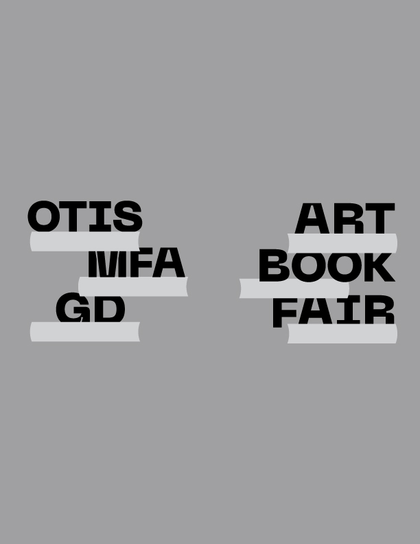
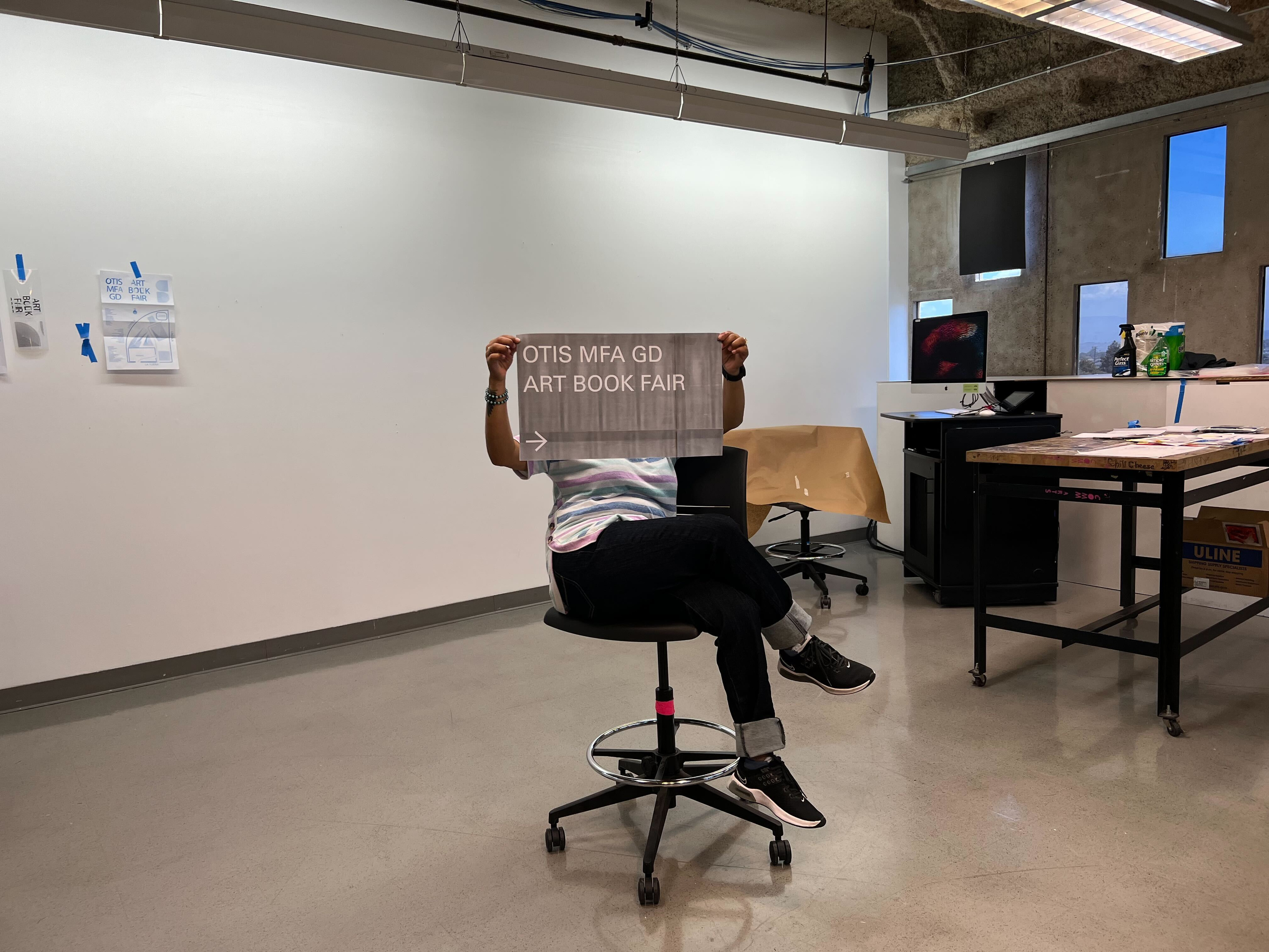
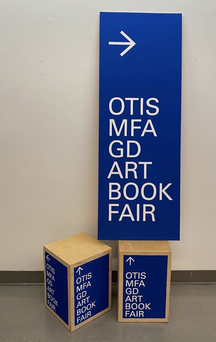
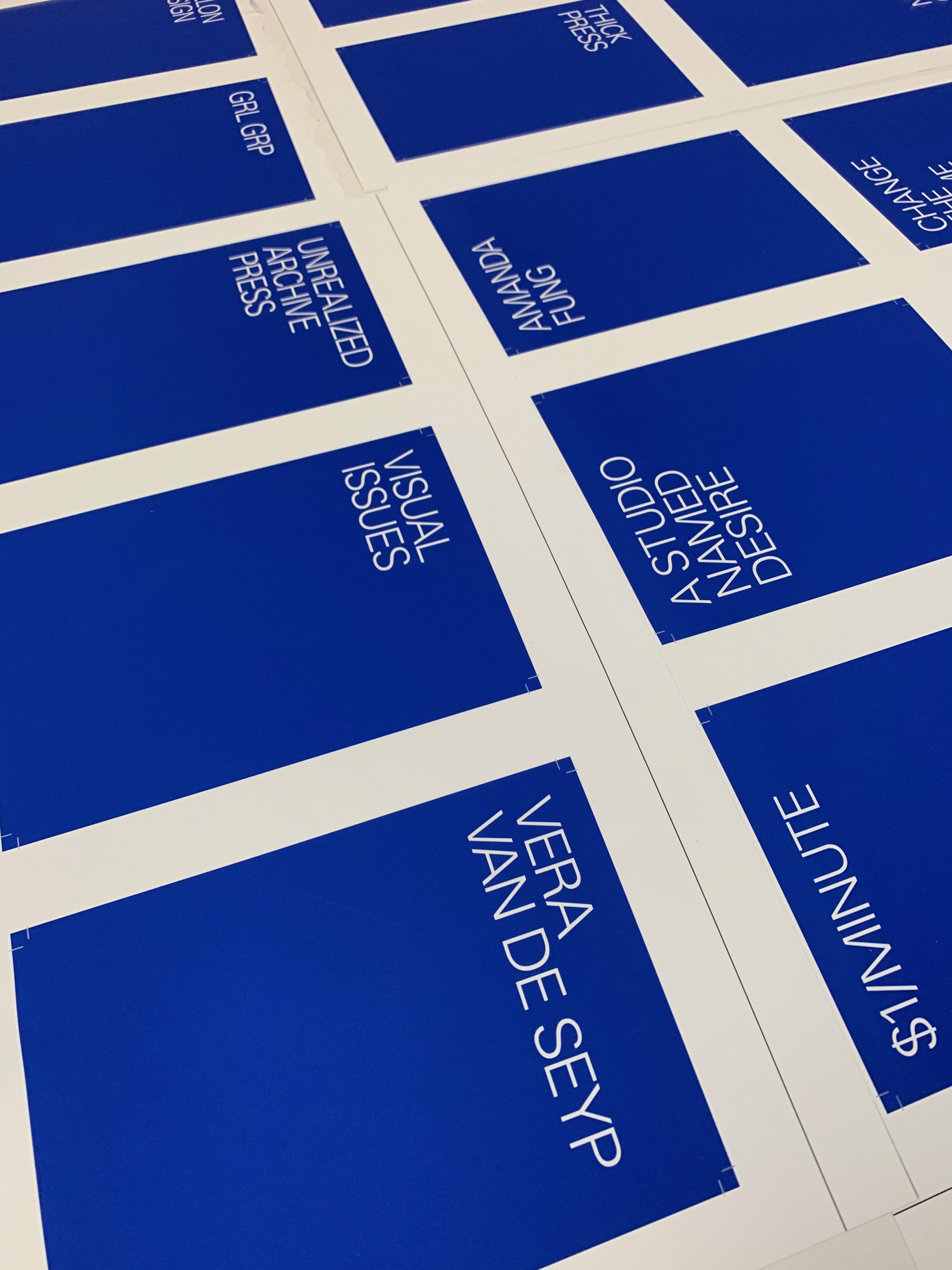
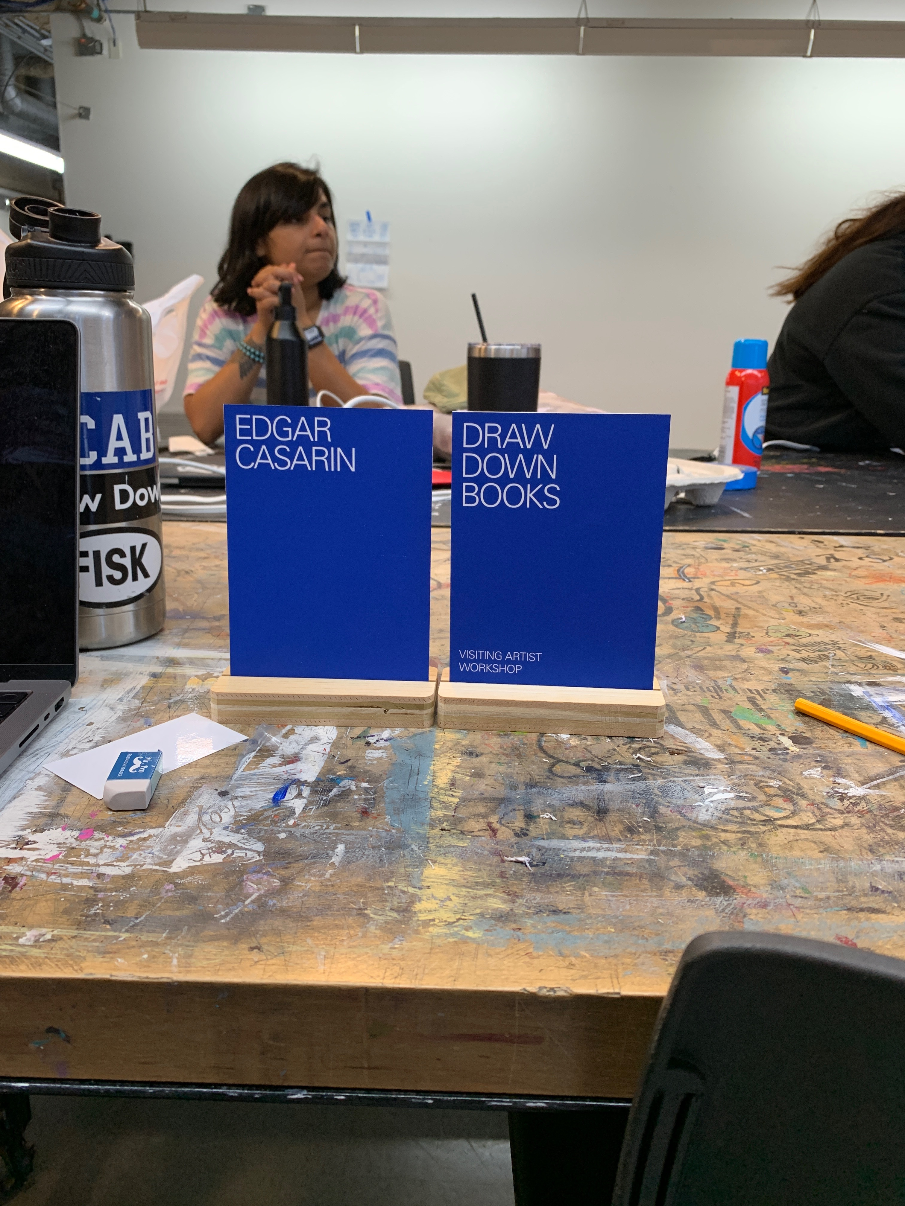
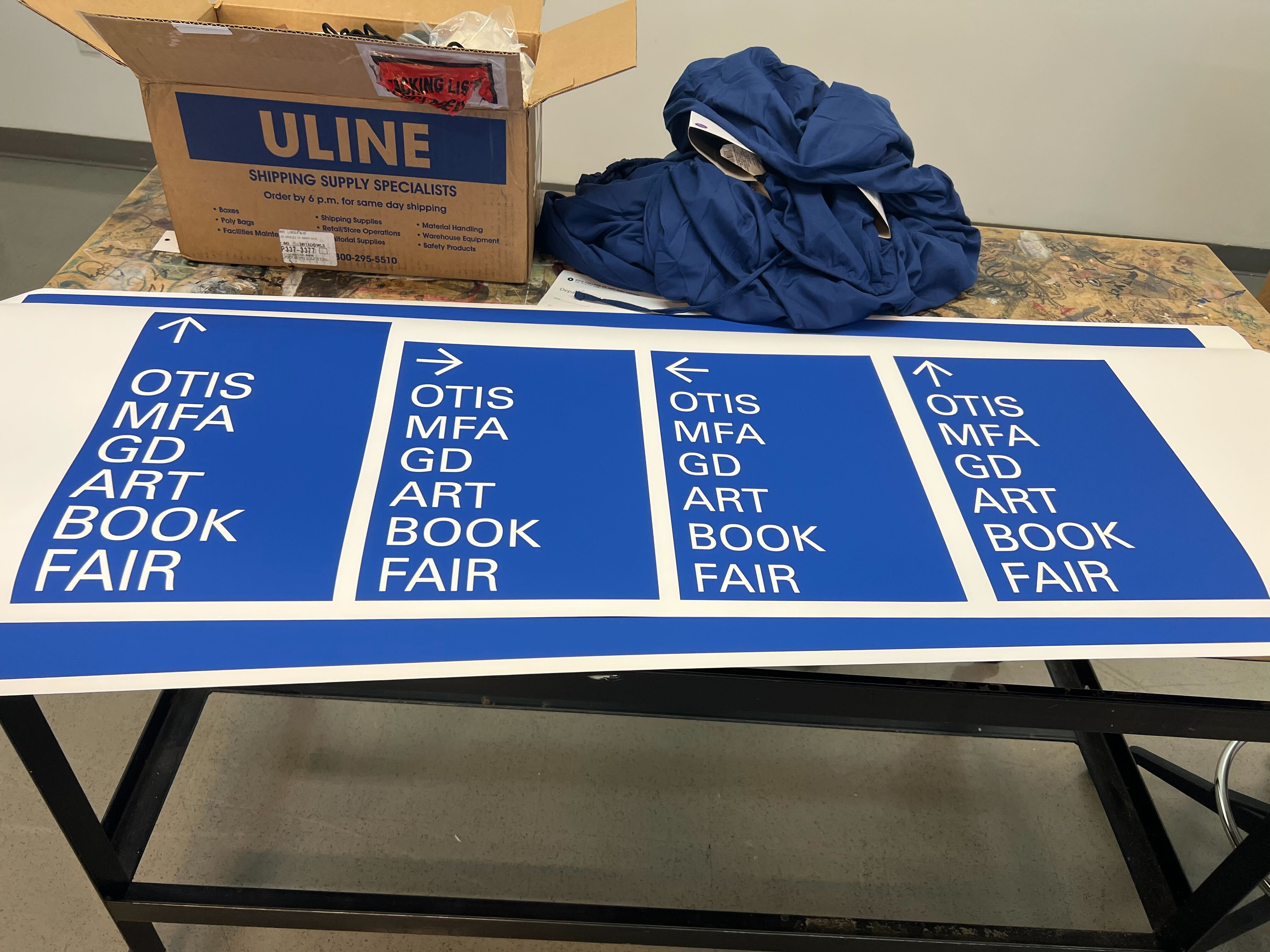
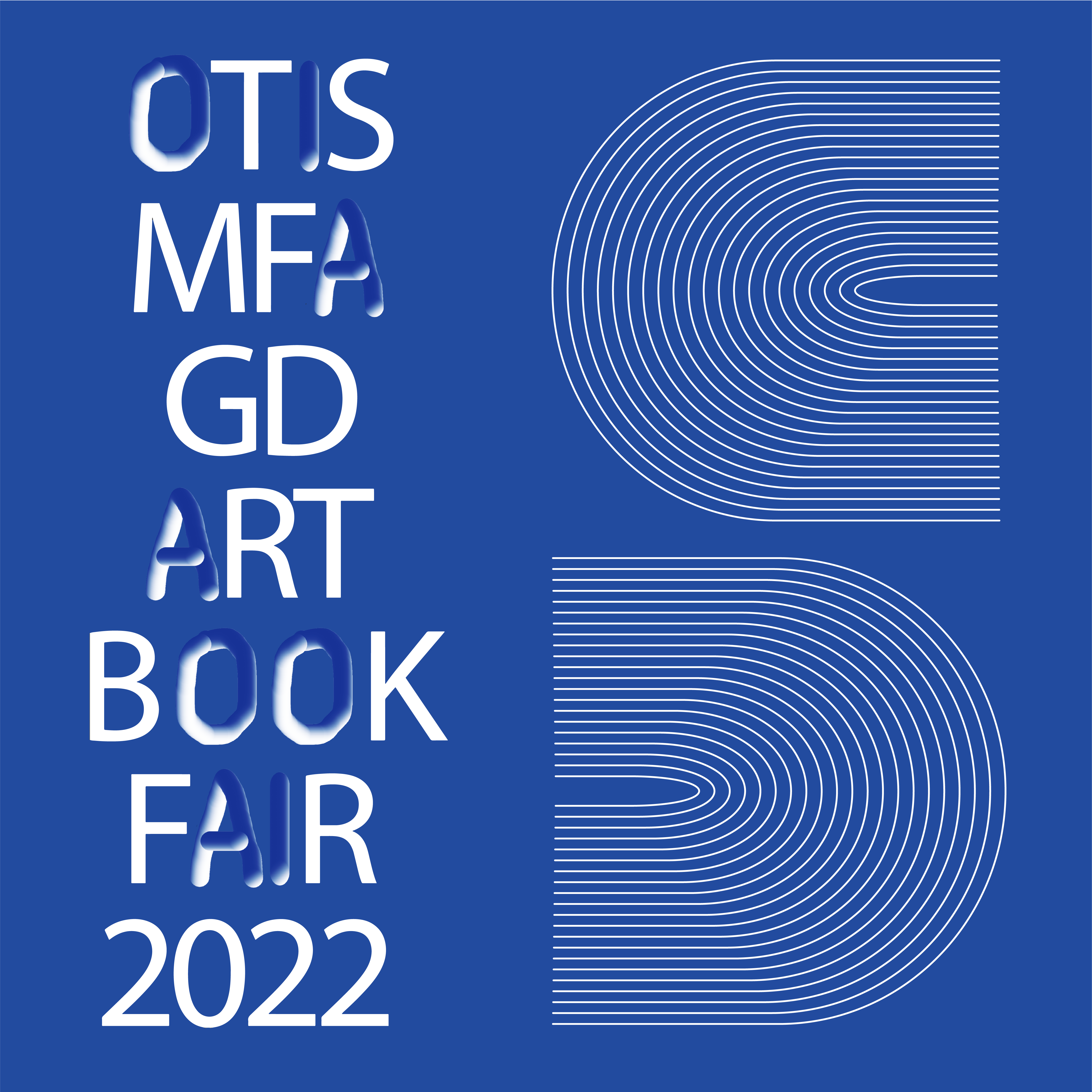
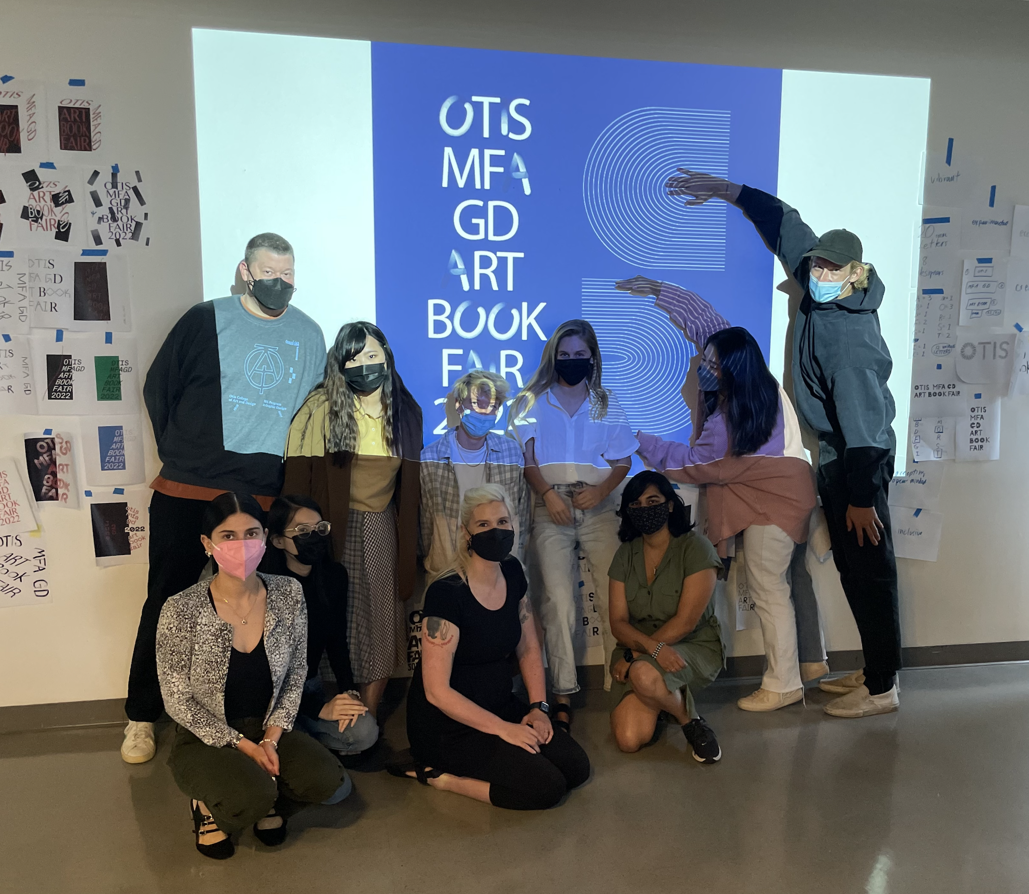
For the Otis MFA GD Art Book Fair, we worked in a group of 8 people along with the DrawDown Books to come up with the identity for the Book Fair and develop systems for its use. We all worked in collaboration for coming up with the identity for the book fair, creating more than 100 iterations in 3 days. Later the identity became the one that had various forms with everyone’s handwriting, that always kept changing.
My major part in this collaboration was creating the website for the book fair. One of my colleagues helped with designing a basic template to start from. All the materials related to the book fair was based on the color of the identity. I used CSS and Html to manipulate the website to work they way I wanted, also changing the cursor to match the identity that we developed.
Video for Mobile View of the Website:
Process:
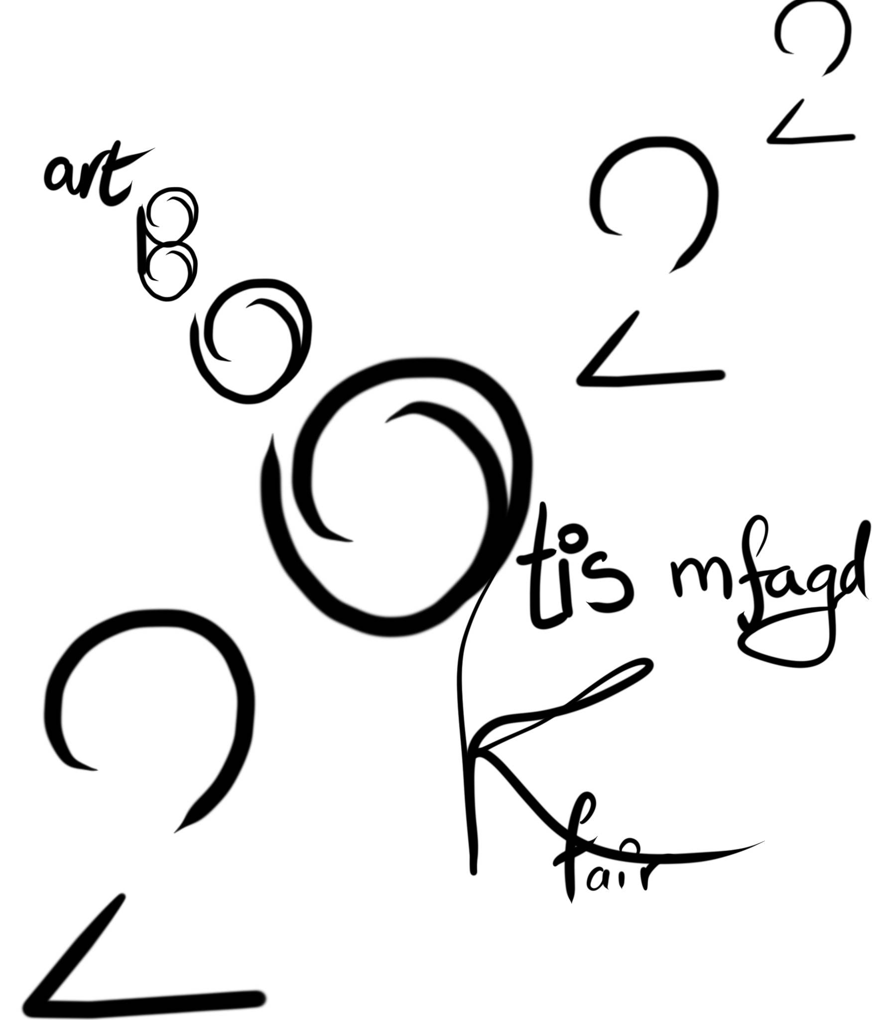
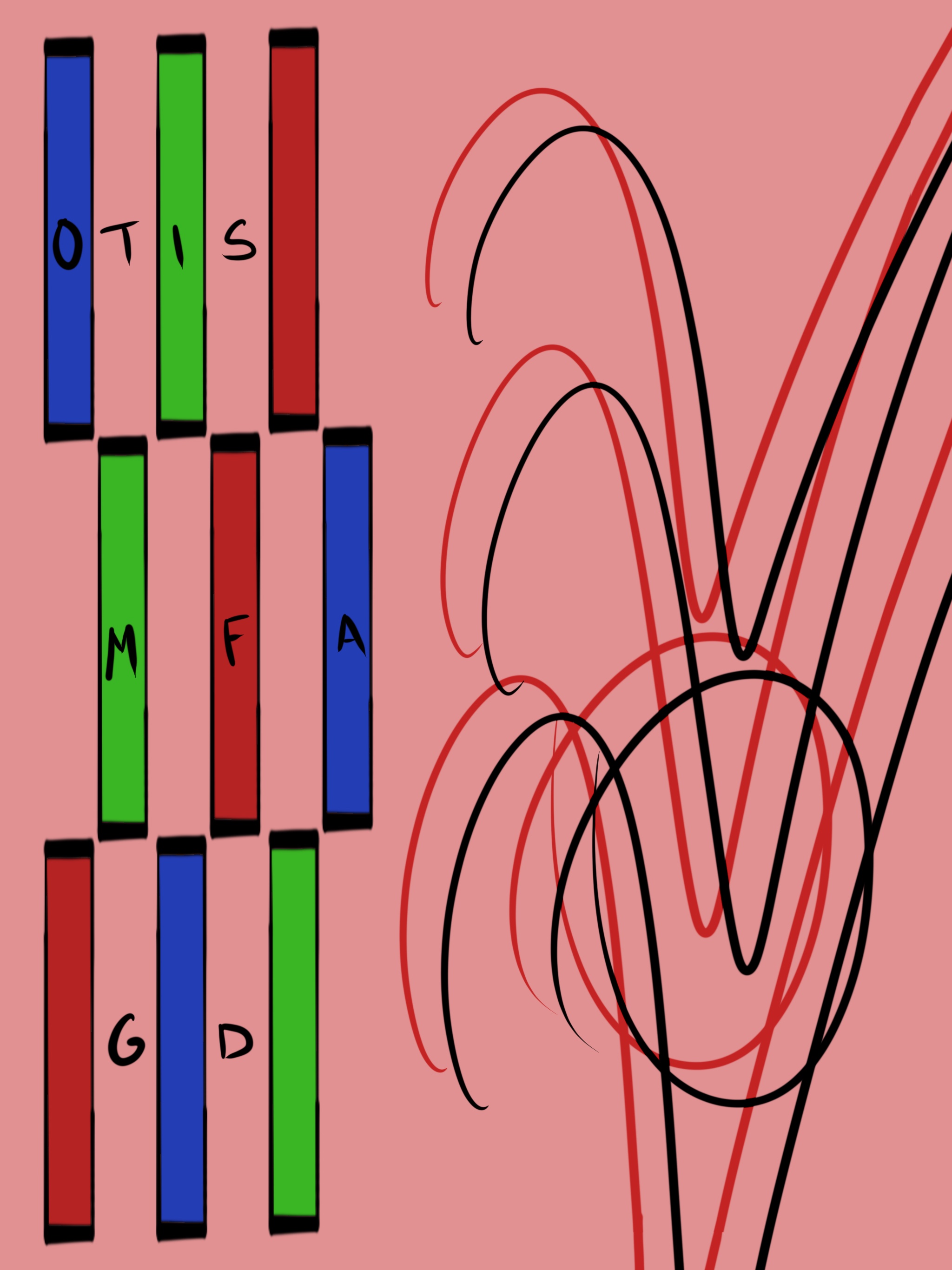
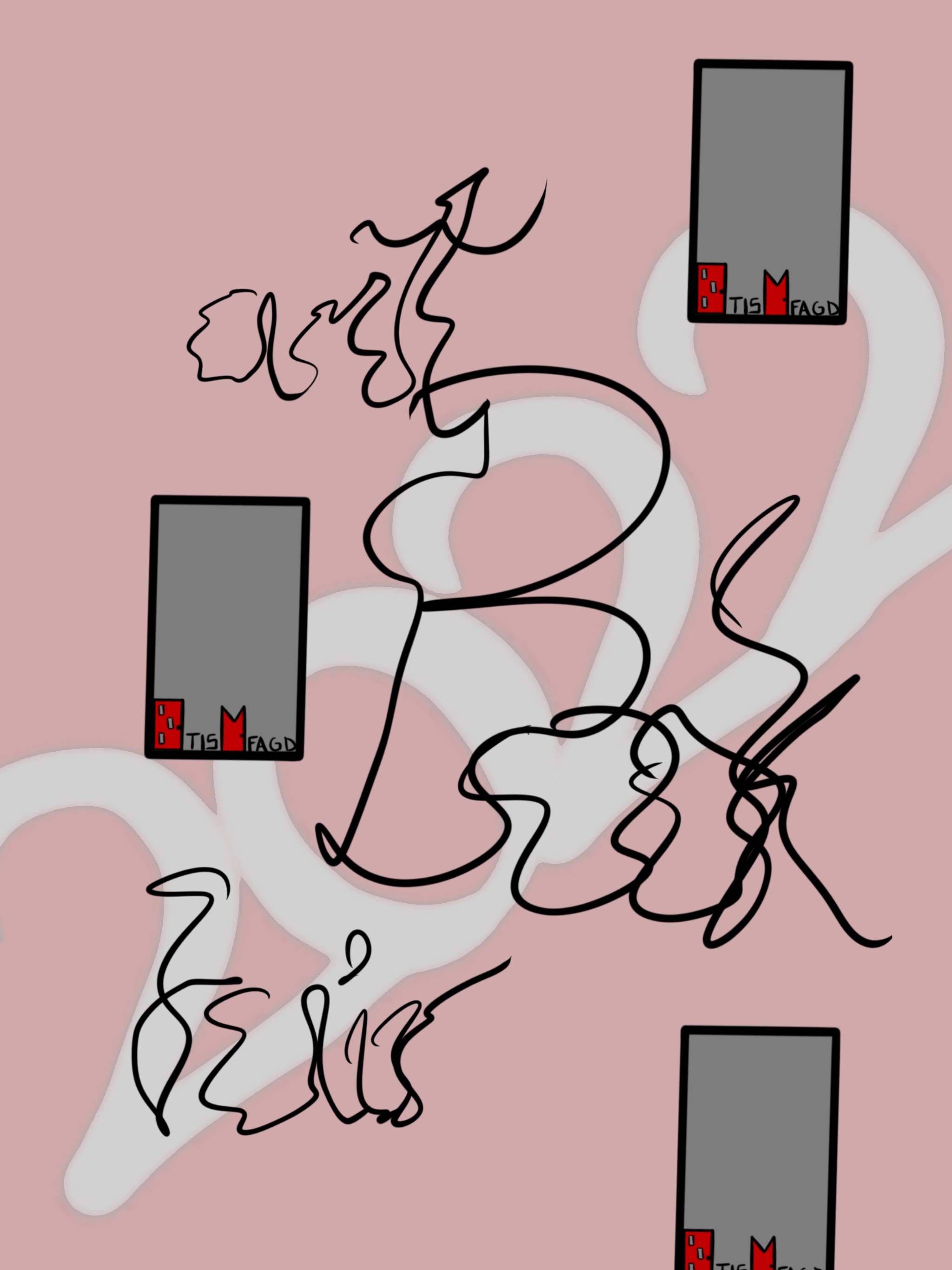
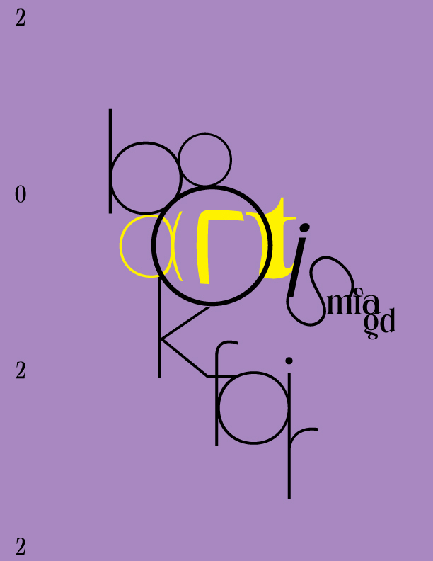
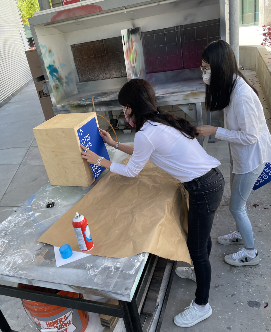
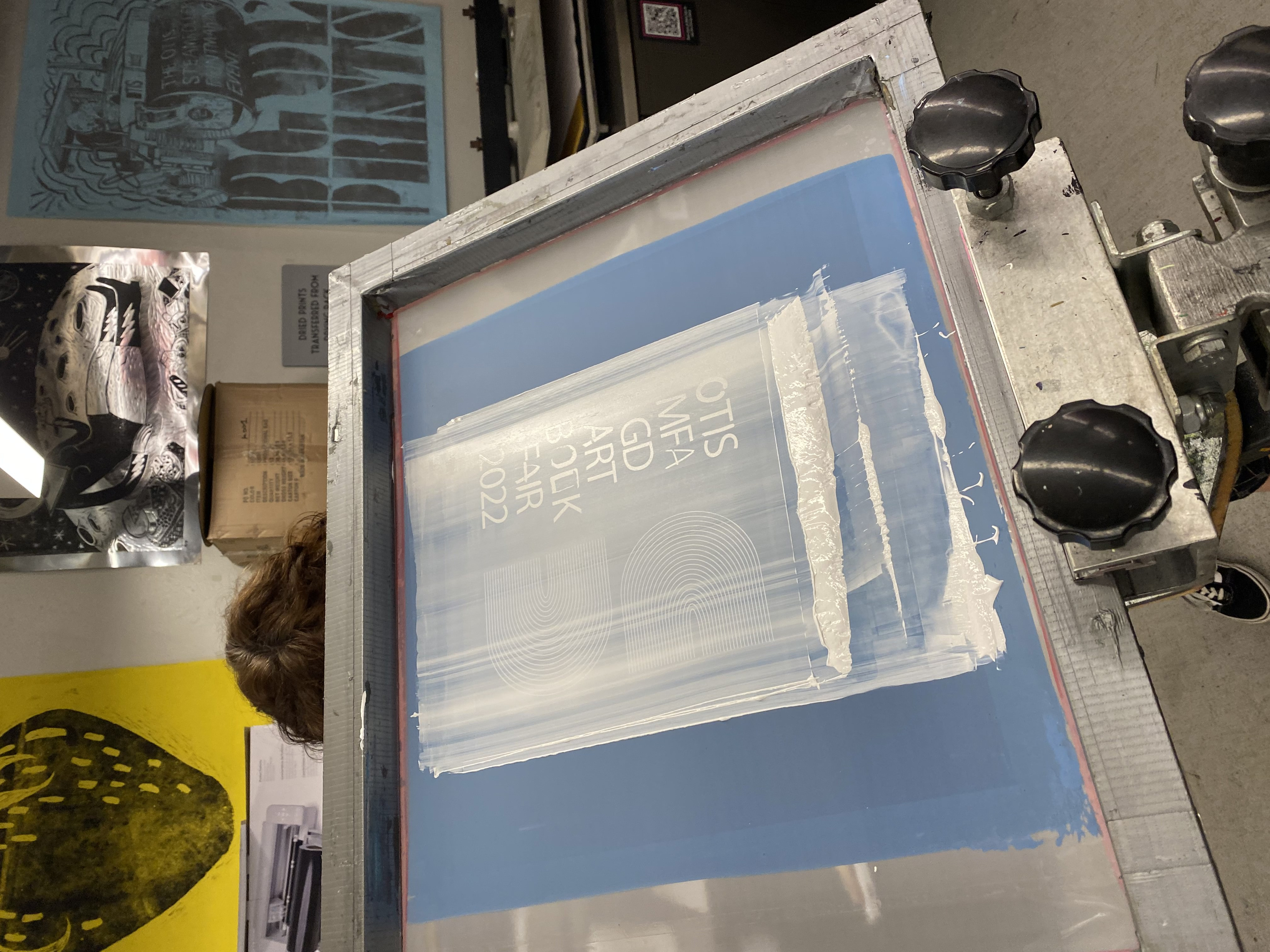
The process for Identity development can be seen below, along with some of my first iterations for the identity —
