A Game of Gods: Reviving Chaupar
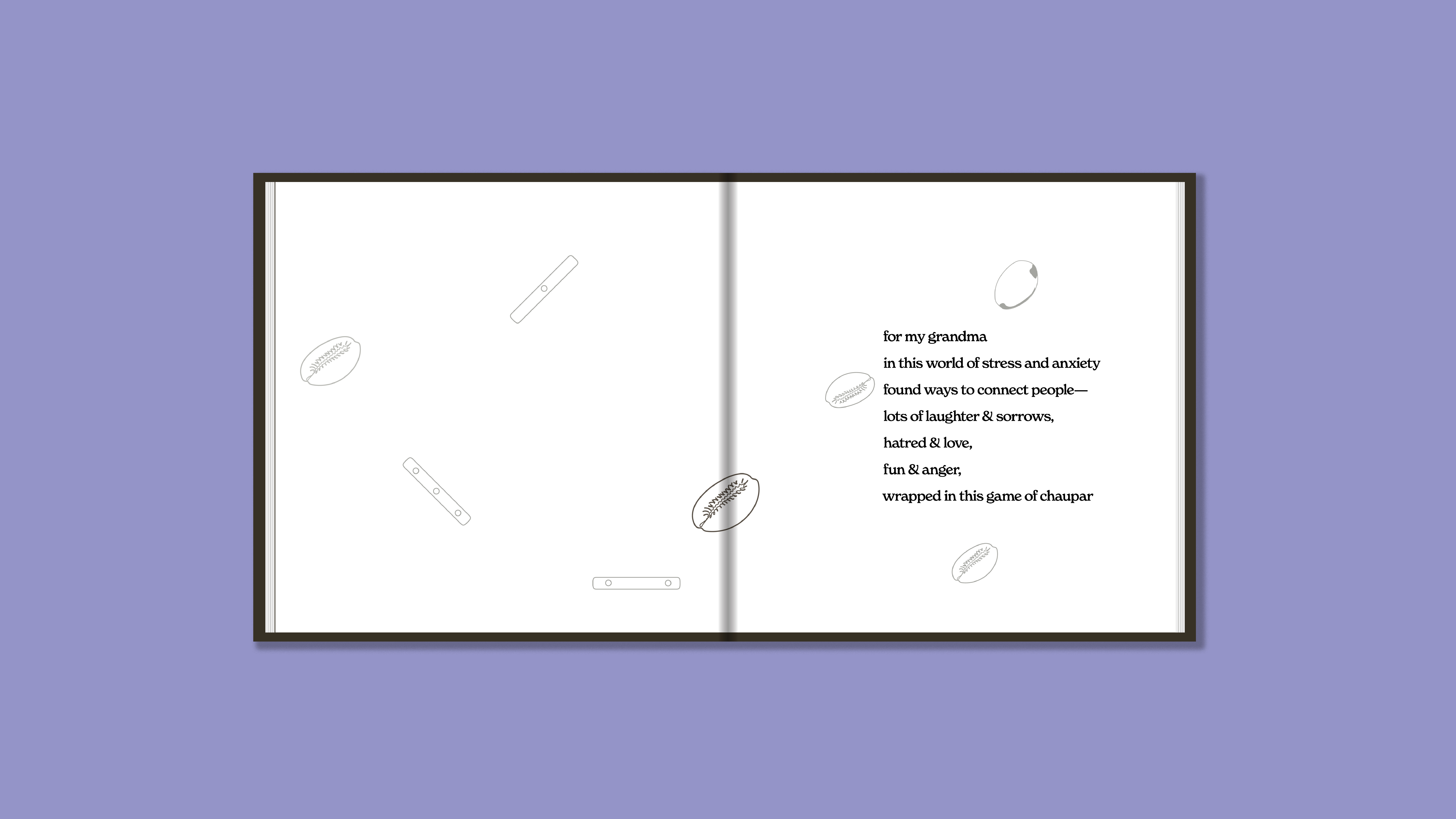
Inspired by my grandmother, a woman who found joy in the simplest of pleasures, I embarked on a journey to revive an ancient Indian game, Chaupar. This project was not just an academic exercise; it was a heartfelt tribute to a beloved figure who introduced me to the world of board games.
Software Used—Adobe InDesign, Adobe Illustrator, Adobe Photoshop, Autodesk AutoCAD, Procreate Categories—Book Design, Publication Design, Package Design, Game Re-Introduction Typefaces Used—New Spirit and Nimbus Sans from Adobe FontsProject Completion—December 2022

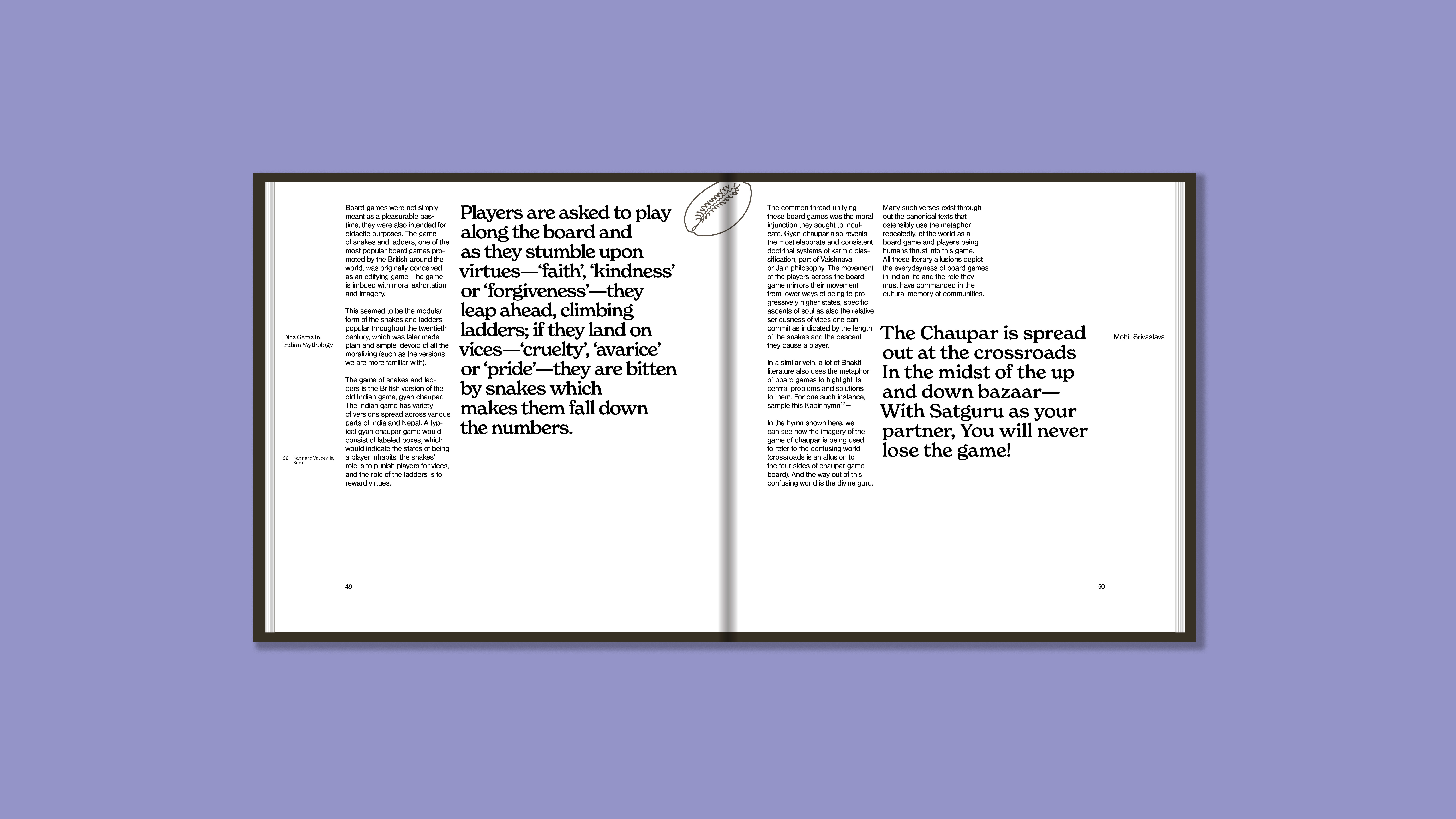
In the heart of ancient India, a game was born, a game believed to be played by the gods themselves. This was Chaupar, a strategic board game that has captivated minds for centuries. However, over time, its grandeur faded, and it transformed from a revered pastime to a child's game.

A Journey Through Time
As I delved into the history of Chaupar, I was intrigued by its transformation. From the celestial realms of the Gods to the earthly courts of emperors, the game has witnessed centuries of cultural shifts. I wanted to capture this journey, to bring the past alive for modern readers.Designing a Playful Publication
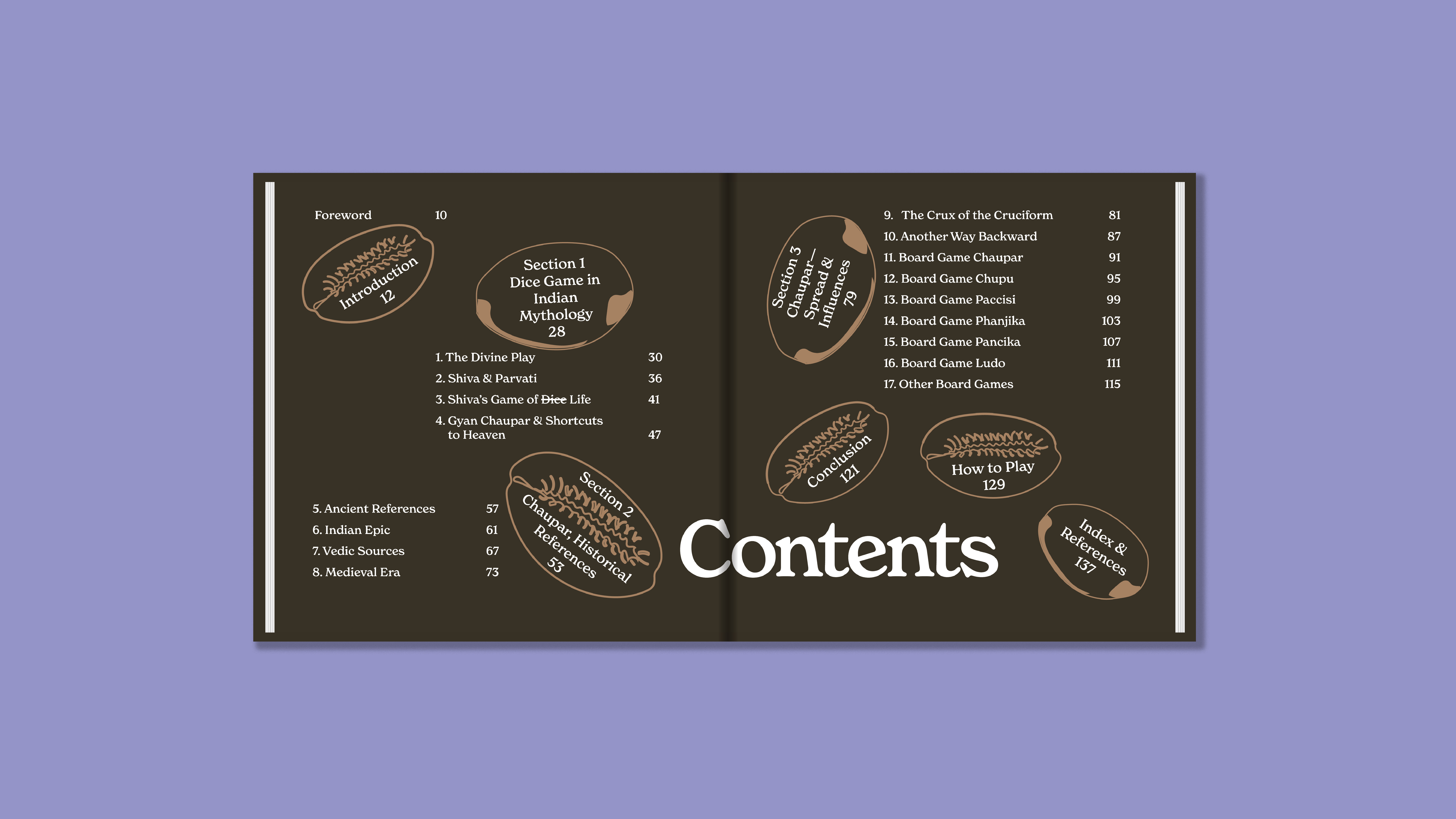
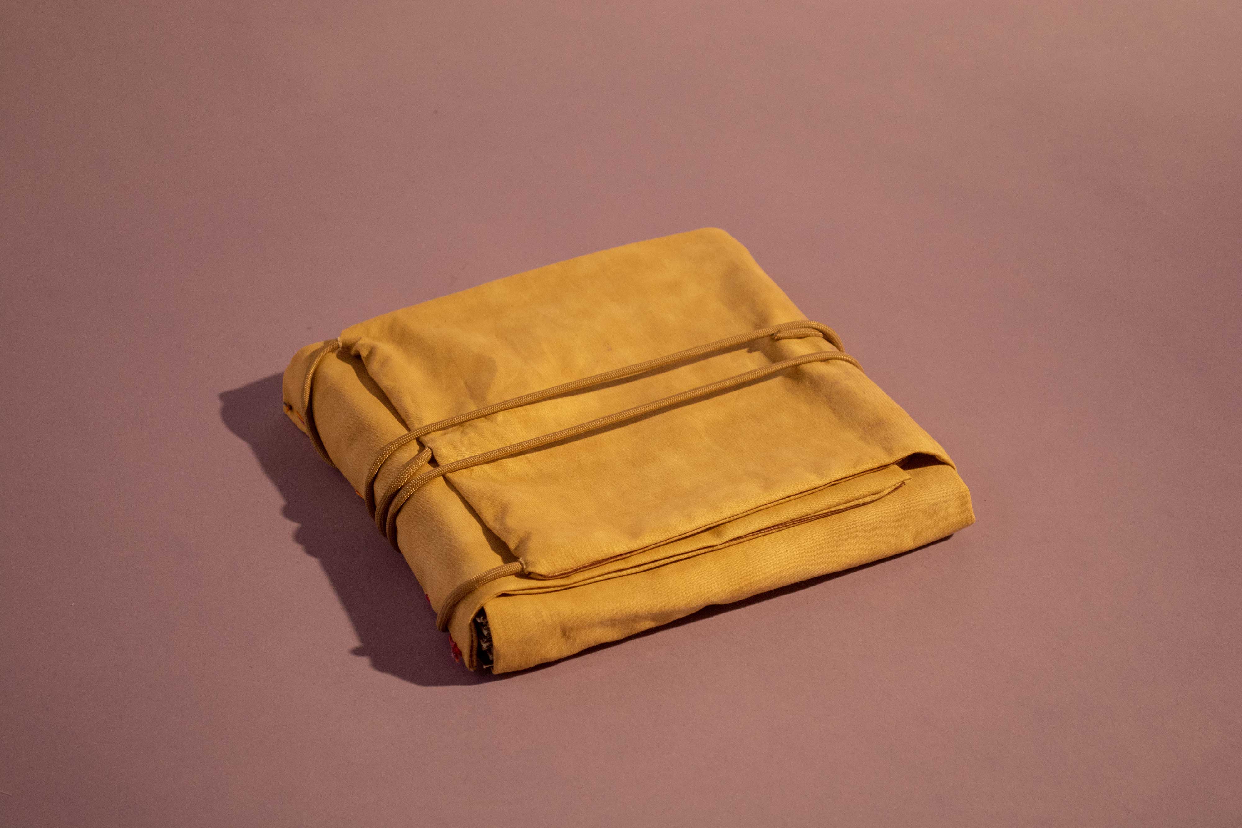
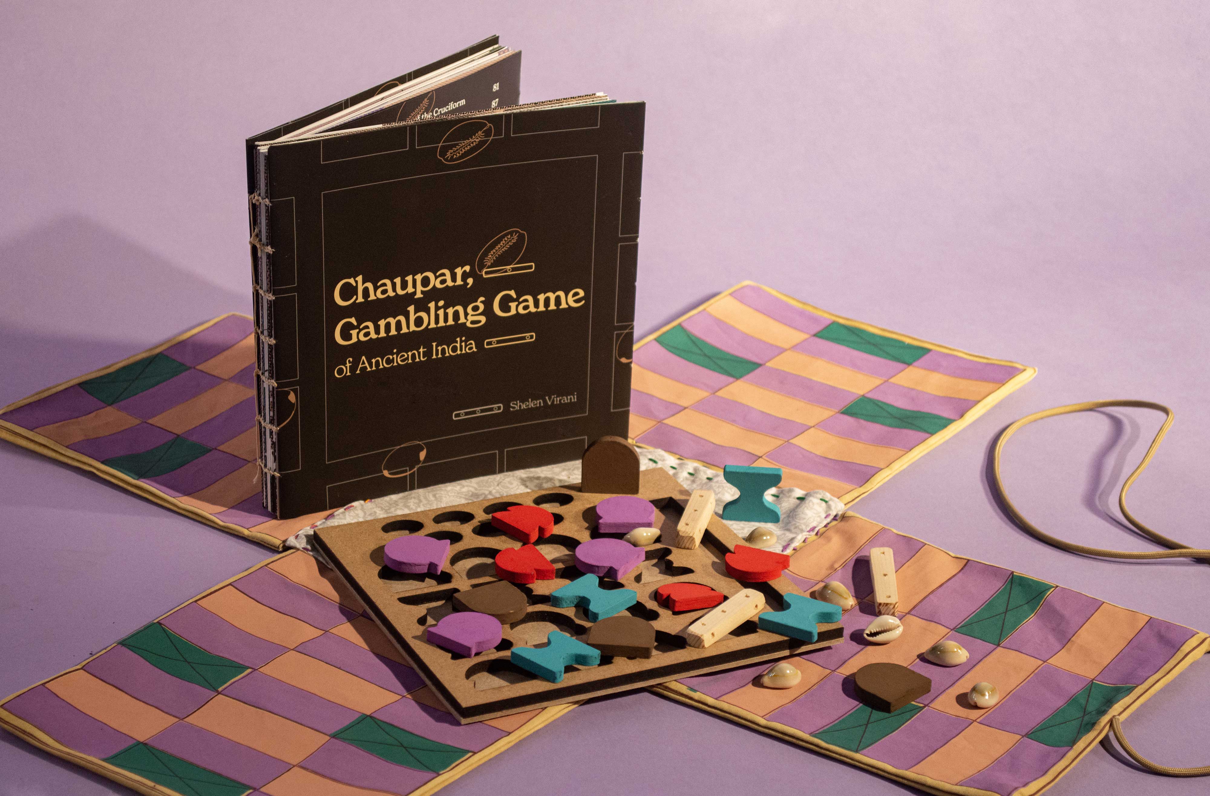
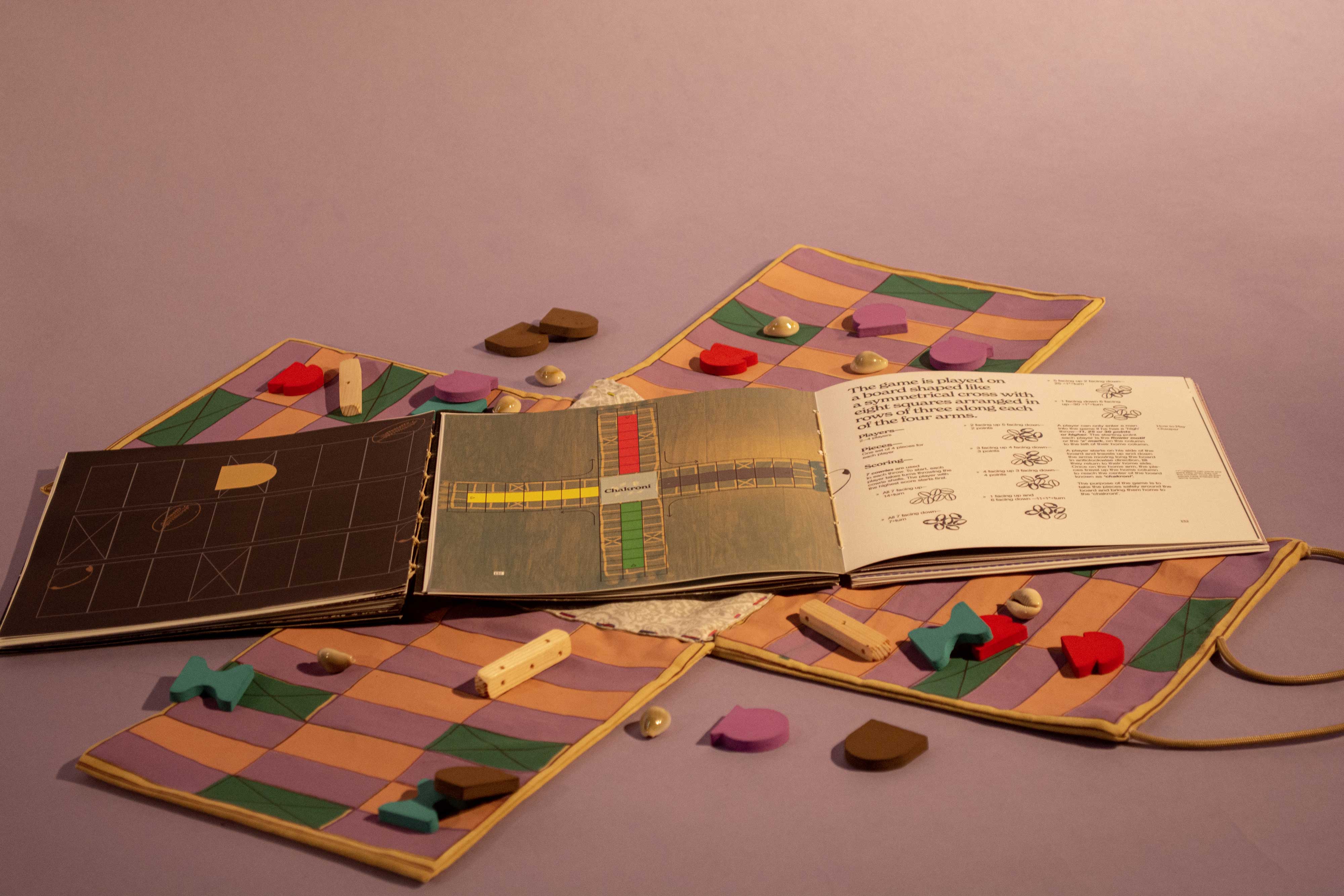
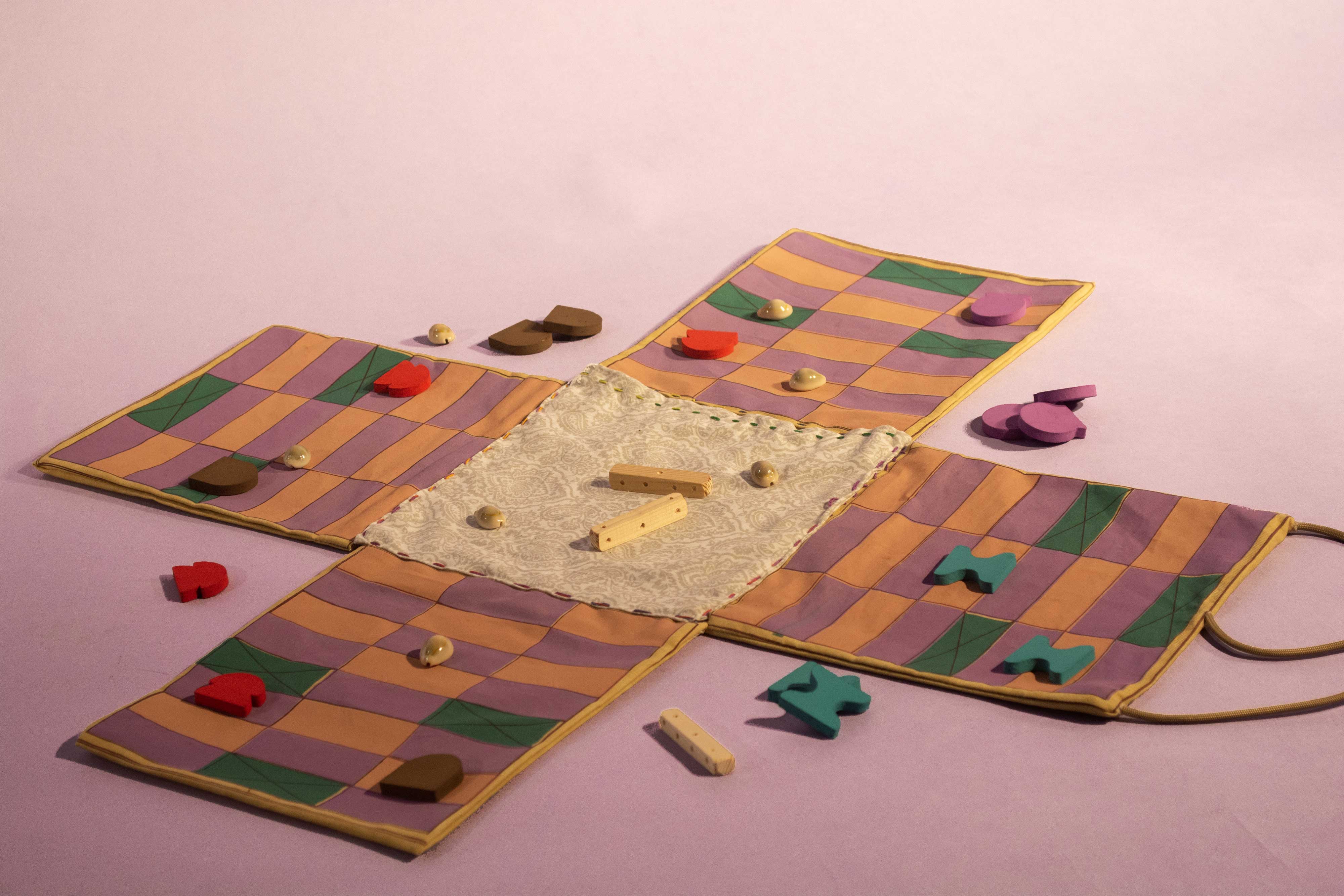
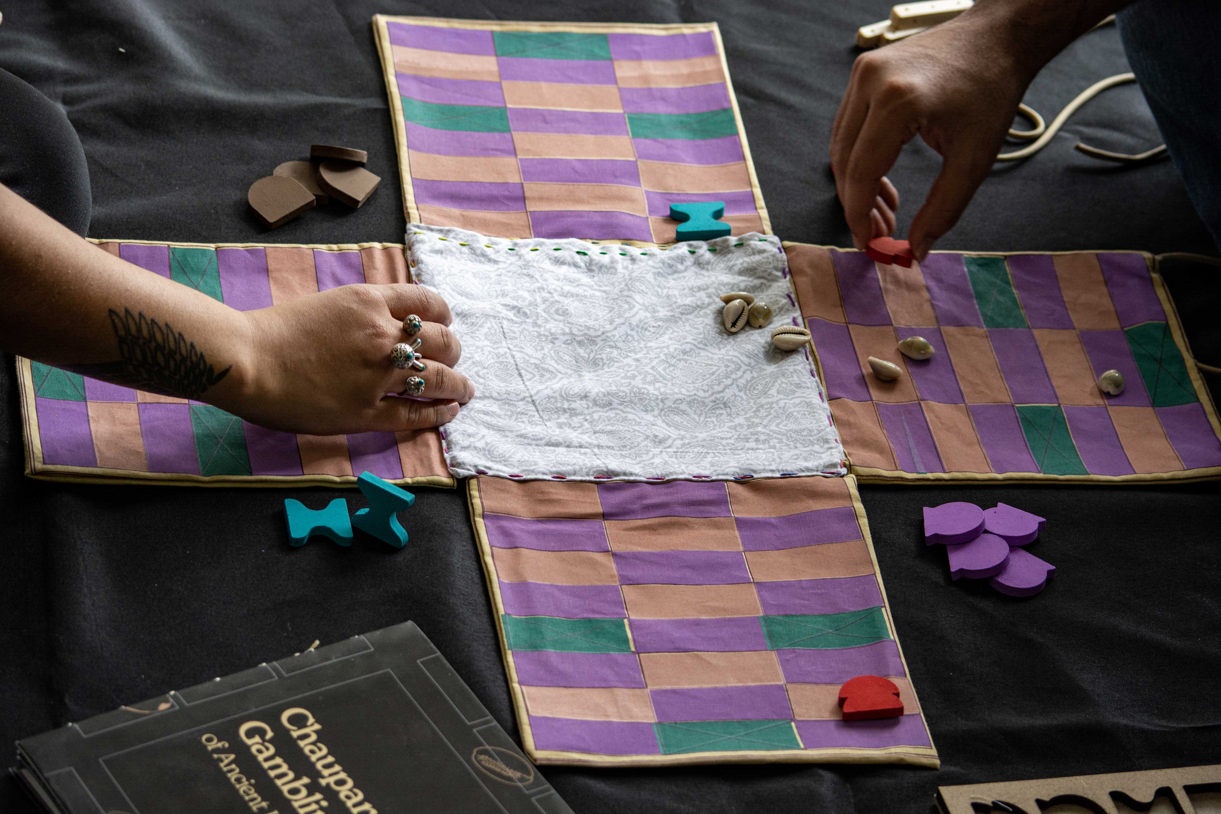
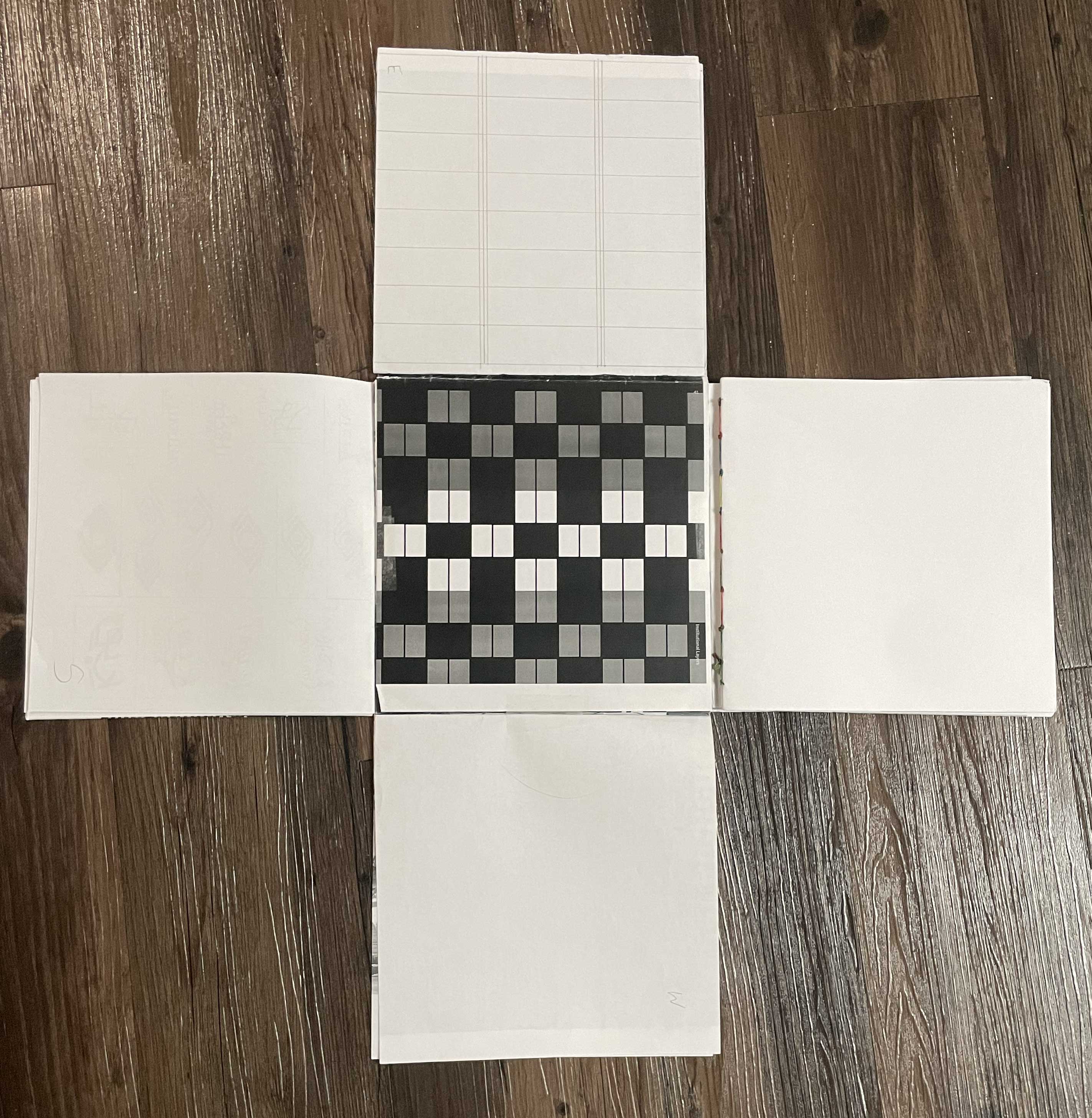
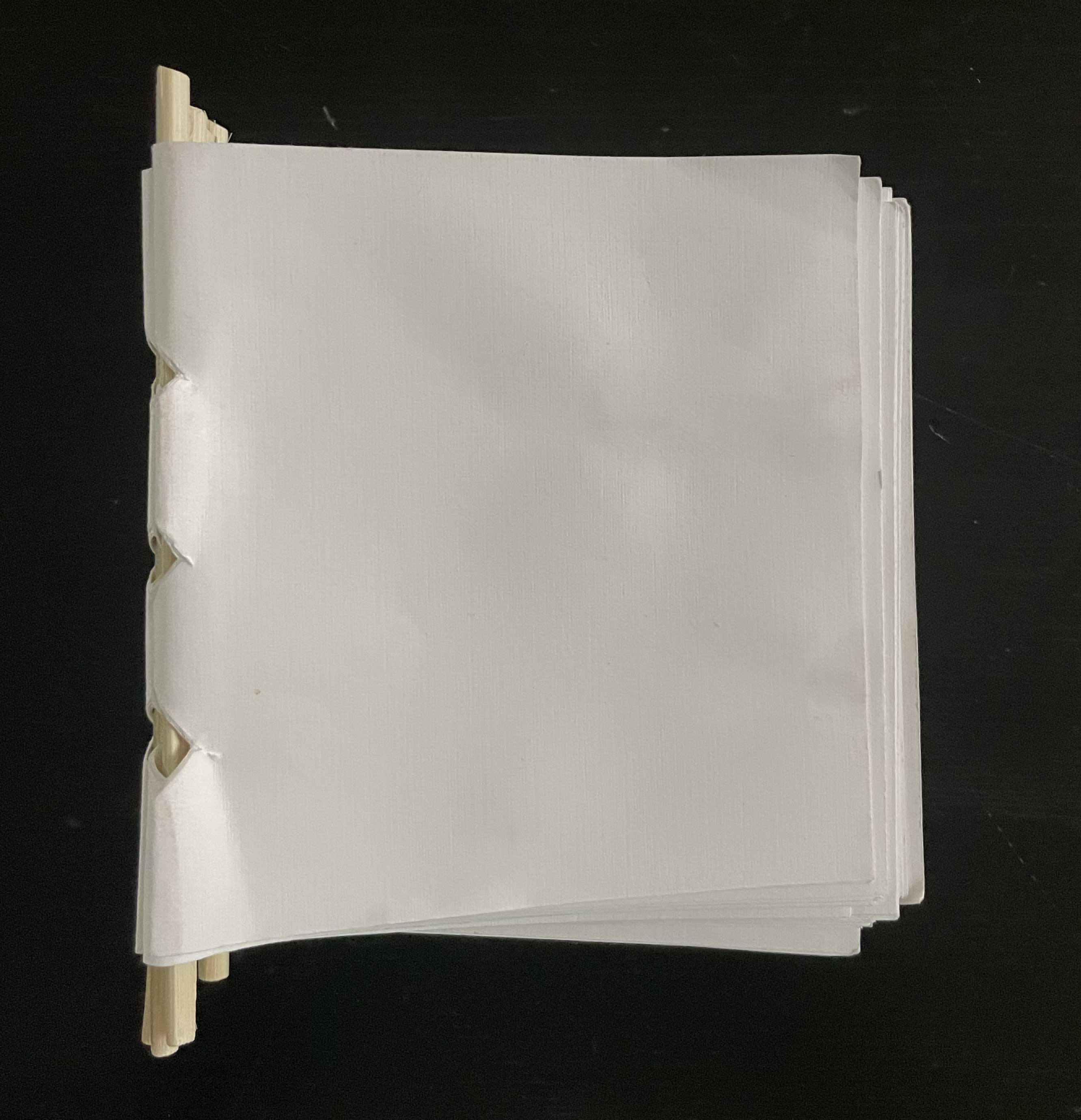
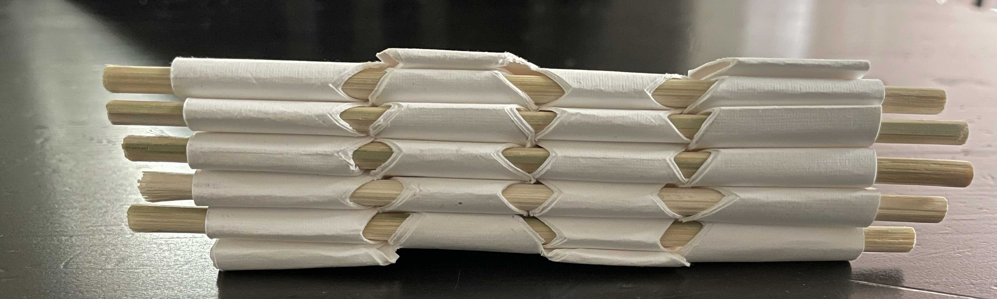
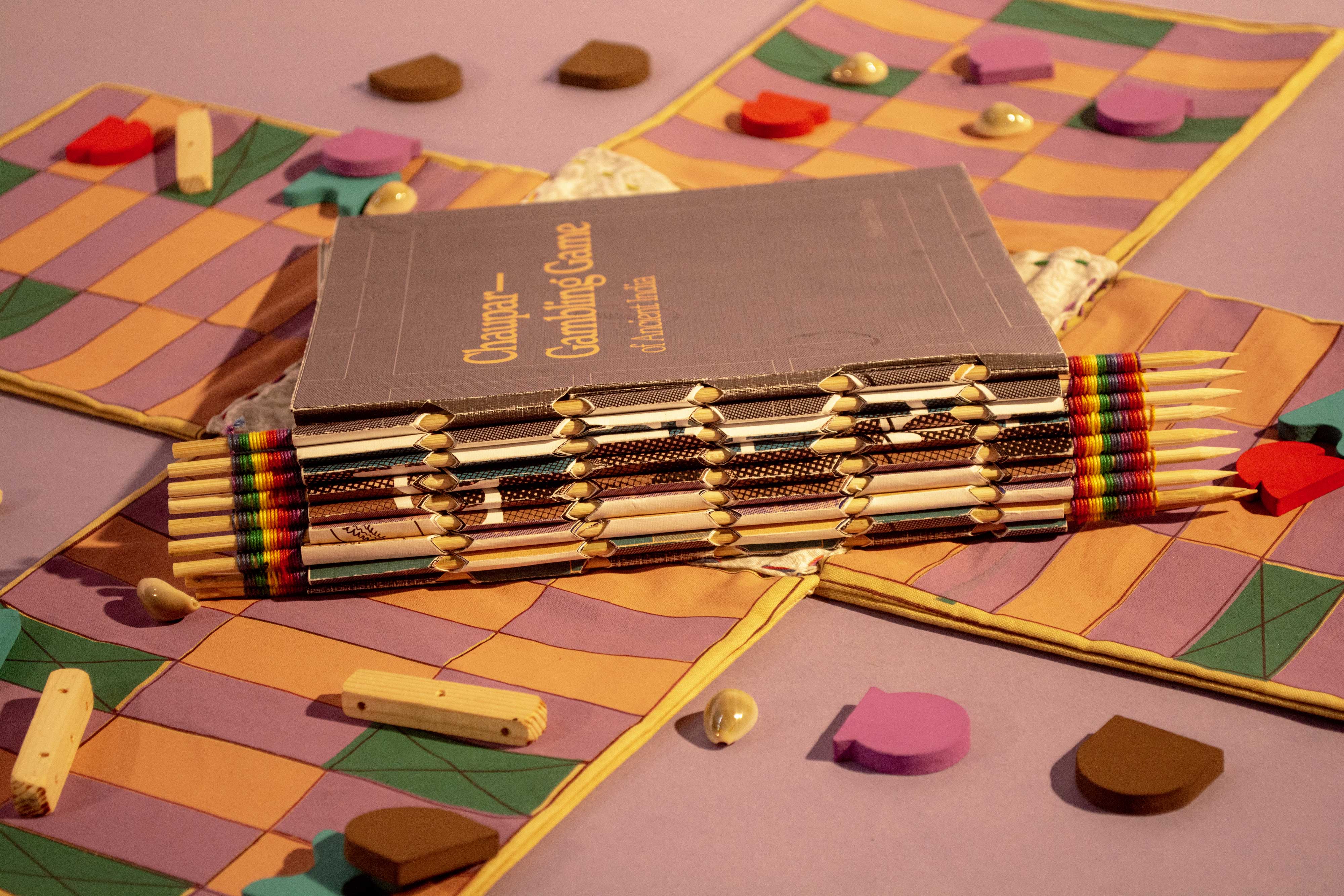
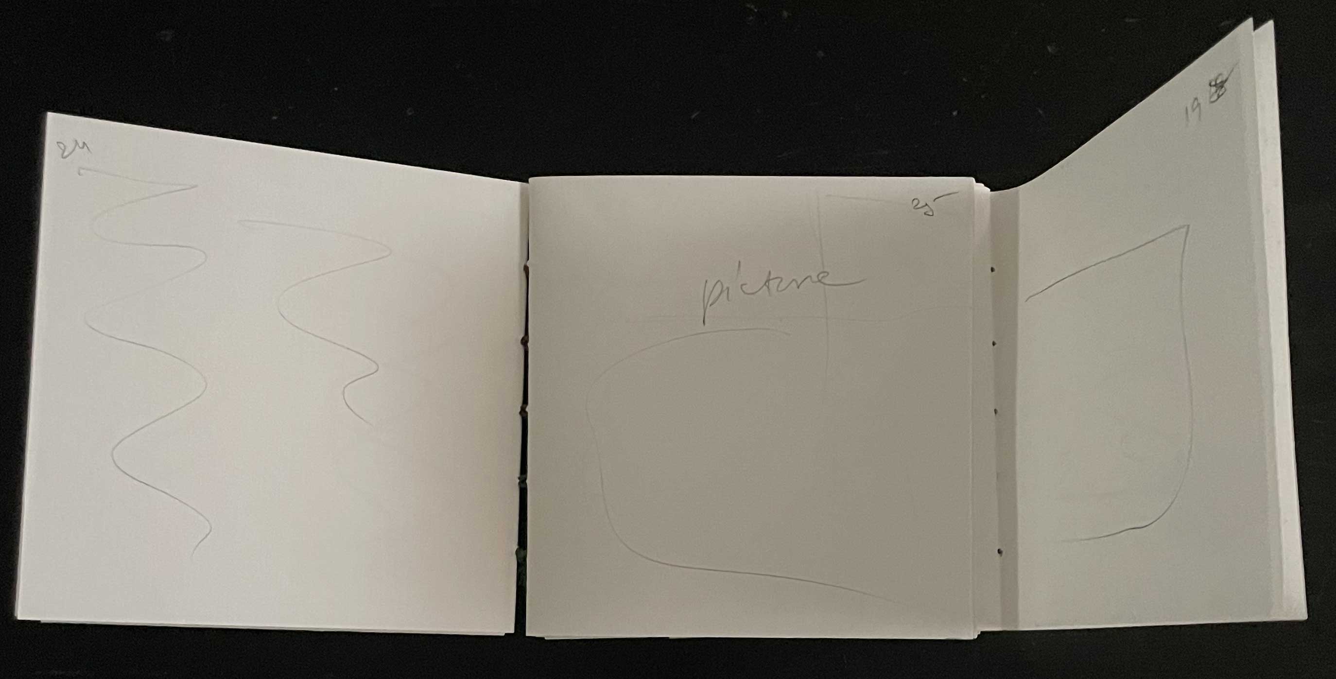
The design of the publication was a crucial aspect of the project. I envisioned a book that would not only inform but also engage. I experimented with various structures, aiming to create a physical experience that mirrored the gameplay itself.Initially, I explored the idea of a book that could be unfolded into a game board. While intriguing, this approach presented challenges in terms of navigation and readability. I pivoted to a more traditional book format, but with a twist: a two-directional opening that revealed both the historical narrative and the game rules.


A Visual Feast
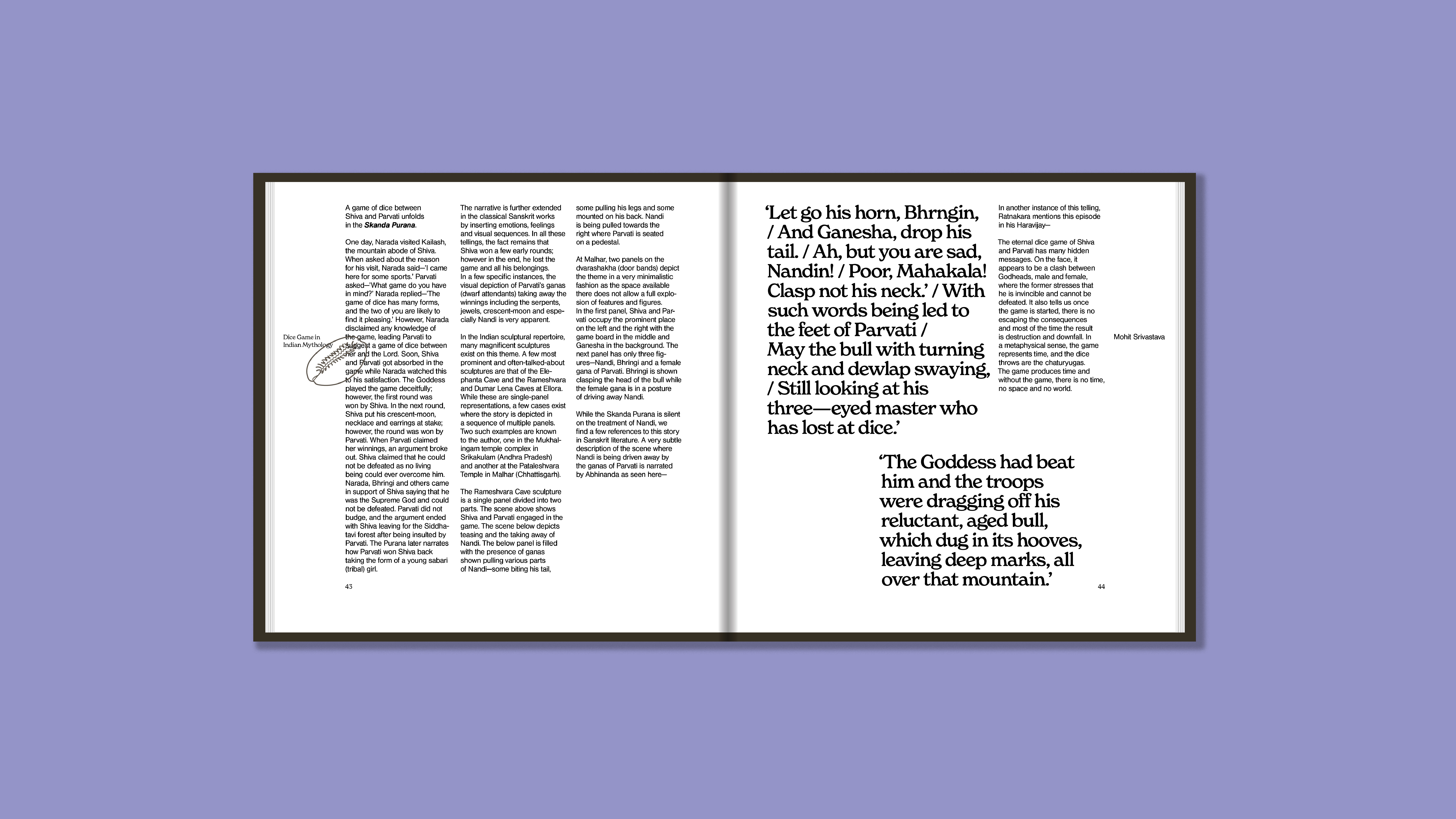
The visual language of the publication was carefully considered. I chose typefaces that evoked a sense of both antiquity and modernity. The layout, inspired by the game board's three-column grid, creates a visually striking and informative experience.By combining historical research, innovative design, and a passion for ancient games, I hope to inspire a new generation of Chaupar enthusiasts.
Final Product:
A Glimpse Inside