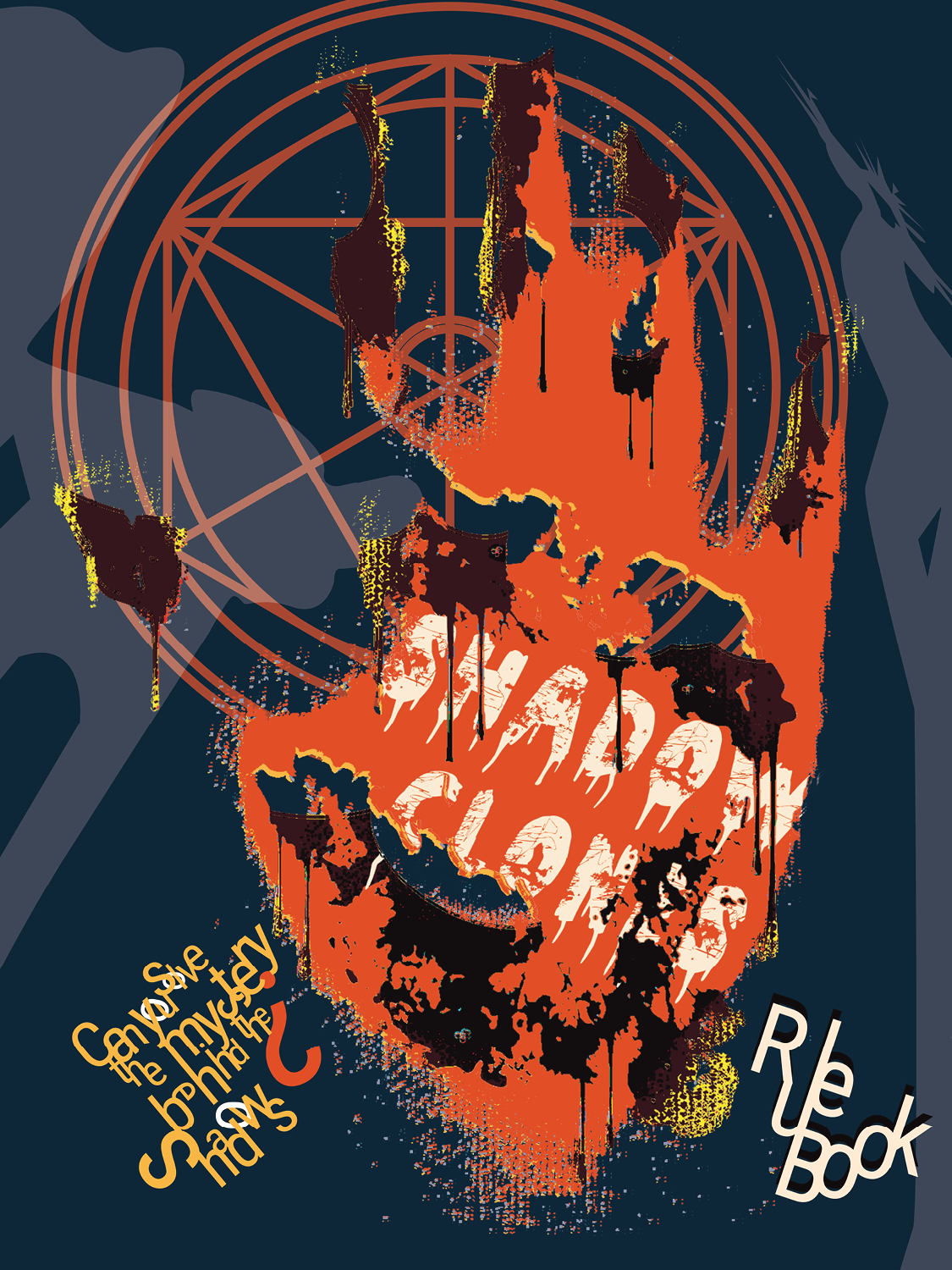
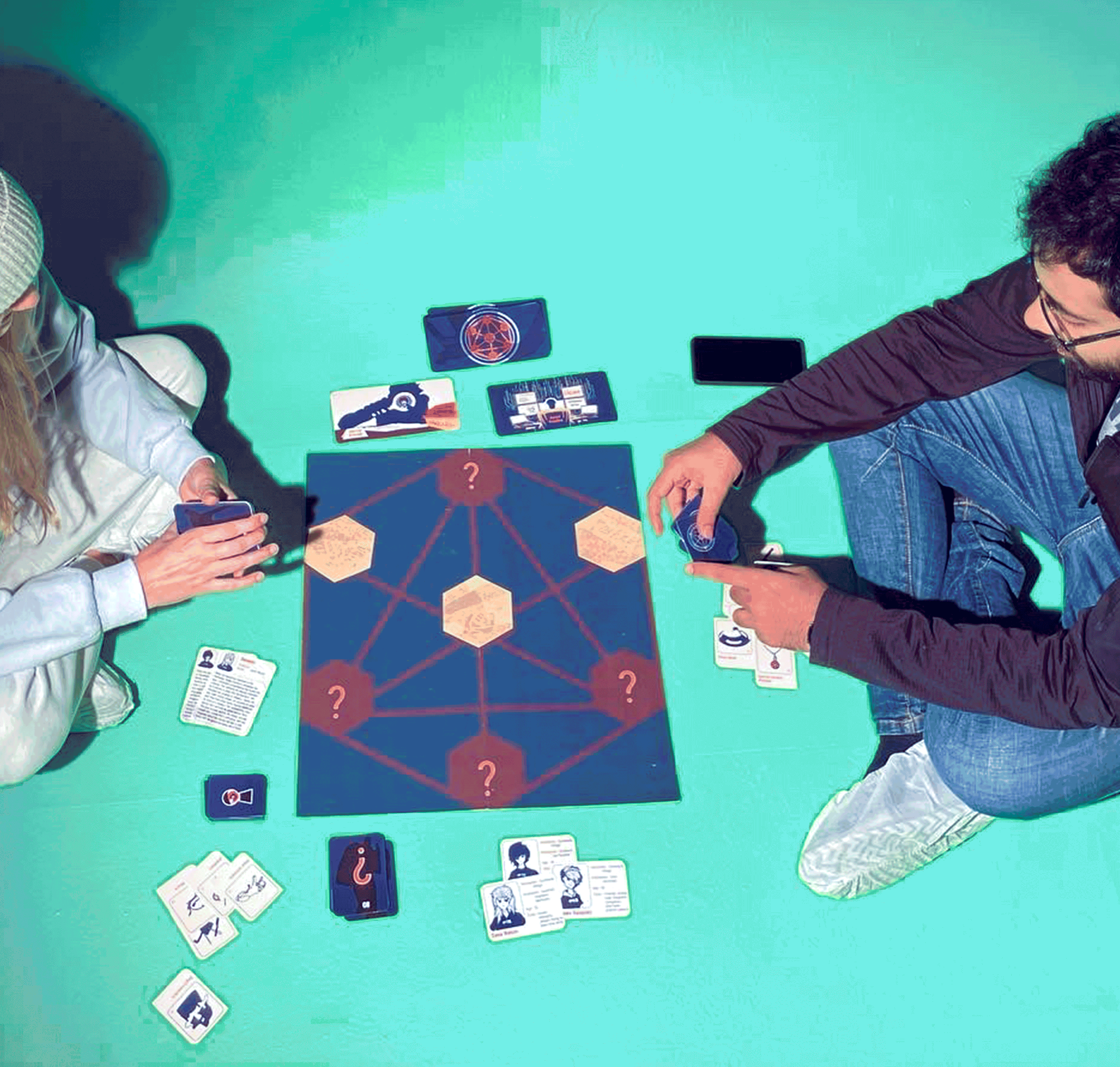
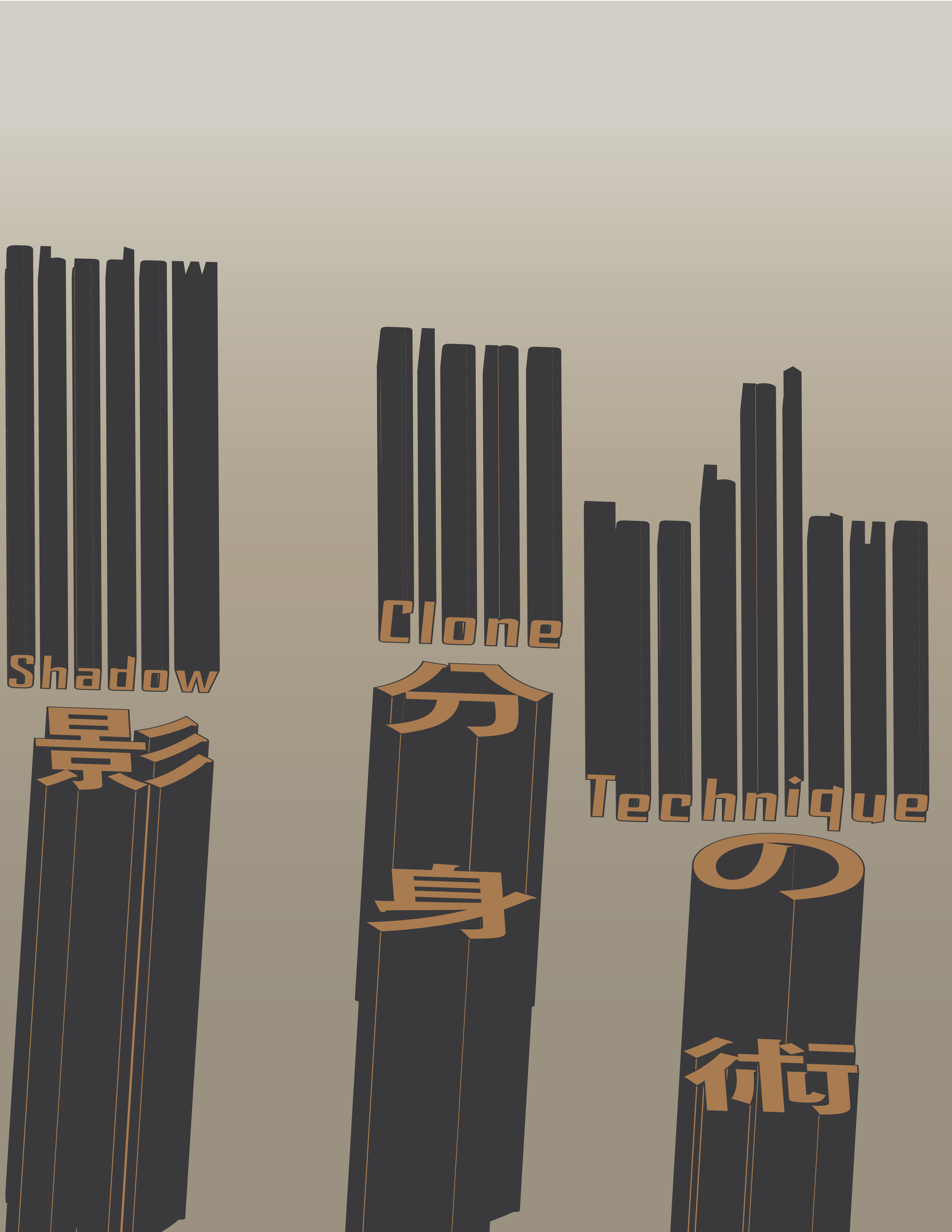
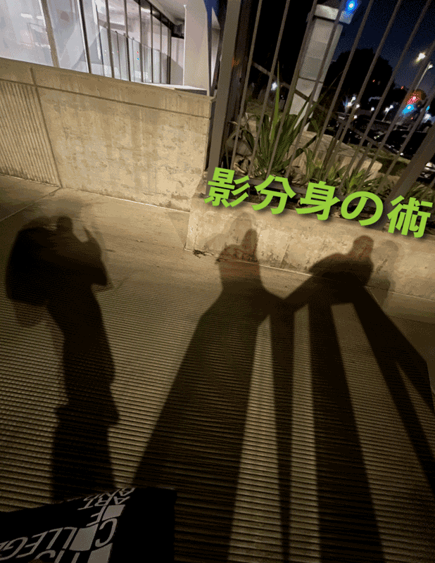
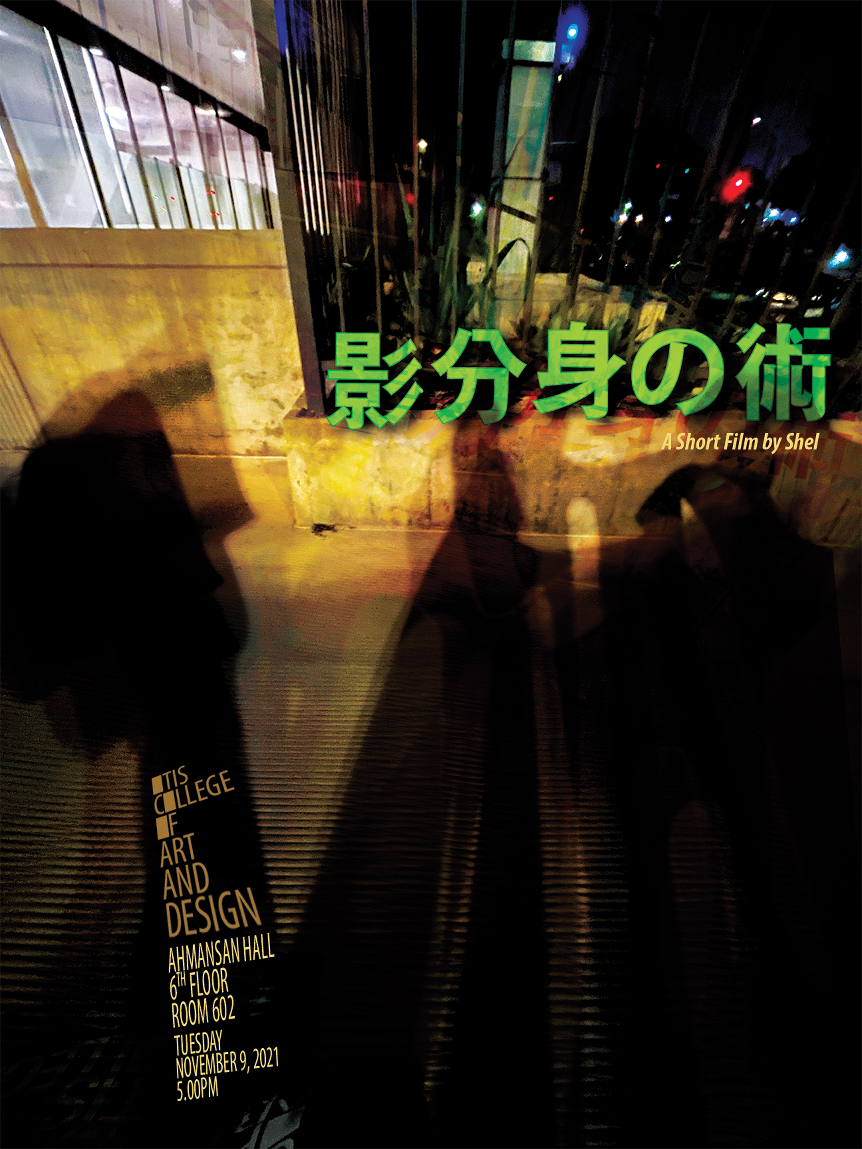
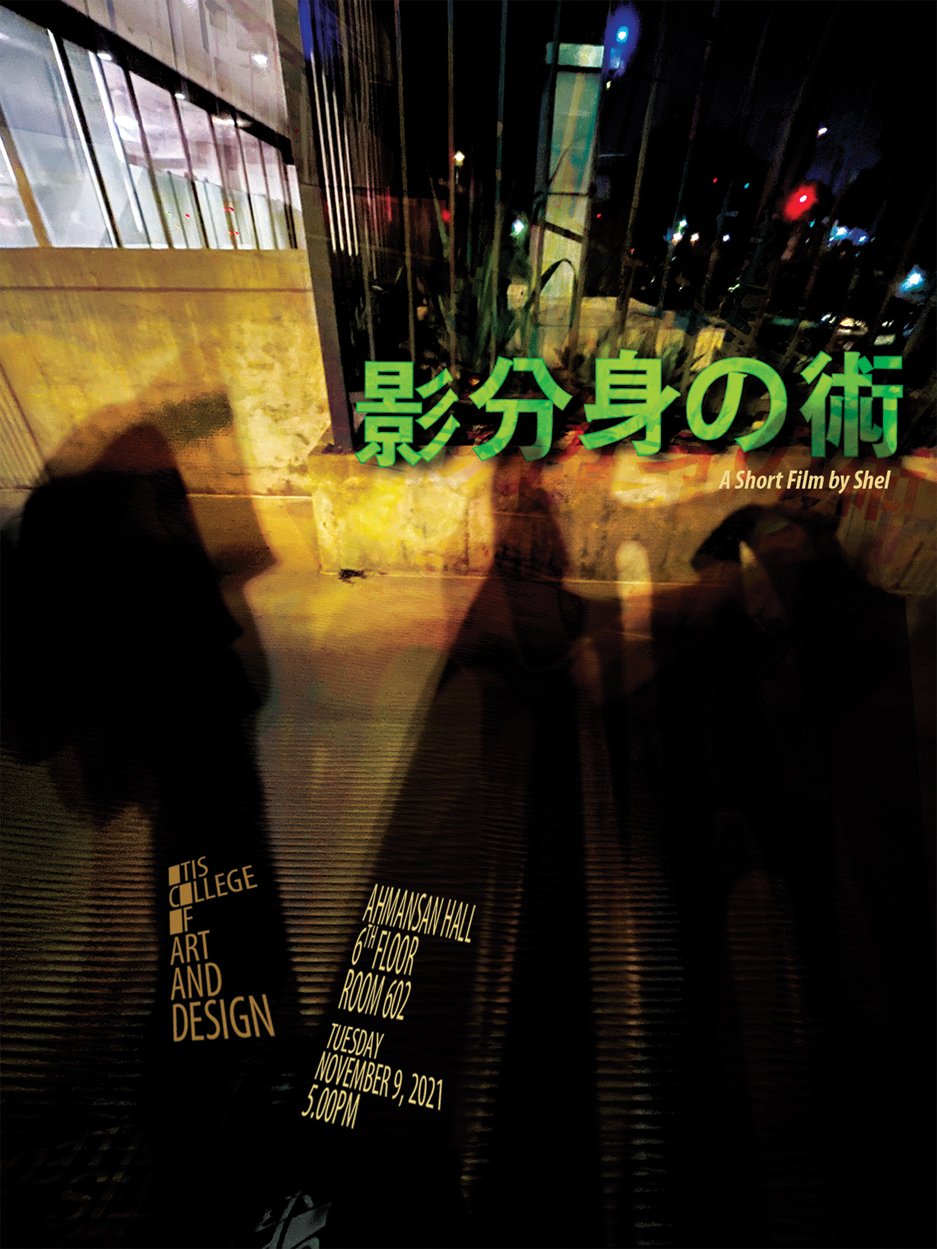
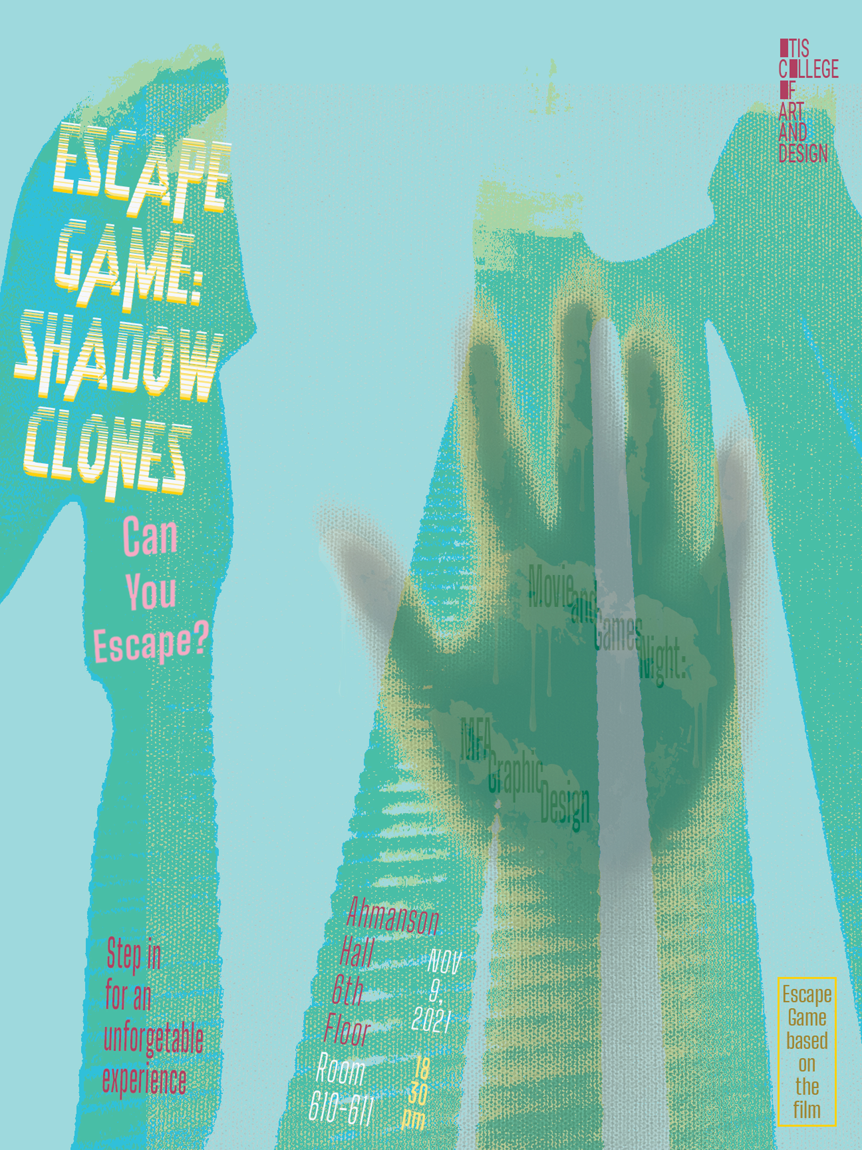
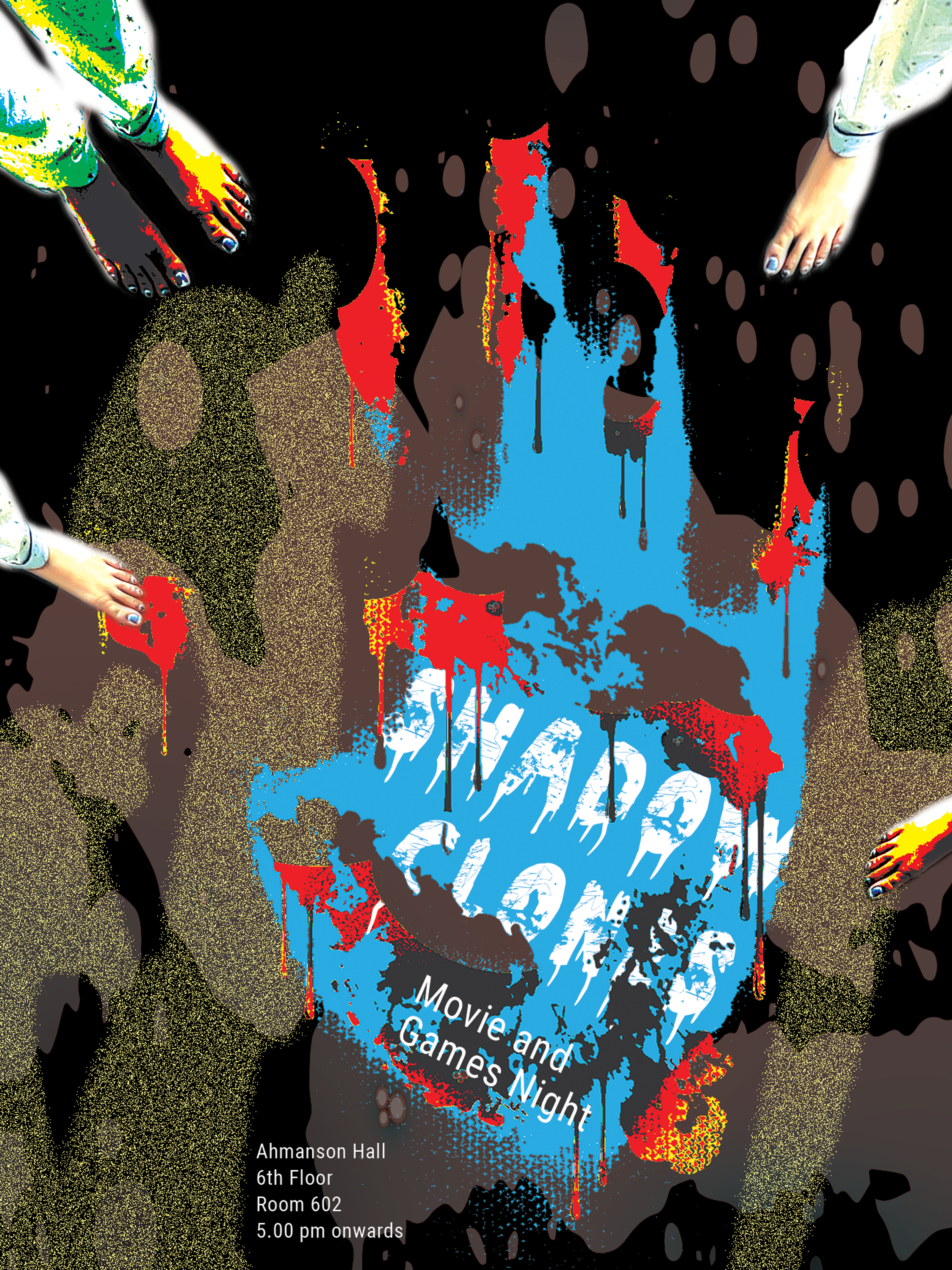
Shadow Clones
A board game with the main focus on visual design, making it visually intriguing and mysterious at the same time. This was my first ever board game, and I took inspiration from various anime to design and generate a story for the game. This game is based on the concept of murder mystery.
Software Used—Adobe Illustrator, Adobe InDesign, Adobe Photoshop and Procreate Categories—Board Game Design, Visual Design, Poster Design, GIF Making, Murder-Mystery Games, Detective GamesProject Completion—December 2021


Concept and Ideation:
Starting with a theme of time, creating posters and developing a poster to invite people for a topic that resembled to a time that felt like a mystery, I created a game that was based on something that I particularly am intrigued about.
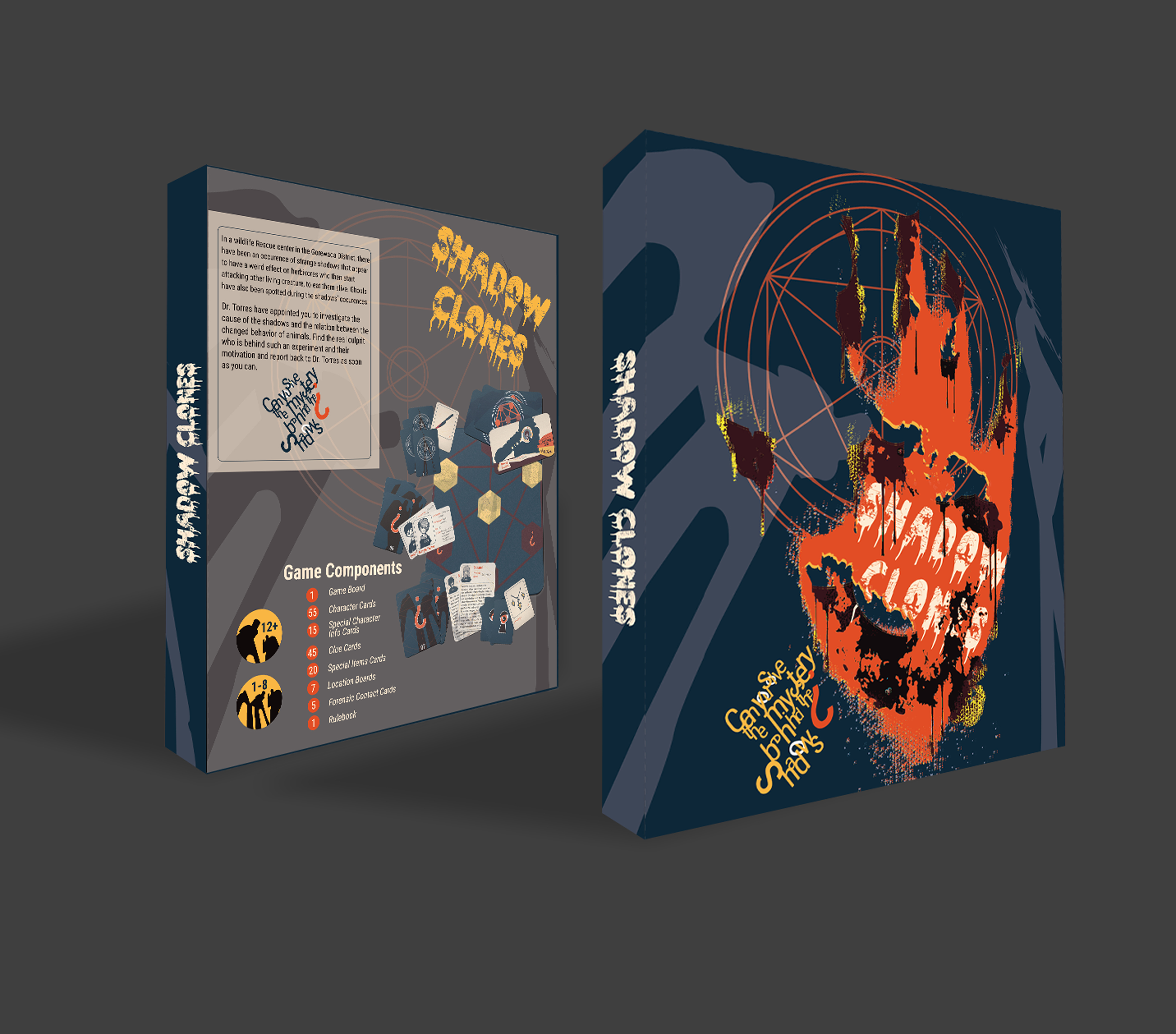
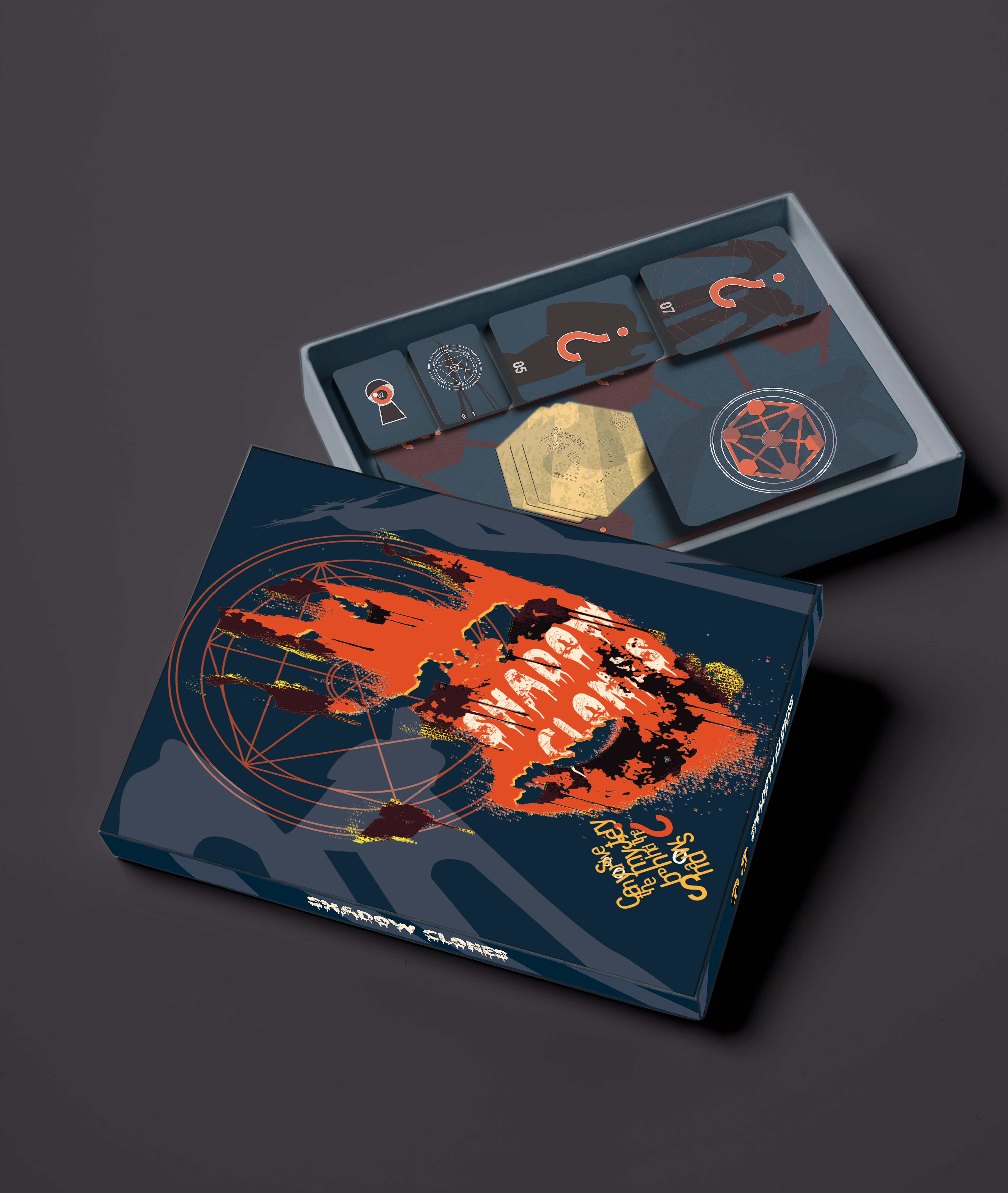
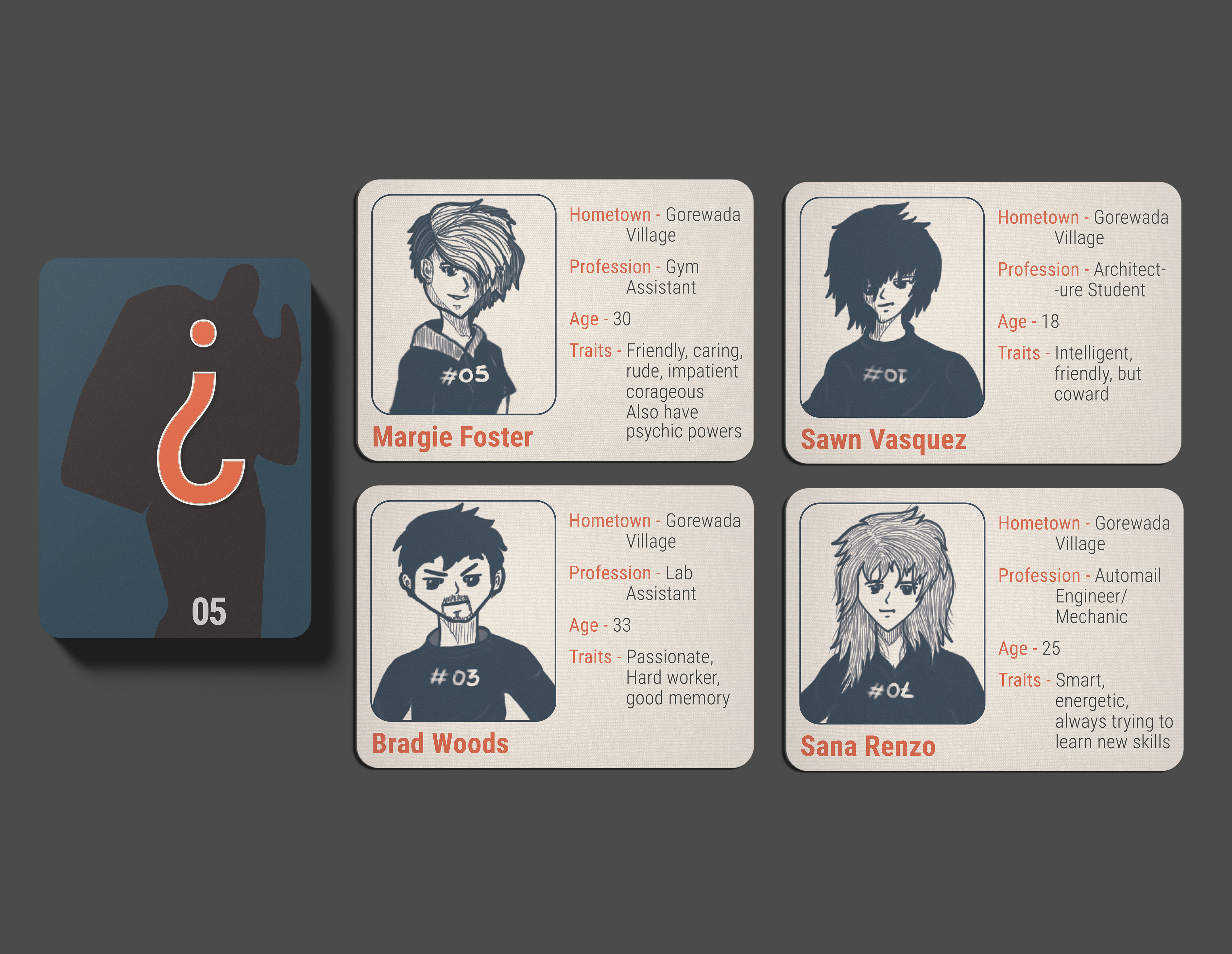
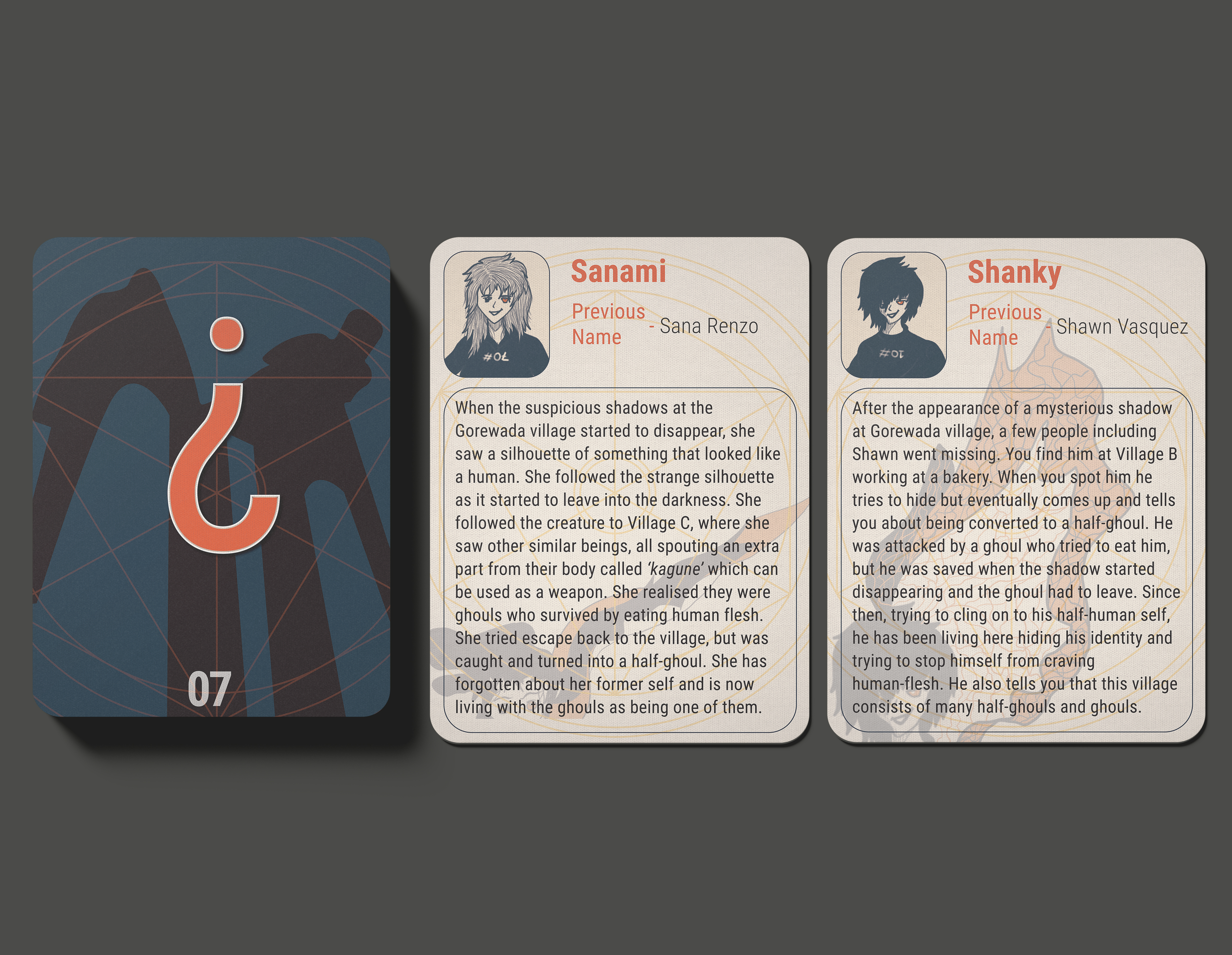
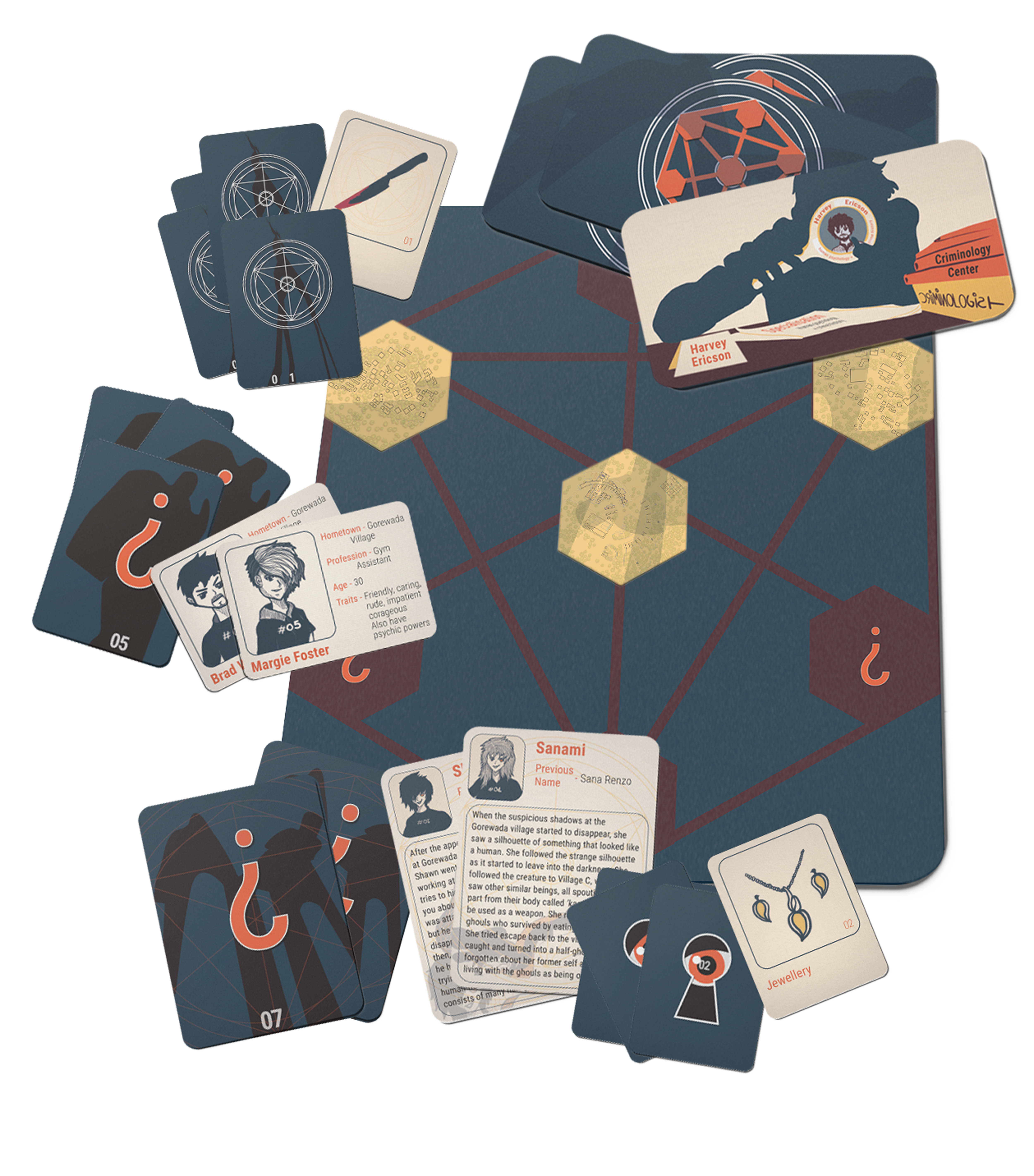
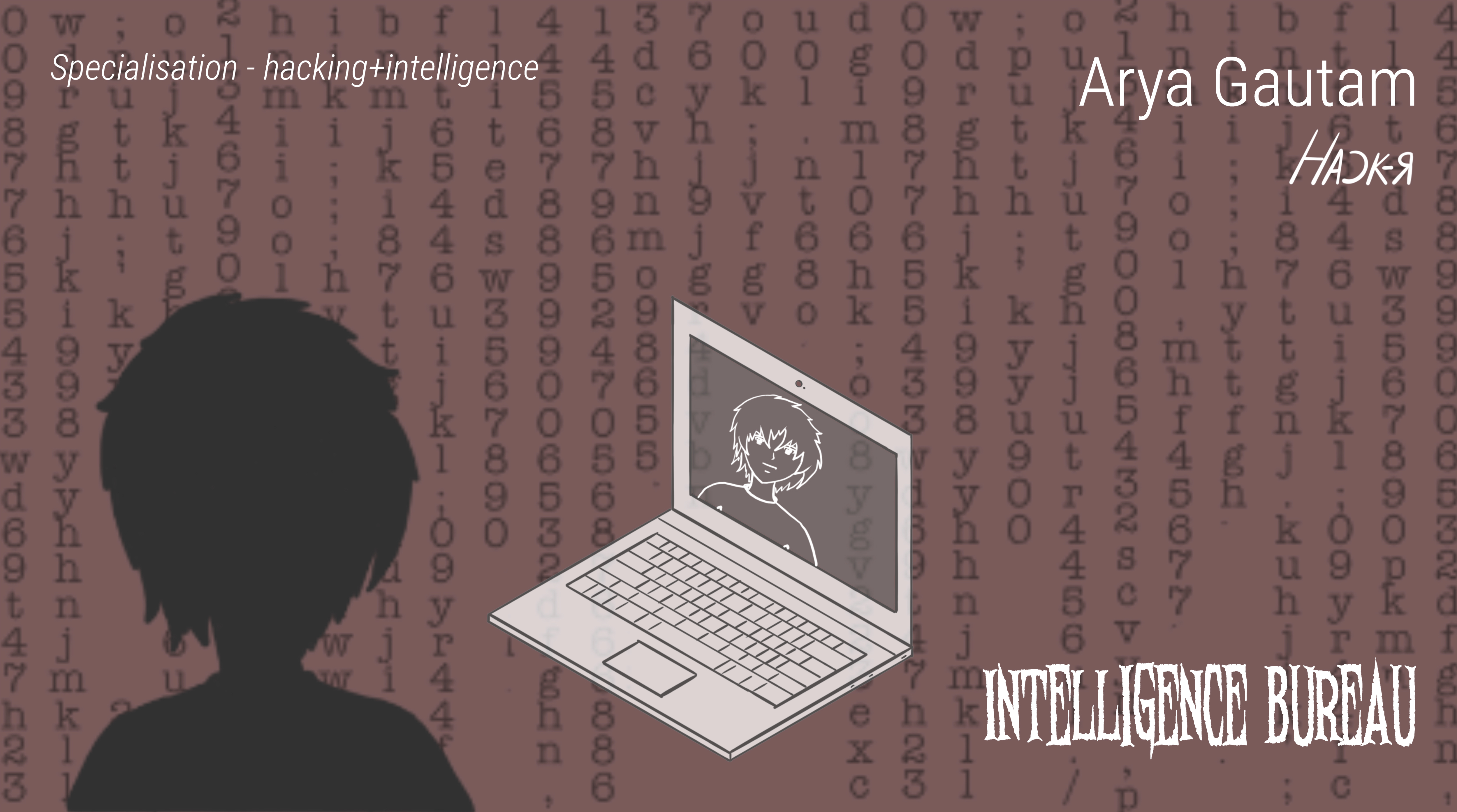
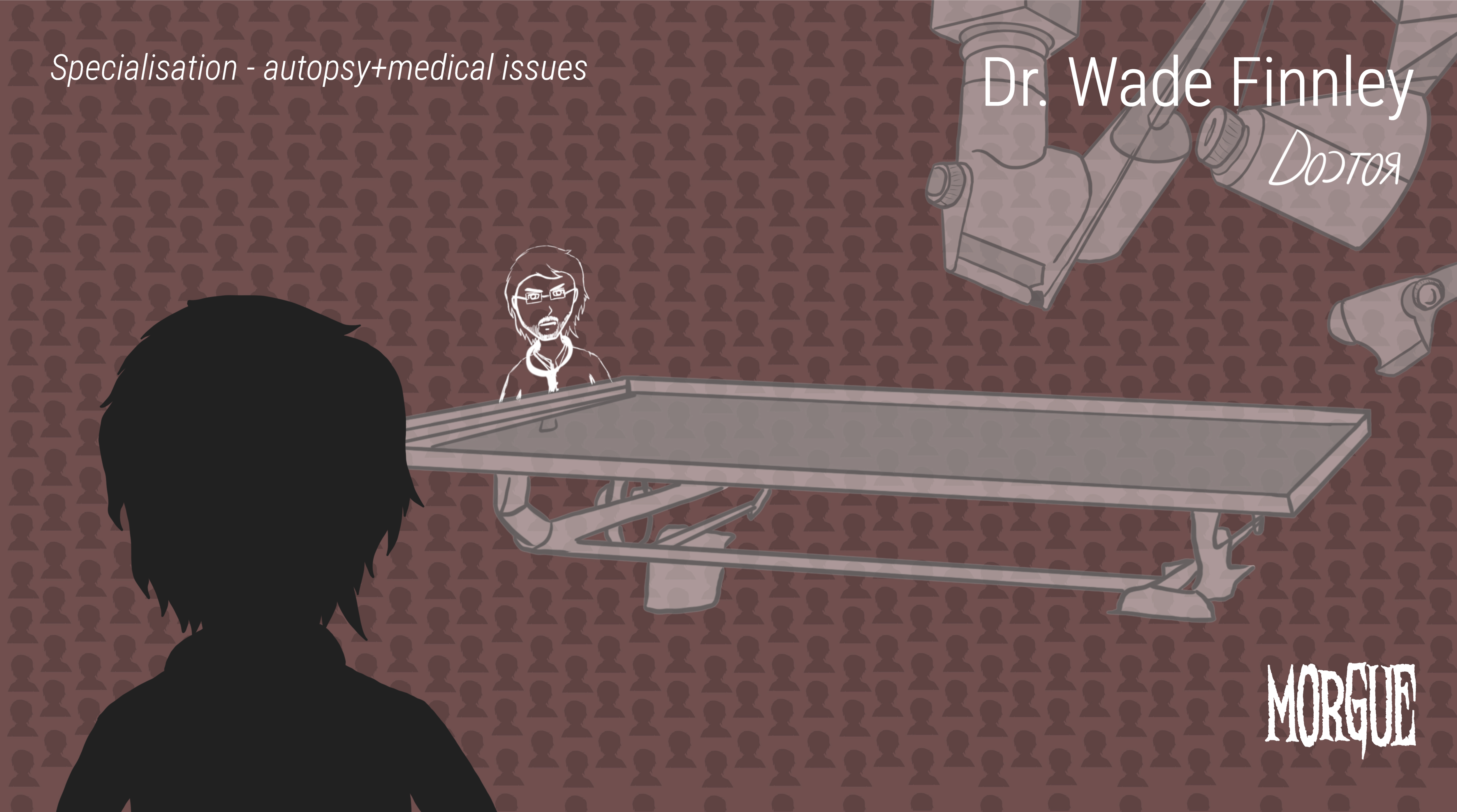
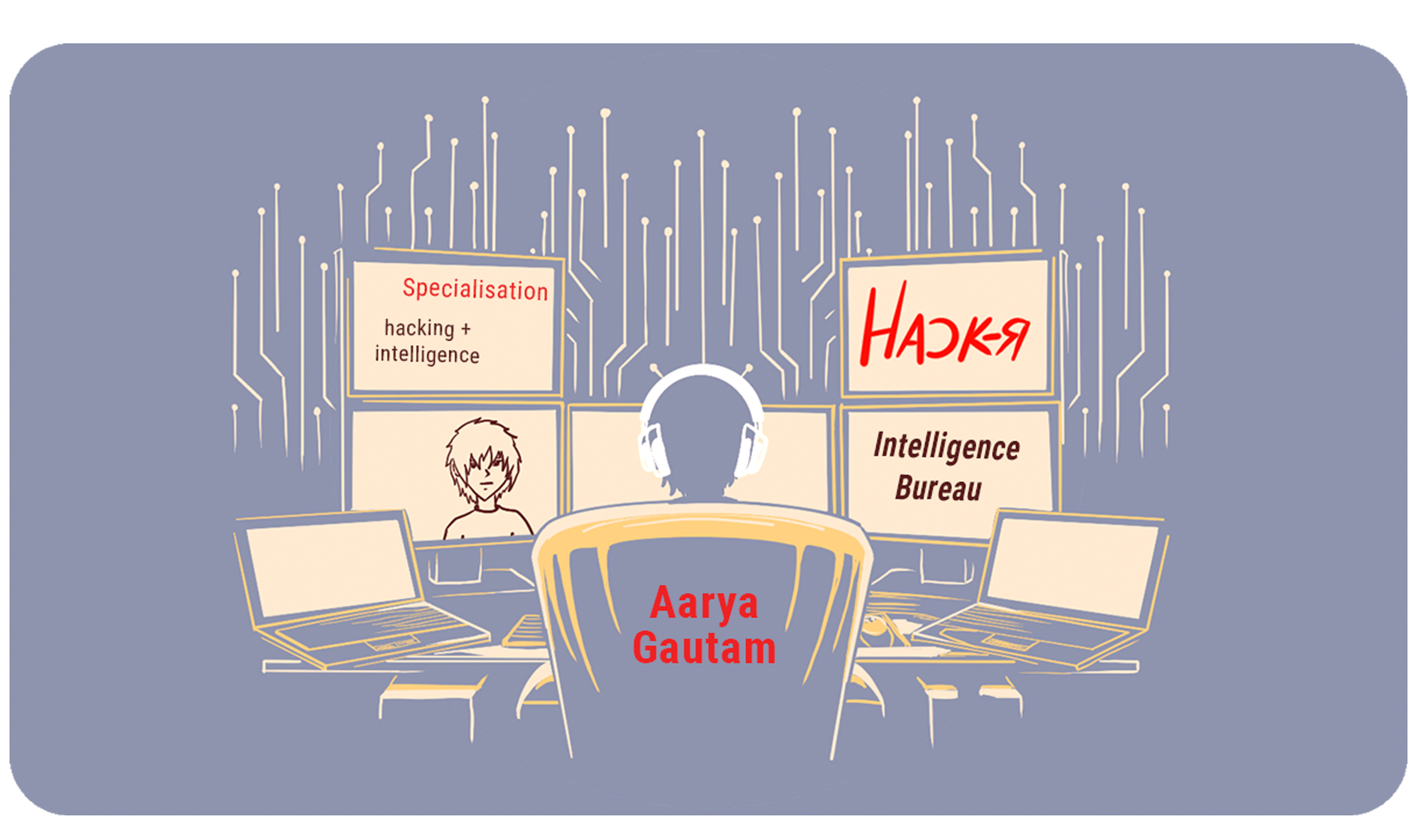
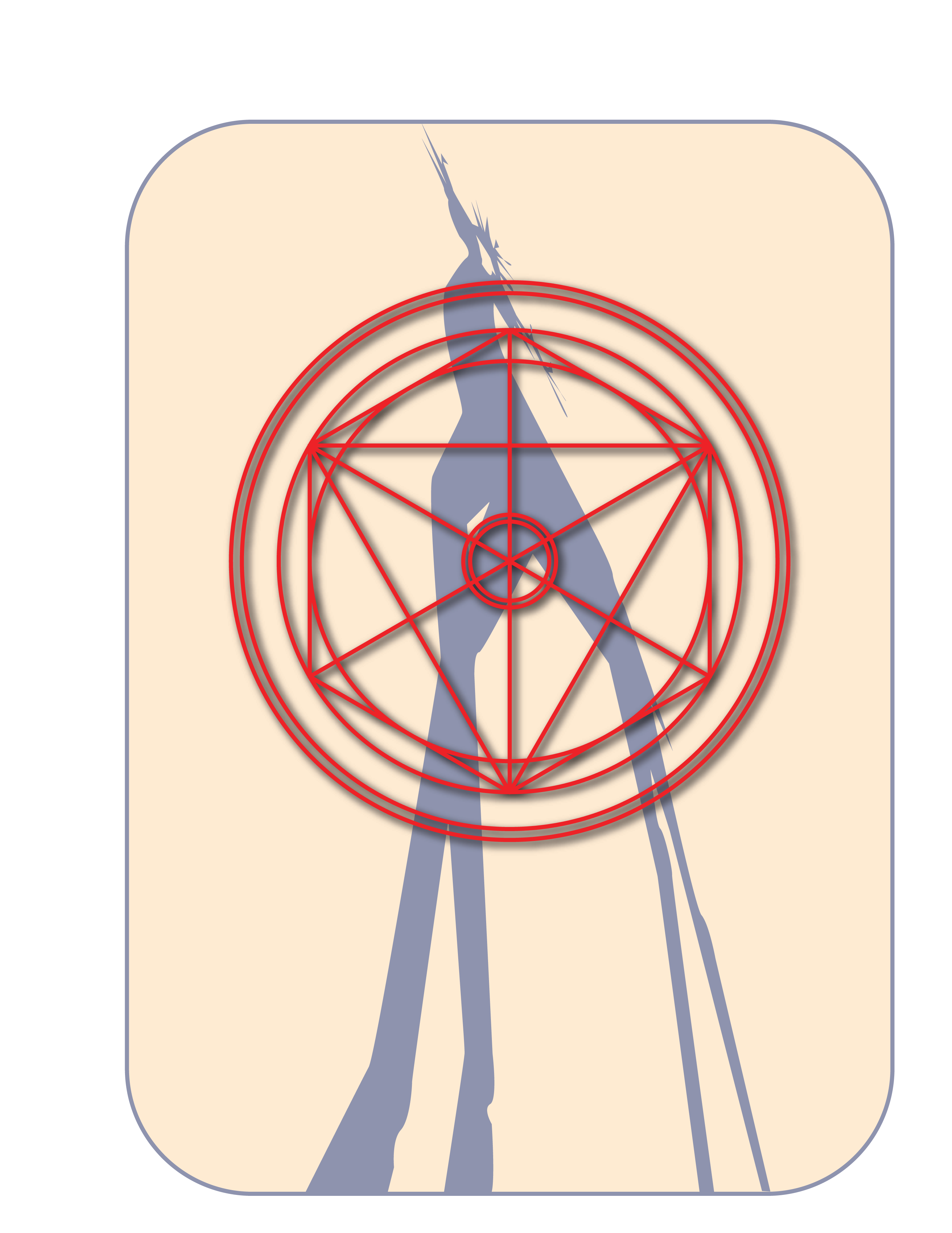
My first ever board game design that includes murder-mystery along with characters inspired by Japanese animations, include the design of cards and story that is still in its development stage. The game consists of 5 different cards, that include, in-game specialists cards, character cards, special character cards, clue cards and special items cards. The different sizes of the cards make it easier for the players to understand the type of card required at a particular time. The typography for these cards is kept basic, in order to easily understand the story and hints given on the cards.
Process:
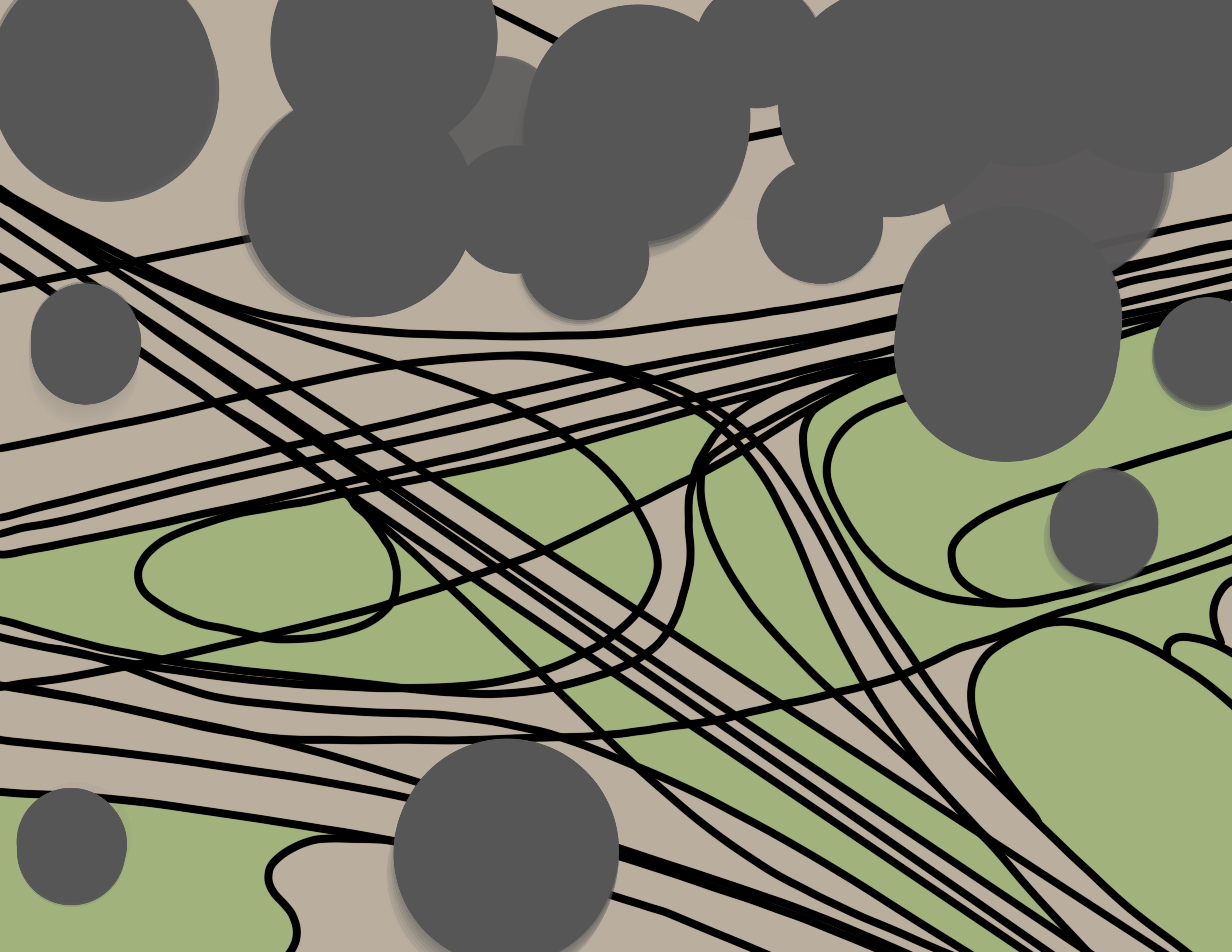
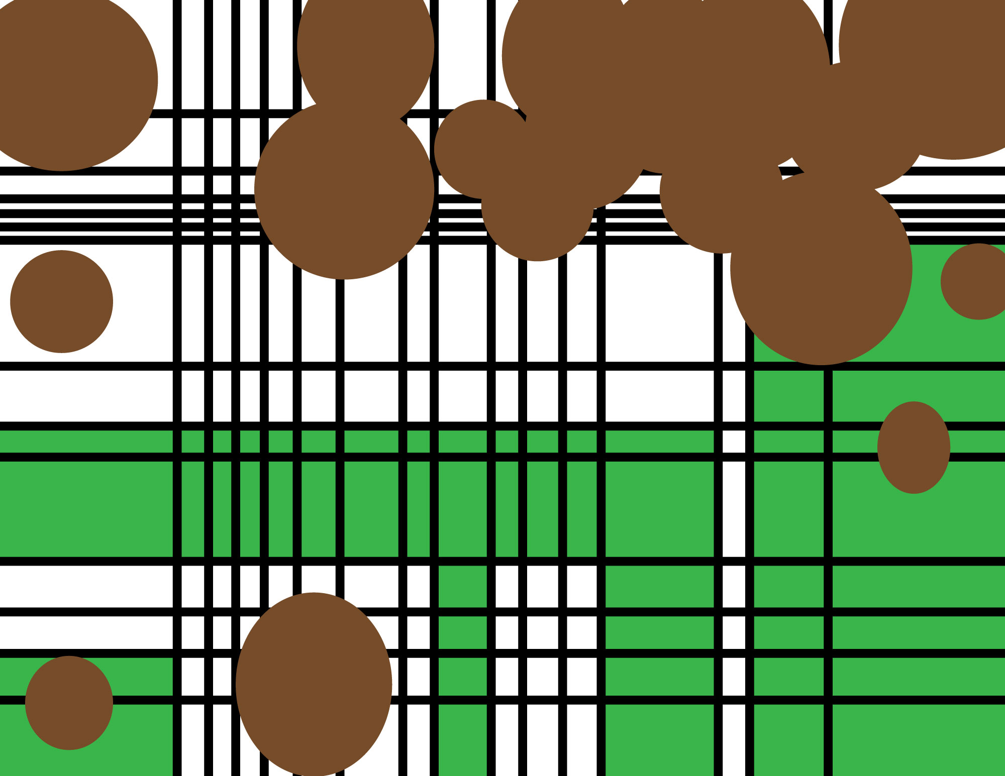
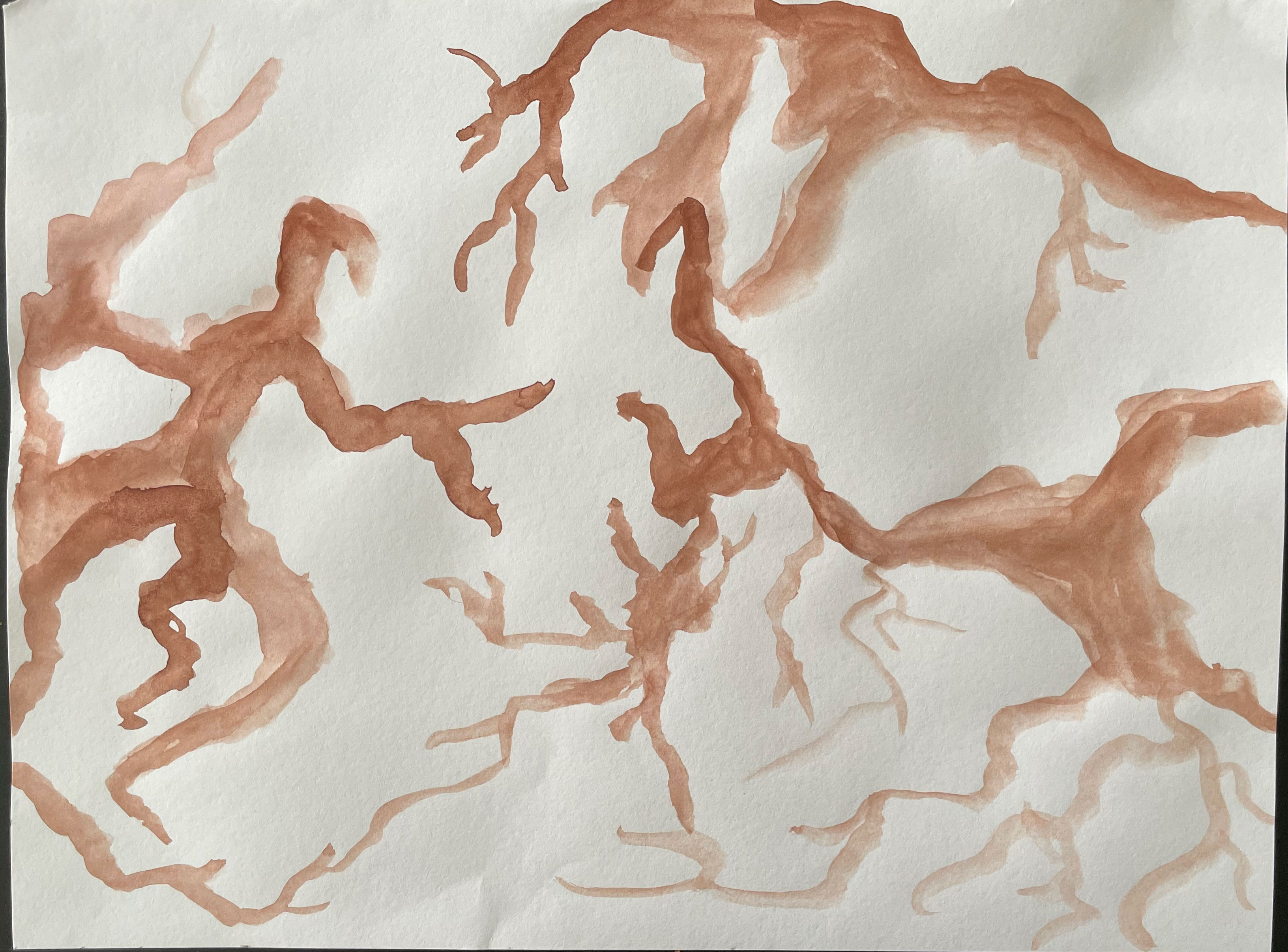
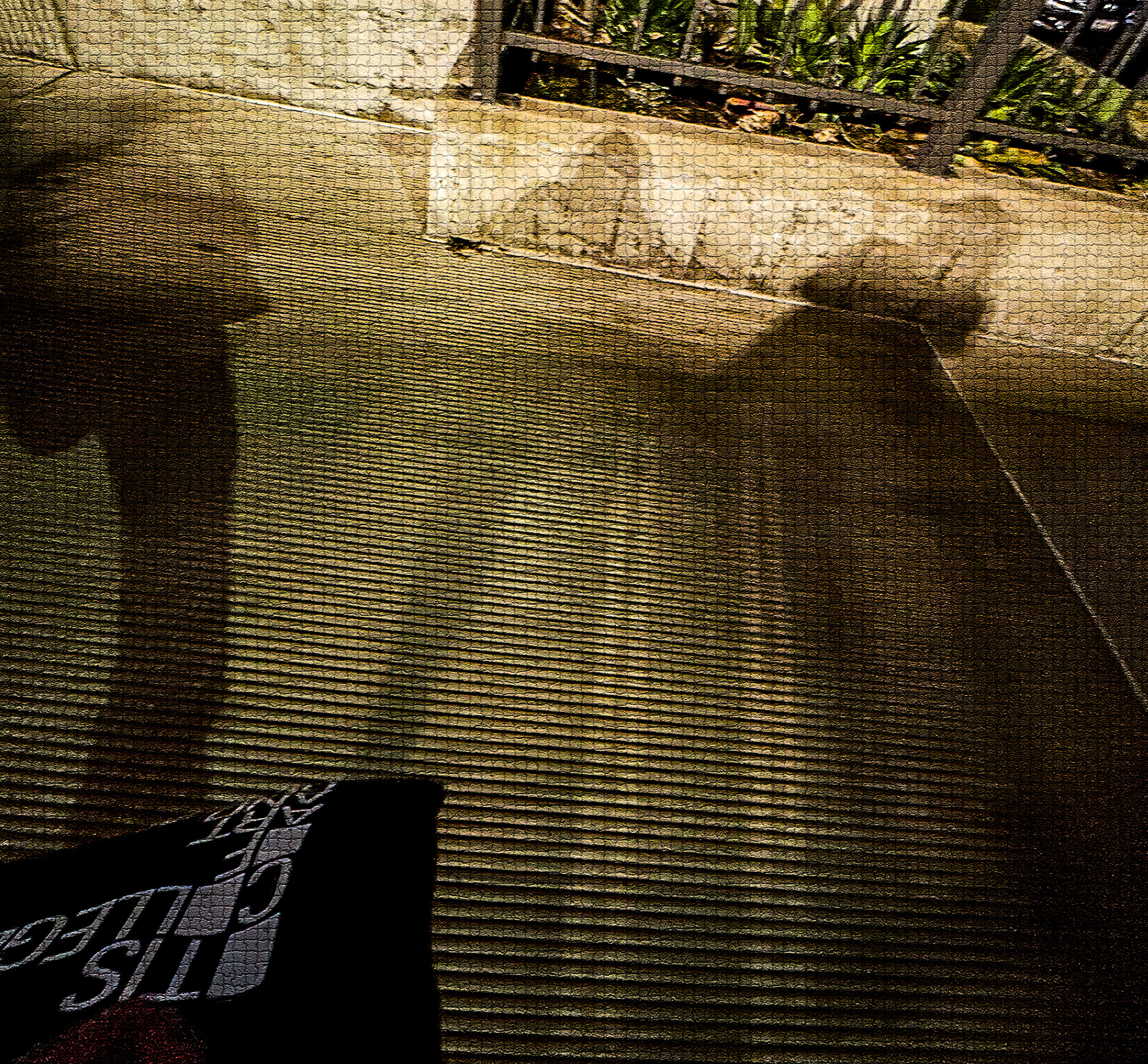
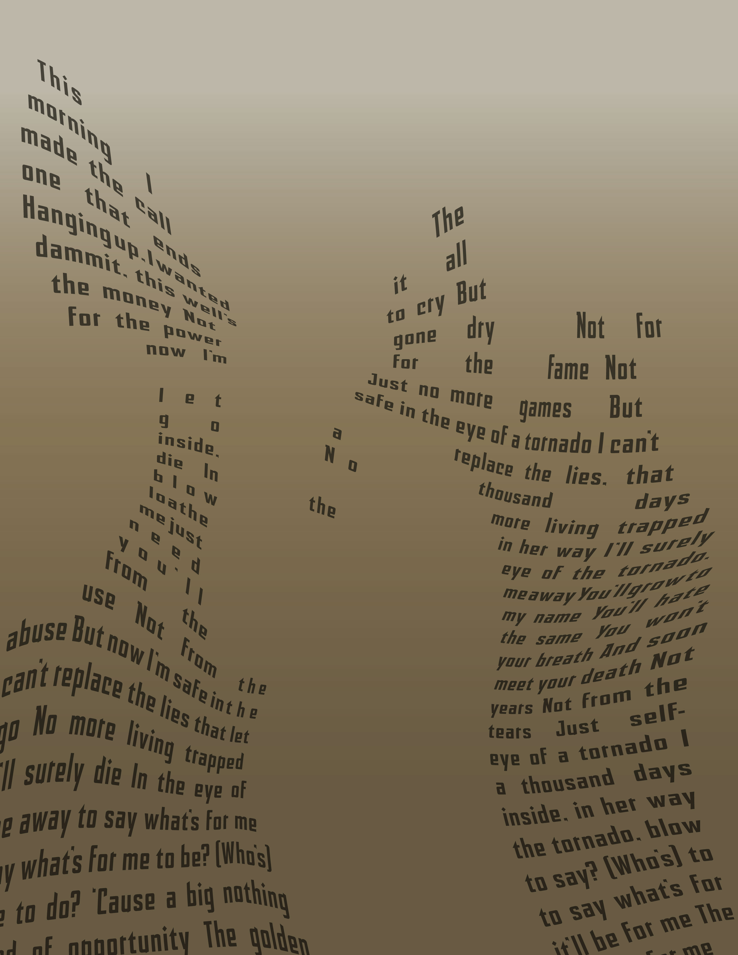
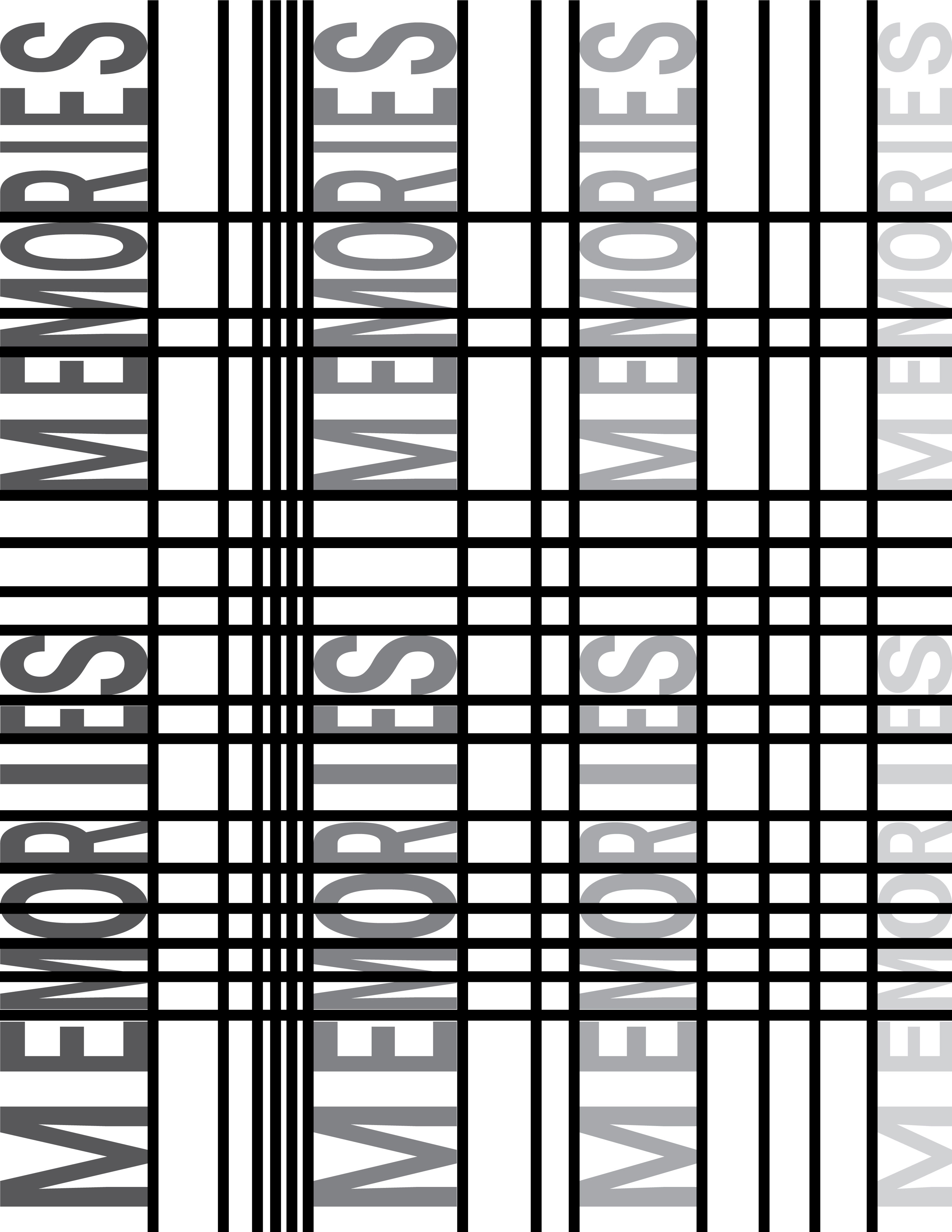
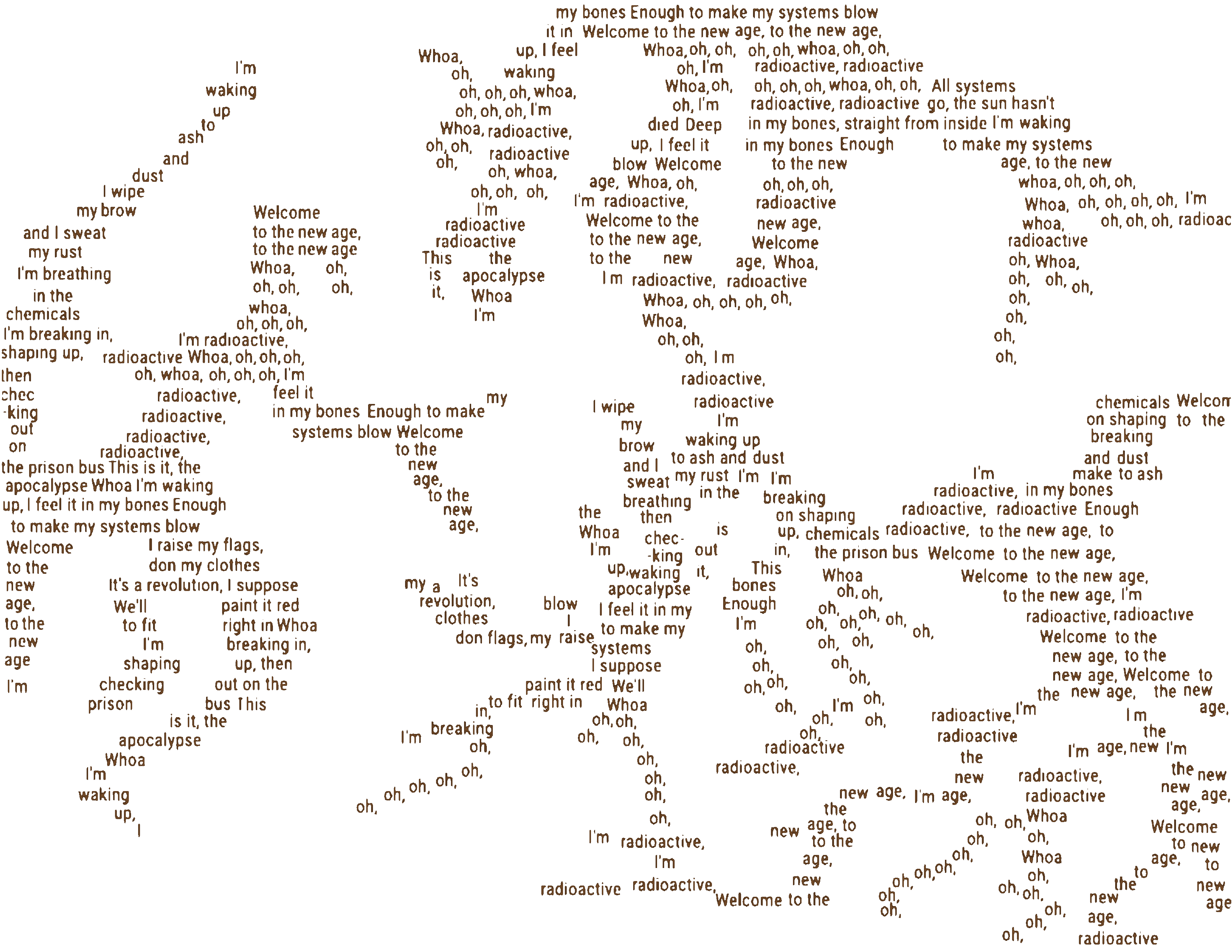
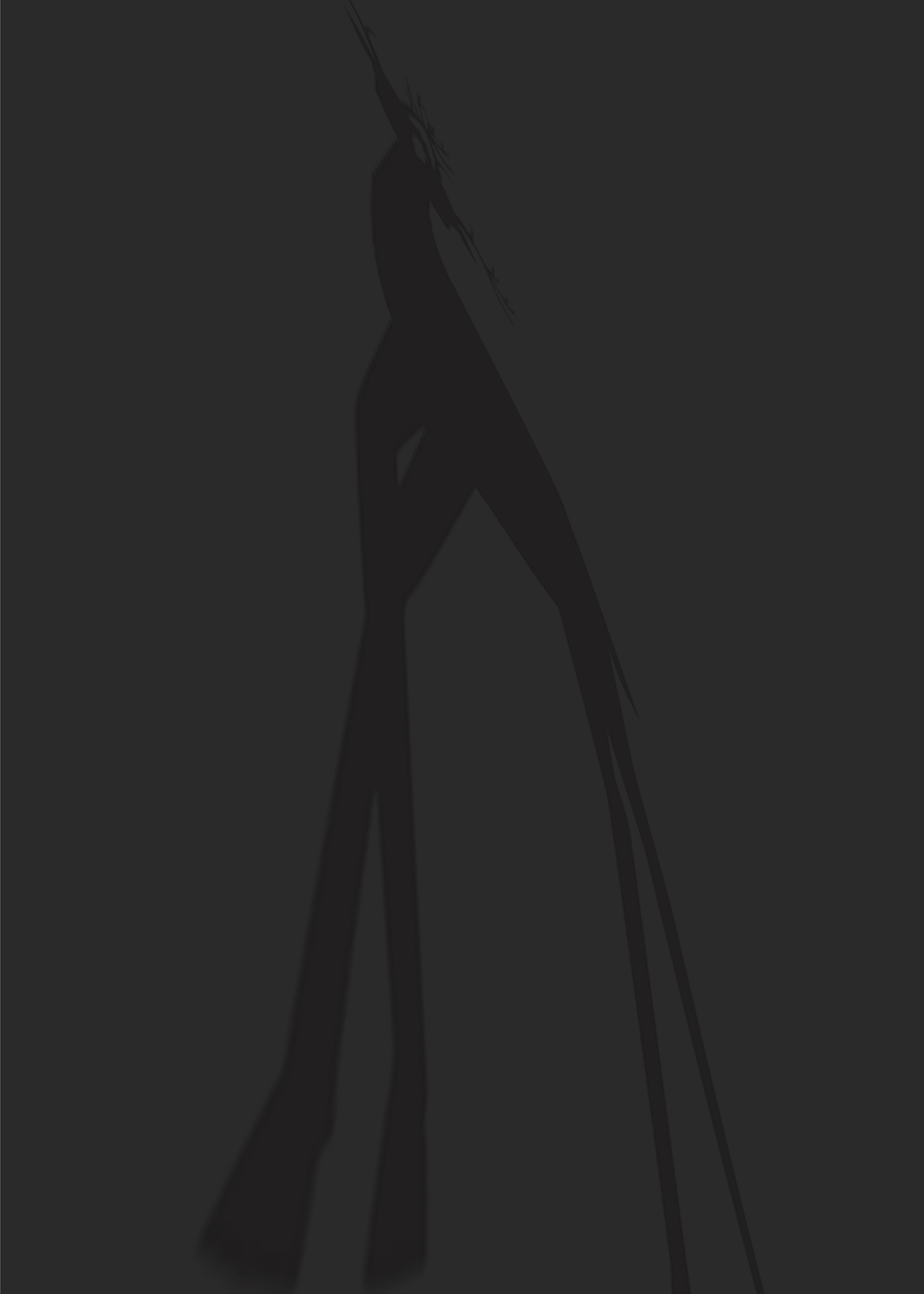
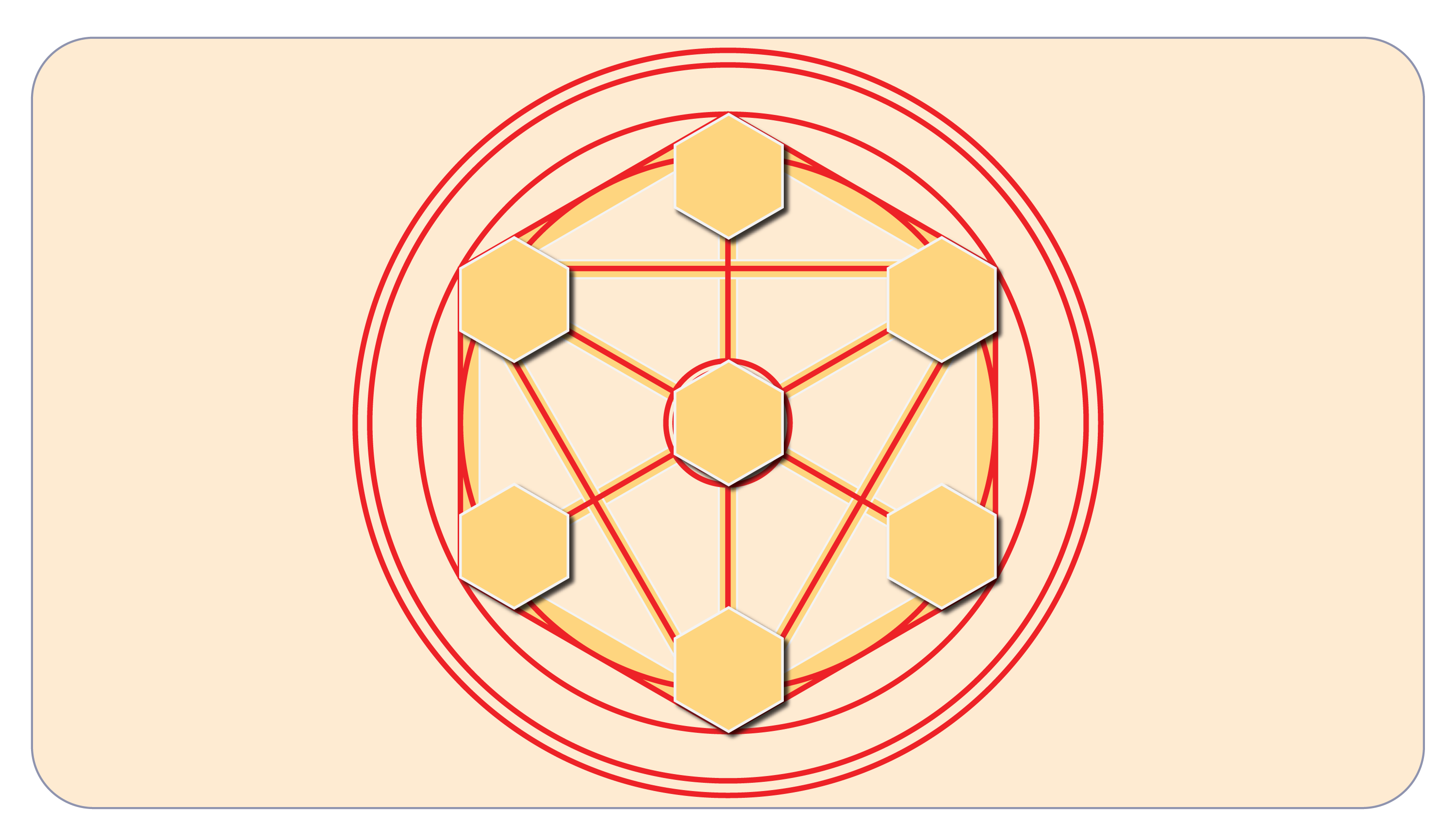
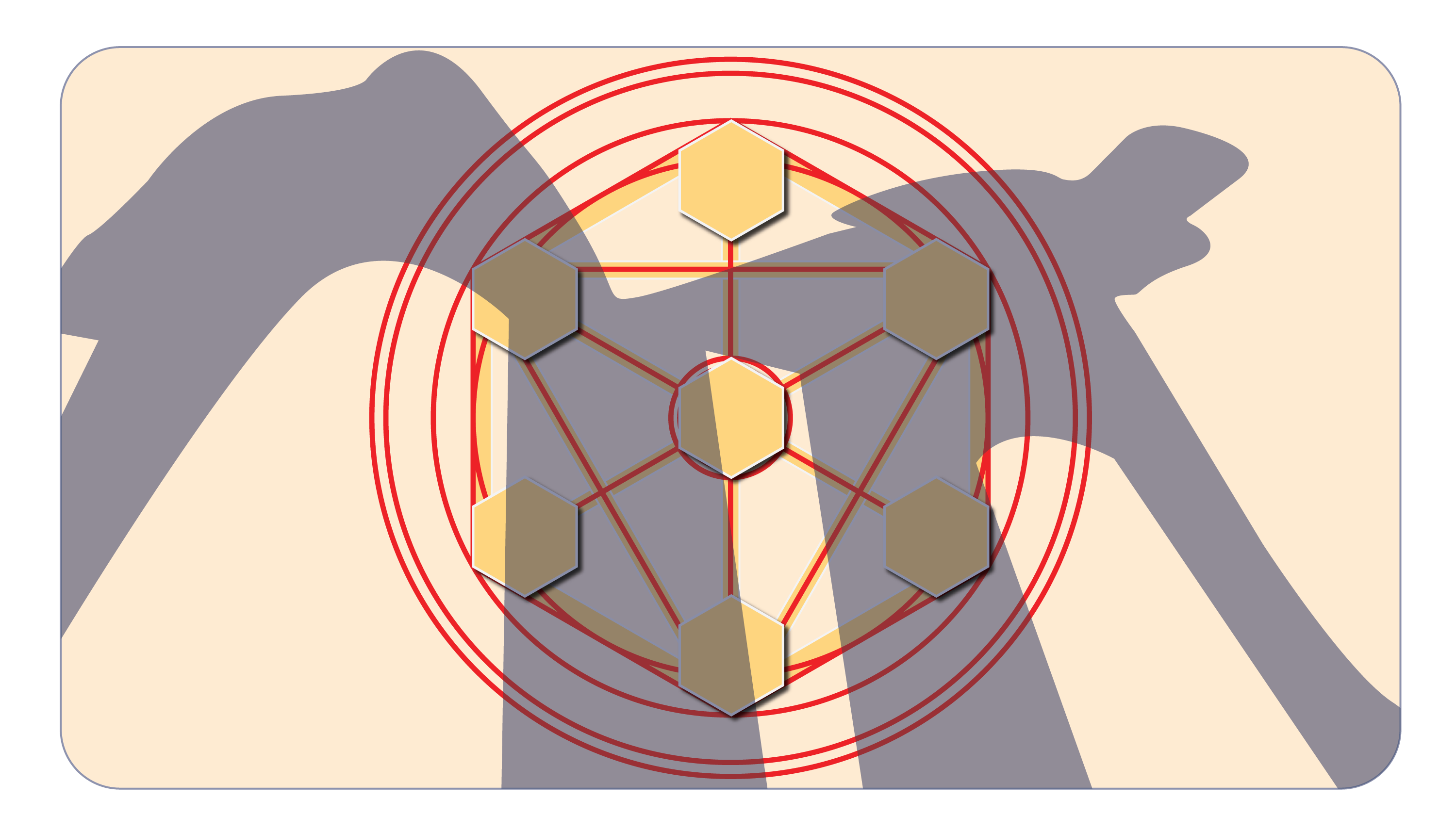
Time — Going back to a few moments from time that had been meaningful, and creating their abstractions lead to the following studies. These studies resulted in more studies, but this time in the form of gifs.


These posters got me curious about how do I show murder-mystery using visuals, while making it also look fun as in the case of mystery board games. The following are the process sketches and mockups of the board game design, which led to the final artifacts that were presented on the very beginning of this page.


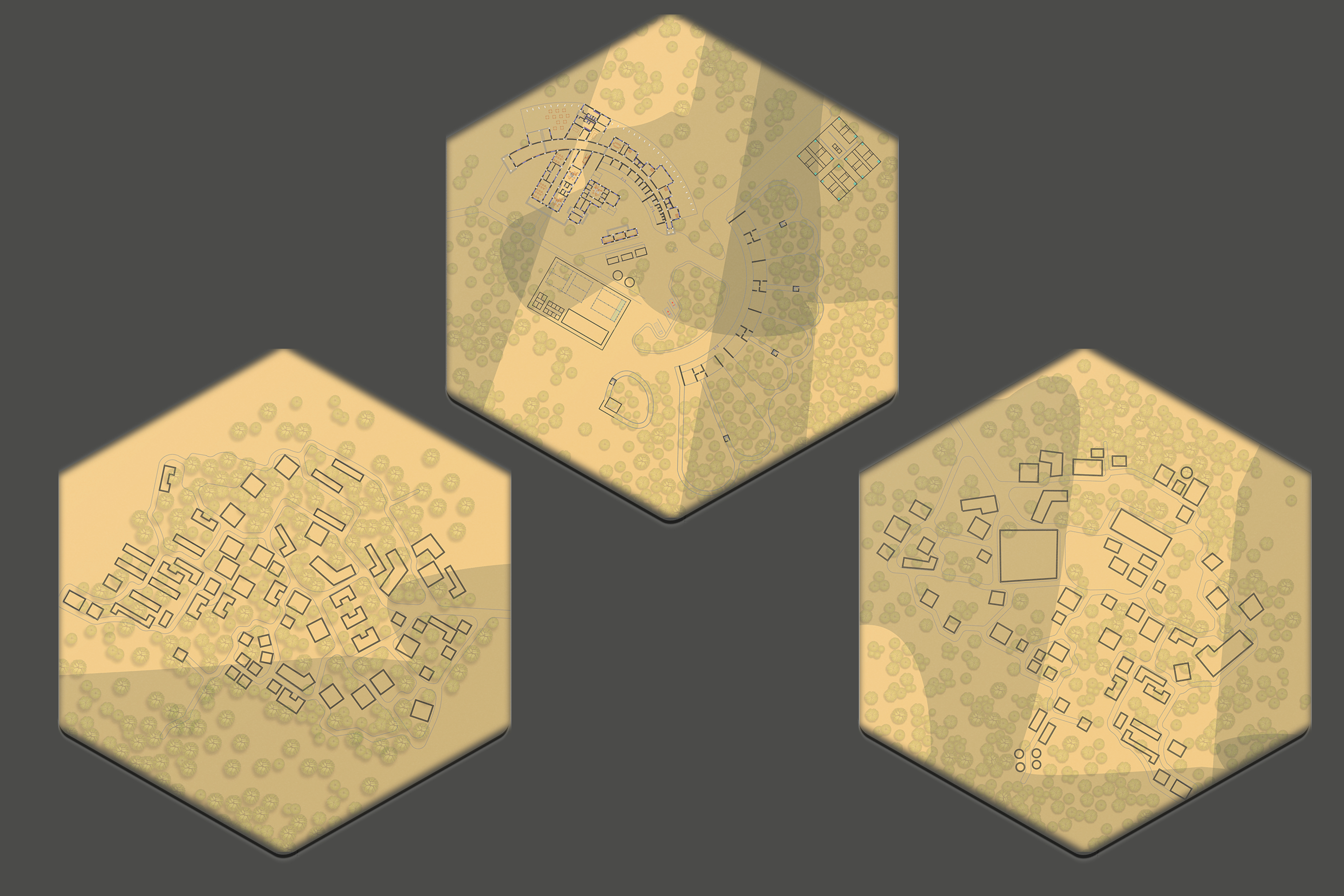
References — My Architectural Thesis: Wildlife Rehabilitation Center,
Anime: Fullmetal alchemist, Tokyo Ghoul and Corpse Party-Tortured Souls,
Board Games: Chronicles of Crime and Sherlock Holmes,
Color Inspiration: IT chapter two movie poster and Spicy Detective stories cover.