Adobe Express: Scaling Impact Through Design & Strategy
As the Global Creative Lead for Adobe Express India, I helped shape the platform’s presence in one of its most dynamic and culturally rich markets. My work extended far beyond content creation—it was about creating meaningful connections through localized, inclusive design.
Product—Adobe Express Skills—Art Direction, Design Strategy, Visual Design, User Experience Design, Leadership, Product Launch for India market, AI StrategyTenure at Adobe—May 2023—present
Strategic Leadership with a Local Lens
At Adobe Express, I led the end-to-end strategy and creative execution for India’s localized template ecosystem. From seasonal moments and small businesses to education and enterprise, I developed systems that brought cultural nuance to life. I worked at the intersection of strategy and design—identifying gaps in the user journey, crafting relevant starter content, and translating brand vision into purposeful, user-first experiences.From Zero to Real Impact
One of my most defining achievements was launching and scaling the India content pipeline from the ground up. I took the region’s offering from zero templates to a fully realized, culturally attuned content library—contributing to measurable growth in both template exports and monthly active users (MAU). Every design decision was grounded in discoverability, functionality, and cultural relevance.A Multidisciplinary Approach
Throughout my time on the team, I wore many hats—designer, strategist, moderator, and art director. While my core focus was the India market, I also supported content moderation for France and Germany, ensuring consistency, accessibility, and alignment across global markets. This role demanded cross-functional collaboration, platform fluency, and a sharp eye for detail.Expressive by Nature, Powered by AI
In addition to visual design, I contributed to a new, India-specific text-to-template AI initiative within Adobe Express. Unlike the general consumer-facing feature, this effort focused on optimizing content generation workflows tailored to designers—making it faster and more efficient for designers to produce culturally relevant templates at scale.I curated creative datasets and refined outputs to meet high visual and cultural standards. This work allowed me to merge my design expertise with emerging technologies, contributing to the development of smarter, more personalized creative tools for a key global market.
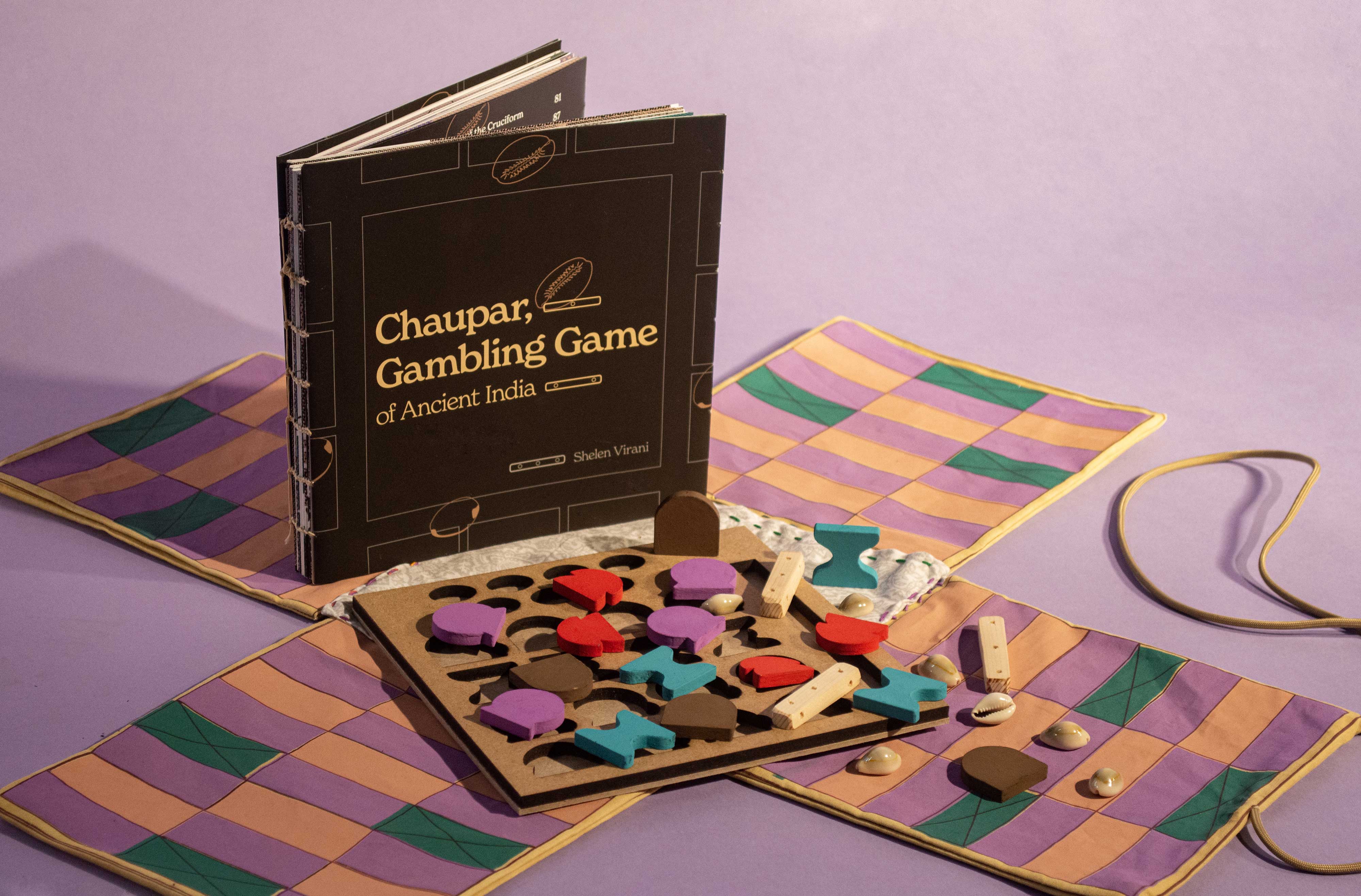
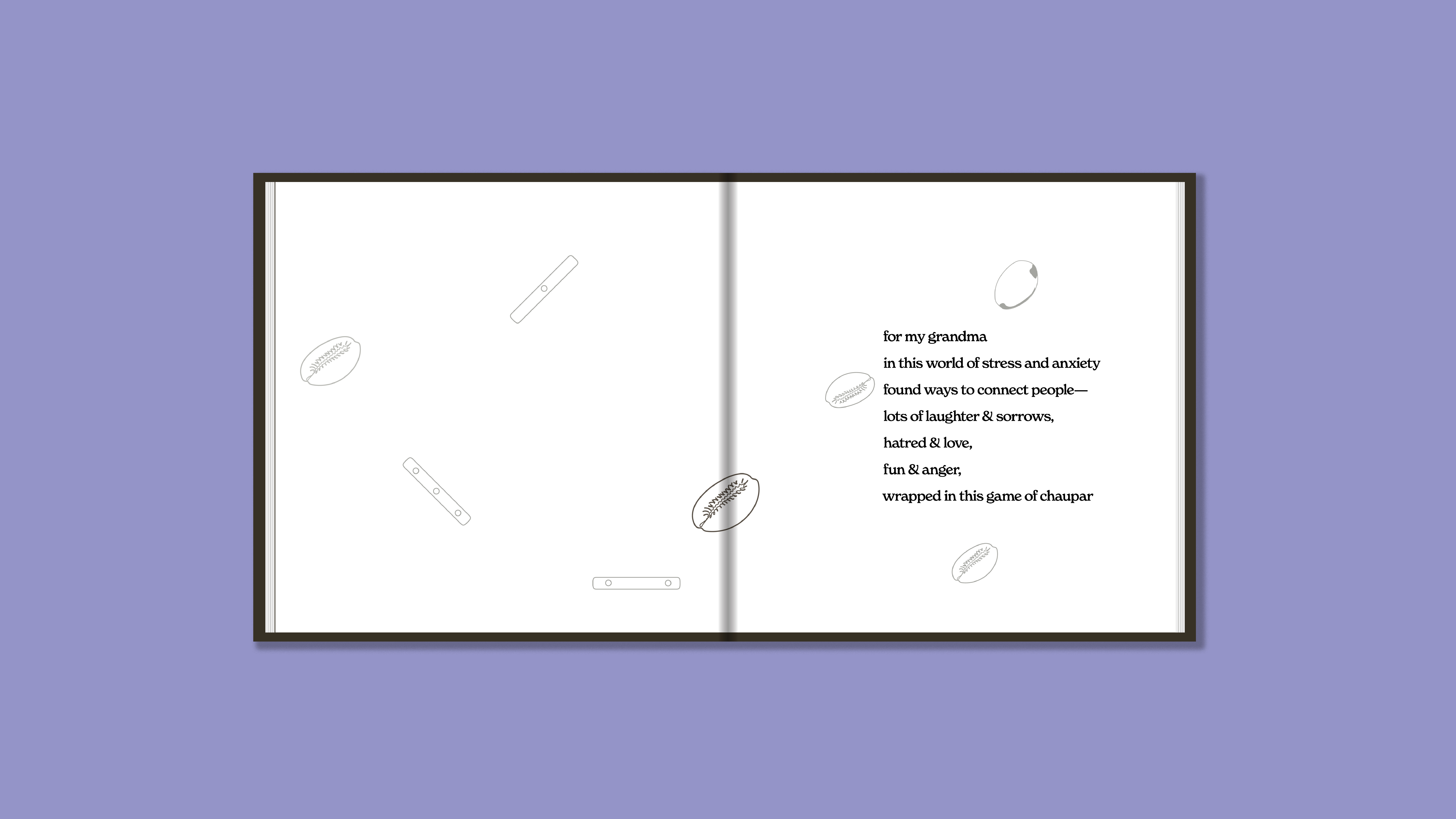
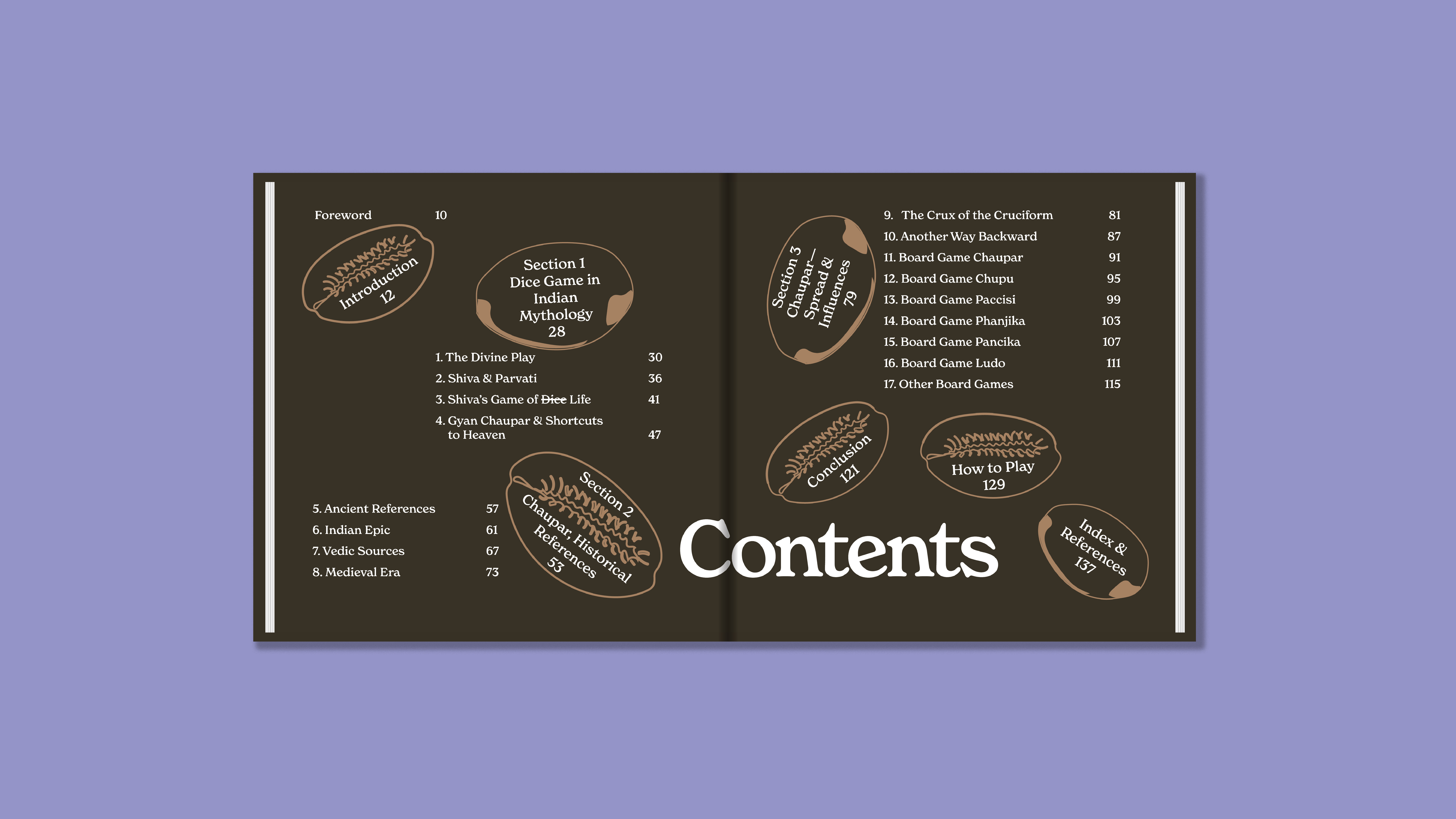
A Game of Gods: Reviving Chaupar
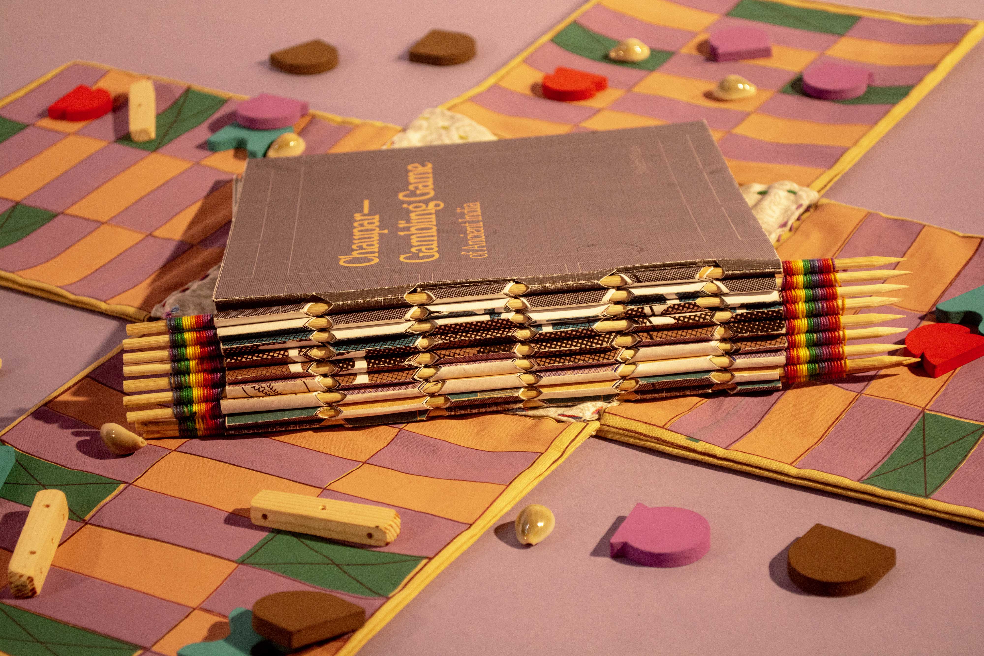
Inspired by my grandmother, a woman who found joy in the simplest of pleasures, I embarked on a journey to revive an ancient Indian game, Chaupar. This project was not just an academic exercise; it was a heartfelt tribute to a beloved figure who introduced me to the world of board games.
Software Used—Adobe InDesign, Adobe Illustrator, Adobe Photoshop, Autodesk AutoCAD, Procreate Categories—Book Design, Publication Design, Package Design, Game Re-Introduction Typefaces Used—New Spirit and Nimbus Sans from Adobe FontsProject Completion—December 2022

In the heart of ancient India, a game was born, a game believed to be played by the gods themselves. This was Chaupar, a strategic board game that has captivated minds for centuries. However, over time, its grandeur faded, and it transformed from a revered pastime to a child's game.

A Journey Through Time
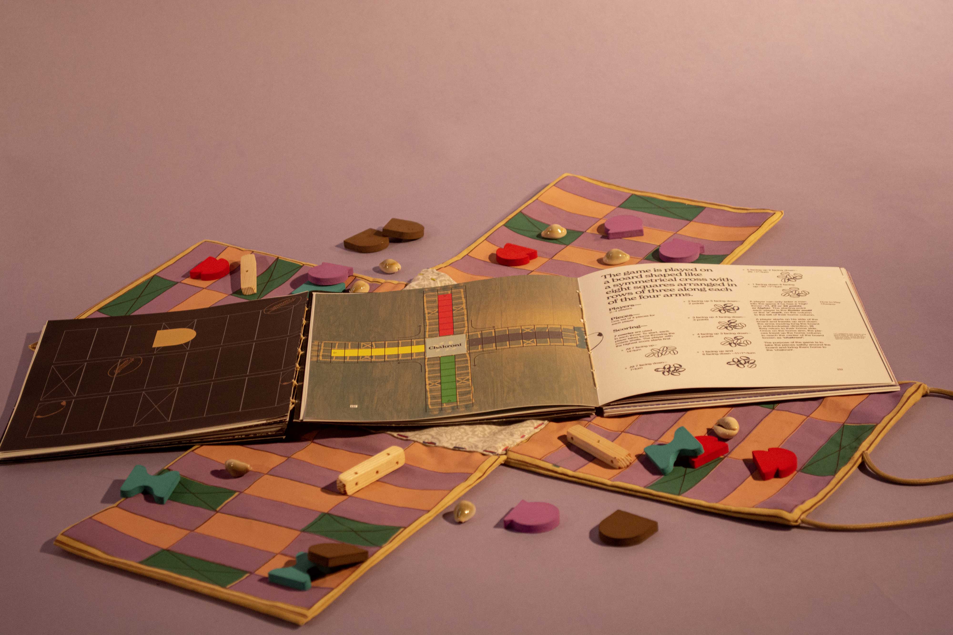
As I delved into the history of Chaupar, I was intrigued by its transformation. From the celestial realms of the Gods to the earthly courts of emperors, the game has witnessed centuries of cultural shifts. I wanted to capture this journey, to bring the past alive for modern readers.Designing a Playful Publication
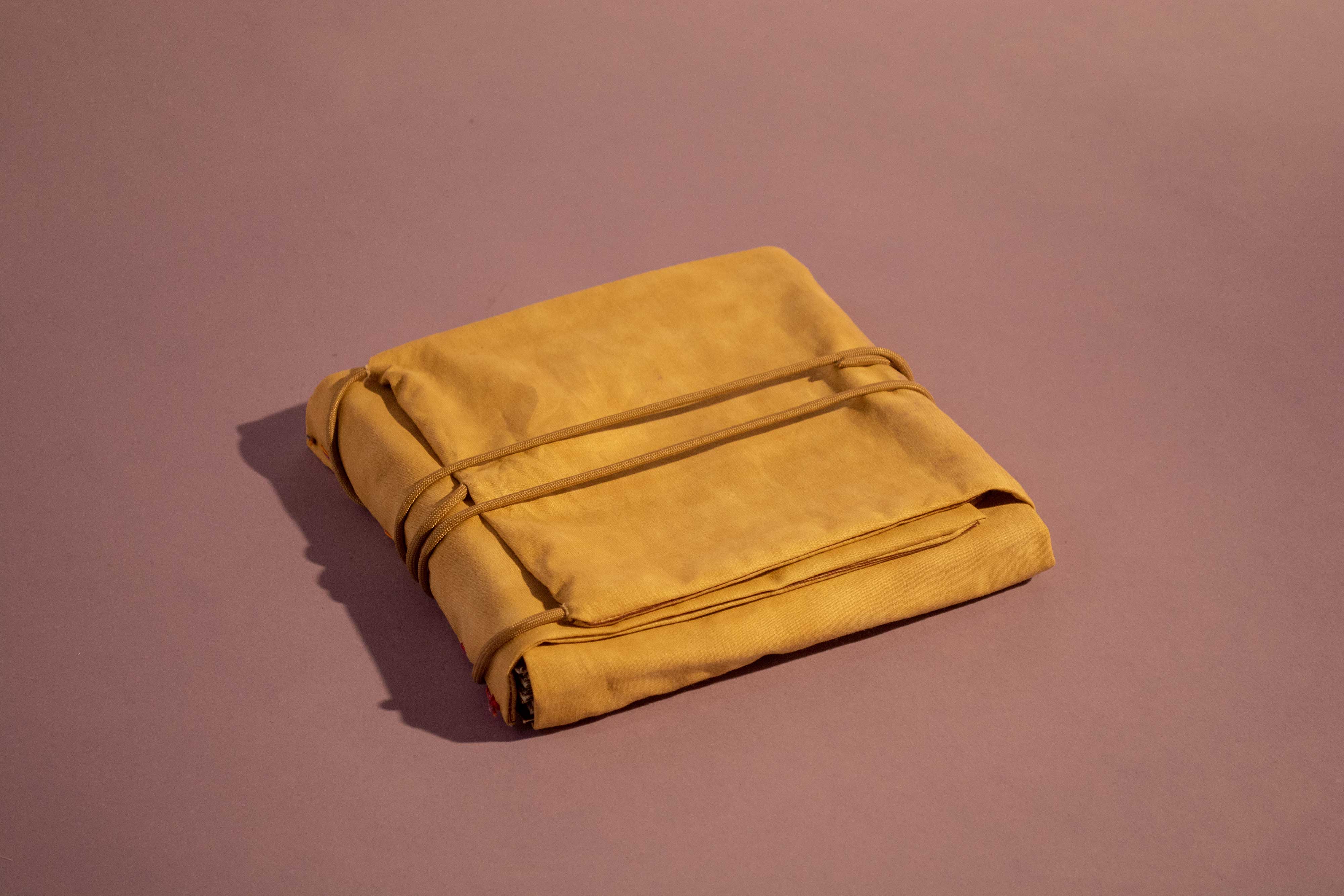
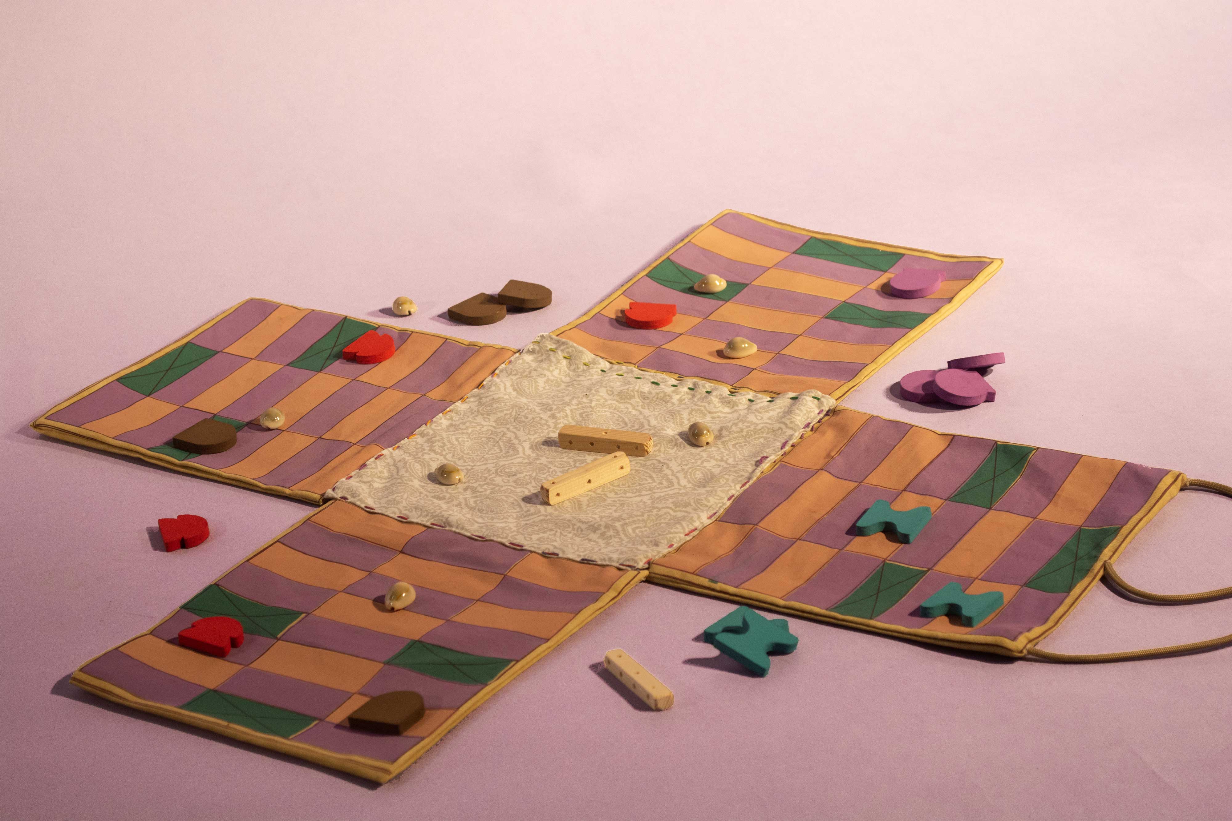
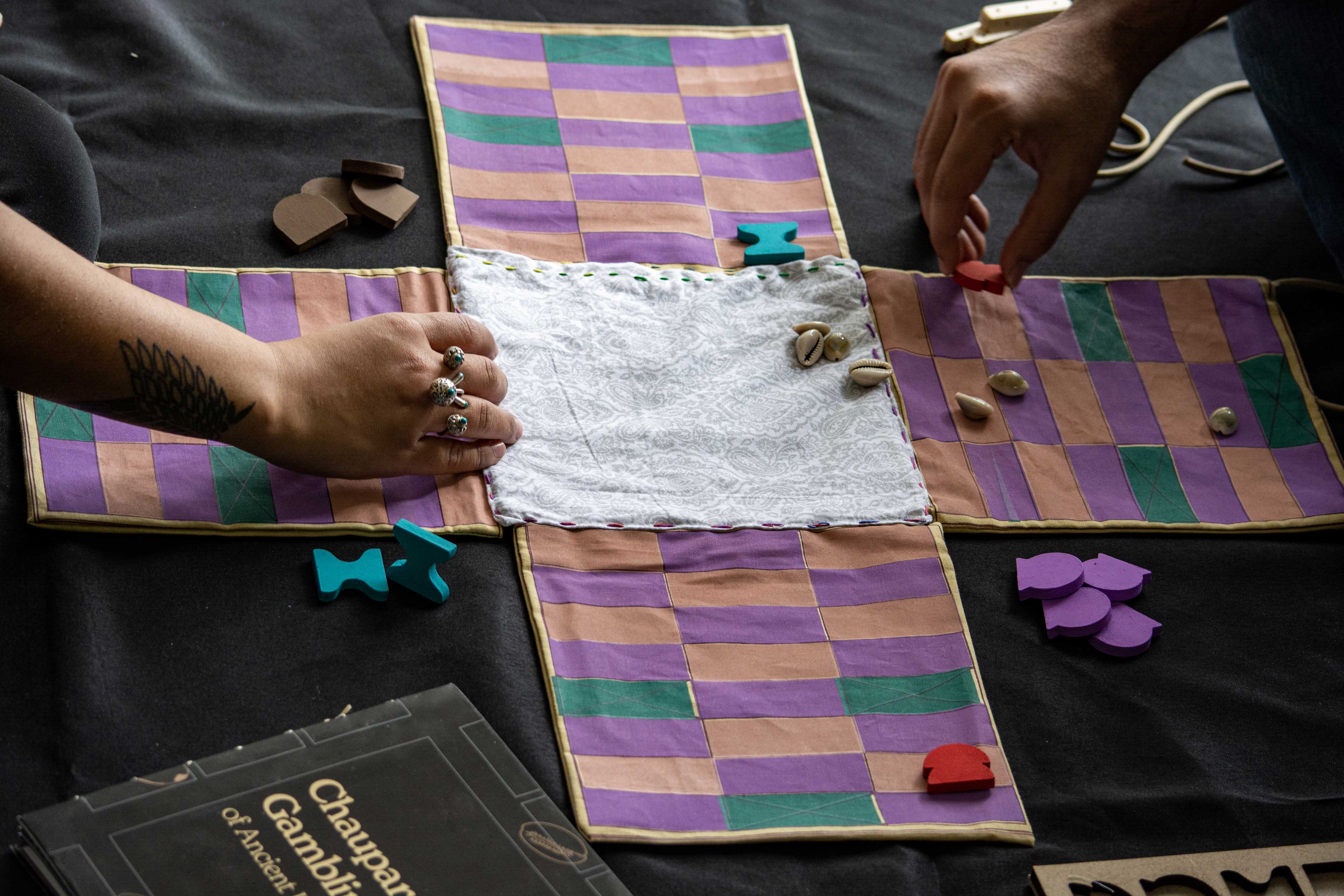
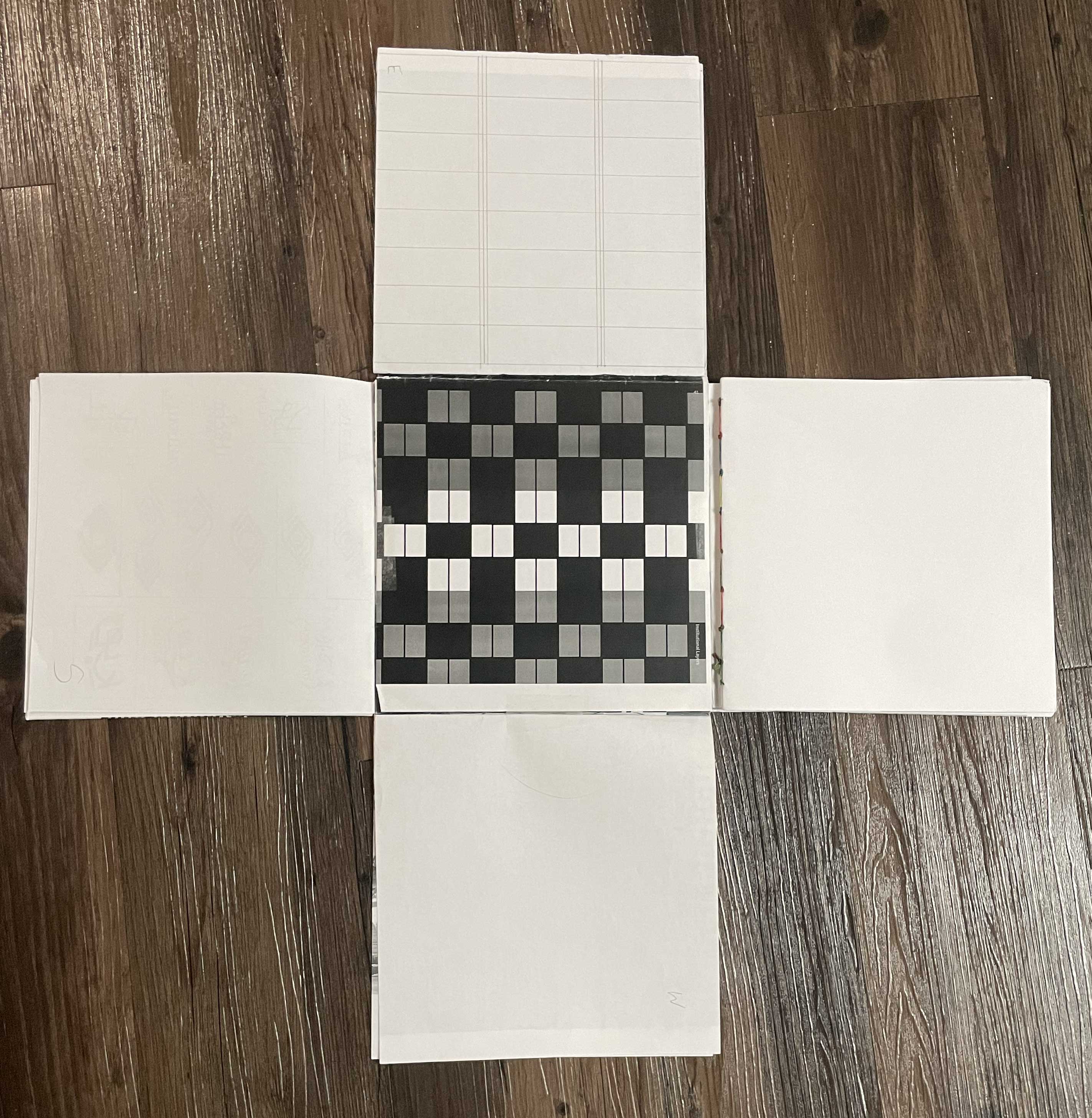
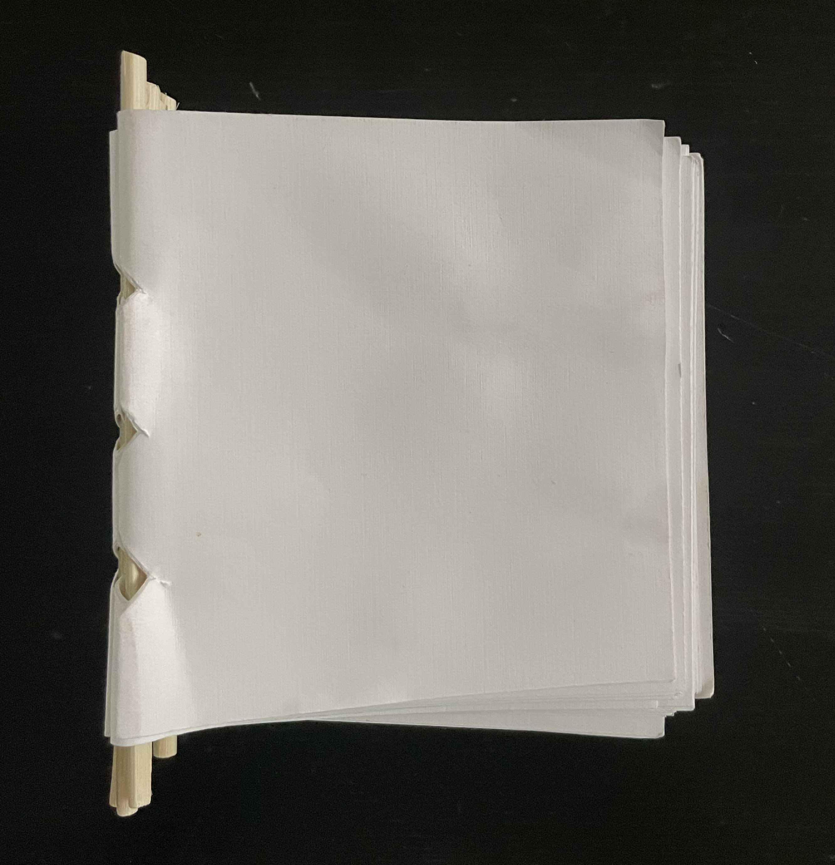
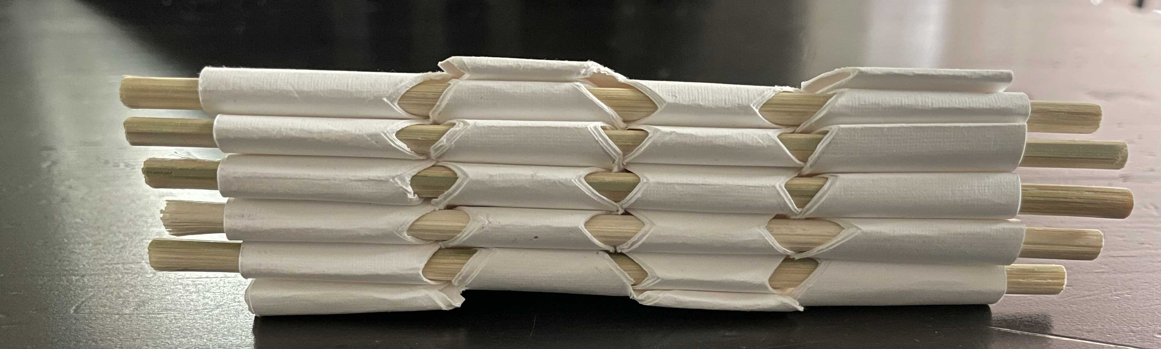
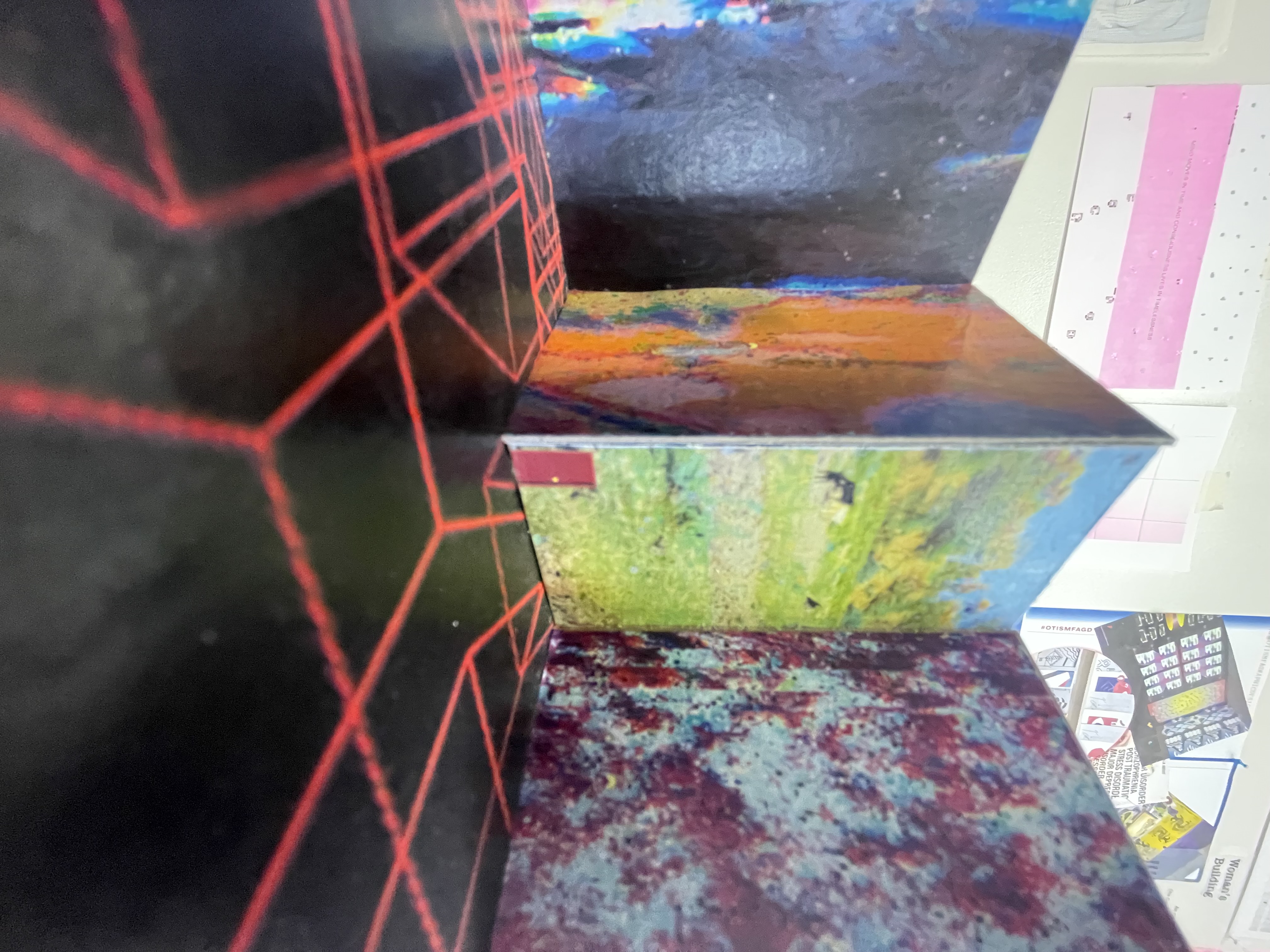
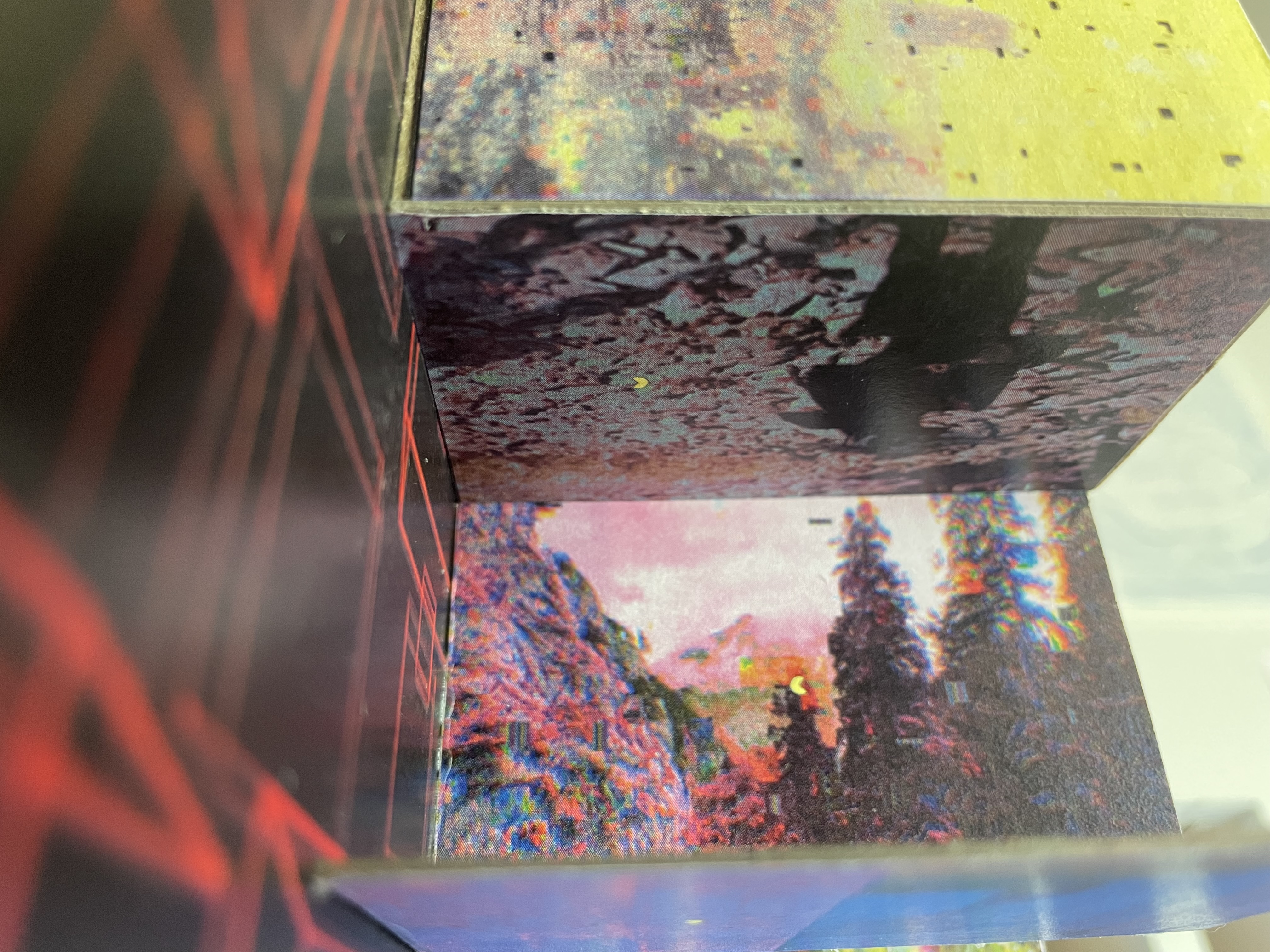
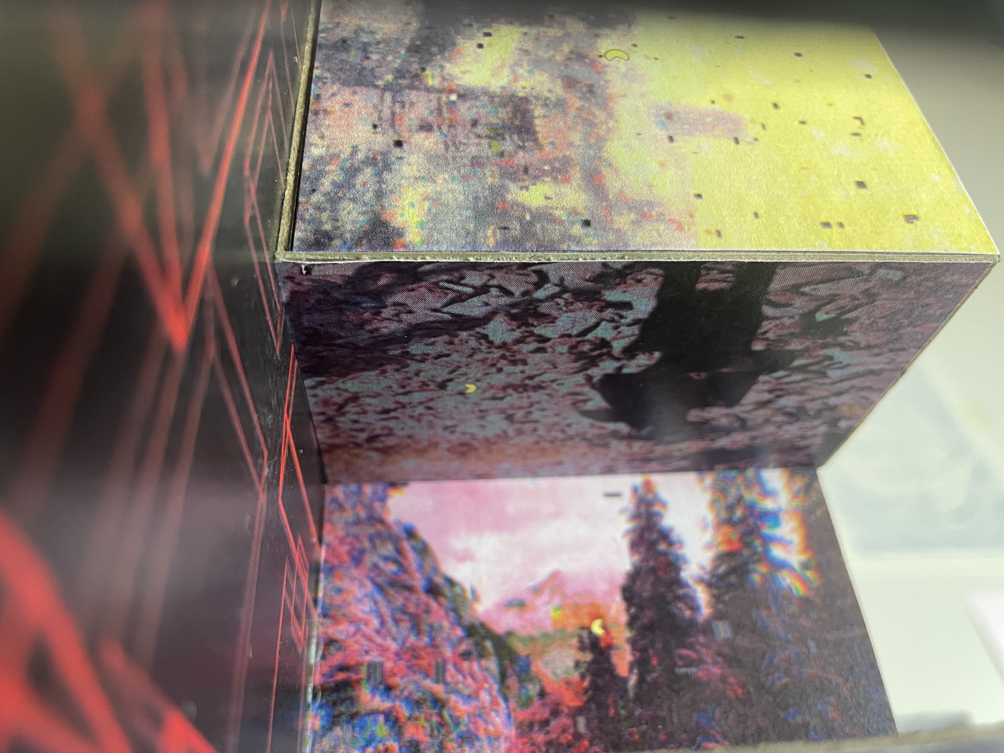
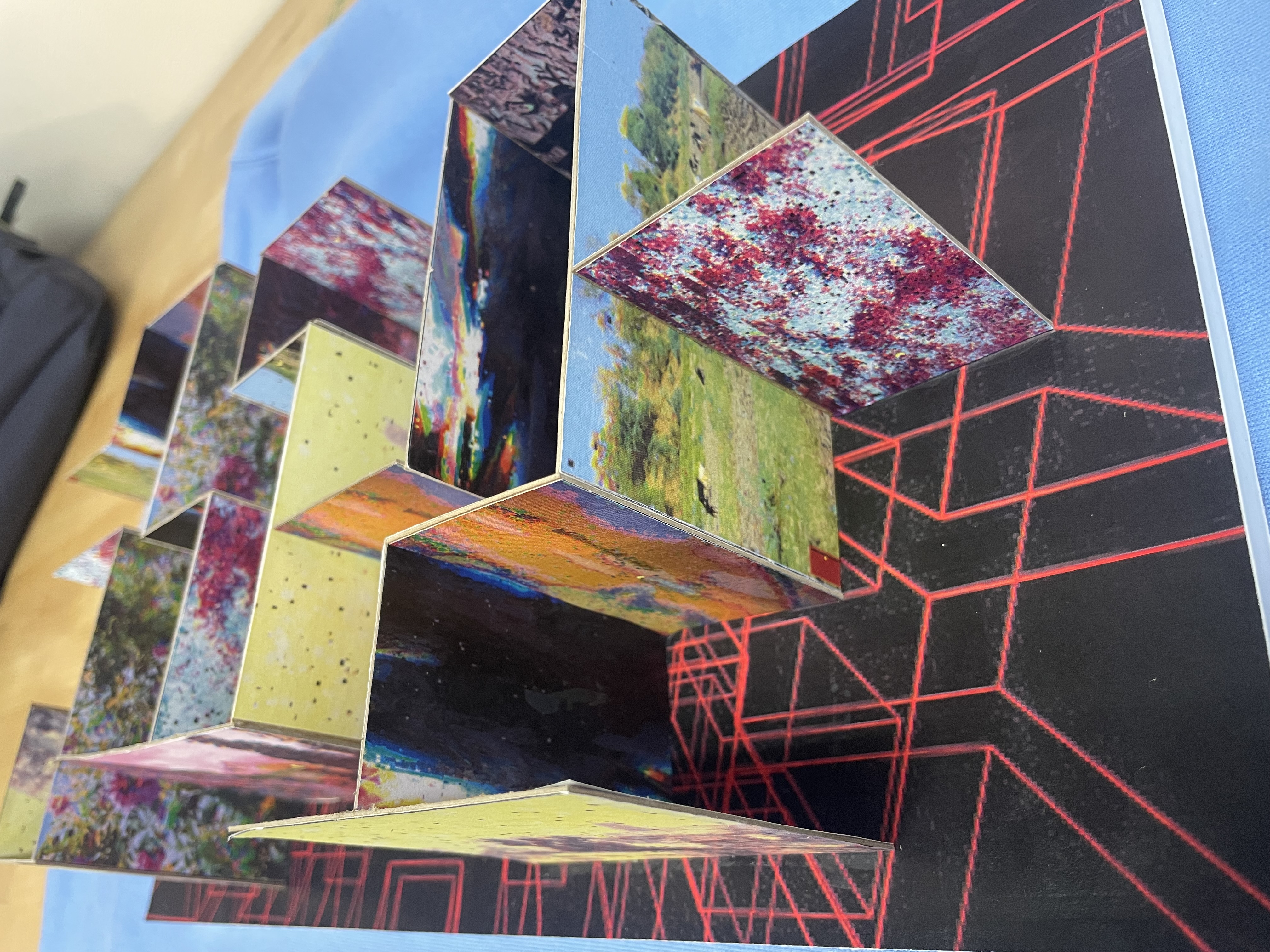
The design of the publication was a crucial aspect of the project. I envisioned a book that would not only inform but also engage. I experimented with various structures, aiming to create a physical experience that mirrored the gameplay itself.Initially, I explored the idea of a book that could be unfolded into a game board. While intriguing, this approach presented challenges in terms of navigation and readability. I pivoted to a more traditional book format, but with a twist: a two-directional opening that revealed both the historical narrative and the game rules.


A Visual Feast
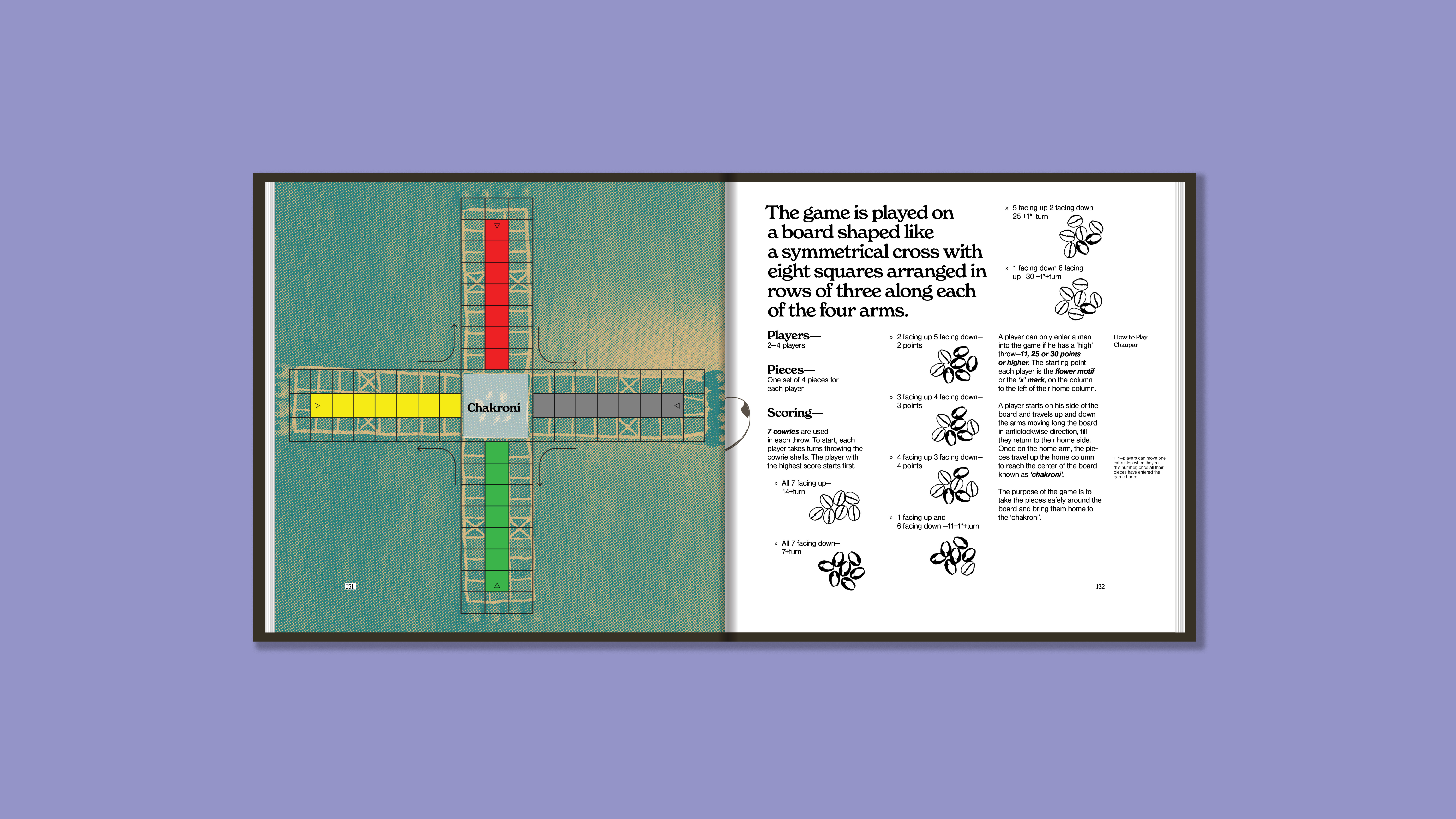
The visual language of the publication was carefully considered. I chose typefaces that evoked a sense of both antiquity and modernity. The layout, inspired by the game board's three-column grid, creates a visually striking and informative experience.By combining historical research, innovative design, and a passion for ancient games, I hope to inspire a new generation of Chaupar enthusiasts.
Final Product:
A Glimpse Inside


Wagging the Tail of Change: Rebranding spcaLA
A heritage of compassion, a future of hope. As one of the oldest animal welfare organizations in SoCal, spcaLA needed a visual identity that would capture its timeless mission. This project sought to explore the intersection of design and social impact creating a visual language that not only reflected their dedication to animal welfare but also evoked a sense of compassion, education, and unwavering commitment to preventing cruelty.
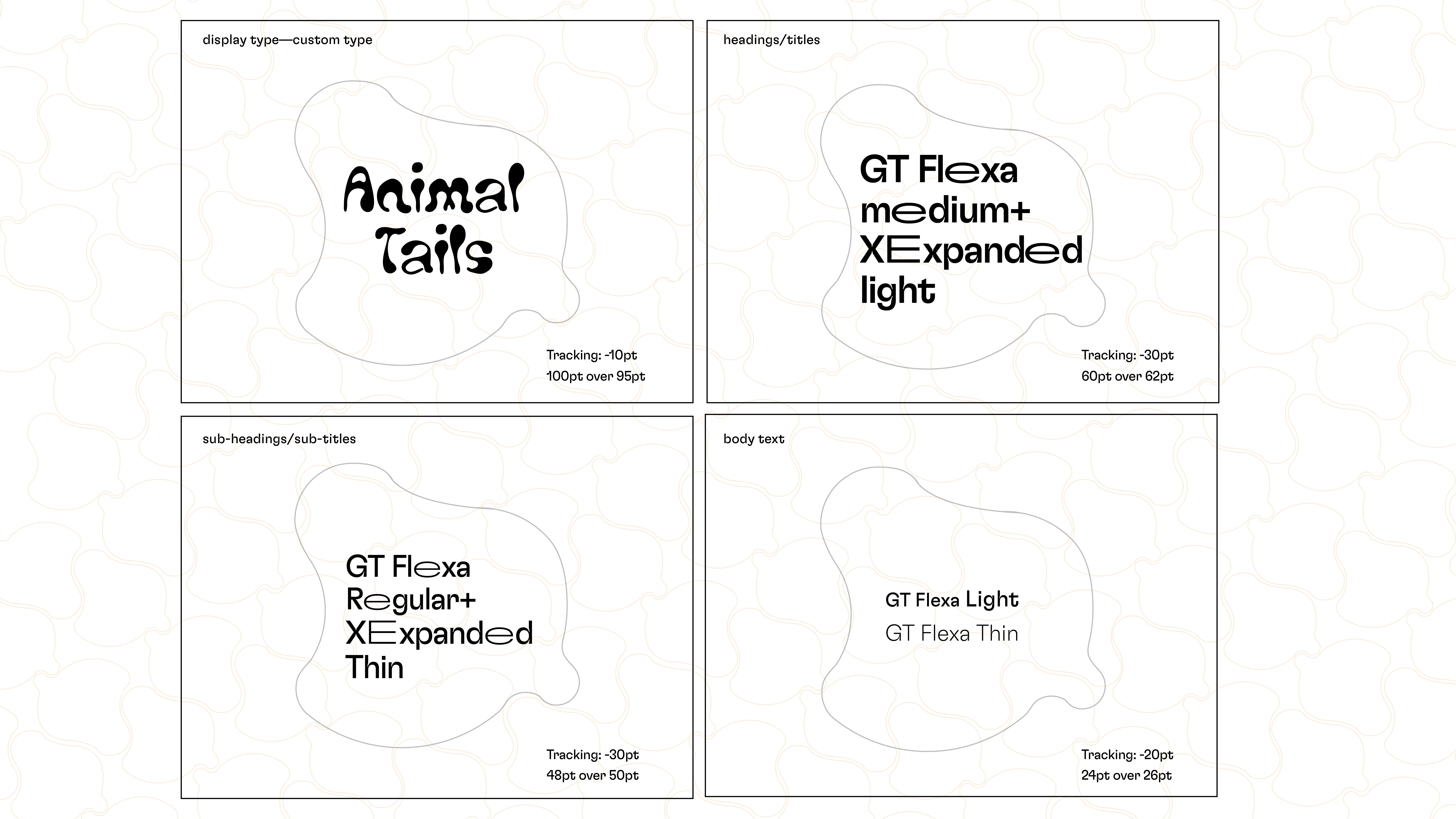
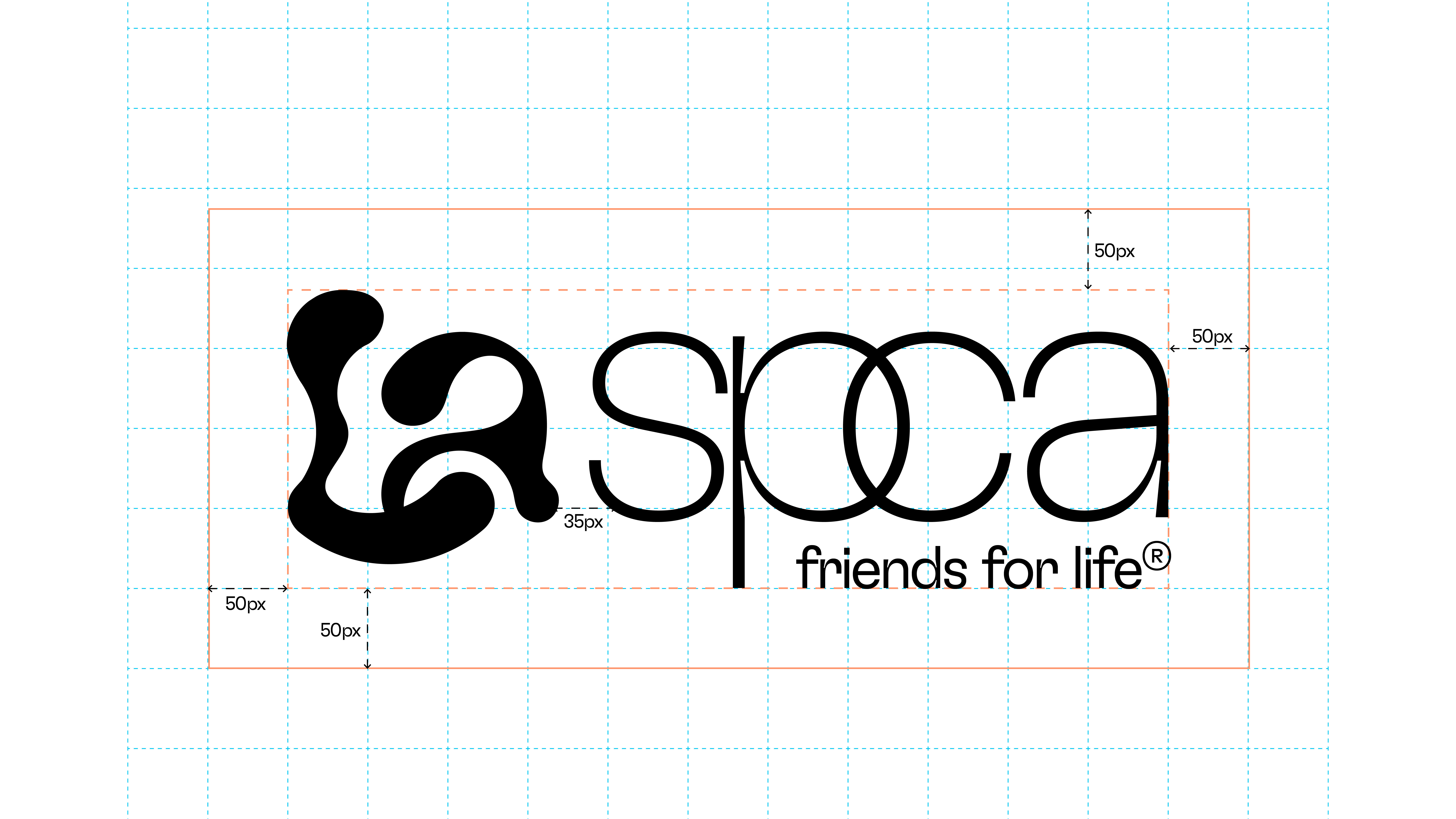
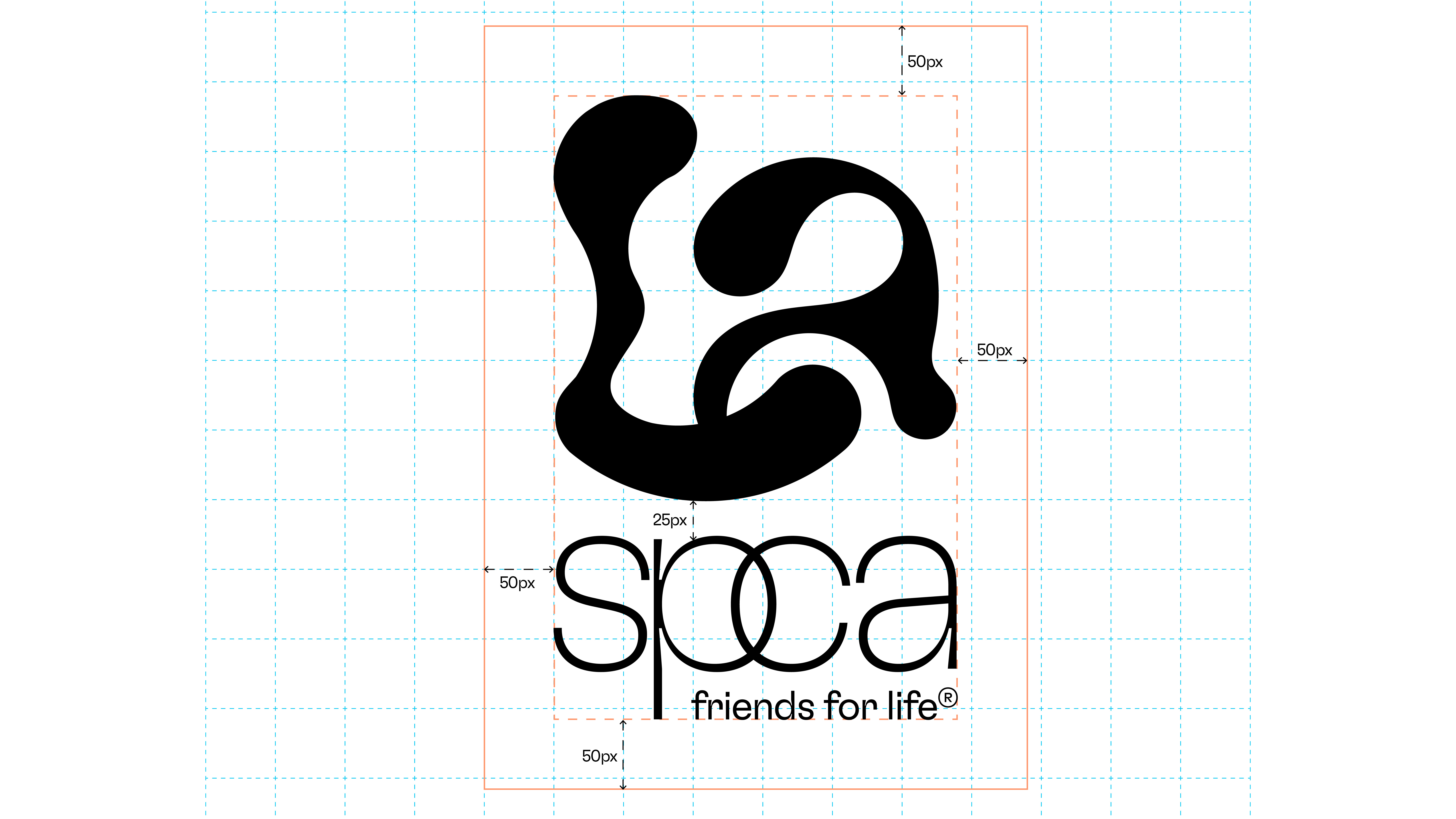
Software Used—Adobe InDesign, Adobe Illustrator, Adobe Photoshop, Procreate, Glyphs3 Categories—Identity and Systems Design, Branding, Brand Guidelines, Typeface Design, Logo Design, Logotype Design Typefaces Used—GT Flexa from Grilli Type and a custom typeface that I call Animal TailsProject Completion—December 2022


A Design Process Driven by Purpose:
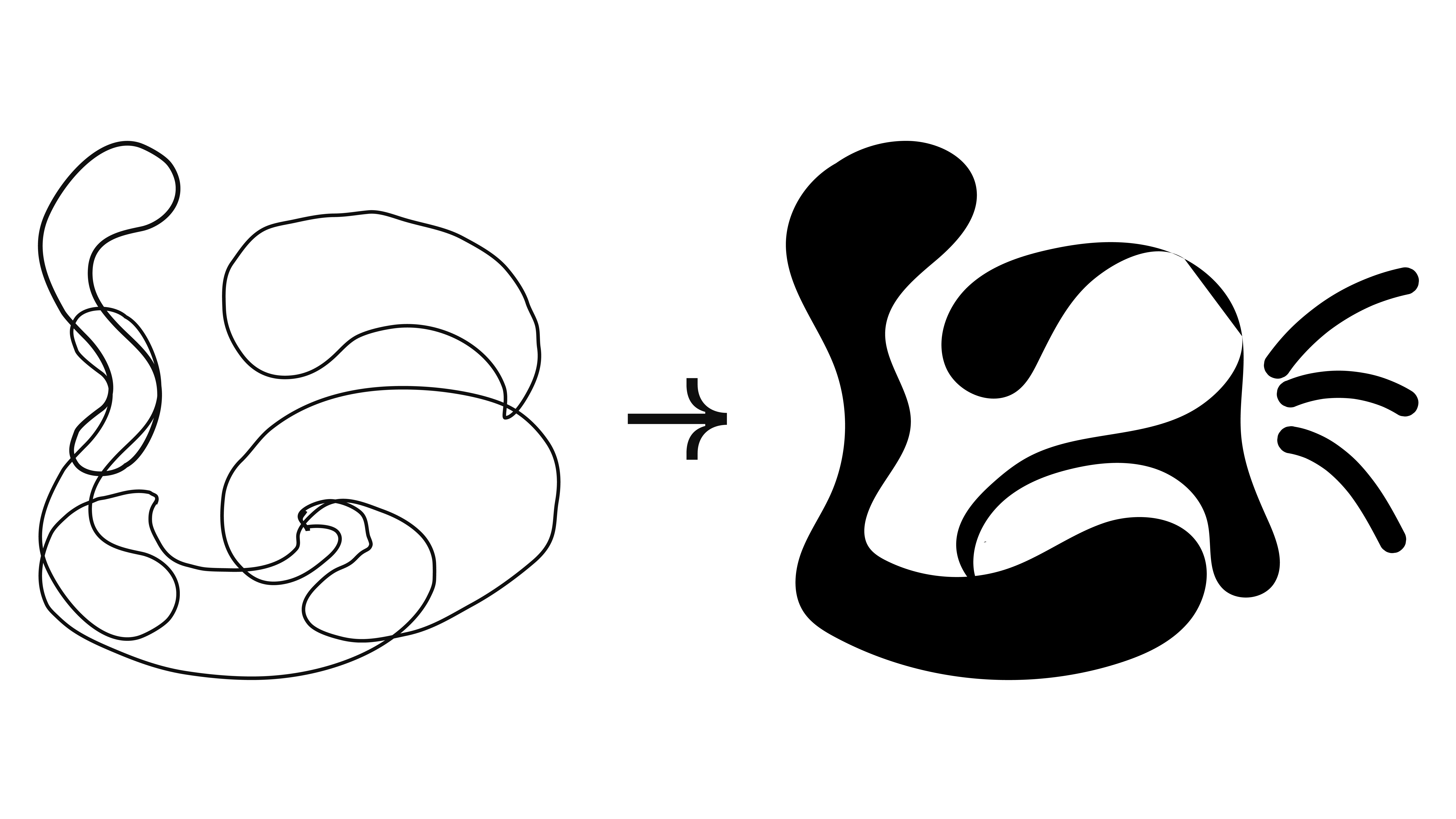
From initial sketches to final deliverables, the design process was a journey of exploration and refinement. I immersed myself in the world of typography, delving into the intricacies of glyph design and font production. Through countless iterations, I honed the visual language of spcaLA, ensuring that every element, from the logo to the typography, reflected the organization's unique character.
The process began with in-depth research into spcaLA’s mission, values, and history. This exploration highlighted the organization’s unique position as an independent entity, dedicated to adapting to the ever-evolving landscape of animal welfare. Inspired by their mission, I started sketching initial concepts that embodied compassion, dynamism, and a touch of playfulness.
spcaLA is ...


A Tailored Approach:
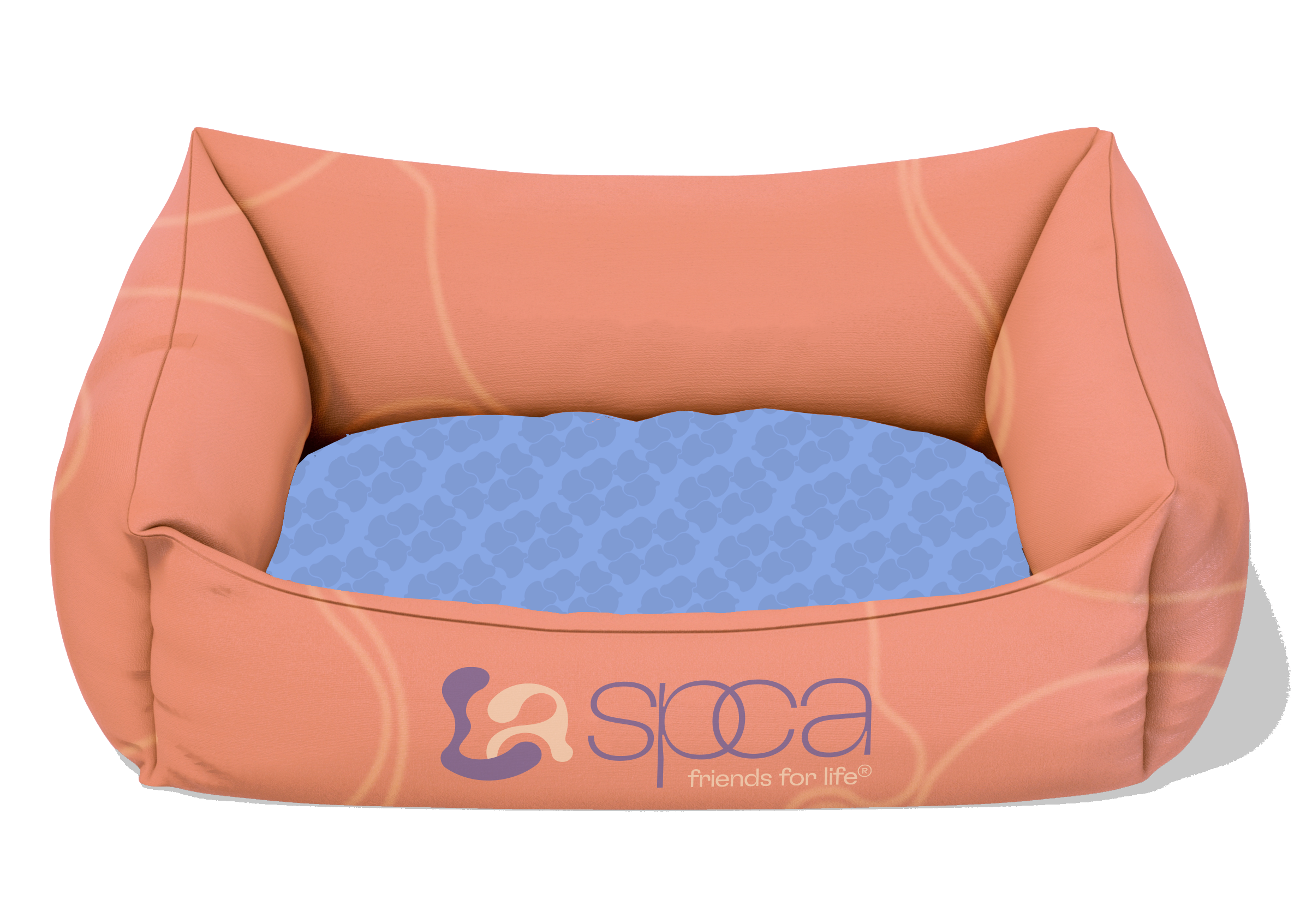
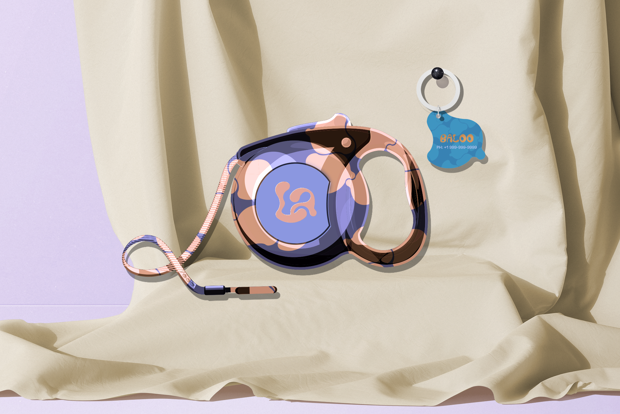
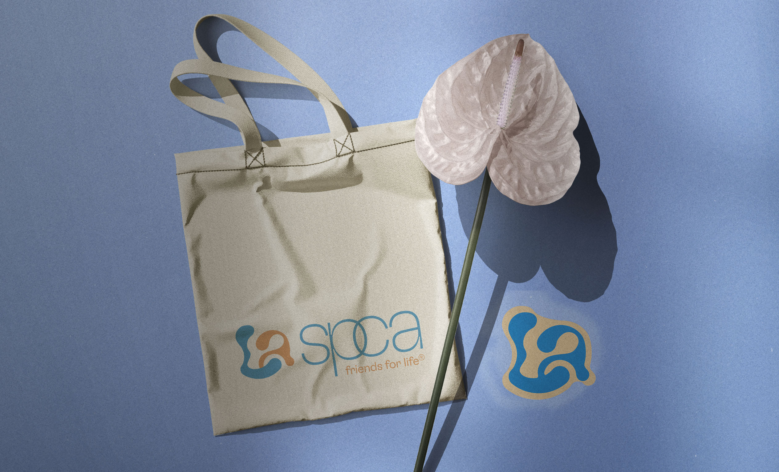
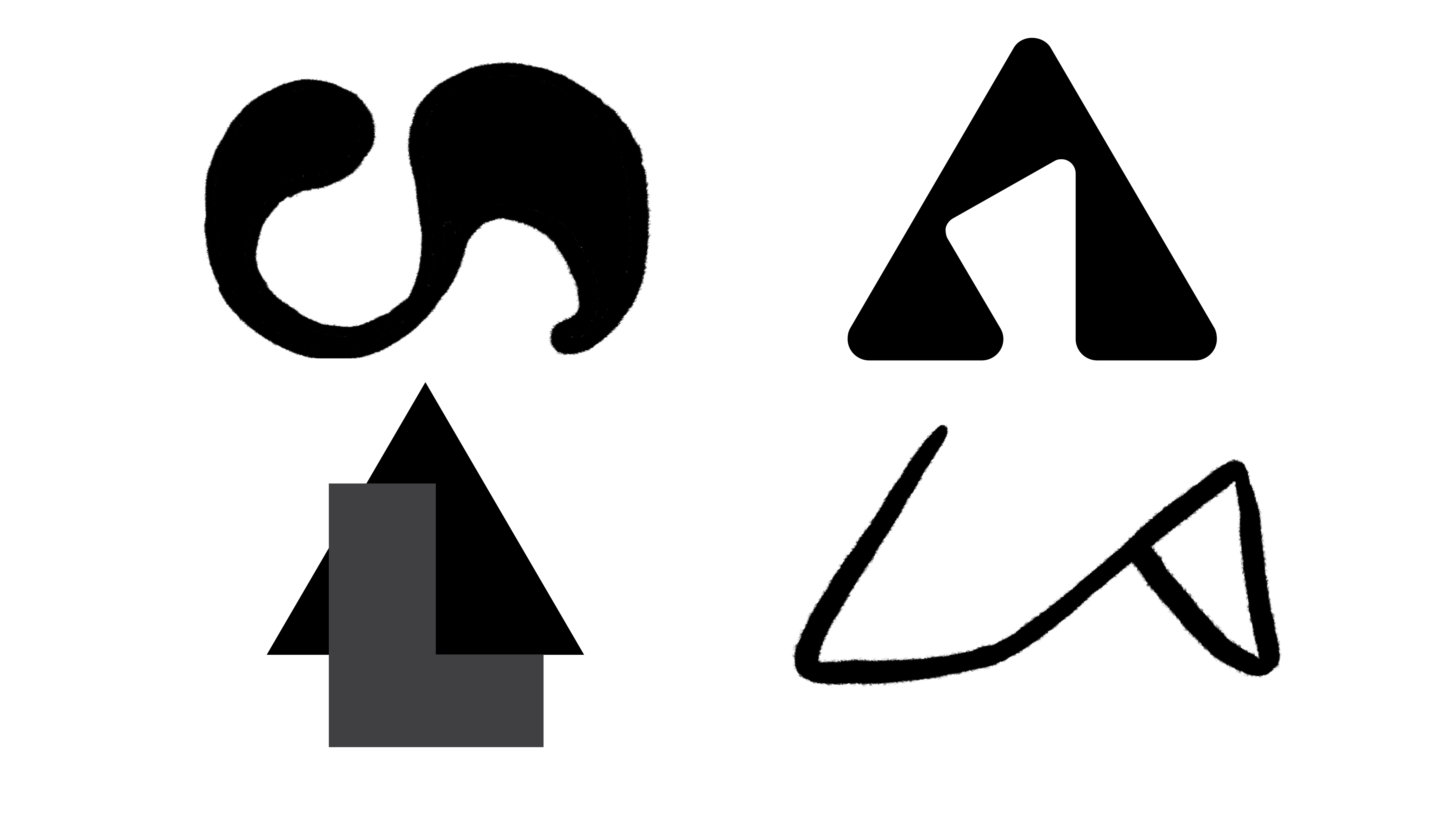
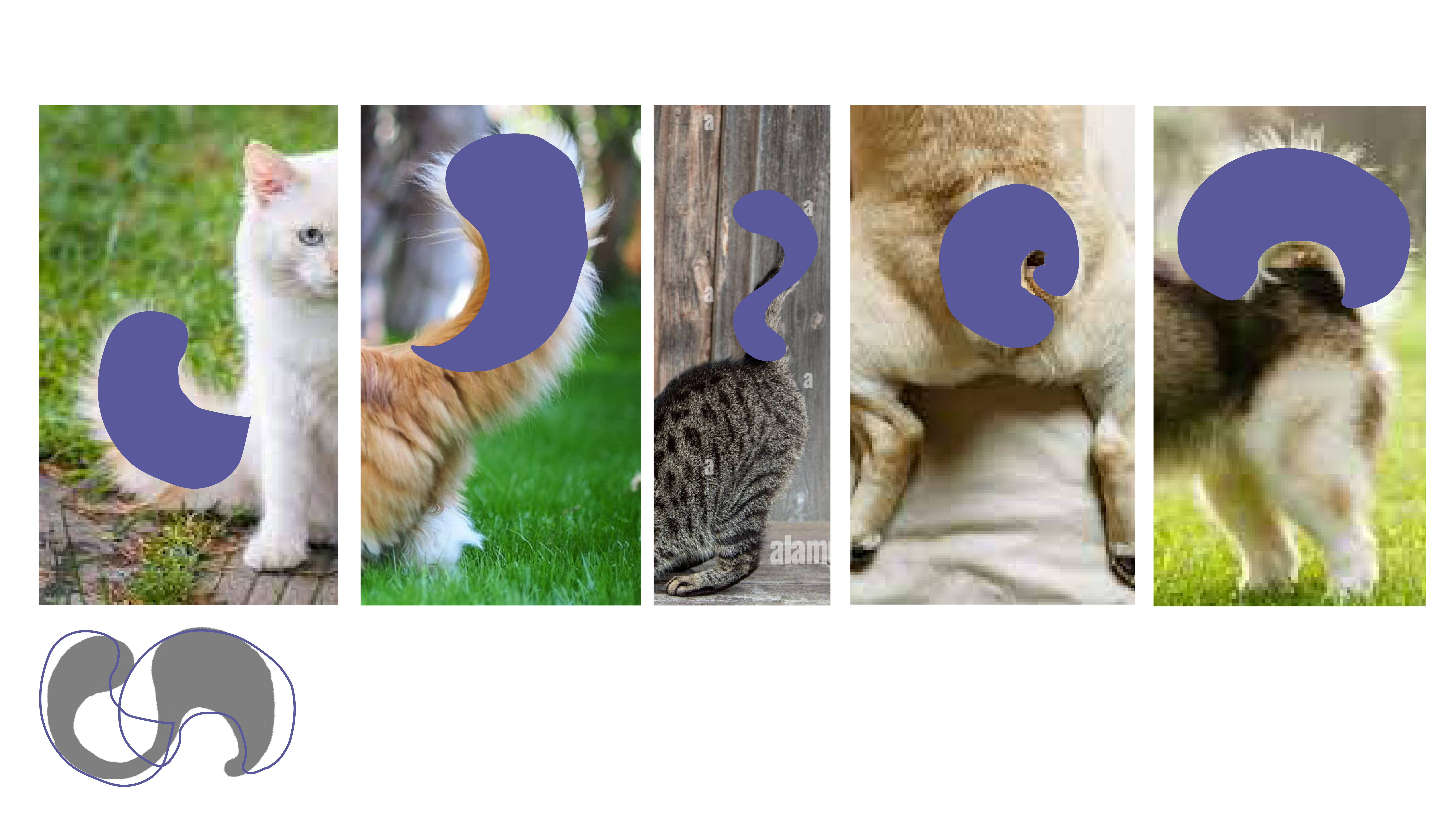
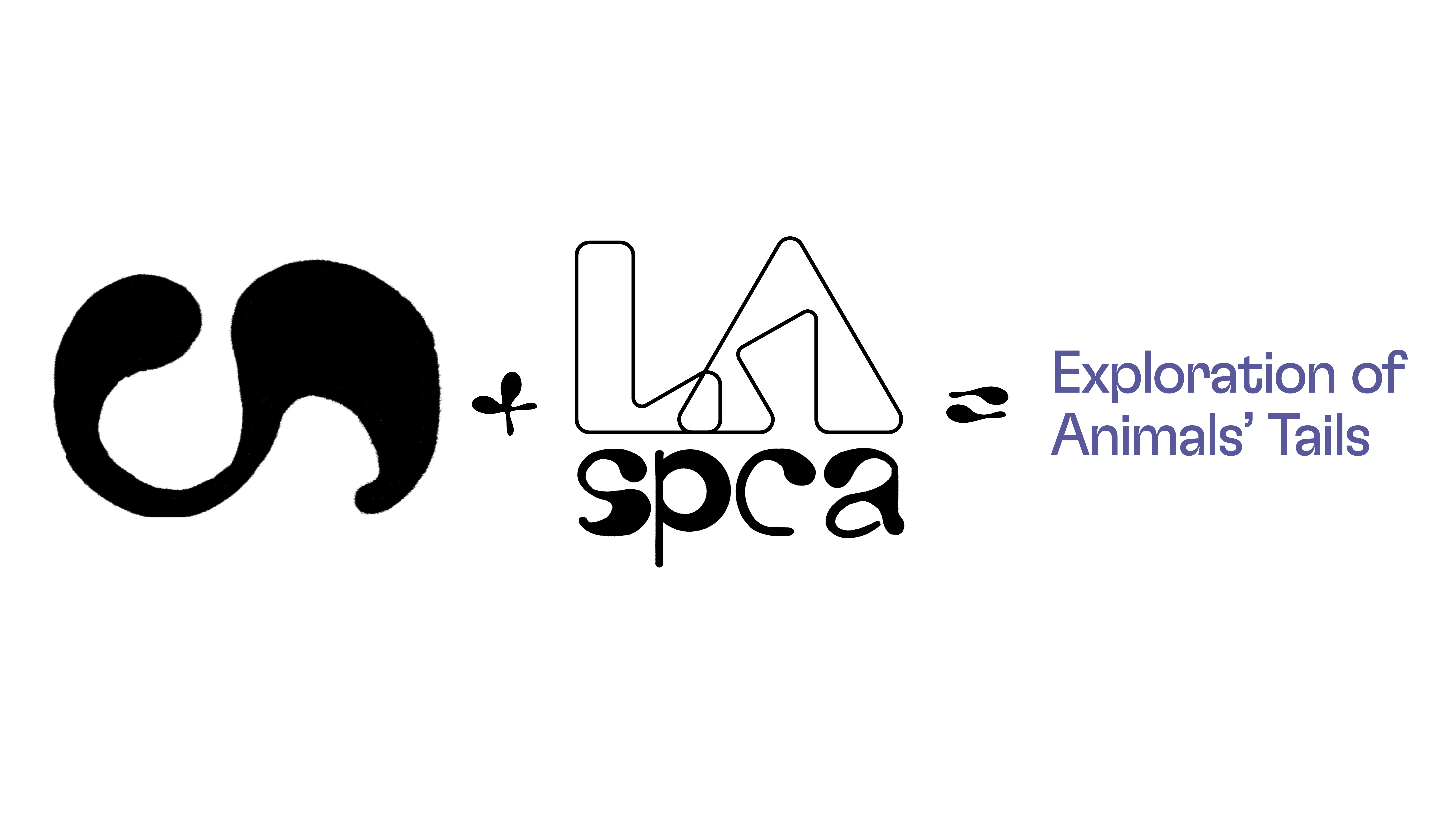
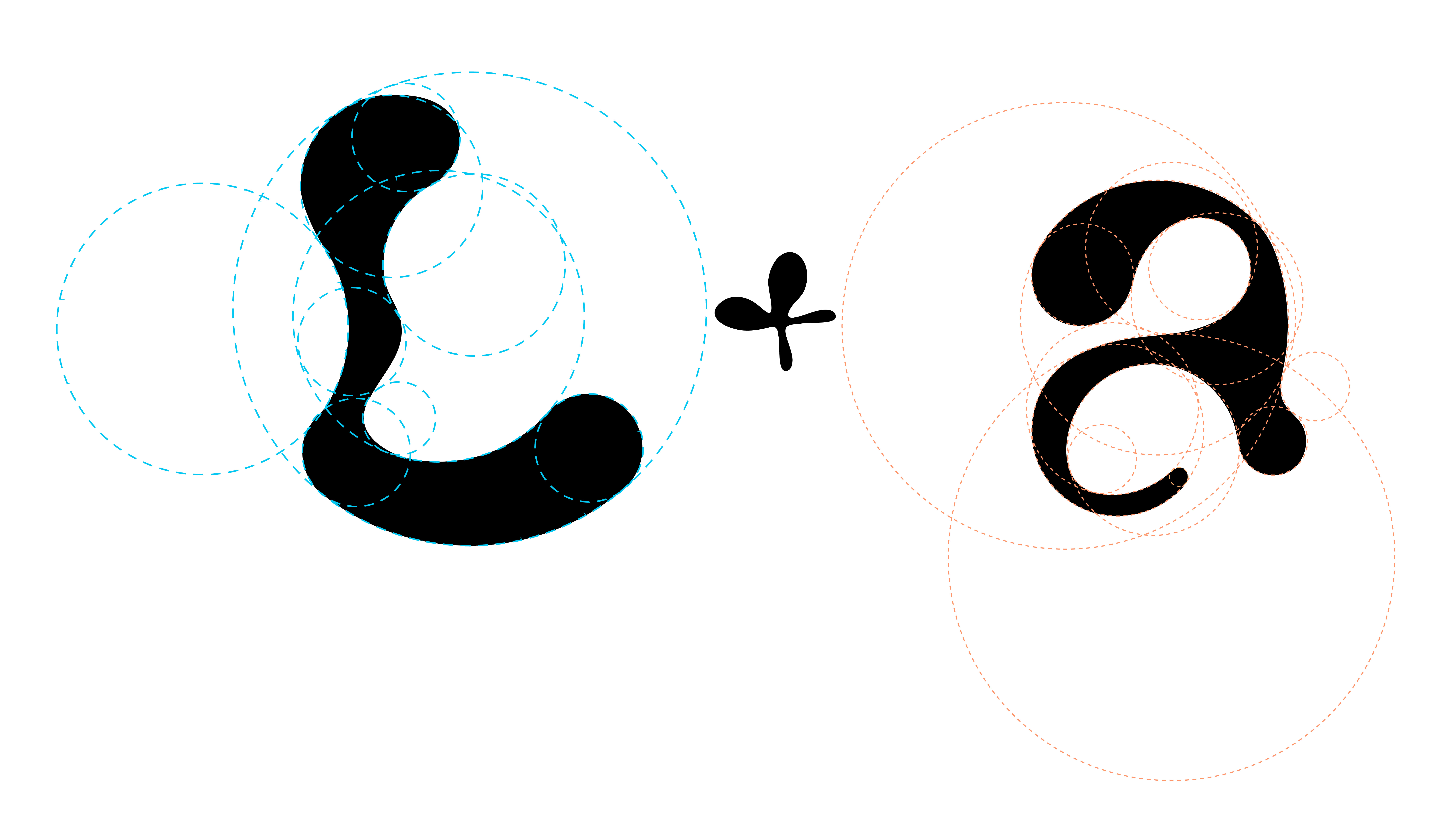
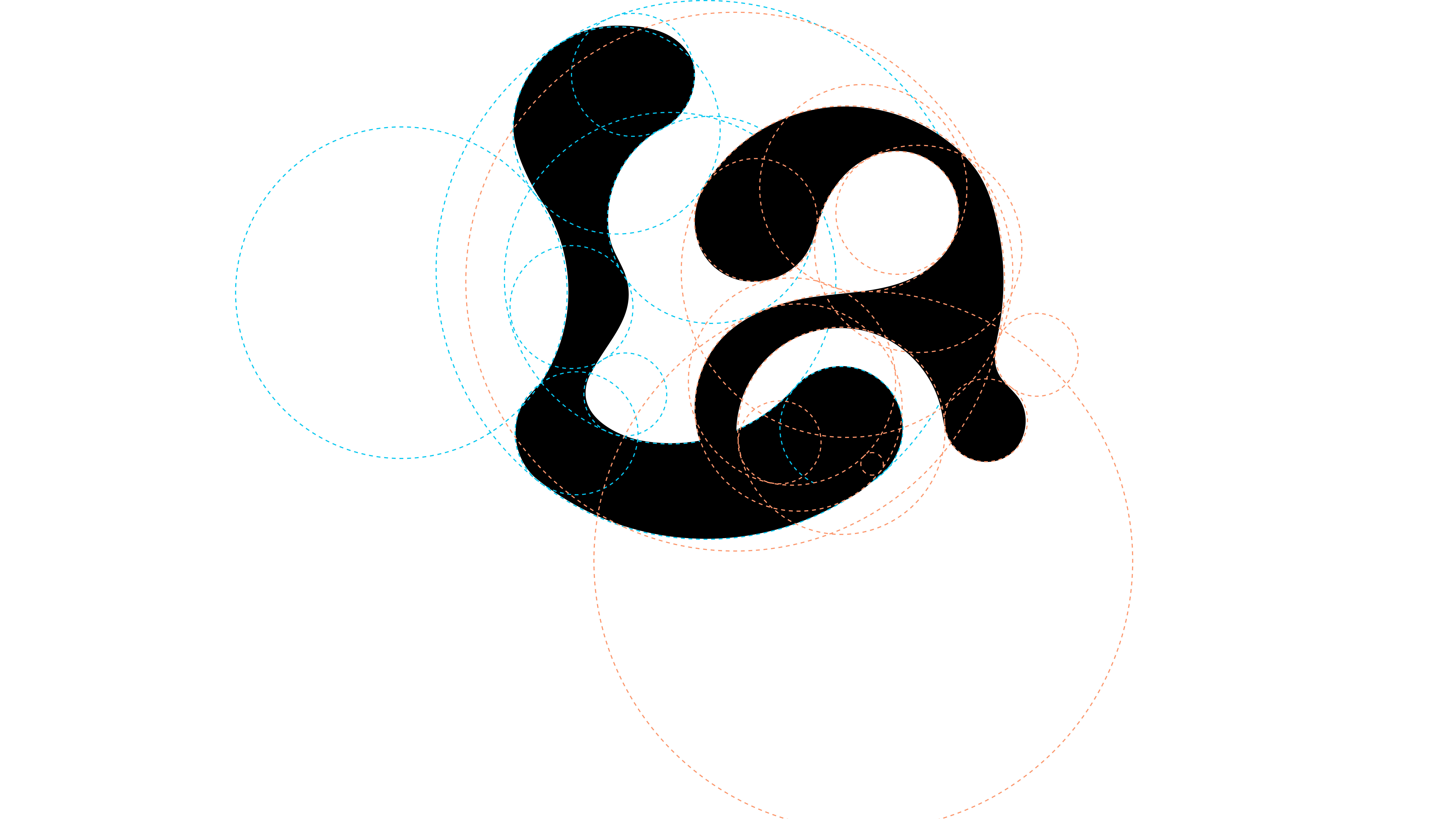
Concept: To embody these qualities, the identity centered around the concept of “Animal Tails”. This central motif symbolizes movement, adaptability, and playful spirit.
Typeface Design: To further embody the concept, a custom typeface, “Animal Tails” was created. This unique typeface features organic shapes and fluid forms, reflecting the dynamic nature of the organization.


To complement this custom typeface, I selected GT Flexa, a versatile font that balances playfulness with professionalism. This font pairing created a dynamic and engaging typographic system that aligned with spcaLA's mission.
A Visual Language of Compassion:
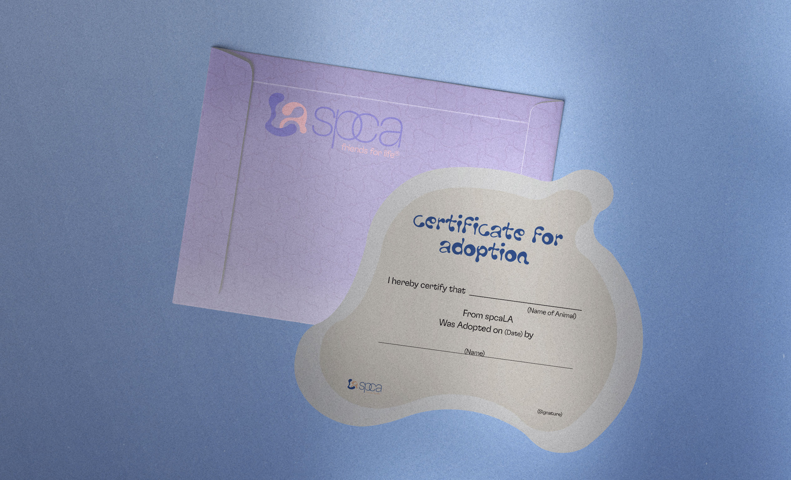
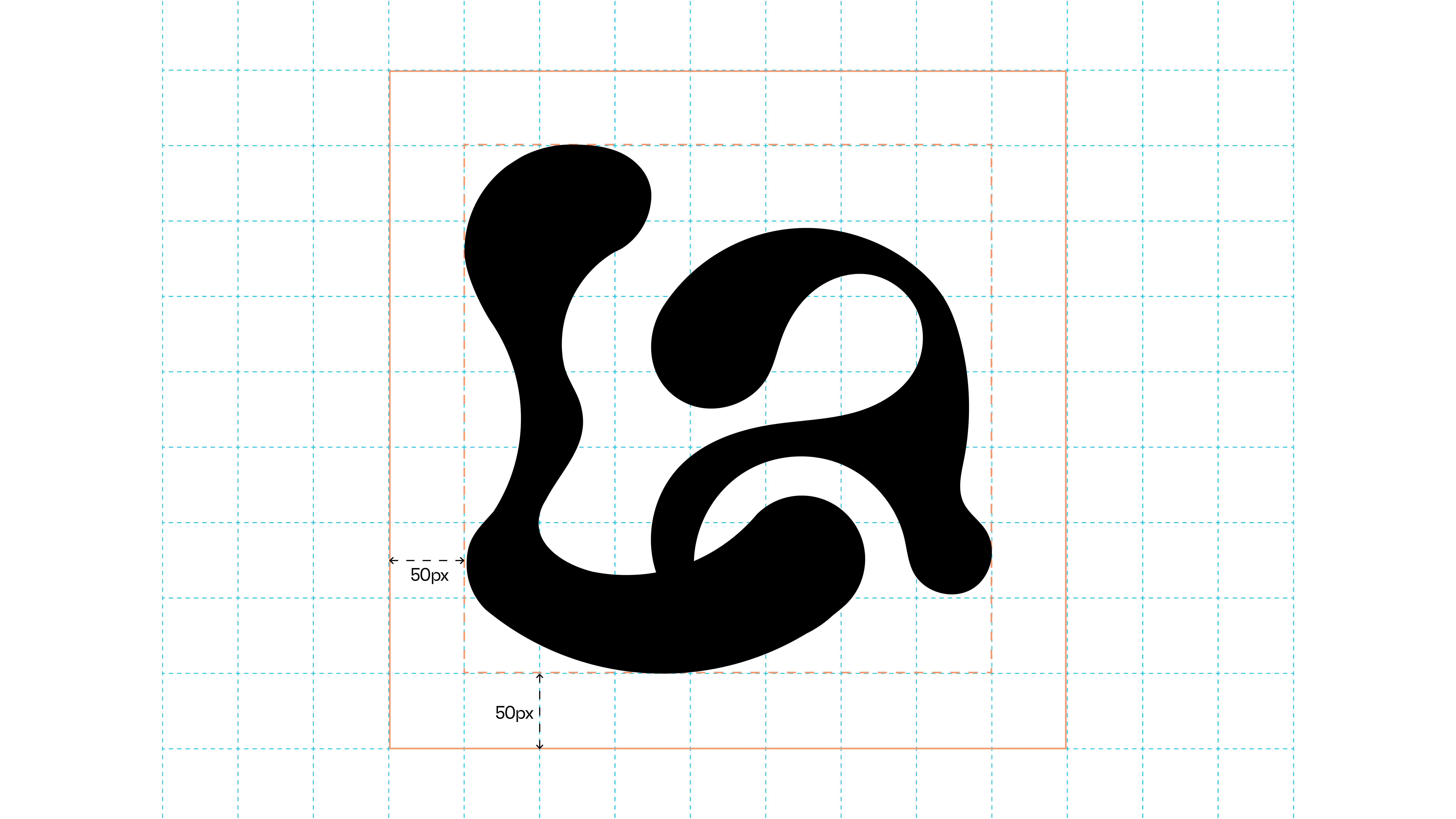
The logo, a stylized "LA" inspired by animal tails, served as the foundation of the identity. It conveyed a sense of movement and fluidity, while also representing the organization's independent spirit.
Logotype Lockups:

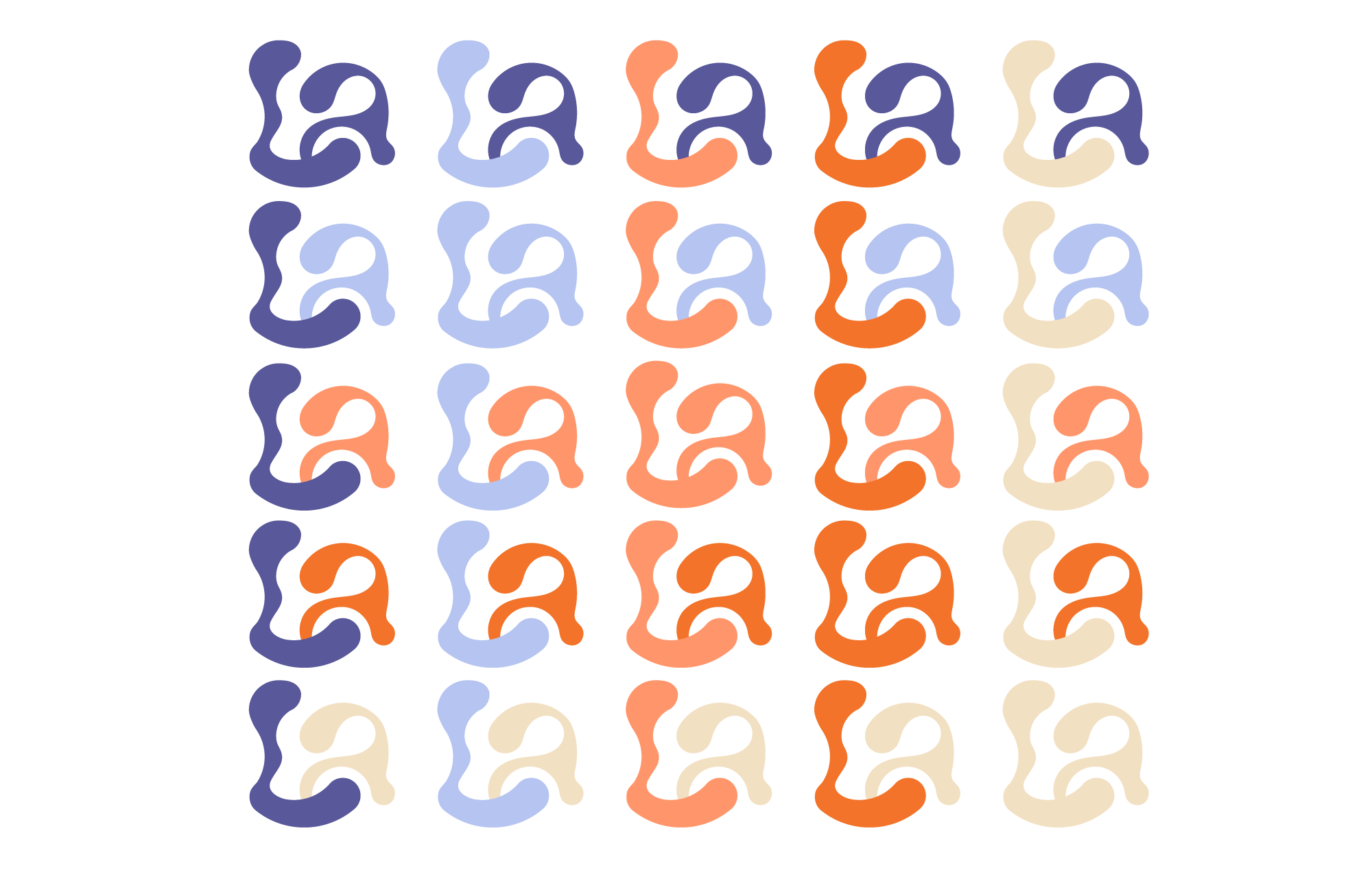
Color Palette:
A carefully curated color palette, incorporating earthy tones and calming hues, reinforced the brand's connection to nature and its commitment to animal welfare.


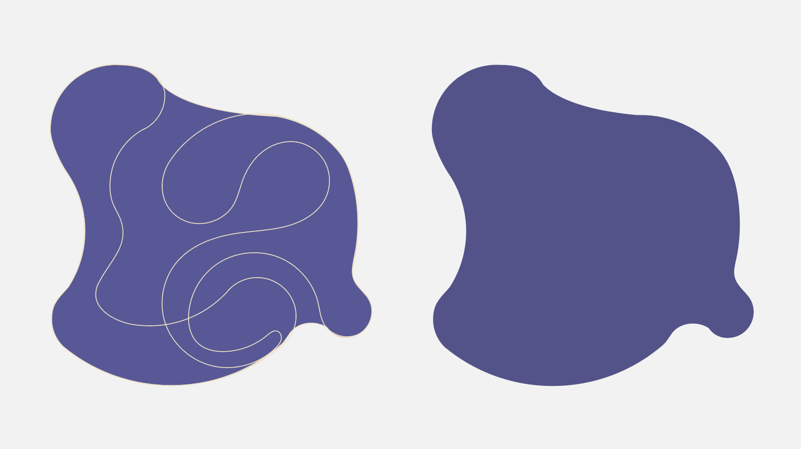
Pattern Design & Image Treatment:

A Legacy of Compassion:
This reimagined identity is more than just a visual makeover; it's a testament to the power of design to inspire and connect. By aligning form with function, I hope to contribute to spcaLA's mission and inspire future generations of animal lovers.
This project was developed as part of an academic exploration into social impact branding, with a focus on creating a meaningful identity for a real-world nonprofit organization.
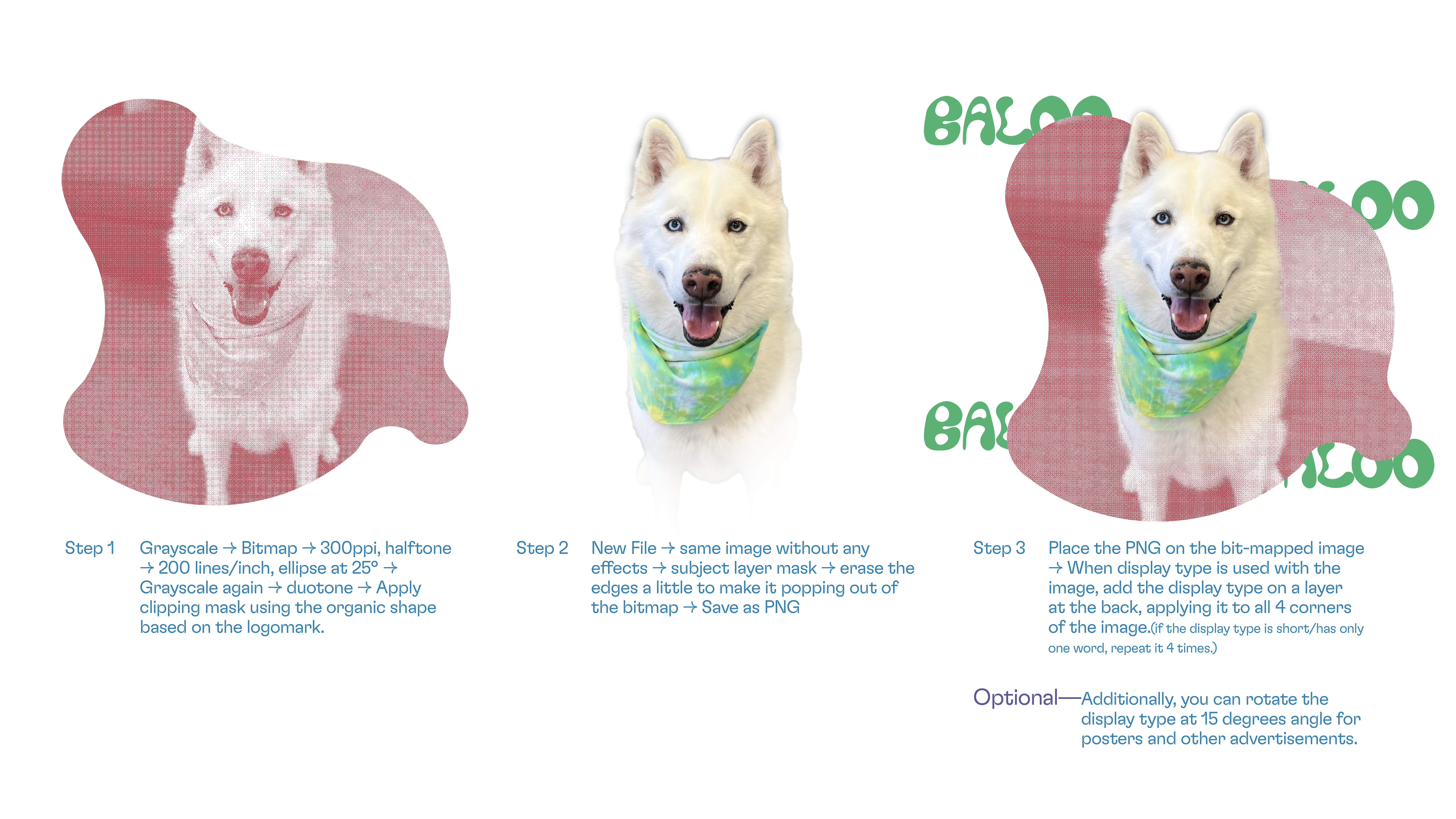
Trapped in a Dream: A Creative Coding Journey
Have you ever felt trapped in a dream, unable to wake up? This unsettling experience inspired me to create a series of interactive graphics that capture that feeling of frustration and confusion.
Software and Languages Used—Visual Studio Code, p5.js,
openprocessing.org and Procreate
Categories—Motion Graphics, Creative Coding, Coding Graphics, Website Design, Mini-Game Design, Poster Design, and Maze/Model Design
Typeface Used—Sligoil Micro from Velvetyne Type
Project Completion—July 2022
Categories—Motion Graphics, Creative Coding, Coding Graphics, Website Design, Mini-Game Design, Poster Design, and Maze/Model Design
Typeface Used—Sligoil Micro from Velvetyne Type
Project Completion—July 2022
The Dream That Sparked It All:
One night, I found myself in a bizarre dream sequence. My room seemed familiar, but the ceiling was different. I opened the door, only to find myself in a new location. This cycle repeated, each doorway leading to a different dreamscape. Panic set in as I realized I was trapped within my own mind. Struggling to control the dream, I tried to move and speak in the real world, but nothing worked. The only connection to reality was the faint sound of the NBA news playing in the background, a sound that persisted even within my dream. Finally, as my husband opened the door in real life, I jolted awake. The first thing I did? Check the ceiling - a desperate confirmation that I was truly back in reality.From Dream To Code:
This experience, both fascinating and terrifying, became the seed for my first foray into creative coding using p5.js. With the help of open-source code from OpenProcessing.org, I embarked on an experimental journey.Sketching The Dream World:
The first step was to translate my dream into a visual concept. I started by creating a rough sketch, followed by an animated gif that captured the essence of the dream. Further research for similar visual elements helped me solidify my design direction.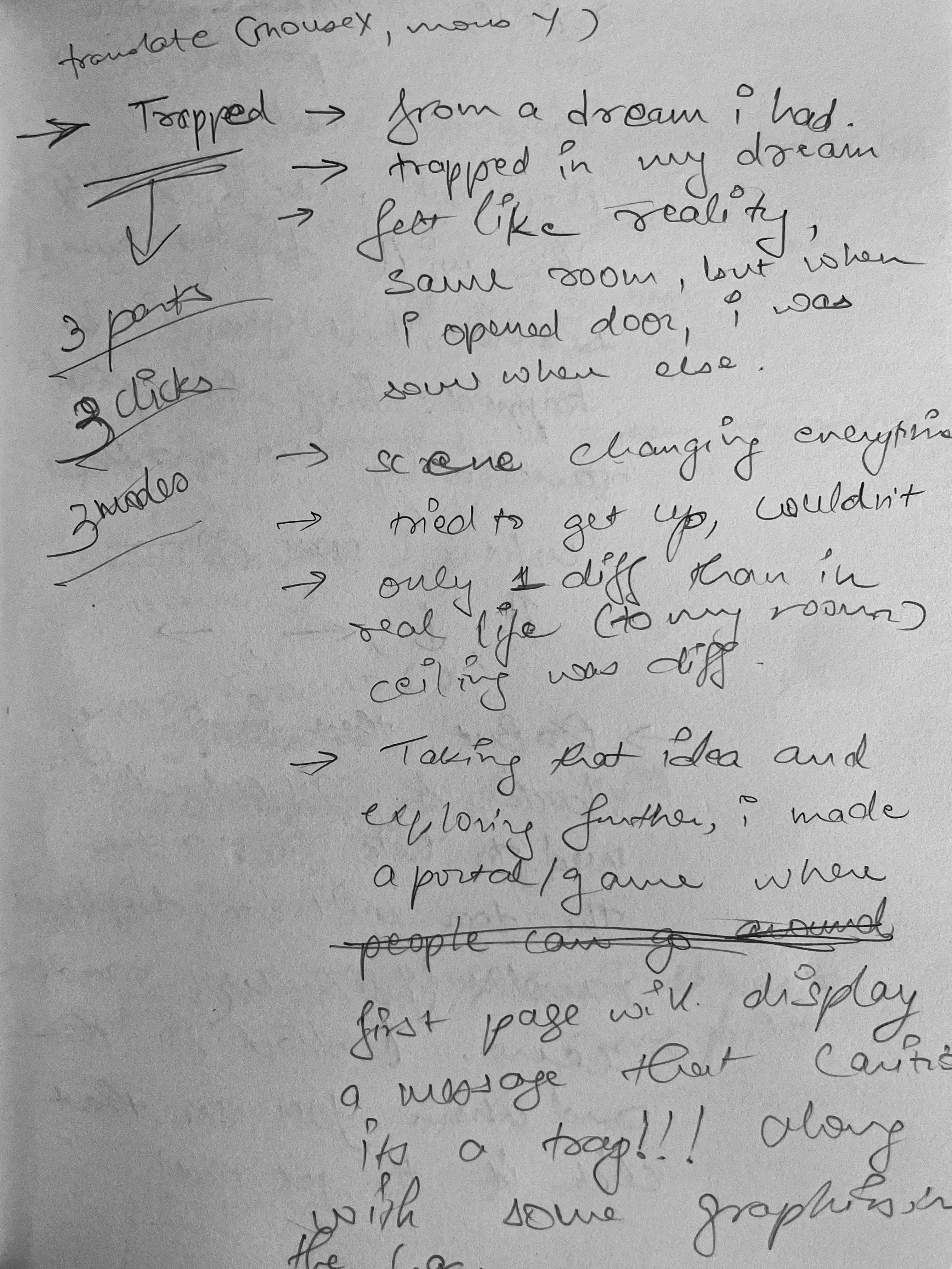
Building the Escape:
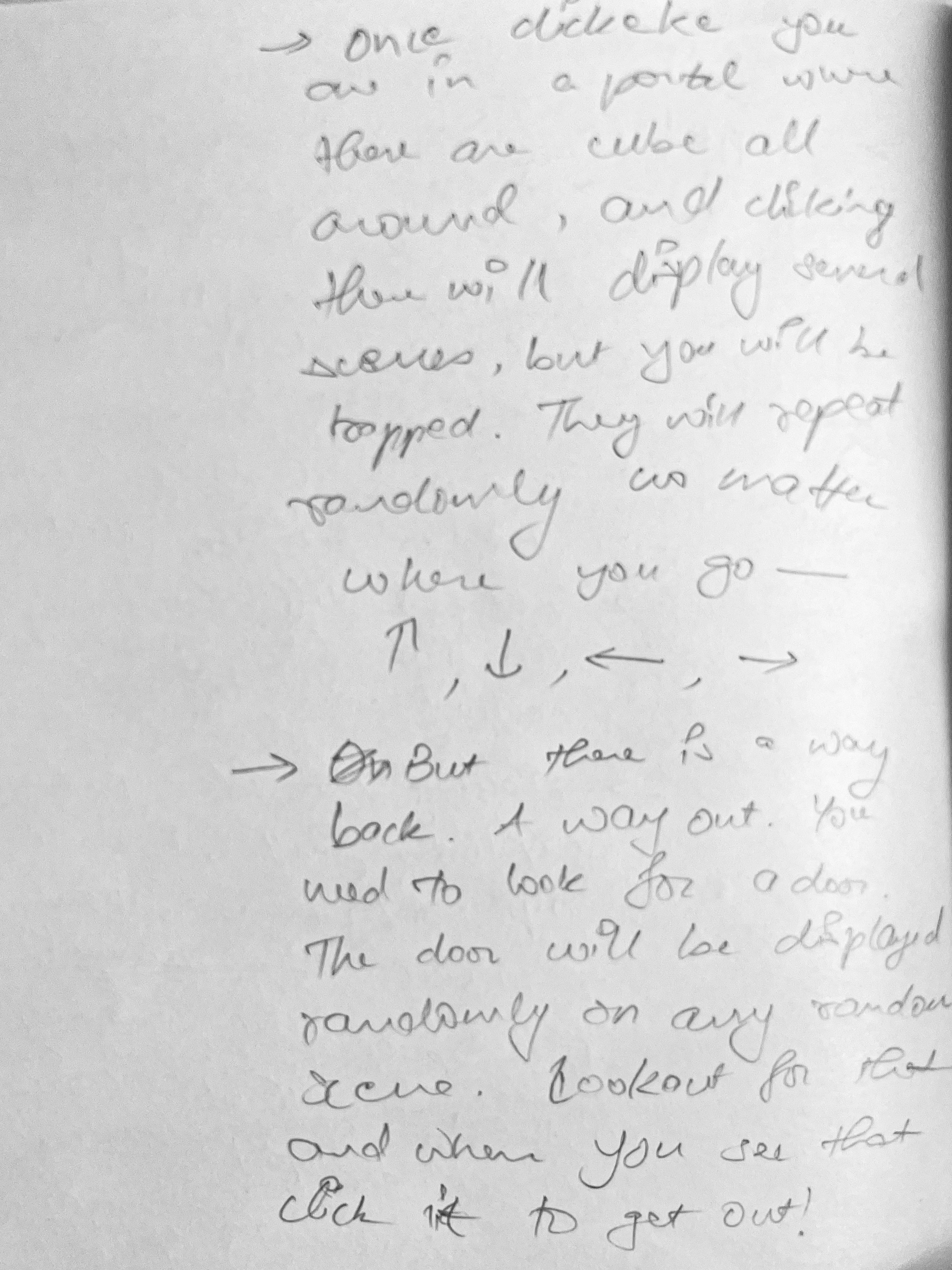
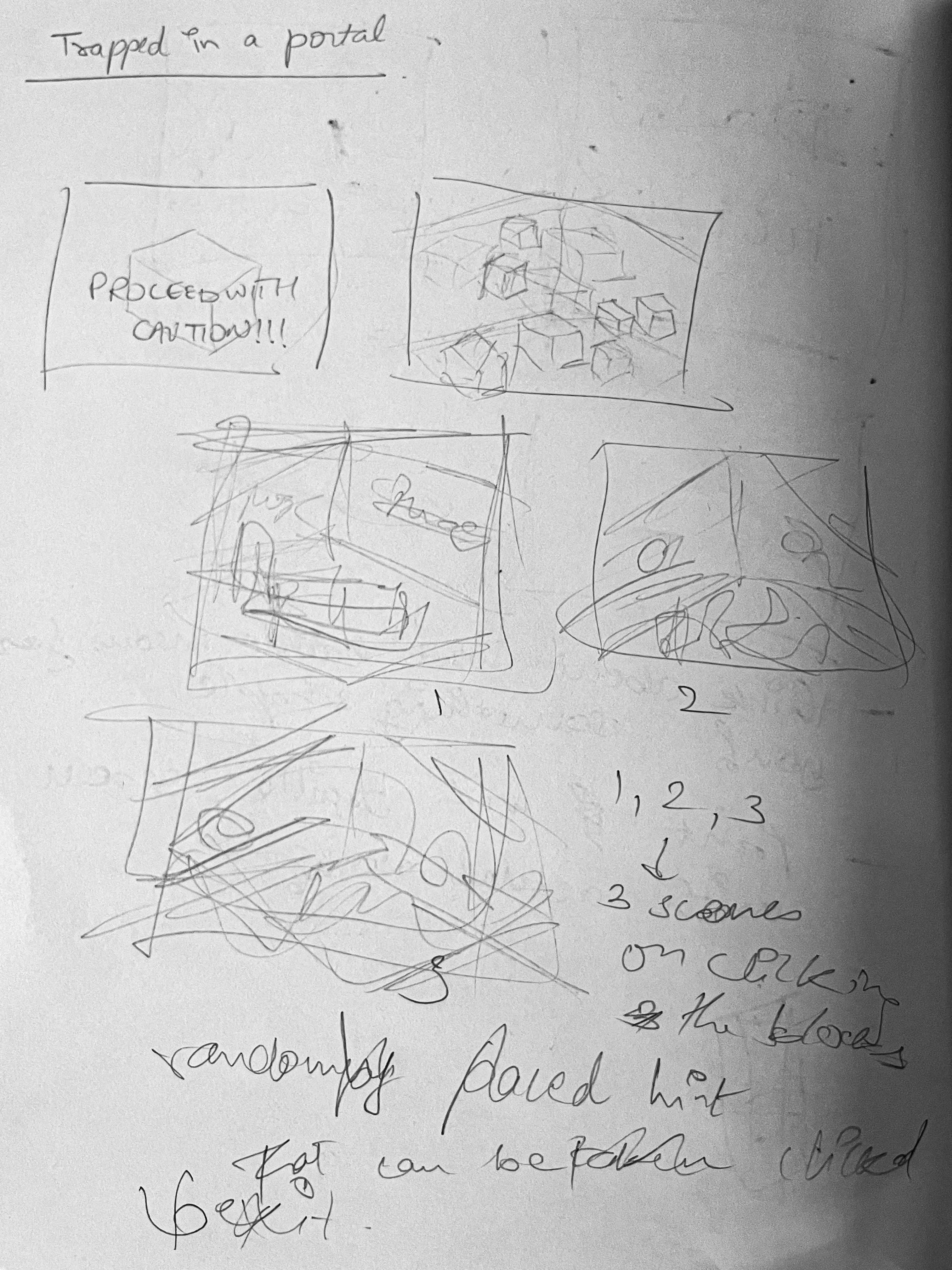
With the invaluable support of my husband, Ejaz Veljee, and my instructor, Vera van de Seyp, I began to transform my vision into code. The resulting project is an interactive game that mimics the feeling of being stuck in a portal.A Clicky Maze:
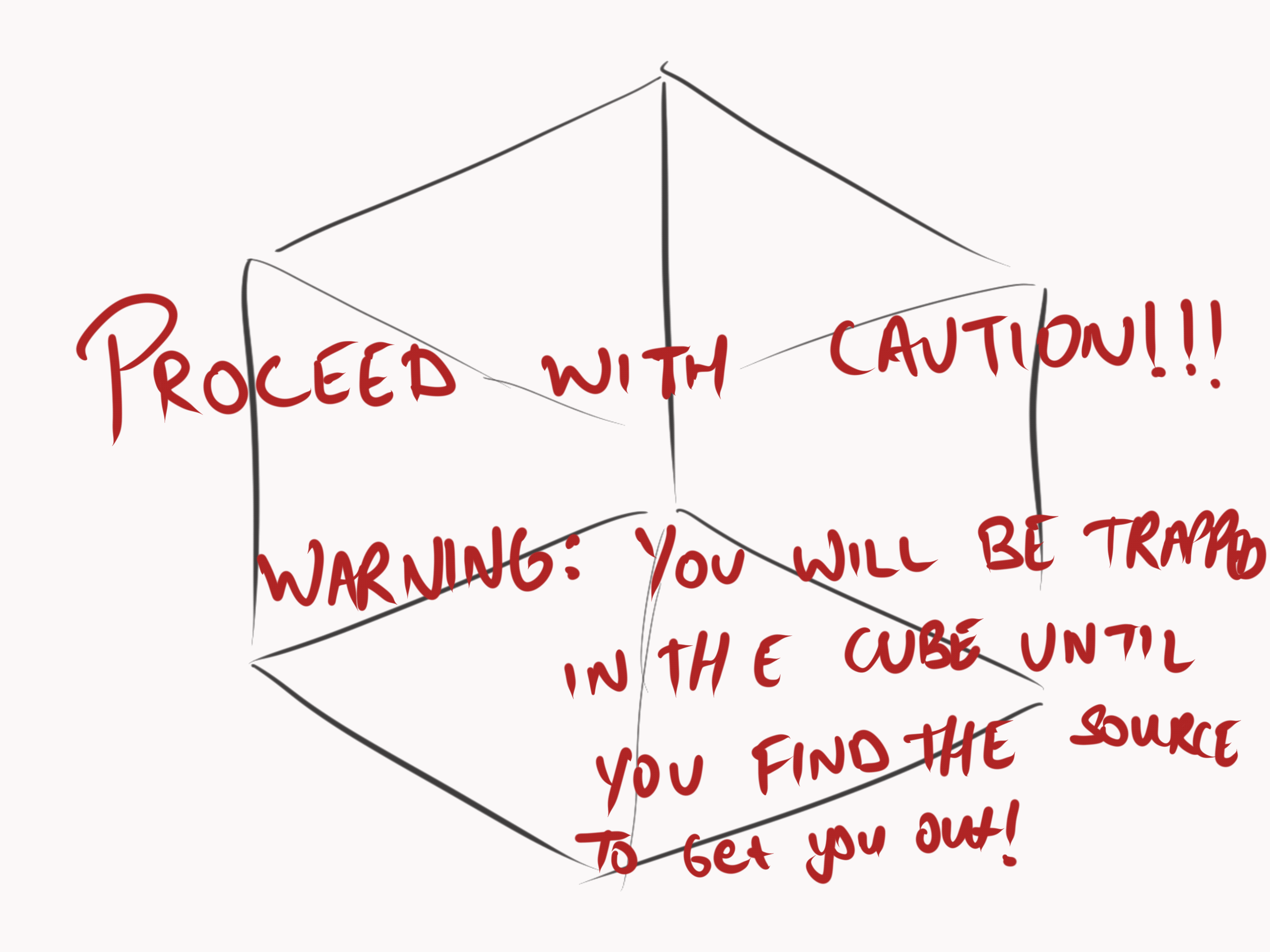
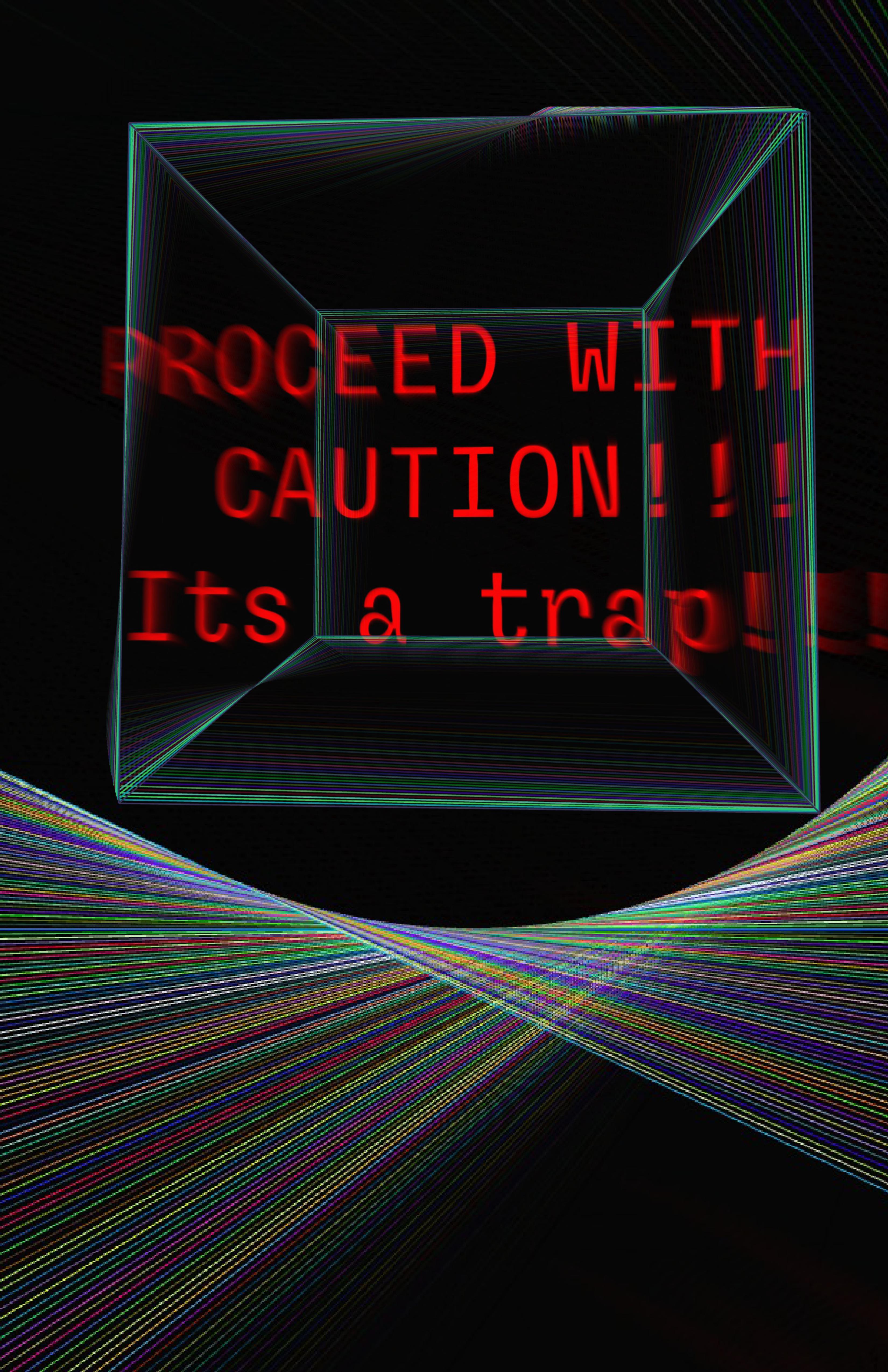
The game opens with a playful warning - "Proceed with Caution!!! It's a trap!" You navigate through the dreamscape using mouse clicks and arrow keys, exploring a series of rooms that shift and transform. But beware, this is where the trap lies! The only escape is through a hidden door that appears randomly in the bottom left corner. Finding this door requires vigilance and awareness, just like realizing you're in a dream within a dream.Interactive and Playable Graphic:
Beyond the Screen:
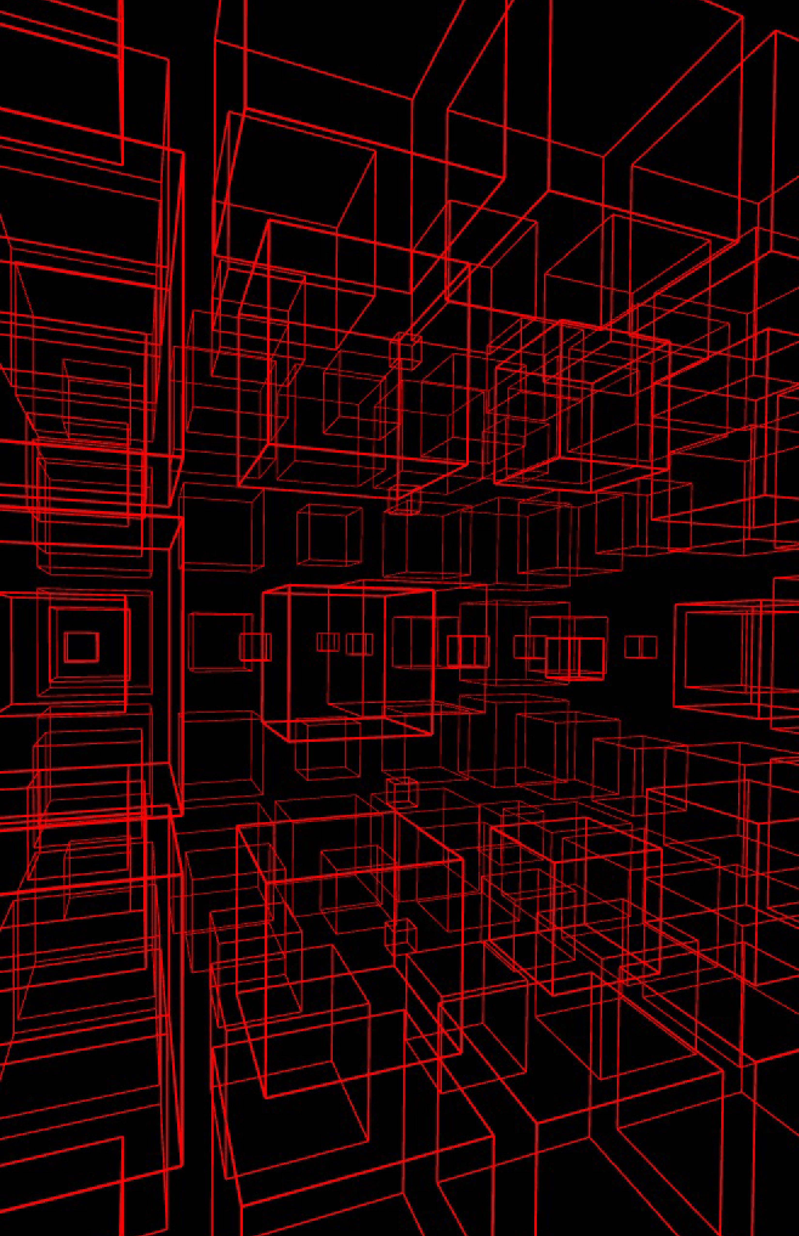
My exploration didn't stop with the digital world. I wanted to create a physical experience that complemented the digital one. This led to the creation of a printed maze and two posters. The maze, with no clear entrance or exit, mirrors the confusion of a lucid dream. Just like in the game, navigating the physical maze requires a conscious effort to find your way out.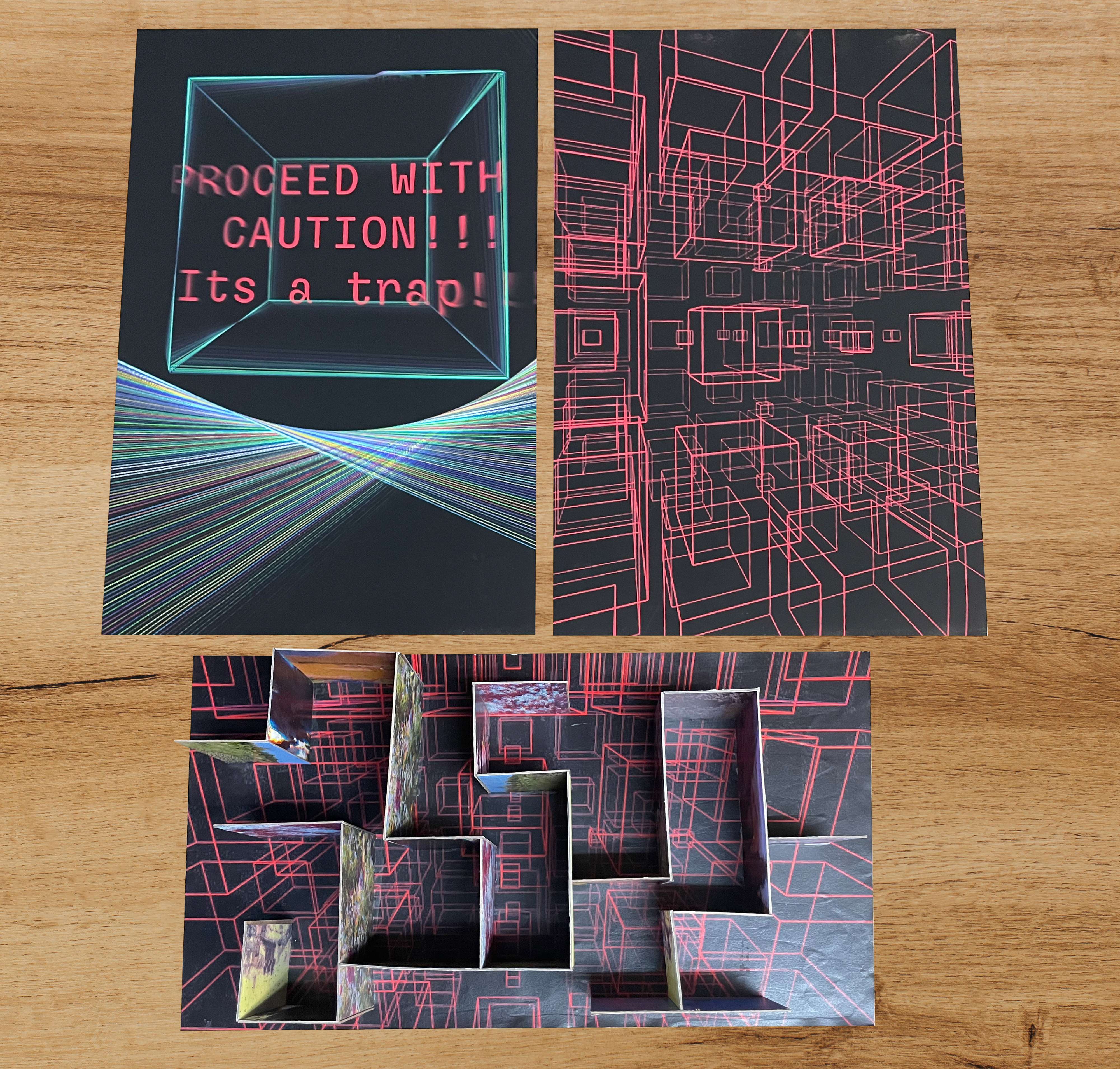
Thanks to Ejaz Veljee and Vera van de Seyp for helping me with the code.
Special credits to FelixTse, watabo_shi and Gabe - hurraaay, whose
references were used to develop my work.
Special credits to FelixTse, watabo_shi and Gabe - hurraaay, whose
references were used to develop my work.
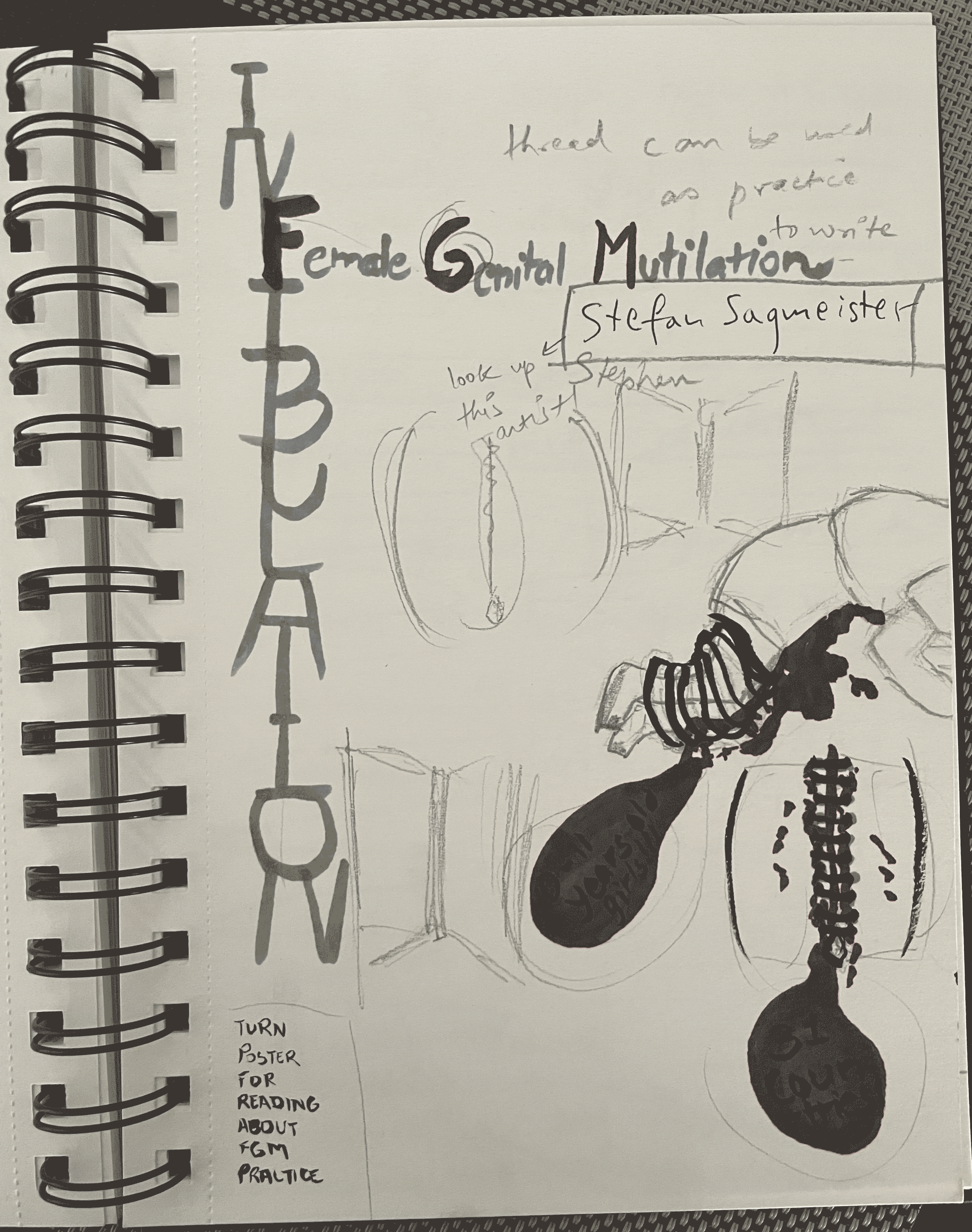
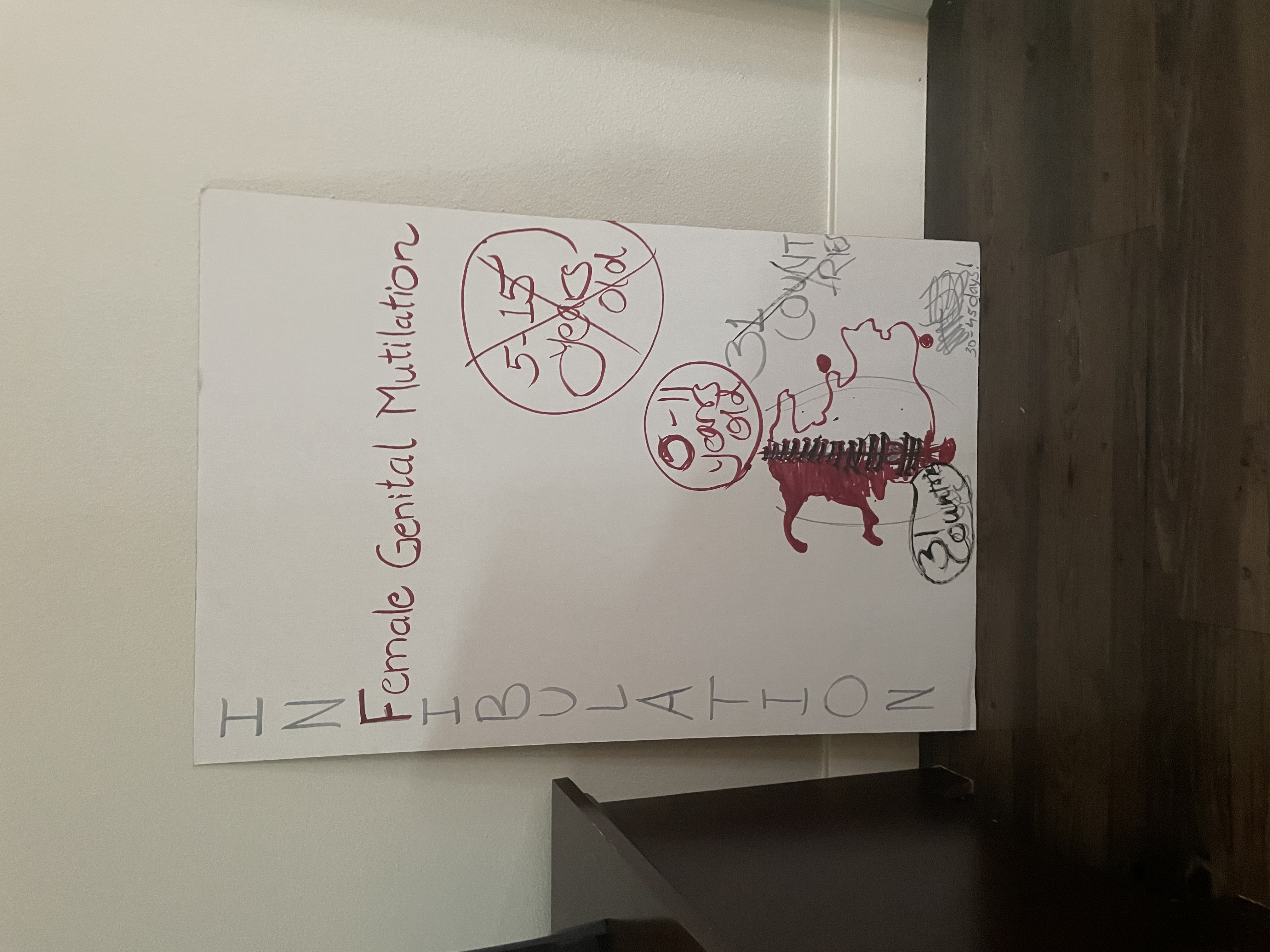
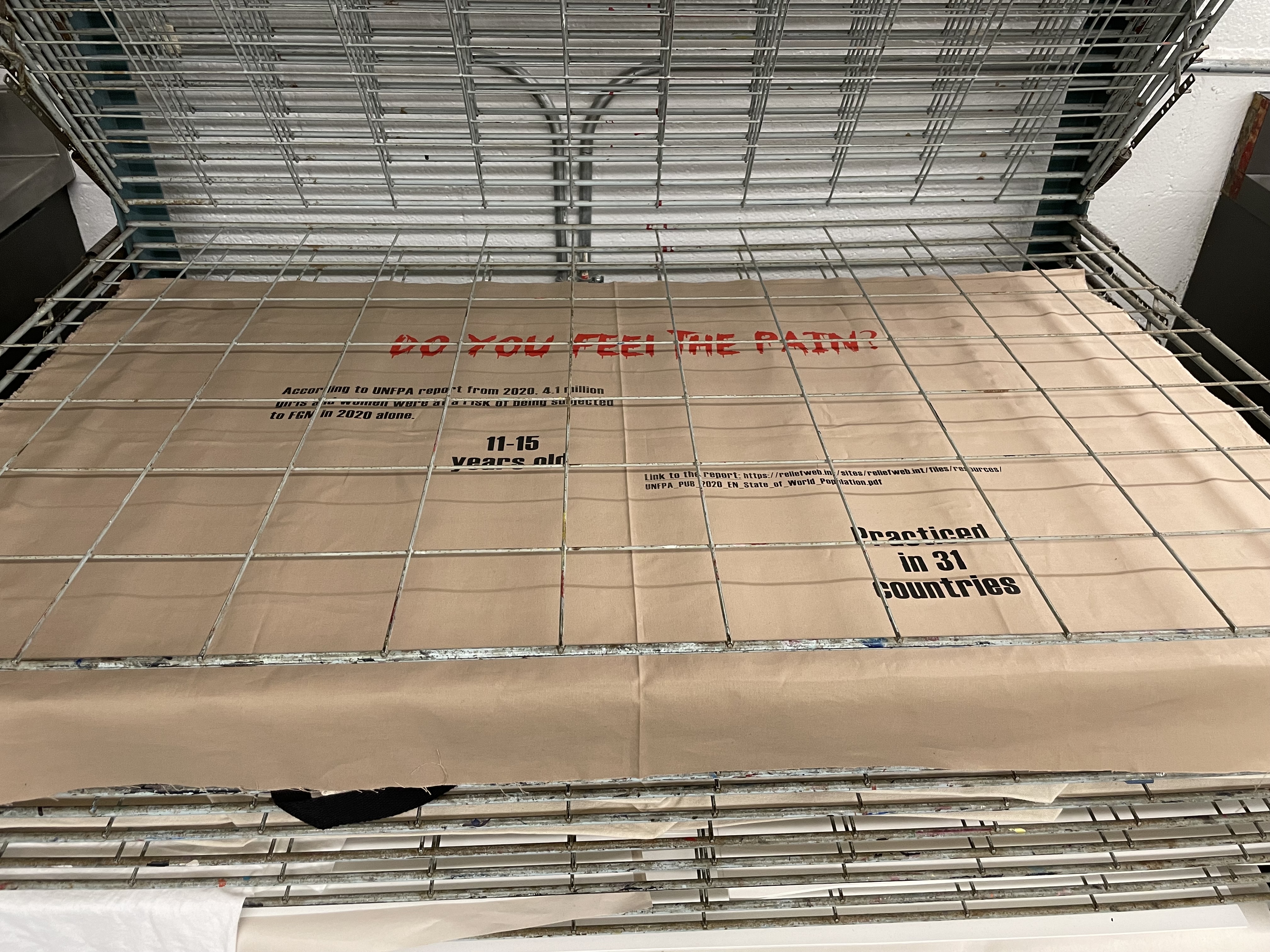
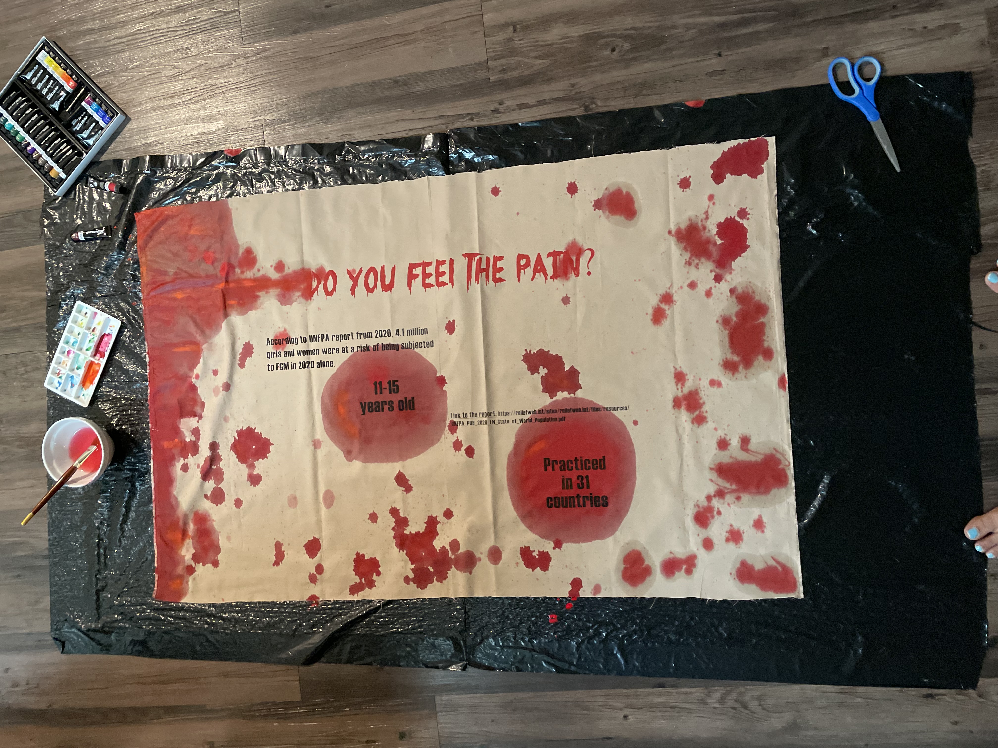
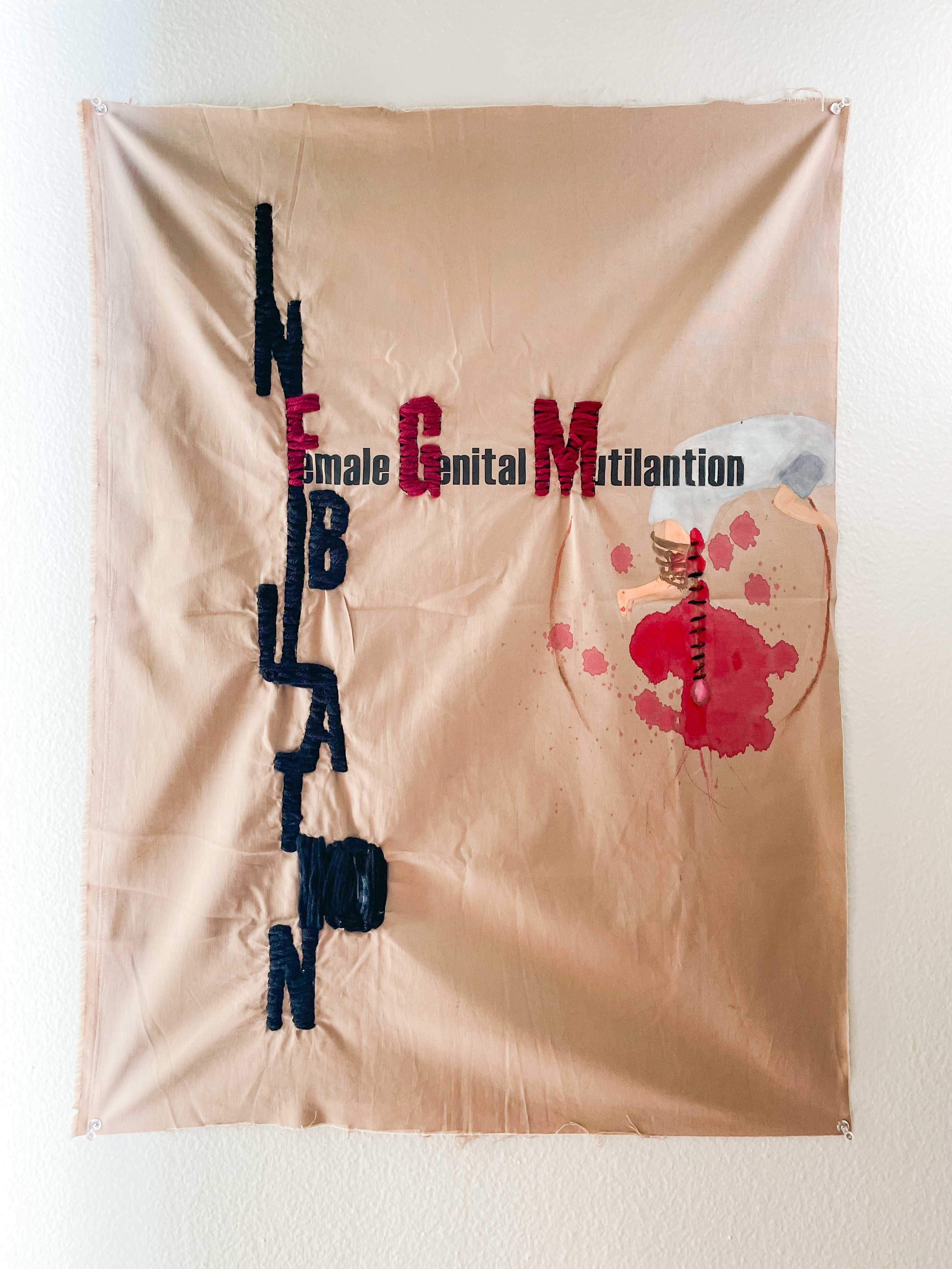
A Painful Tradition: The Infibulation Project
In the heart of Design Week, a spark ignited within me. A desire to shed light on the often-hidden plight of women worldwide, particularly the cruel practice of infibulation. This ancient tradition, a barbaric act of female genital mutilation, has scarred countless lives.
To give voice to the voiceless, I embarked on a creative journey. A journey that would culminate in an interactive poster, a poignant testament to the suffering endured by countless girls and women.
To give voice to the voiceless, I embarked on a creative journey. A journey that would culminate in an interactive poster, a poignant testament to the suffering endured by countless girls and women.
Material Used—Fabric to resemble skin, thread to simulate the stitches,
red paint and ink to mirror the blood
Categories—Interactive Poster Design, Poster Design, Social Responsibility, Women's Safety, Human-Centered Design, Socially Responsible Design, Inclusive Design
Project Completion—September 2021
Categories—Interactive Poster Design, Poster Design, Social Responsibility, Women's Safety, Human-Centered Design, Socially Responsible Design, Inclusive Design
Project Completion—September 2021


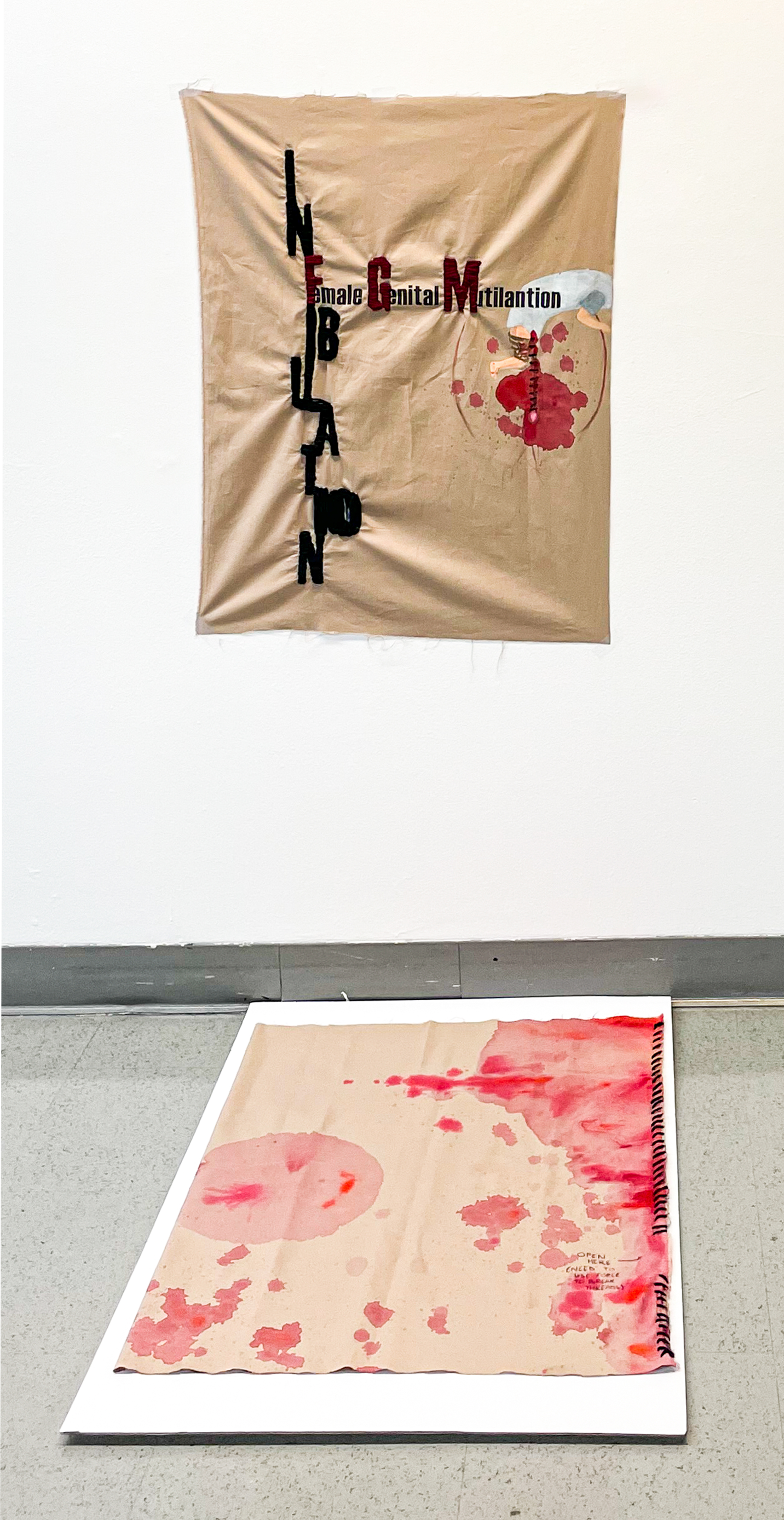
A Canvas of Suffering
The poster, a stark and unsettling piece, was crafted with meticulous care. Skin-toned fabric, a symbol of vulnerability and innocence, was meticulously sewn shut, mirroring the horrific procedure of infibulation. Crimson ink and threads, like wounds, crisscrossed the surface, a stark reminder of the physical and emotional trauma inflicted.The viewer is invited to interact with the poster, to physically tear open the stitches. This act of defiance, however small, echoes the struggle of women who have been forced to endure this painful ordeal.
A Call to Action
The video displayed on the top showcasing me tearing the poster open, further amplifies the impact of the project. This visual performance, created during the early days of my artistic journey, underscores my commitment to using design as a tool for social change.I am deeply grateful to Piotr Shzhalski, whose guidance and encouragement inspired me to explore this sensitive topic and experiment with innovative techniques. By sharing this project, I hope to spark conversations, raise awareness, and ultimately contribute to the eradication of this harmful practice.